6.9 Getting Familiar With the Normal Distribution
By now you see why normal distributions are often good models of error (aggregation of forces!) and also how you might use them to make predictions. But why is it that distributions that look very different from one another are all called “normal”? The shape of the normal distribution is intuitively like “a bell”, but let’s consider what that really means.
To be more concrete, let’s go back to Kargle, our favorite video game.
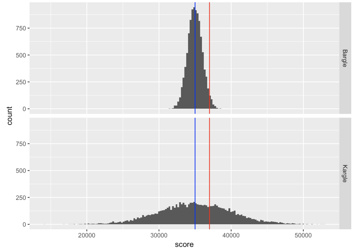
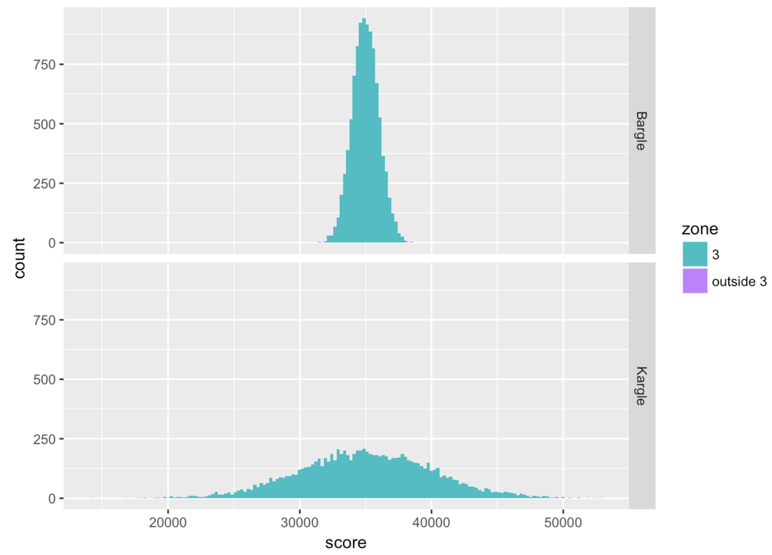
Remember we had that friend who scored 37,000 points in Kargle (shown in red) and we were trying to evaluate how skilled a player she was? When we discovered that the bottom distribution (where the standard deviation is about 5,000) was the actual distribution of Kargle scores, we were less impressed than when we thought it was the top distribution. As it turns out, the top distribution (with a standard deviation of about 1,000) is from a game called Bargle.
Normal distributions are roughly “bell-shaped” in that there are way more scores in the middle than there are out in the tails. They are also symmetrical from left to right. But it turns out that normal distributions are even more regular, and thus quantifiable, than that description.
To illustrate the regularity of this normal shape, let’s just think about the players of both Kargle and Bargle that are within plus or minus (+/-) one standard deviation from the mean. We’ll call this area of the distribution Zone 1 for now. These are the players with the less extreme scores.
Dividing Scores into Zones Based on Standard Deviation
We constructed a new variable called zone that simply indicates whether each person’s score is within Zone 1 (coded “1”) or outside of it (coded “outside”).
To do this we first transformed each person’s raw score into a z score (which, you may recall, indicates how many standard deviations a score is from the mean). We then coded “1” in the variable zone for every player whose z score was > -1 and < 1. (Don’t worry about doing this in R; you can learn later if you want.)
In the histograms below, we have shaded Zone 1 in red, and anything outside of Zone 1 in purple.
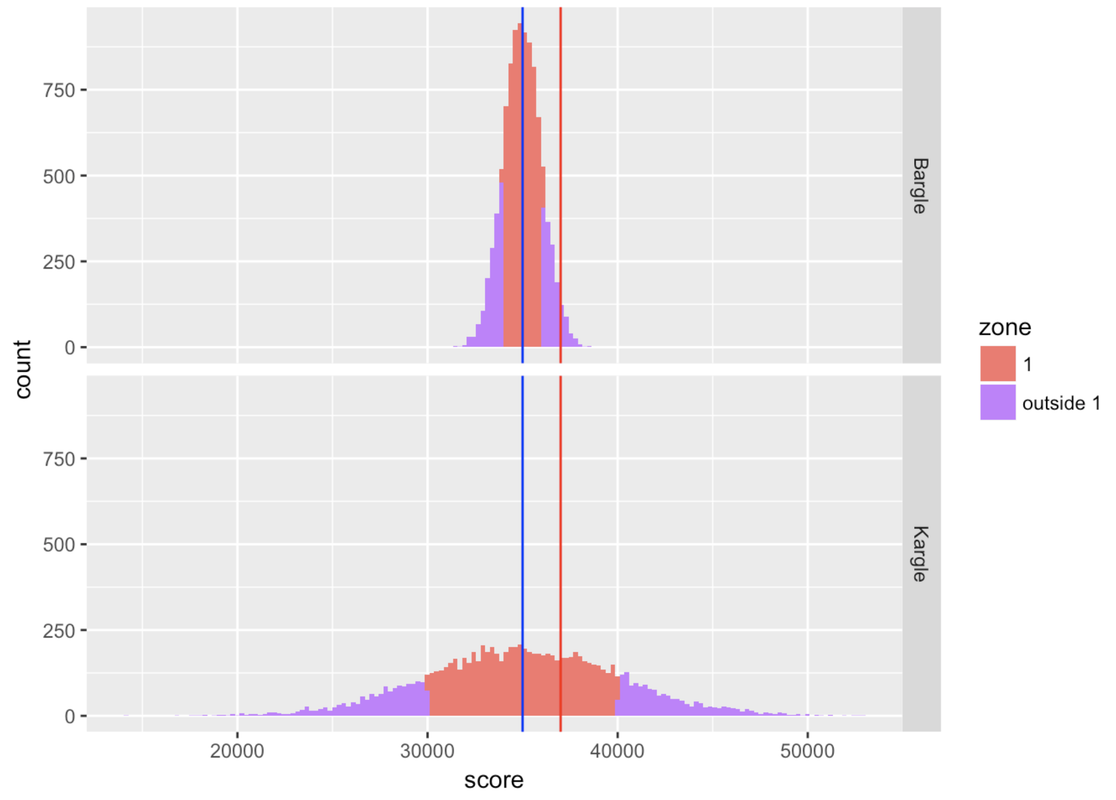
Notice that our friend who scored 37,000 falls into Zone 1 for Kargle, but if that was her score in Bargle, she would be outside Zone 1. Putting aside our friend for a moment, what’s the proportion of players that fall inside Zone 1 in Bargle and Kargle? Let’s run a tally to find out.
tally(zone ~ game, data=VideoGame, format="proportion") game
zone Bargle Kargle
1 0.6844 0.6822
outside 1 0.3156 0.3178Wow, Zone 1—within one standard deviation from the mean—is very similar (about .68) for both Bargle and Kargle! Interestingly, more than half the distribution is within one standard deviation of the mean.
If we are one standard deviation in the positive direction, the z score would be 1. If we are one standard deviation in the negative direction, the z score would be -1. So Zone 1, +/- one standard deviation, would contain all the data for which z scores fall between -1 and 1.
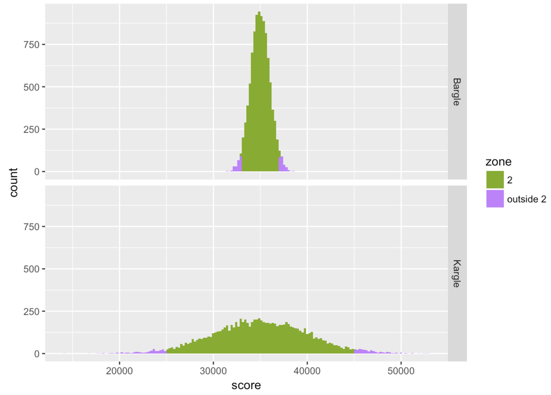
Let’s loosen our idea of “close to” average and consider the players of both Kargle and Bargle who are +/- two standard deviations from the mean. We’ll call this area Zone 2 for now.
           game
zone        Bargle Kargle
  2         0.9518 0.9487
  outside 2 0.0482 0.0513
Basically, .95 of the scores fall within two standard deviations of the mean. In a normal distribution, scores are so clustered in the center that if you go out just two standard deviations from the center, you have captured a whole lot of your distribution!
       zone Bargle Kargle
1         1 0.6844 0.6822
2         2 0.9518 0.9487
3         3 0.9982 0.9972
4 outside 3 0.0018 0.0028
Zone 3, which is within three standard deviations from the mean, seems to cover almost all of the distribution. If you look at the tally (or look very, very carefully at the histograms), you can see that there is a tiny proportion of scores outside Zone 3.
The Empirical Rule
The cool thing about normal distributions is that they all basically follow this pattern. In the smooth perfect version of the normal distribution (i.e., the theoretical probability distribution), Zone 1 covers about .68, Zone 2 covers .95, and Zone 3 covers .997. This .68-.95-.997 pattern is called the empirical rule.
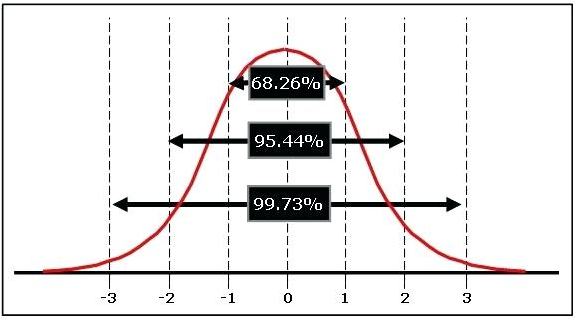
The empirical rule tells us:
Approximately 68 percent of the scores in a normal distribution are within one standard deviation, plus or minus, of the mean.
Approximately 95 percent of the scores are within two standard deviations.
Approximately 99.7 percent of scores are within three standard deviations of the mean (in other words, almost all of them).
The smooth normal distribution is something that is so perfect that it doesn’t really exist. It’s a mathematical object, kind of like how there are straight lines in the world, but a mathematical straight line is this perfect thing that has no mass, no jitter, and goes on forever. In the same way, a mathematical normal distribution is perfect with no mass, no jitter, and it goes on forever.
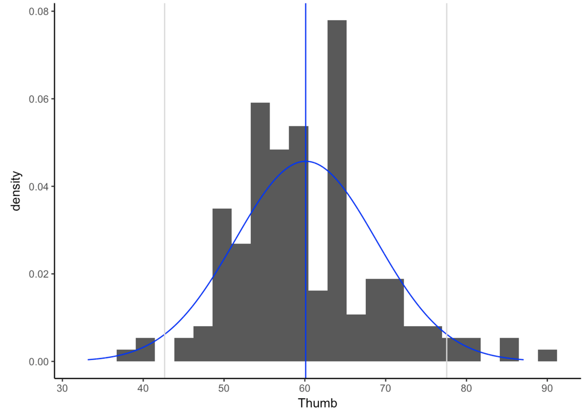
The tails of the normal distribution never quite hit 0, they just go on forever and ever. This is why the normal distribution is sometimes called asymptotic. This feature is important because it allows us to predict the very tiny probabilities of very unlikely events such as a person with a thumb length of 1,000 mm.
You probably have never even heard of a thumb so long. But, if we assume the normal probability distribution, we could quantify exactly how low the probability would be of finding such a rare event.
You can try making up a standard deviation for your own game (we’ll call it Zargle) and simply run the code. It will show you the histograms and proportions for the three zones. Try some different standard deviations to try and break the empirical rule.
require(coursekata)
set.seed(5)
# set up Kargle
n <- 1000
m <- 35000
s <- 5000
score <- rnorm(n, m, s)
game <- rep("Kargle", n)
Kargle <- data.frame(score, game)
# Kargle intervals
zscore <- (Kargle$score-m)/s
interval <- ifelse(zscore>0, trunc(1+zscore), trunc(zscore - 1))
absinterval <- ifelse(zscore>0, abs(trunc(1+zscore)), abs(trunc(zscore - 1)))
Kargle <- cbind(Kargle, zscore, interval, absinterval)

# set up Bargle
n <- 1000
m <- 35000
s <- 1000
score <- rnorm(n, m, s)
game <- rep("Bargle", n)
Bargle <- data.frame(score, game)
# Bargle intervals
zscore <- (Bargle$score-m)/s
interval <- ifelse(zscore>0, trunc(1+zscore), trunc(zscore - 1))
absinterval <- ifelse(zscore>0, abs(trunc(1+zscore)), abs(trunc(zscore - 1)))
Bargle <- cbind(Bargle, zscore, interval, absinterval)

VideoGame <- rbind(Bargle, Kargle)

# zone 1
VideoGame$zone <- ifelse(VideoGame$absinterval == 1, 1, 2)
VideoGame$zone <- recode(VideoGame$zone, '1'="1", '2'="outside 1")
VideoGame$zone <- factor(VideoGame$zone)
tally(zone ~ game, data=VideoGame, format="proportion")
zonetable <- tally(zone ~ game, data=VideoGame, format="proportion")

# zone 2
VideoGame$zone <- ifelse(VideoGame$absinterval <= 2, 2, 3)
VideoGame$zone <- recode(VideoGame$zone, '2'="2", '3'="outside 2")
VideoGame$zone <- factor(VideoGame$zone)
tally(zone ~ game, data=VideoGame, format="proportion")
zonetable <- rbind(zonetable, tally(zone ~ game, data=VideoGame, format="proportion"))

# zone 3
VideoGame$zone <- ifelse(VideoGame$absinterval <= 3, 3, 4)
VideoGame$zone <- recode(VideoGame$zone, '3'="3", '4'="outside 3")
VideoGame$zone <- factor(VideoGame$zone)
tally(zone ~ game, data=VideoGame, format="proportion")
tally(zone ~ game, data=VideoGame, format="proportion")
zonetable <- rbind(zonetable, tally(zone ~ game, data=VideoGame, format="proportion"))

# all zones
VideoGame$zone <- ifelse(VideoGame$absinterval > 4, 4, VideoGame$absinterval)
VideoGame$zone <- recode(VideoGame$zone, '1'="1",'2'="2",'3'="3", '4'="outside 3")
VideoGame$zone <- factor(VideoGame$zone)
# change the standard deviation to whatever you'd like it to be
s <- 3500

# you can just run the code now --- the rest of this just sets up the game

# set up Zargle
n <- 1000
m <- 35000
score <- rnorm(n, m, s)
game <- rep("Zargle", n)
Zargle <- data.frame(score, game)

# Zargle intervals
zscore <- (Zargle$score-m)/s
interval <- ifelse(zscore>0, trunc(1+zscore), trunc(zscore - 1))
absinterval <- ifelse(zscore>0, abs(trunc(1+zscore)), abs(trunc(zscore - 1)))
zone <- ifelse(absinterval > 4, 4, absinterval)
zone <- factor(zone)
Zargle <- cbind(Zargle, zscore, interval, absinterval, zone)

# add Zargle to VideoGame
VideoGame <- rbind(VideoGame,Zargle)
VideoGame$zone <- recode(VideoGame$zone, '1'="1",'2'="2",'3'="3", '4'="outside 3")
VideoGame$zone <- factor(VideoGame$zone)

# make histogram
gf_histogram( ~ score, fill = ~zone, data = VideoGame, bins=160) %>%
    gf_facet_grid(game ~ .)

# make table
VideoGame$zone <- ifelse(VideoGame$absinterval == 1, 1, 2)
VideoGame$zone <- factor(VideoGame$zone)
zonetable <- tally(zone ~ game, data=VideoGame, format="proportion")

VideoGame$zone <- ifelse(VideoGame$absinterval <= 2, 2, 3)
VideoGame$zone <- factor(VideoGame$zone)
zonetable <- rbind(zonetable, tally(zone ~ game, data=VideoGame, format="proportion"))

VideoGame$zone <- ifelse(VideoGame$absinterval <= 3, 3, 4)
VideoGame$zone <- factor(VideoGame$zone)
zonetable <- rbind(zonetable, tally(zone ~ game, data=VideoGame, format="proportion"))

table <- data.frame(rbind(zonetable[1,], zonetable[3,], zonetable[5,], zonetable[6,]))
zone <- c('1','2','3',"outside 3")
table <- cbind(zone, table)
table
# just run the code; no solution
ex() %>% check_error()This is what we would get for the Zargle distribution if the standard deviation was set for 3,500.
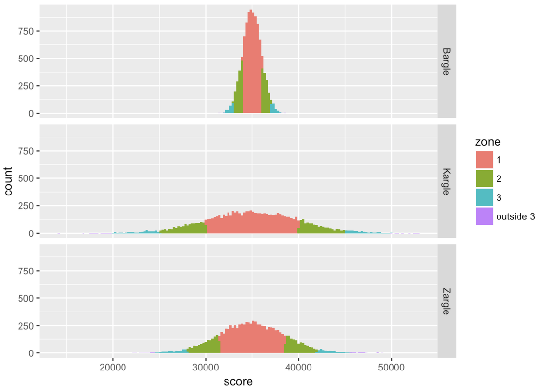
       zone Bargle Kargle  Zargle
1         1 0.6844 0.6822 0.67965
2         2 0.9518 0.9487 0.95360
3         3 0.9982 0.9972 0.99680
4 outside 3 0.0018 0.0028 0.00320
The empirical rule can be very useful when trying to make a quick interpretation of a specific score. If a friend has a baby and tells you it was 54 cm long, how would you interpret that measurement? As an experienced statistician, you should ask: what is the mean, and what is the standard deviation, of the distribution of baby length at birth?
As it turns out, the mean baby length is roughly 50 cm, and the standard deviation is 2 cm. Using the empirical rule, you would say, “Wow! Your baby is like two standard deviations above the mean! That’s a huge baby! Only .05 of babies are longer than 54 cm (the mean plus two standard deviations). You’ve got yourself a big one!”
Actually, you’d be slightly wrong. (Sorry, I know we set you up!) According to the empirical rule, .95 scores in a normal distribution are within plus or minus two standard deviations from the mean. It follows from this that .05 of the scores are more extreme than this, or outside plus or minus two standard deviations.
But note, in the figure, that if .05 of the scores are outside plus or minus two standard deviations, half of those would be expected to be more than two standard deviations above the mean, and half less than two standard deviations below the mean.
So, only .025 of scores would be higher than two standard deviations above the mean. That baby is even more impressive than we thought! He or she is longer than 97.5% of all babies!
What Counts as Unlikely?
We have seen how modeling the error distribution (in the case of the empty model, the distribution of scores around the mean) can help us to calculate probabilities and make predictions. The problem with a probability, though, is that it’s just a number. It doesn’t tell us what to do. We still have to think about it even after all our fancy R code calculations.
For example, if we wanted to use a model of finger lengths to design stretchy one-size-fits-all gloves, how big should we make the gloves? After all, even though very long thumbs are unlikely, they are still possible. But if we make these gloves too big, then we’ll alienate short-fingered folks.
What would be the right glove size? To answer questions like this, we have to figure out what are the most likely lengths of people’s fingers, and that means we need to make a judgment call about what “likely” and “unlikely” mean. We might be able to agree on the best way to estimate a probability, but people will differ on what counts as “unlikely.”
For example, someone who is very risky might look at a .01 probability and say, “Hey! At least it is still possible.” But someone who likes being very certain might say, “Even .40 is unlikely because it’s less likely than a coin toss!” So in being part of a statistics community, it’s helpful to have an agreement about what counts as unlikely.
Statisticians, as a community, have decided to count .05 and lower probabilities as unlikely. So in the case of a DGP that produces a fairly normal population, we would count scores that are outside of Zone 2 (+/- two standard deviations from the mean) as unlikely scores, and the scores within Zone 2 as likely. Note that this decision doesn’t result from a calculation. Human statisticians just sort of agree—yeah, .05 is a pretty low likelihood.