3.7 The Five-Number Summary
So far we have used histograms as our main tool for examining distributions. But histograms aren’t the only tool we have available. In this section we will introduce a few more tools for examining distributions of quantitative variables. In the following section we will introduce some tools for examining the distributions of categorical variables.
Sorting Revisited, and the Min/Max/Median
In the previous chapter we introduced the simple idea of sorting a quantitative variable in order. Before sorting the numbers, it was hard to see a pattern. You could read the numbers, but it was hard to draw any conclusions about the distribution itself.
As soon as we sort the numbers in order, we can see things that are true of the distribution. For example, when we sort even a long list of numbers we can see what the smallest number is and what the largest number is. This shows us something about the distribution that we couldn’t have seen just by looking at a jumbled list of numbers.
We can demonstrate this by looking at the Wt variable in the MindsetMatters data frame. Write some code to sort the housekeepers by weight from lowest to highest, and then see what the minimum and maximum weights are.
require(coursekata)
# Write code to sort Wt from lowest to highest
# Solution 1
arrange(MindsetMatters, Wt)

# Solution 2
sort(MindsetMatters$Wt)
3
ex() %>% check_or(
    check_function(., "arrange", not_called_msg = "If you were trying to use `sort`, that's acceptable but your code must have resulted in an error.") %>% check_result() %>% check_equal(),
    check_function(., "sort") %>% check_result() %>% check_equal()
) [1] 90 105 107 109 115 115 115 117 117 118 120 123 123 124 125 126 127
[18] 128 130 130 131 133 134 134 135 136 137 137 137 140 140 141 142 142
[35] 142 143 144 145 145 148 150 150 154 154 155 155 156 156 156 157 158
[52] 159 160 161 161 161 162 163 163 164 166 167 167 168 170 172 173 173
[69] 178 182 183 184 187 189 196Note that you can also use the function arrange() to sort, but that will sort the entire data frame. We just wanted to be able to see the sorted weights in a row, so we just used sort() on the vector (MindsetMatters$Wt).
Now that we have sorted the weights, we can see that the minimum weight is 90 pounds and the maximum weight is 196 pounds. In addition to knowing the minimum and maximum weight, it would be helpful to know what the number is that is right in the middle of this distribution. If there are 75 housekeepers, we are looking for the 38th housekeeper’s weight, because there are 37 weights that are smaller than this number and 37 that are bigger than this number. This middle number is called the median.
Numbers such as the minimum (often abbreviated as min), median, and maximum (abbreviated as max) are helpful for understanding a distribution. These three numbers can be thought of as a three-number summary of the distribution. We’ll build up to the five-number summary in a bit.
There is a function called favstats() (for favorite statistics) that will quickly summarize these values for us. Here is how to get the favstats for Wt from MindsetMatters.
favstats(~ Wt, data = MindsetMatters) min Q1 median Q3 max mean sd n missing
90 130 145 161.5 196 146.1333 22.46459 75 0There are a lot of other numbers that are generated by the favstats() function, but let’s take a look at Min, Median, and Max for now. By looking at the median weight in relation to the minimum and maximum weight, you can tell a little bit about the shape of the distribution.
Try writing code to get the favstats() for the variable Population for countries in the data frame HappyPlanetIndex.
require(coursekata)

HappyPlanetIndex$Region <- recode(
    HappyPlanetIndex$Region,
    '1'="Latin America",
    '2'="Western Nations",
    '3'="Middle East and North Africa",
    '4'="Sub-Saharan Africa",
    '5'="South Asia",
    '6'="East Asia",
    '7'="Former Communist Countries"
)
# Modify the code to get favstats for Population of countries in HappyPlanetIndex
favstats()
favstats(~ Population, data = HappyPlanetIndex)
ex() %>% check_function("favstats") %>% check_result() %>% check_equal() min Q1 median Q3 max mean sd n missing
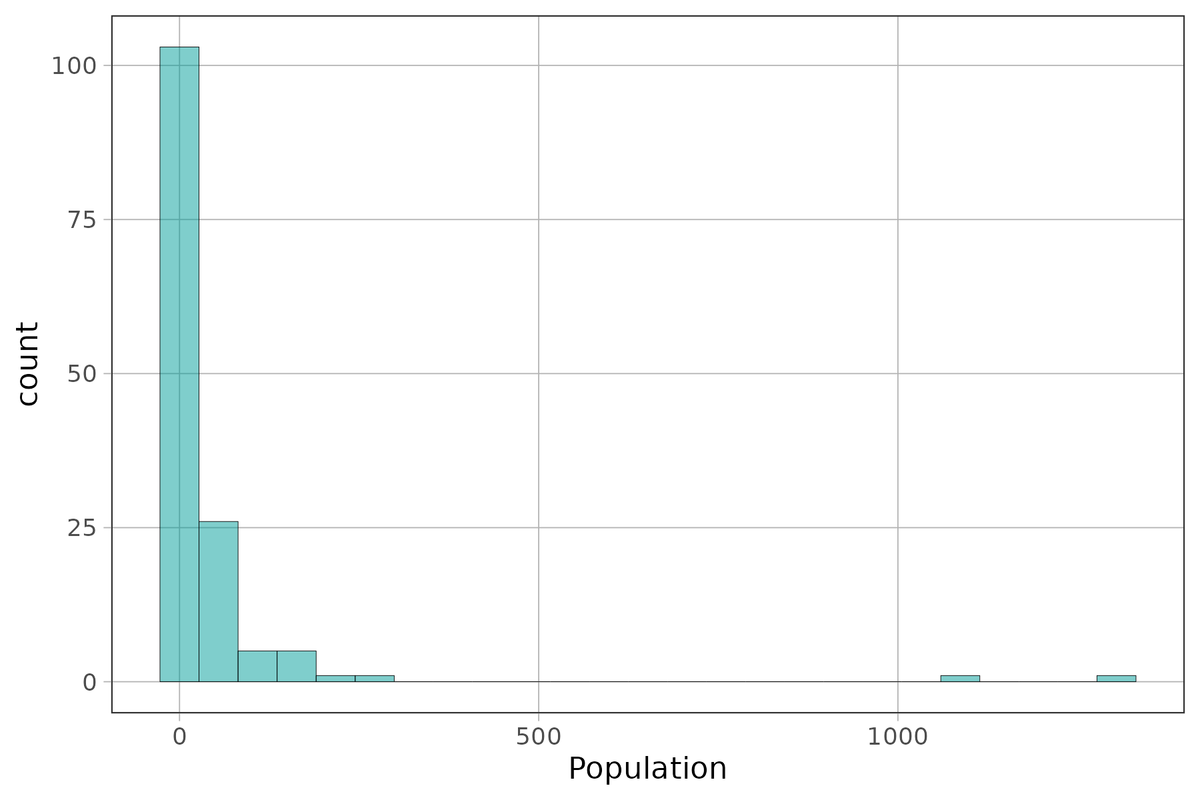
0.29 4.455 10.48 31.225 1304.5 44.14545 145.4893 143 0Create a histogram of Population to see if your intuition about the shape of this distribution from looking at the min/median/max is correct.
require(coursekata)

HappyPlanetIndex$Region <- recode(
    HappyPlanetIndex$Region,
    '1'="Latin America",
    '2'="Western Nations",
    '3'="Middle East and North Africa",
    '4'="Sub-Saharan Africa",
    '5'="South Asia",
    '6'="East Asia",
    '7'="Former Communist Countries"
)
# Make a histogram of Population from HappyPlanetIndex using gf_histogram
gf_histogram(~ Population, data = HappyPlanetIndex)
ex() %>% check_function("gf_histogram") %>% check_result() %>% check_equal()
Quartiles and the Five-Number Summary
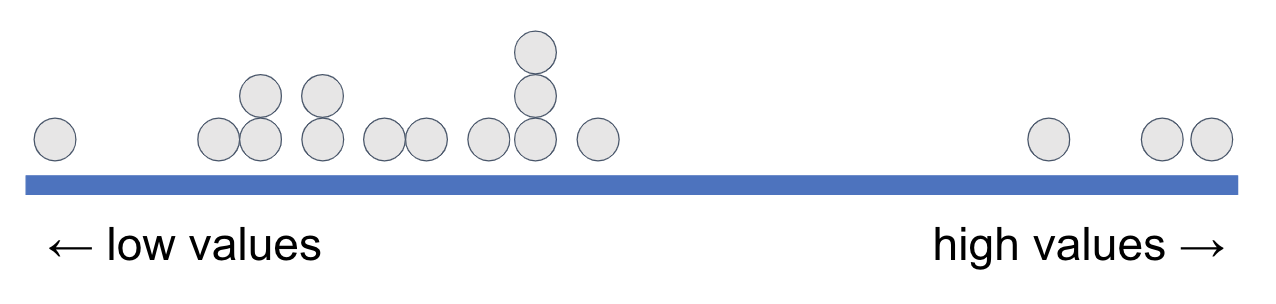
Another way to think about what we’ve been doing is this. Imagine all the data points are sorted and lined up along the thick blue line below based on their values on a variable.
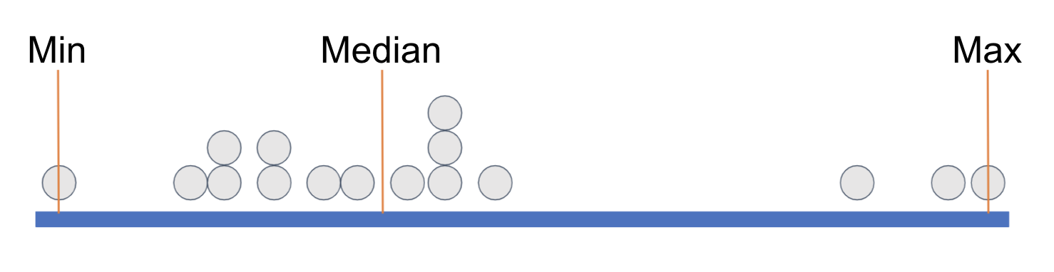
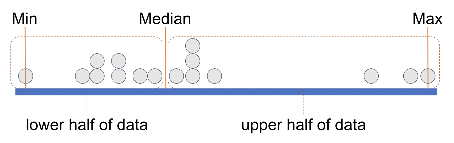
We have placed some orange vertical lines to indicate the min (minimum, the lowest value), the median (the middle value), and the max (maximum, the highest value). This divides the distribution into two groups with equal numbers of data points, split at the median.
We can think of each of these equal-sized groups as a half, and we have drawn a rectangle around each half of the data points. (You can count the points and see that there are 8 in each half.)
If we divide each half again into two equal parts we end up with quartiles, each with an equal number of data points. It’s as if a long vector of data points have been sorted according to their values on a variable and then cut into four equal-sized groups.
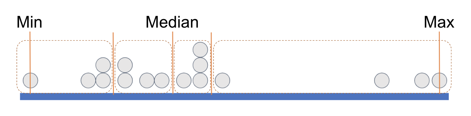
Each rectangle represents a quartile. The leftmost rectangle, which contains the lowest .25 of values, is called the first quartile. (Sometimes people call it the bottom quartile). The next rectangle, right up to the median, is called the second quartile. The two rectangles past the median, in the upper half of the distribution, are called the third quartile and fourth quartile (or top quartile), respectively.
It is important to note that what is equal about the four quartiles is the number of data points included in each. Each quartile contains one-fourth of the observations, regardless of what their exact scores are on the variable.
In order to demarcate where, on the measurement scale, a quartile begins and ends, statisticians have given each cut point (the orange lines) a name: Q0, Q1, Q2, Q3, and Q4.
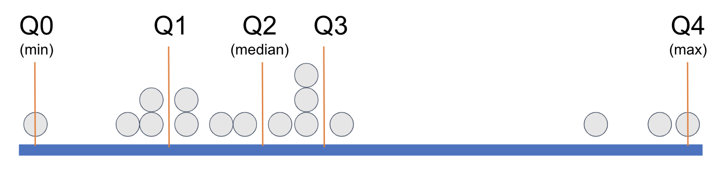
When statisticians refer to the five-number summary they are referring to these five numbers: the minimum, Q1, the median, Q3, and the maximum. Look again at the favstats() for Wt, below.
favstats(~ Wt, data = MindsetMatters) min Q1 median Q3 max mean sd n missing
90 130 145 161.5 196 146.1333 22.46459 75 0Now you can see that the favstats() function gives you the five-number summary (min, Q1, median, Q3, max), then the mean, standard deviation, n (number of observations), and missing, which in this example is the number of housekeepers who are missing a value for weight. We will delve into the mean and standard deviation in later chapters.
Here we have visualized the five-number summary for Wt on a number line (we won’t draw in all 75 data points; it would be too many dots!).
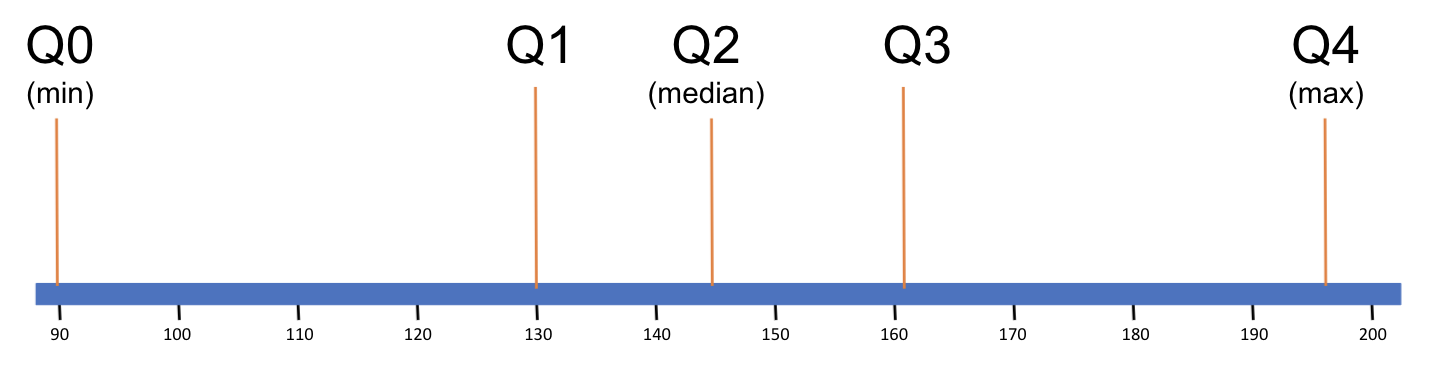
The five-number summary indicates that in this distribution, the middle two quartiles are narrower than the lowest and highest quartiles. This suggests that the data points in the middle quartiles are more clustered together on the measurment scale than the data points at the edges of the distribution of Wt.
Range and Inter-Quartile Range
The distance between the max and min gives us range, a quick measure of how spread-out the values are in a distribution. Based on the numbers from the favstats() results above, use R as a calculator to find the range of Wt.
require(coursekata)
# Based on the numbers from the favstats results above, use R as a calculator to find the range of Wt in MindsetMatters
# comment for submit button
ex() %>% check_output_expr("196 - 90")[1] 106In distributions like the Population of countries, the range can be very deceptive.
favstats(~ Population, data = HappyPlanetIndex) min Q1 median Q3 max mean sd n missing
0.29 4.455 10.48 31.225 1304.5 44.14545 145.4893 143 0The range looks like it is about 1,304.2 million. But we saw in the histogram that this is due to one or two very populous countries! There was a lot of empty space in that distribution. In cases like this, it might be useful to get the range for just the middle .50 of values. This is called the interquartile range (IQR).
Use the five-number summary of Population to find the IQR. You can use R as a calculator.
require(coursekata)

HappyPlanetIndex$Region <- recode(
    HappyPlanetIndex$Region,
    '1'="Latin America",
    '2'="Western Nations",
    '3'="Middle East and North Africa",
    '4'="Sub-Saharan Africa",
    '5'="South Asia",
    '6'="East Asia",
    '7'="Former Communist Countries"
)
# Use R as a calculator to find the IQR of Population from the HappyPlanetIndex data set
# comment for submit button
ex() %>% check_output_expr("31.225 - 4.455")[1] 26.77Interquartile range ends up being a handy ruler for figuring out whether a data point should be considered an outlier. Outliers present the researcher with a hard decision: should the score be excluded from analysis because it will have such a large effect on the conclusion, or should it be included because, after all, it’s a real data point?
For example, China is a very populous country and is the very extreme outlier in the HappyPlanetIndex, with a population of more than 1,300 million people (another way of saying that is 1.3 billion). If it weren’t there, we would have a very different view of the distribution of population across countries. Should we exclude it as an outlier?
Well, it depends on what we are trying to do. If we wanted to understand the total population of this planet, it would be foolish to exclude China because that’s a lot of people who live on earth! But if we are trying to get a sense of how many people live in a typical country, then perhaps it would make more sense to exclude China.
But then, what about the second-most populous country—India? Should we exclude it too? What about the third-most populous country—the US? Or the fourth—Indonesia? How do we decide what an outlier is? That process seems fraught with subjectivity.
There is no one right way to do it. After all, deciding on what an “outlier” is really depends on what you are trying to do with your data. However, the statistics community has agreed on a rule of thumb to help people figure out what an outlier might be. Any data point bigger than the \(Q3 + 1.5*IQR\) is considered a large outlier. Anything smaller than the \(Q1 - 1.5*IQR\) is considered a small outlier.