3.9 Exploring Variation in Categorical Variables
So far we have focused on examining the distributions of quantitative variables. Our methods for examining distributions differ, however, depending on whether a variable is quantitative or categorical.
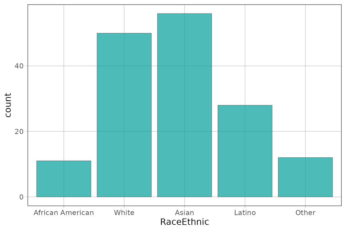
Although we are tempted to call this a roughly normal or bell-shaped distribution, isn’t it a little strange to say the center of this distribution is Asian? What is the range of this distribution? Is it “Other” minus “African American”? Something about these descriptions of this distribution seems off!
We have thus far used histograms to examine the distribution of a variable. But histograms aren’t appropriate if the variable is categorical. And if R knows it’s categorical (if, for example, you have specified it as a factor), it won’t even run the histogram, and will give you an error message instead.
Bar Graphs
When a variable is categorical you can visualize the distribution with a bar graph. It looks like a histogram, but it’s not. There is no such thing as bins, for example, in a bar graph. The number of bars in a bar graph will always equal the number of categories in your variable.
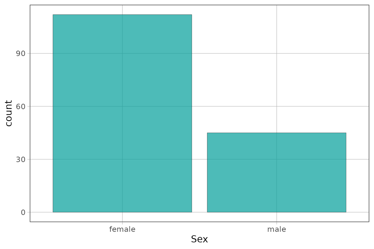
So let’s take a look at variables like Sex and RaceEthnic from the data frame Fingers. These have been specified as factors and the levels have been labeled already.
Here’s the code for making a bar graph in R:
gf_bar(~ Sex, data = Fingers)
Use the code window below to create a bar graph of RaceEthnic. (Again, use the gf_bar() command.)
require(coursekata)
# Create a bar graph of RaceEthnic in the Fingers data frame. Use the gf_bar() function
gf_bar(~RaceEthnic, data = Fingers)
ex() %>% check_function("gf_bar") %>% {
    check_arg(., "data") %>% check_equal(incorrect_msg="Don't forget to set `data=Fingers`")
    check_result(.) %>% check_equal(incorrect_msg = "Did you use `~RaceEthnic`?")
}
You can change the width of these bars by adding the argument width and setting it to some number between 0 and 1.
You learned about the arguments color and fill for gf_histogram(). It turns out that these arguments work the same way for gf_bar(). Try playing with the colors here.
require(coursekata)
# Add arguments color and fill to these bar graphs
# Make sure to add color and fill to both of the graphs
gf_bar(~ Sex, data = Fingers)
gf_bar(~ RaceEthnic, data = Fingers)
# the colors below are just examples. Any color is acceptable as long as you use the color and fill arguments
gf_bar(~ Sex, data = Fingers, color="darkgray", fill="mistyrose" )
gf_bar(~ RaceEthnic, data = Fingers, color="darkgray", fill="mistyrose")
ex() %>% {
    check_function(., "gf_bar", index = 1) %>% {
        check_arg(., "color")
        check_arg(., "fill")
    }
    check_function(., "gf_bar", index = 2) %>% {
        check_arg(., "color")
        check_arg(., "fill")
    }
}Shape, Center, and Spread
Visualizing the distributions of categorical variables is just as important as visualizing the distributions of quantitative variables. However, the features to look at need to be adjusted a little.
Shape of the distribution of a categorical variable doesn’t really make sense. Just by reordering the bars, you can alter the shape. So, we don’t want to pay too much attention to the shape of the distribution of a categorical variable.
Both center and spread are still worth noting. In some ways, center is easier to determine in a categorical variable than it is in a quantitative variable. The category with the most cases is the center; it’s where most observations are. This is also called the mode of the distribution—the most frequent score.
Spread is a way of characterizing how well distributed the cases are across the categories. Do most observations fall in one category, or is there an even distribution across all the categories?
Frequency Tables
Categorical variables can also be summarized with frequency tables (also called tallies). We’ve used the tally() command before. Use tally() to look at the distributions of Sex and RaceEthnic from the data frame Fingers.
require(coursekata)
# This creates a frequency table of Sex
# Do not change this code
tally(~ Sex, data = Fingers)

# Write code to create a frequency table of RaceEthnic
tally(~ Sex, data = Fingers)
tally(~ RaceEthnic, data = Fingers)
ex() %>% check_function(., "tally", index = 2) %>% check_result() %>% check_equal()
success_msg("You're a supe-R coder!")Sex
female male
112 45RaceEthnic
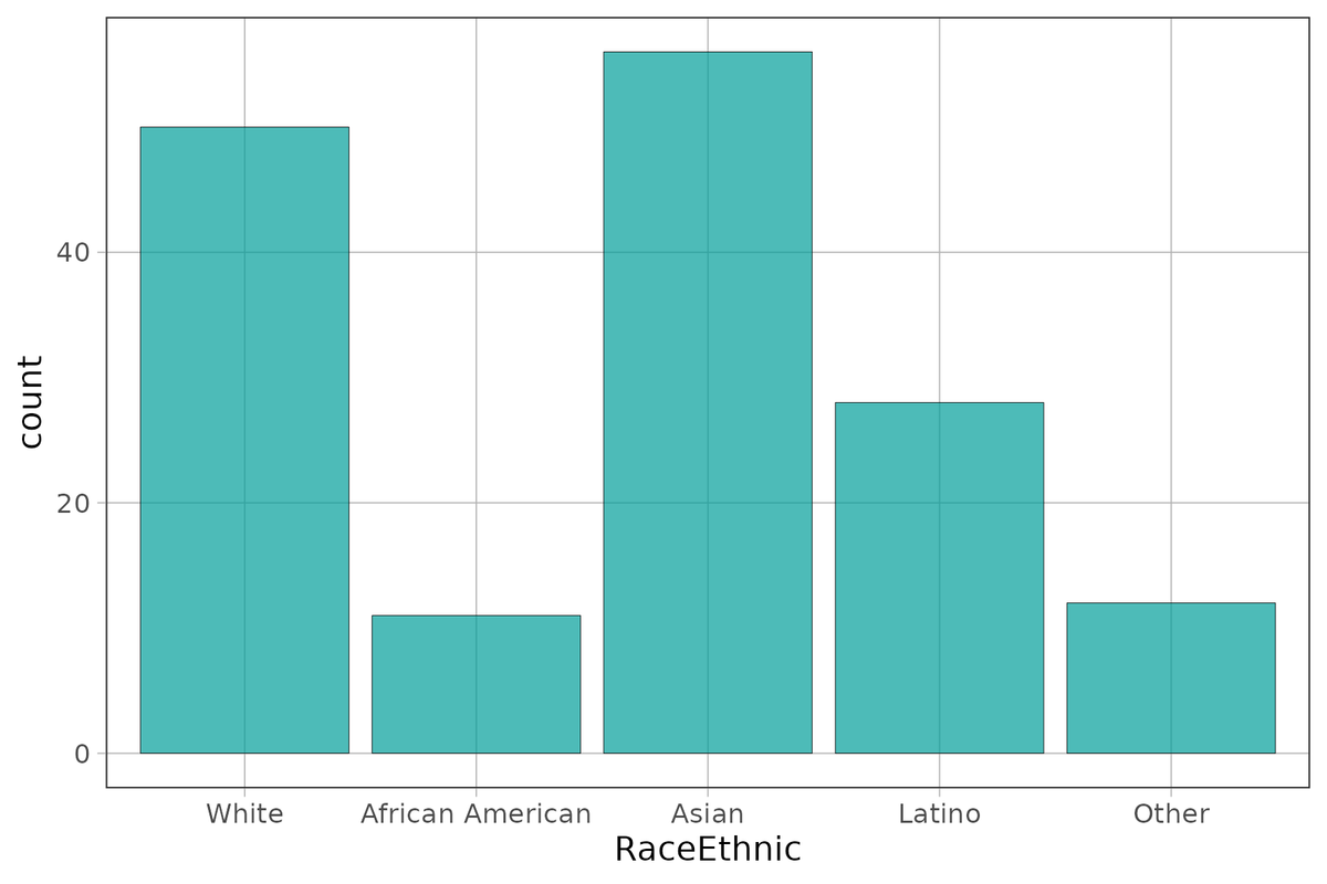
White African American Asian Latino
50 11 56 28
Other
12Sometimes you may also want the total across all levels of the variable. Because this total is presented outside the main breakdown in the tally table, we say it is in the “margin.” You can get totals by adding margins as an argument to tally().
tally(~ Sex, data = Fingers, margins = TRUE)Sex
female male Total
112 45 157More often than not, it may be more useful to look at the relative frequencies (proportions) than these counts. We can add an argument to tally() to get these same data in that format.
tally(~ Sex, data = Fingers, format = "proportion")Sex
female male
0.7133758 0.2866242Try including both format and margin as arguments for a tally of RaceEthnic. What do you predict the total proportion (in the margin) will be?
require(coursekata)
# Add margin and format arguments to the tally() function. Set margins to TRUE and format to proportion
tally(~ RaceEthnic, data = Fingers)
tally(~ RaceEthnic, data = Fingers, margins = TRUE, format = "proportion")
ex() %>% check_or(
    check_function(., "tally") %>% {
        check_arg(., "margins") %>% check_equal()
        check_arg(., "format") %>% check_equal()
        check_result(.) %>% check_equal()
    },
    check_output_expr(., 'tally(~ RaceEthnic, data = Fingers, margins = TRUE, format = "proportion")')
)RaceEthnic
White African American Asian Latino
0.31847134 0.07006369 0.35668790 0.17834395
Other Total
0.07643312 1.00000000Do you think we could also use tally() for quantitative variables like Thumb? Let’s try it here. Write code for creating a frequency table of Thumb.
require(coursekata)
# write code to create a frequency table of Thumb
tally(~Thumb, data = Fingers)
ex() %>% check_function("tally") %>% {
    check_arg(., "x") %>% check_equal()
    check_arg(., "data") %>% check_equal()
    check_result(.) %>% check_equal()
}Distributions of categorical variables are best explored with frequency tables (tallies) and bar graphs; distributions of quantitative variables are better explored with histograms and boxplots. For both kinds of variables, one might choose to use raw frequencies, or one might choose relative frequencies (such as density or proportion), depending on the purpose. It is important to have a comprehensive toolbox for examining all kinds of variables.