6.7 Modeling Error With the Normal Distribution
The Concept of a Theoretical Probability Distribution
Calculating probabilities from your sample distribution works okay, especially if you have a lot of data. But if you have a smaller amount of data, the shape of the distribution can be very jagged. Remember back in Chapter 3 when we were examining the distribution of die rolls? We simulated a random sample of 24 die rolls, and came up with a distribution that looked like this:
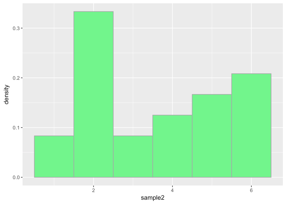
We wouldn’t want to use this distribution to calculate the probability of the next die roll being a 6 because we can do better. We know, in this case, that the probability is 1 out of 6, because we have a good idea of what the actual DGP and resulting population distribution look like.
Even though the sample distribution of our 24 simulated die rolls doesn’t look uniform, we are pretty confident that it actually came from a uniform distribution in which each of the six sides of the die have an equal probability of coming up.
We bring this up because even though most of the time with real data we don’t know what the shape of the population distribution looks like, we can be pretty sure it doesn’t look exactly like our sample distribution. For this reason, and also to make calculation of probabilities easier, we usually model the distribution of error with a smoother theoretical probability distribution. The uniform distribution, which we used in the case of die rolls, is an example of a theoretical probability distribution.
Aggregation and the Normal Probability Distribution
The most common theoretical probability distribution used to model error is the normal distribution (often referred to as a “bell-shaped curve”). Even if the distribution of error in our data doesn’t look exactly normal, there are good reasons to assume that in the population the distribution of error, for many variables, will be normal.
The reason for this has to do with the principle of aggregation. When scores on an outcome variable are pushed up and down by multiple other variables—something that is frequently true for the variables we might be interested in—the distribution of the outcome variable tends to take on a normal shape.
This process, in which multiple independent variables get summed together, is called aggregation. And the resulting normal distribution has nothing to do with what the variables are; it’s just a mathematically determined conclusion that results from the aggregation process.
Demonstrating the Aggregation Process
We can demonstrate the power of aggregation with a simple simulation. Let’s simulate a data set with 1,000 observations and 10 variables, each generated randomly from a uniform distribution, and each having possible scores of -3 to +3.
We’ll start by simulating one variable, using this code:
var1 <- resample(-3:3, 1000)Go ahead and run the code to create var1. Let’s put it in a data frame called somedata.
To do this we will use the data.frame() function. This function allows us to take one or more vectors of the same length and combine them into a data frame in which each vector becomes a variable.
require(coursekata)
set.seed(1)
# this resamples numbers -3 to 3, 1000 times
var1 <- resample(-3:3, 1000)

# put var1 into a data frame called somedata
somedata <-
var1 <- resample(-3:3, 1000)
somedata <- data.frame(var1)
ex() %>% check_object("somedata") %>% check_equal()Go ahead and make a histogram of var1 and see what it looks like.
require(coursekata)

set.seed(2)
somedata <- data.frame(var1 = resample(-3:3, 1000))
# Create a histogram of var1 from somedata
gf_histogram(~var1, data = somedata)
ex() %>% check_function("gf_histogram") %>% check_result() %>% check_equal()The following code will create the other nine variables (var2 to var10), and then save the 10 simulated variables in a data frame called somedata.
var2 <- resample(-3:3, 1000)
var3 <- resample(-3:3, 1000)
var4 <- resample(-3:3, 1000)
var5 <- resample(-3:3, 1000)
var6 <- resample(-3:3, 1000)
var7 <- resample(-3:3, 1000)
var8 <- resample(-3:3, 1000)
var9 <- resample(-3:3, 1000)
var10 <- resample(-3:3, 1000)
somedata <- data.frame(var1, var2, var3, var4, var5, var6, var7, var8, var9, var10)
Print the first six lines of somedata, and then make 10 histograms, one for each of the 10 variables.
require(coursekata)

set.seed(2)
somedata <- 1:10 %>%
    purrr::set_names(paste0("var", 1:10)) %>%
    purrr::map_df(~resample(-3:3, 1000))
# write code to print out a few lines of somedata

# write code to create individual histograms
# the first one (var1) has been written for you
gf_histogram(~ var1, fill = "red", data = somedata)
head(somedata)
gf_histogram(~var1, fill = "red", data = somedata)

# colors, if any, do not affect scoring
gf_histogram(~var2, data = somedata)
gf_histogram(~var3, data = somedata)
gf_histogram(~var4, data = somedata)
gf_histogram(~var5, data = somedata)
gf_histogram(~var6, data = somedata)
gf_histogram(~var7, data = somedata)
gf_histogram(~var8, data = somedata)
gf_histogram(~var9, data = somedata)
gf_histogram(~var10, data = somedata)
ex() %>% {
    check_function(., "head") %>% check_arg("x") %>% check_equal()
    check_function(., "gf_histogram", index = 1) %>% check_arg("object") %>% check_equal()
    check_function(., "gf_histogram", index = 2) %>% check_arg("object") %>% check_equal()
    check_function(., "gf_histogram", index = 3) %>% check_arg("object") %>% check_equal()
    check_function(., "gf_histogram", index = 4) %>% check_arg("object") %>% check_equal()
    check_function(., "gf_histogram", index = 5) %>% check_arg("object") %>% check_equal()
    check_function(., "gf_histogram", index = 6) %>% check_arg("object") %>% check_equal()
    check_function(., "gf_histogram", index = 7) %>% check_arg("object") %>% check_equal()
    check_function(., "gf_histogram", index = 8) %>% check_arg("object") %>% check_equal()
    check_function(., "gf_histogram", index = 9) %>% check_arg("object") %>% check_equal()
    check_function(., "gf_histogram", index = 10) %>% check_arg("object") %>% check_equal()
} var1 var2 var3 var4 var5 var6 var7 var8 var9 var10
1 -2 -1 1 -2 -3 -2 -3 -1 2 0
2 1 -3 1 3 0 0 -1 -1 2 -2
3 1 2 2 0 3 -3 -2 0 -3 0
4 -2 0 0 -3 -1 3 -2 1 -1 1
5 3 -2 -2 3 -2 1 0 1 -2 3
6 3 -3 -1 0 -1 -2 2 1 1 2
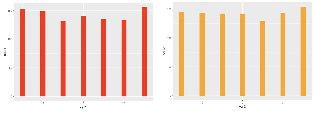
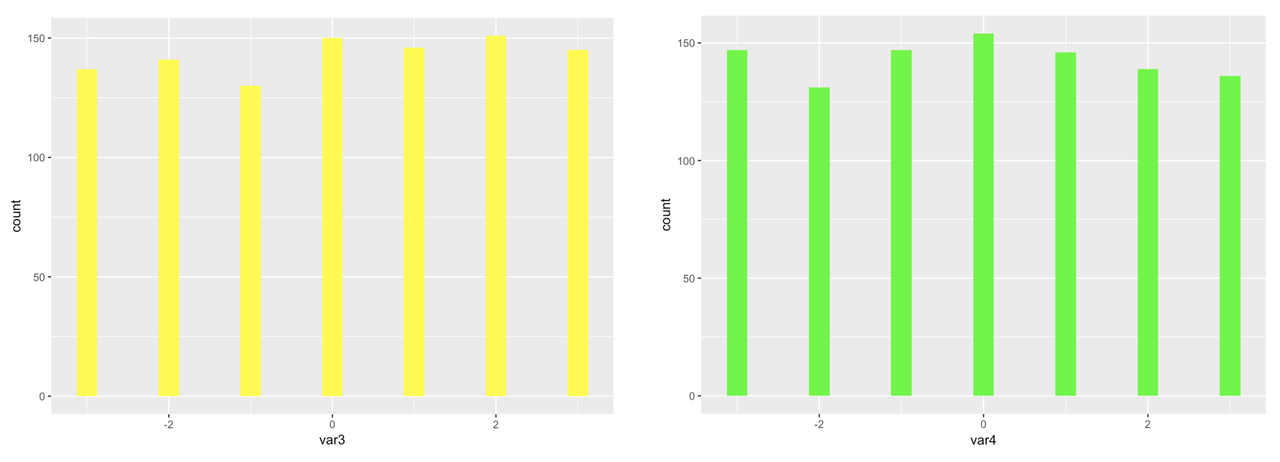
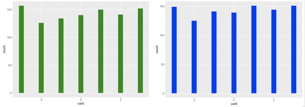
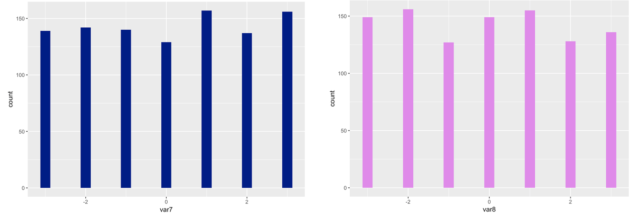
Because we simulated large samples of the 10 variables, and because we randomly selected each score from a uniform distribution, we can see that, as expected, each distribution looks approximately uniform in shape.
We can also see from the histograms that the mean of each variable is close to 0, again as expected, based on the code we used to simulate the variables. You can use the R function summary() to get a quick summary of all the variables in somedata. This function is similar to favstats(), except that favstats will only summarize one variable, while summary will summarize all of the variables in a data frame. Try it in the window below.
require(coursekata)

set.seed(2)
somedata <- 1:10 %>%
    purrr::set_names(paste0("var", 1:10)) %>%
    purrr::map_df(~resample(-3:3, 1000))
# run this code
summary(somedata)
summary(somedata)
ex() %>% check_function("summary") %>% check_result() %>% check_equal()
success_msg("Fantastic! On to the next challenge") var1 var2 var3 var4
Min. :-3.000 Min. :-3.000 Min. :-3.00 Min. :-3.000
1st Qu.:-2.000 1st Qu.:-2.000 1st Qu.:-2.00 1st Qu.:-2.000
Median : 0.000 Median : 0.000 Median : 0.00 Median : 0.000
Mean :-0.018 Mean : 0.014 Mean : 0.06 Mean :-0.018
3rd Qu.: 2.000 3rd Qu.: 2.000 3rd Qu.: 2.00 3rd Qu.: 2.000
Max. : 3.000 Max. : 3.000 Max. : 3.00 Max. : 3.000
var5 var6 var7 var8
Min. :-3.000 Min. :-3.000 Min. :-3.000 Min. :-3.000
1st Qu.:-2.000 1st Qu.:-2.000 1st Qu.:-2.000 1st Qu.:-2.000
Median : 0.000 Median : 0.000 Median : 0.000 Median : 0.000
Mean : 0.031 Mean : 0.054 Mean : 0.058 Mean :-0.067
3rd Qu.: 2.000 3rd Qu.: 2.000 3rd Qu.: 2.000 3rd Qu.: 2.000
Max. : 3.000 Max. : 3.000 Max. : 3.000 Max. : 3.000
var9 var10
Min. :-3.000 Min. :-3.000
1st Qu.:-2.000 1st Qu.:-2.000
Median : 0.000 Median : 0.000
Mean : 0.061 Mean : 0.039
3rd Qu.: 2.000 3rd Qu.: 2.000
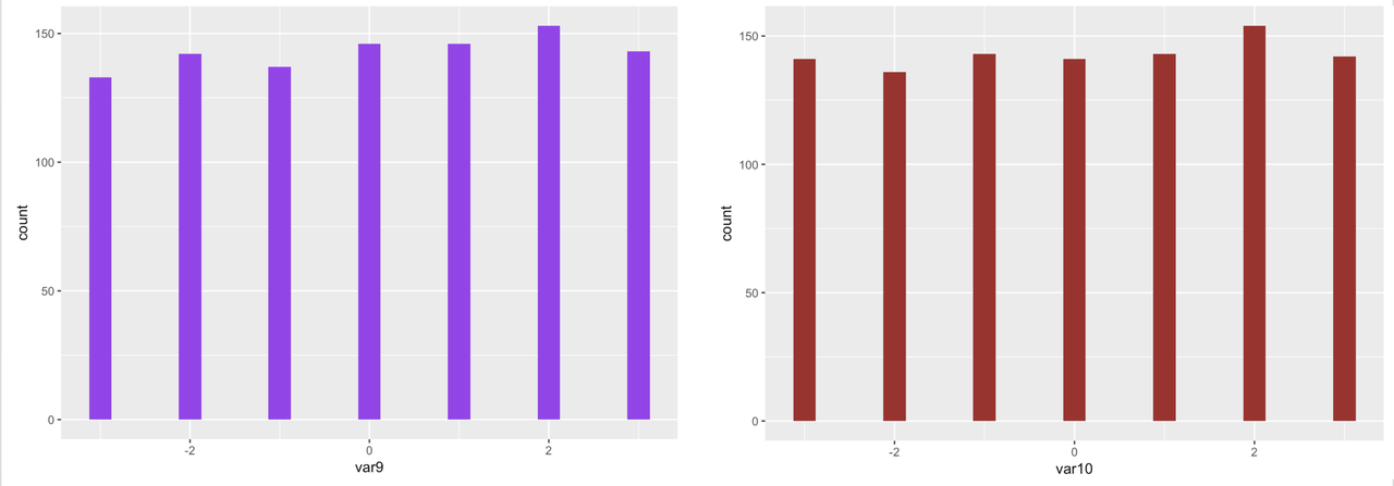
Max. : 3.000 Max. : 3.000Now for the aggregation part: let’s see what happens if we make a new summary variable that is the sum of the 10 variables for each row in the data set.
Try to write some R code that adds up all 10 variables and saves the sum as a variable in somedata. Make a histogram of that variable (we can call it sum).
require(coursekata)

set.seed(2)
somedata <- 1:10 %>%
    purrr::set_names(paste0("var", 1:10)) %>%
    purrr::map_df(~resample(-3:3, 1000))
# save the sum of the 10 variables to the sum column
somedata$sum <-

# this will make a density histogram of the sums
gf_dhistogram(~sum, data = somedata)
somedata$sum <- somedata$var1 + somedata$var2 + somedata$var3 + somedata$var4 + somedata$var5 + somedata$var6 + somedata$var7 + somedata$var8 + somedata$var9 + somedata$var10

gf_dhistogram(~sum, data = somedata)
ex() %>% {
    check_object(., "somedata") %>% check_column("sum") %>% check_equal()
    check_function(., "gf_dhistogram") %>% check_result() %>% check_equal()
}
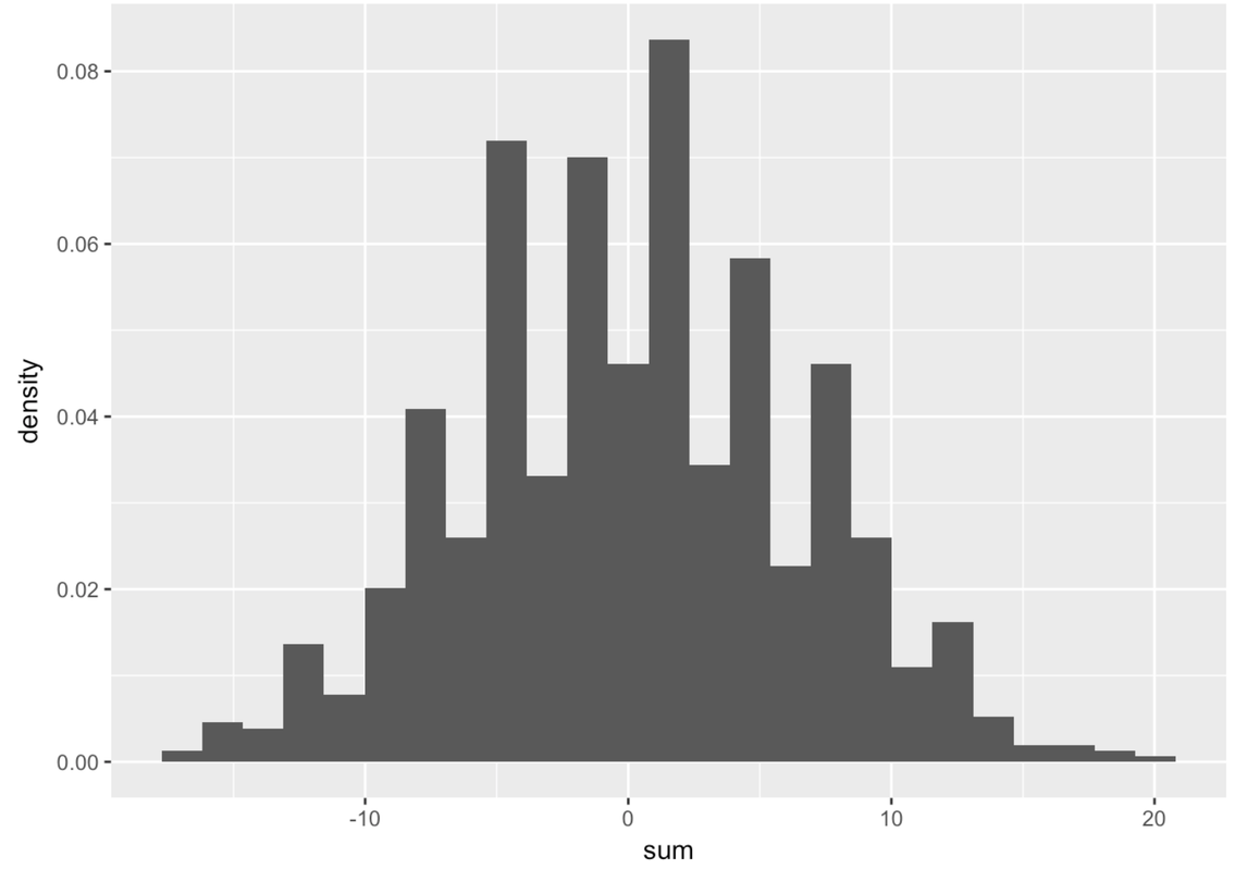
If you see gaps like this in the histogram, that often means the default number of bins (or bars) is too large. R’s default is 30. Try fewer bins. Try more bins. Try to observe what is the general shape of this distribution that is common across these different ways of presenting the same numbers.
require(coursekata)

set.seed(2)
somedata <- 1:10 %>%
    purrr::set_names(paste0("var", 1:10)) %>%
    purrr::map_df(~resample(-3:3, 1000)) %>%
    mutate(sum = var1 + var2 + var3 + var4 + var5 + var6 + var7 + var8 + var9 + var10)
# try changing the bin number to be smaller than 30
gf_dhistogram(~ sum, data = somedata, bins = 30)

 # try changing the bin number to be larger than 30
gf_dhistogram(~ sum, data = somedata, bins = 30)
# try changing the bin number to be smaller than 30
gf_dhistogram(~ sum, data = somedata, bins = 10)

# try changing the bin number to be larger than 30
gf_dhistogram(~ sum, data = somedata, bins = 75)
ex() %>% check_error()
As you can see, just aggregating multiple scores together caused the resulting distribution to be normal in shape. None of the 10 variables you added together were normal—they all were uniform in shape. But the sum is almost perfectly normal.
While a few randomly-generated values might move each sum up, others will move it down. This results in a lot of sums that are clustered around the middle (in this case, 0). This fact is what gives us the confidence to usually assume that the distribution of errors is normal. And as you will see later in the course, this idea of aggregation also underlies the models we use for evaluating and comparing statistical models.
Let’s think about how this might apply to data that we have been thinking about. If you are interested in why people lose weight or have a particular thumb length, there are probably a lot of different explanatory variables involved. Some of these variables move these outcomes up and some move these outcomes down. By aggregating these forces, the ones that pull in different directions balance each other out, leaving more scores in the middle than in the tails.