4.2 Explaining One Variable With Another
Let’s start by looking at the distribution of Thumb.
Write code to draw a histogram of Thumb from the Fingers data frame. Feel free to play around with features like labels, gf_labs(), or with arguments like color, fill, bins, or binwidth.
require(coursekata)
# Create a histogram of Thumb from the Fingers data set
gf_histogram(~Thumb, data=Fingers)
hist(Fingers$Thumb)
ex() %>% check_or(
    check_function(., "gf_histogram") %>% {
        check_arg(., "object") %>% check_equal()
        check_arg(., "data") %>% check_equal()
    },
    check_function(., "hist") %>%
        check_arg("x") %>% check_equal()
)
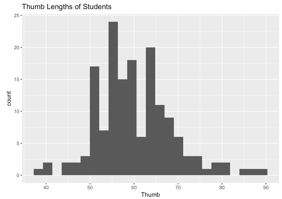
If you played around with the number or width of your bins, the shape of your plot might look a little different from the one above.
We’ve seen this distribution a few times now. It looks like most of the thumbs run between 40 and 80 mm; the center of the distribution is somewhere around 60 mm; and the distribution is kind of bell-shaped, with most of the observations clustered around the middle, then just a few observations in the outer tails.
Let’s say we want to use some other variable to explain the variation we see in thumb length. A starting place is to think about other variables that, if we knew someone’s score on that variable, would help us make a better guess about their thumb length.
One variable that might explain the variation in thumb length is Sex. You might intuitively sense that male and female thumb lengths would differ, or vary. But then again, even among a bunch of females, their thumb lengths vary too.
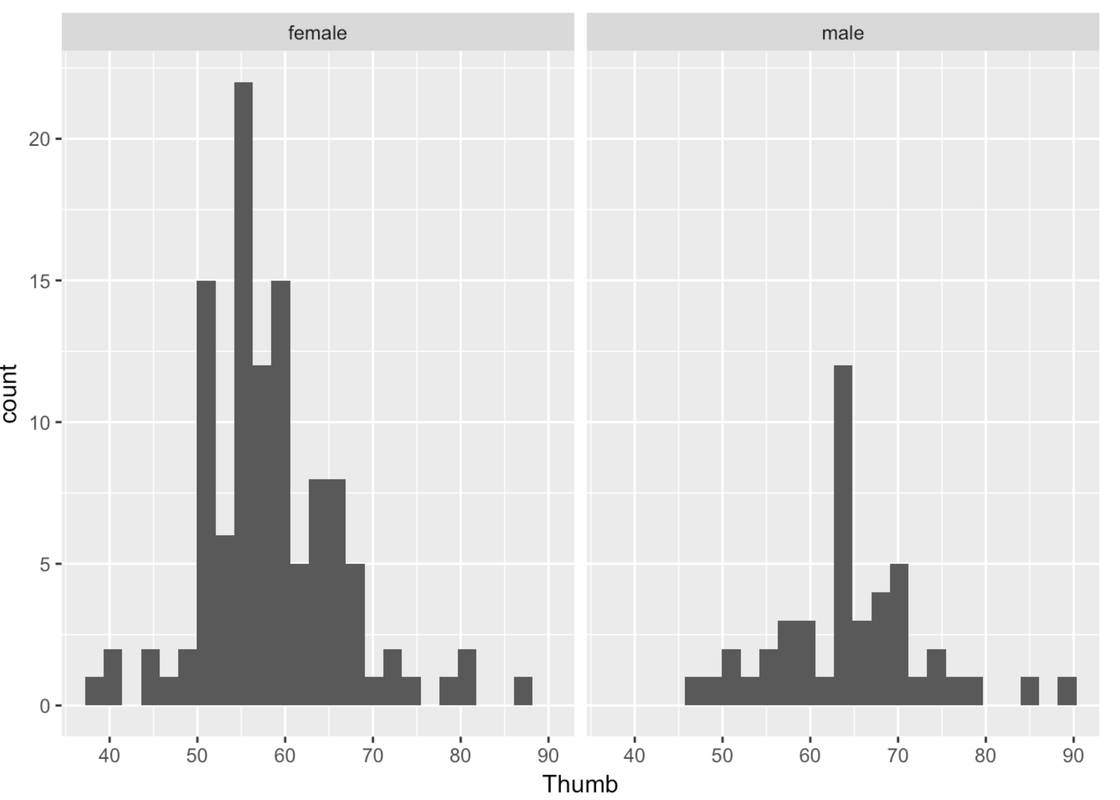
Unfortunately, the variable Sex is not included in our previous histogram. But we can visualize the relationship between Thumb and Sex in a few ways. One way is by coloring or filling in the data in the histogram by Sex, assigning females one color and males another.
To do this we use the fill = argument, but instead of putting in a color we put a tilde (~) and then the name of a variable: fill = ~ Sex.
gf_histogram(~ Thumb, data = Fingers, fill = ~ Sex)
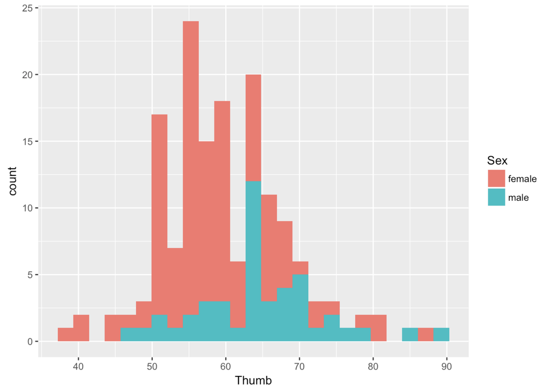
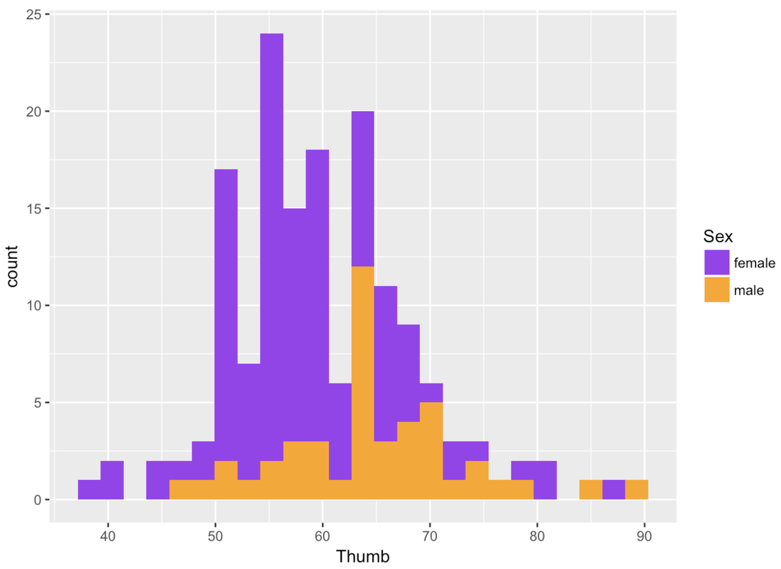
Whenever you color these data with another variable, it’s a bit of a pain to change the default colors. Thankfully, this default color scheme seems nice for this particular situation. But it is really nice to be able to change the colors. You have to chain on one additional (slightly complicated) line of code (using %>%) and substitute the color names you want for the different values of the variable. For example, here’s the R code to change the colors of this histogram.
gf_histogram(~ Thumb, data = Fingers, fill = ~ Sex) %>%
  gf_refine(scale_fill_manual(values = c("purple", "orange")))
You could also indicate Sex in the histogram by giving males and females different outline colors (instead of fill colors). To do that you would just change fill to color, as in the following code block:
gf_histogram(~ Thumb, data = Fingers, color = ~ Sex) %>%
  gf_refine(scale_color_manual(values = c("purple", "orange")))
Notice that the second line of the code above changes the default outline colors using gf_refine().
Try changing the fill colors used for the different values of Sex (female and male) in the histogram we made before.
require(coursekata)
# Change the default colors for the different values of the explanatory variable
gf_histogram(~ Thumb, data = Fingers, fill = ~ Sex)
gf_histogram( ~ Thumb, data = Fingers, fill = ~ Sex) %>%
    gf_refine(scale_fill_manual(values = c("red","blue")))
msg <- "Did you make sure to use the pipe (`%>%`) to send the output of `gf_histogram` to `gf_refine`?"
ex() %>% {
    check_function(., "gf_histogram")
    check_function(., "gf_refine") %>% {
        check_arg(., "object", arg_not_specified_msg = msg) %>%
          check_equal(incorrect_msg = msg, append = FALSE, eq_fun = function(x, y) all(class(x) == class(y)))
        check_arg(., "...",    arg_not_specified_msg = msg)
    }
    check_function(., "scale_fill_manual") %>%
        check_arg("values")
}
Another way to examine the male and female data is to split the histogram we made into two—one for females and another for males. We can chain on (using %>%) the command gf_facet_grid() after gf_histogram(). This will put the histogram of Thumb for females, and one for males, in a grid.
gf_histogram(~ Thumb, data = Fingers) %>%
  gf_facet_grid(. ~ Sex)
Remember that putting something after the ~ means something gets changed on the x-axis. gf_facet_grid() works the same way. Putting the variable Sex after the ~ puts these two graphs in a row along the x-axis. Putting Sex before the ~ puts these two graphs in a column along the y-axis.
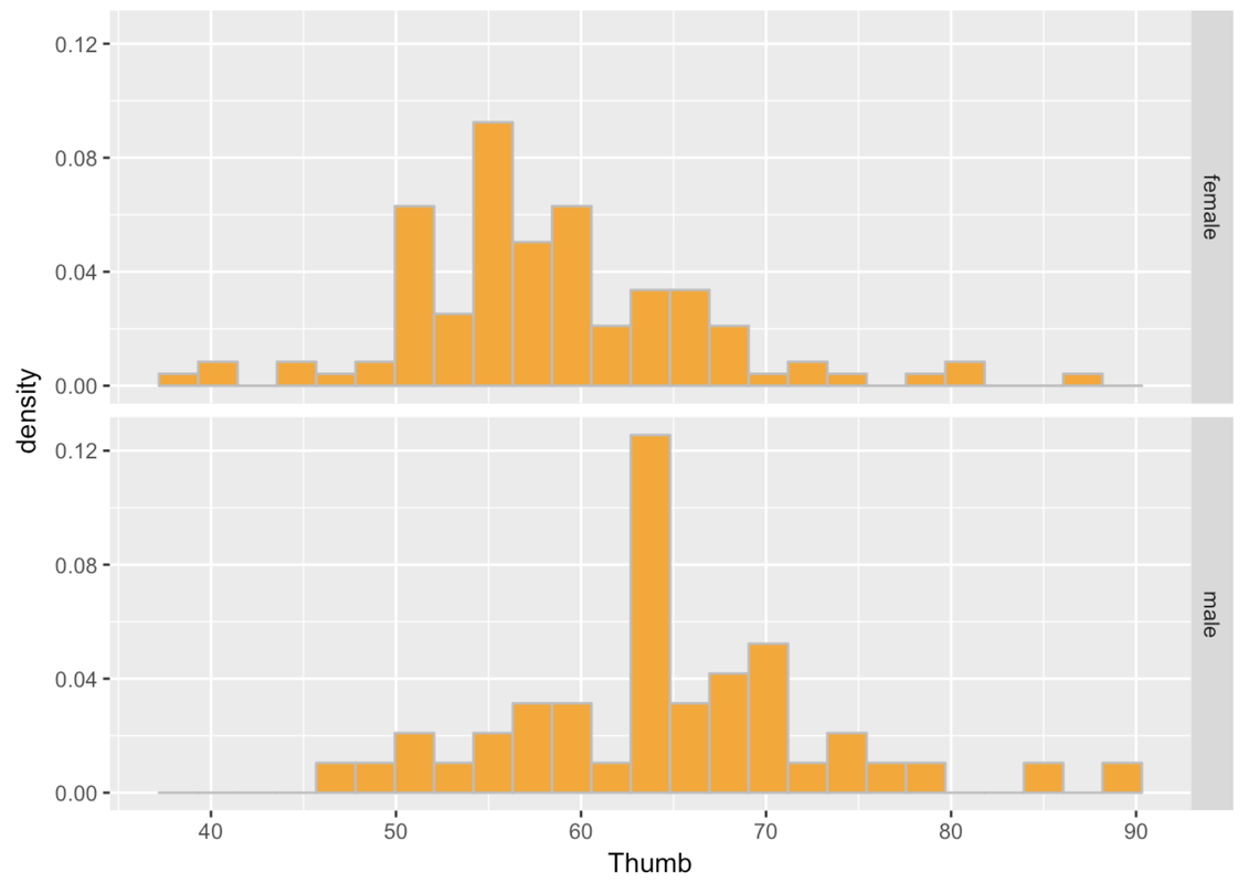
gf_histogram(~ Thumb, data = Fingers) %>%
  gf_facet_grid(Sex ~ .)
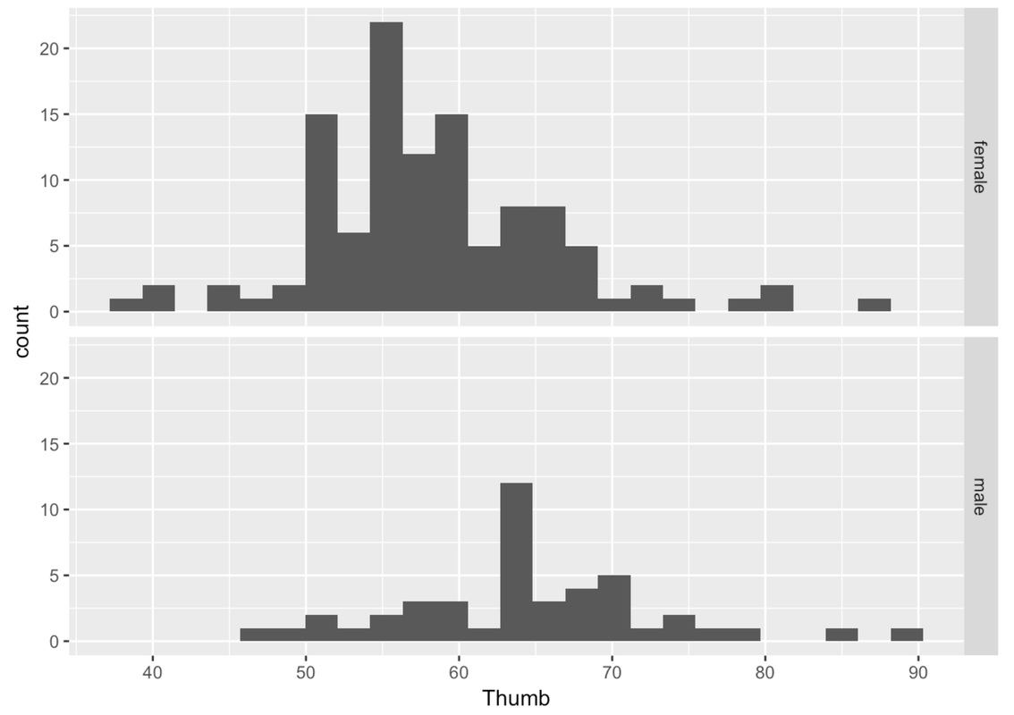
This is more helpful than side-by-side because it’s easier to compare where the distributions are along the same Thumb axis. It seems that the distribution of thumb lengths for males is shifted higher relative to the female distribution.
Also, it is immediately apparent that there are fewer males than females. This is when a measure like density (rather than count) comes in handy.
Adjust the following code to re-create these histograms as density histograms.
require(coursekata)
# Modify this code to create density histograms
gf_histogram(~ Thumb, data = Fingers) %>%
    gf_facet_grid(Sex ~ .)
# Modify this code to create density histograms
gf_dhistogram(~ Thumb, data = Fingers) %>%
    gf_facet_grid(Sex ~ .)
ex() %>% {
    check_function(., "gf_dhistogram") %>% {
        check_arg(., "object") %>% check_equal()
        check_arg(., "data") %>% check_equal()
    }
    check_function(., "gf_facet_grid") %>% {
        check_arg(., "object") %>% check_equal()
        check_result(.) %>% check_equal()
    }
}
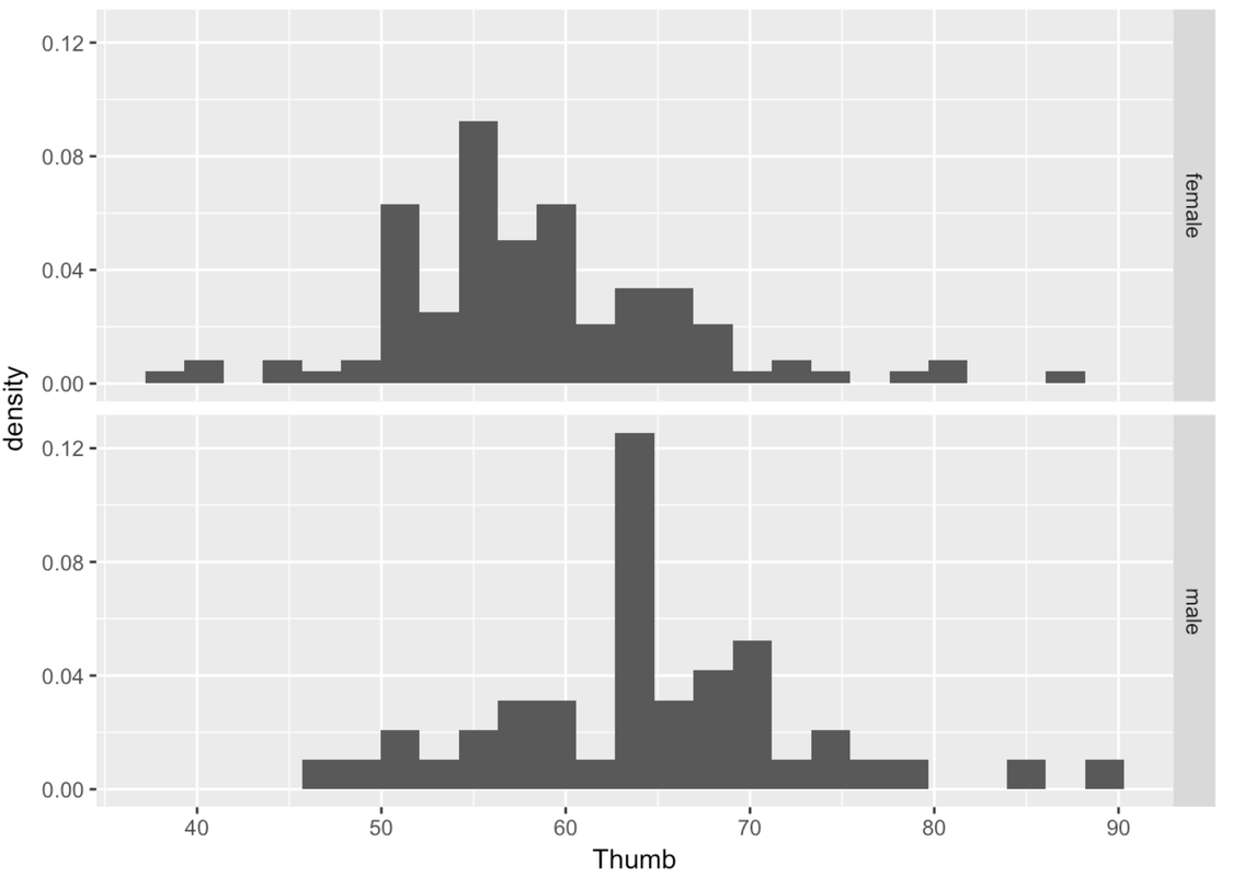
Another way of thinking about Sex explaining variation in Thumb is to say that Thumb is really made up of two different distributions, one for males and one for females. Although the shape of these two histograms are roughly normal, the average male thumb is bigger than the average female thumb. It almost seems like the whole male distribution is shifted higher along the x-axis. The center of the distribution is different across the two groups, but also the variation (or spread) within the groups is now smaller within each of the two histograms than it is in the combined distribution.
This isn’t to say that just because we know someone’s sex we definitely know their thumb length. After all, there are both males and females with longer thumbs and both males and females with shorter thumbs. This variation among members of the same group is called within-group variation.
When we combine all the thumbs together in a single histogram, we are able to see how spread-out the overall distribution is. This gives us an idea of the total variation. When we divide the distribution up and look separately at the two histograms, we can see the within-group variation.
Notice that these group-specific histograms tend to have less variation than the single histogram. It’s as if some of the variation in Thumb has been accounted for by Sex. Because we can only see the within-group variation after we divide the distribution up by Sex, another name for within-group variation is leftover variation.
Even though there is still a lot of variation in thumb length left over after taking out Sex, it is still true that if we know someone’s sex we can be a little better at predicting their thumb length. A little better may not be great, but it is better than nothing.
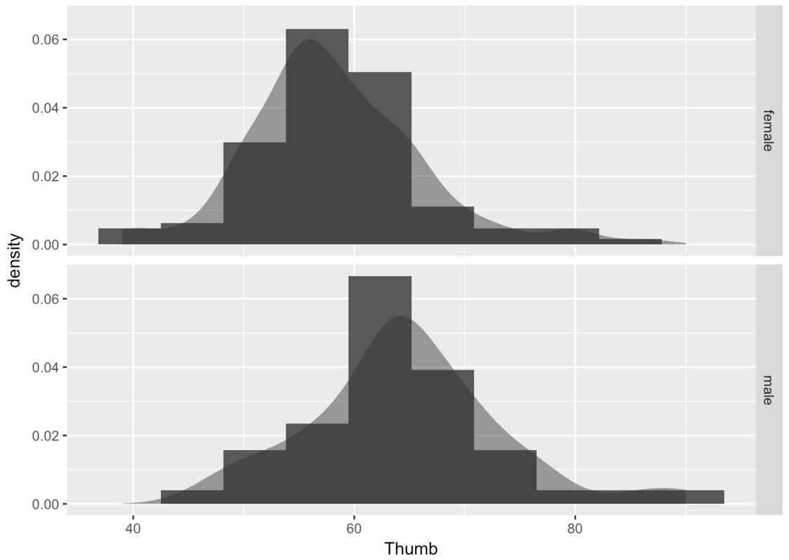
There are some cool things you can do with this grid of histograms. A lot of what you already know about histograms can be added here. You can adjust bins, you can add labels, and you can chain on density plots.
gf_dhistogram( ~ Thumb, data = Fingers, bins = 10) %>%
gf_facet_grid(Sex ~ .) %>%
gf_density()
You can adjust color and fill as usual.
gf_dhistogram( ~ Thumb, data = Fingers, fill = "orange", color = "gray") %>%
gf_facet_grid(Sex ~ .)
Make a grid of histograms to investigate the association of the variable you chose with Thumb length. (Make sure to use a categorical variable. )
require(coursekata)
# Write code to create paneled density histograms of Thumb to explore variables that would do a poor job of explaining variation (categorical variables)
# Any of these would be marked correct
gf_dhistogram(~Thumb, data = Fingers, fill = ~RaceEthnic) %>%
    gf_facet_grid(RaceEthnic ~ .)

gf_dhistogram(~Thumb, data = Fingers, fill = ~Year) %>%
    gf_facet_grid(Year ~ .)

gf_dhistogram(~Thumb, data = Fingers, fill = ~Job) %>%
    gf_facet_grid(Job ~ .)

gf_dhistogram(~Thumb, data = Fingers, fill = ~MathAnxious) %>%
    gf_facet_grid(MathAnxious ~ .)

gf_dhistogram(~Thumb, data = Fingers, fill = ~Interest) %>%
    gf_facet_grid(Interest ~ .)
ex() %>% {
    check_function(., "gf_dhistogram") %>% {
        check_arg(., "object")
        check_arg(., "data")
    }
    check_or(.,
        check_function(., "gf_facet_grid", index = 1) %>%
            check_arg("object"),
        check_function(., "gf_facet_grid", index = 2) %>%
            check_arg("object"),
        check_function(., "gf_facet_grid", index = 3) %>%
            check_arg("object"),
        check_function(., "gf_facet_grid", index = 4) %>%
            check_arg("object"),
        check_function(., "gf_facet_grid", index = 5) %>%
            check_arg("object")
    )
}Here are a few example histograms you could have made. The gray histograms on the left make a grid of thumb length based on year in college. The colorful histograms are based on Race/Ethnicity.
gf_histogram(~ Thumb, data = Fingers) %>%
  gf_facet_grid(Year ~ .)

gf_dhistogram(~ Thumb, data = Fingers, fill = ~ RaceEthnic) %>%
  gf_facet_grid(RaceEthnic ~ .)