8.2 The Regression Line as a Model
Introducing the Regression Model
When both the outcome and explanatory variables are quantitative, we need a different kind of model. We can’t use the mean as a model, because we don’t have groups. Instead we use a line, the regression line.
The regression line has a lot more in common with the mean as a model than you might at first think. Both are mathematical objects constructed from data. The mean is easy to construct and thus makes very simple predictions. The regression line is a little more complex and can be used to make better predictions.
As you may recall from your previous study of algebra, the equation for a straight line is \(y=mx+b\). In statistics, we would say that the regression line is a two-parameter model, the parameters being the slope (\(m\)) and y-intercept (\(b\)). You may recall a teacher at some point telling you that the slope is the “rise over run” and the y-intercept is where the line crosses the y-axis (that is, the value of \(y\) when \(x\) is 0). Fitting the model, therefore, is a matter of finding the particular line (i.e., slope and intercept) that best fits the data.
Both the mean and the regression line, when used as models, are used to generate predicted scores on the outcome variable, both for existing data points and for new observations that might be created in the future.
The two graphs below illustrate how these predictions work for the empty model (left) and the Height (regression) model (right).
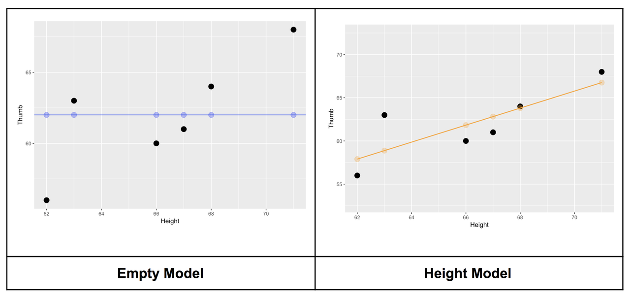
In the left panel of the figure above, the blue horizontal line is drawn at the mean of the outcome variable, Thumb, representing the empty model. We have indicated the model prediction for each data point, represented as blue dots at the mean, directly above or below the data point.
Each blue dot represents a person’s height and predicted thumb length under the empty model. For example, one student has a height of 66 inches. Using the empty model, their predicted thumb length is the mean, or 62 millimeters. As you can see, under the empty model, every person has the same predicted thumb length: 62 millimeters.
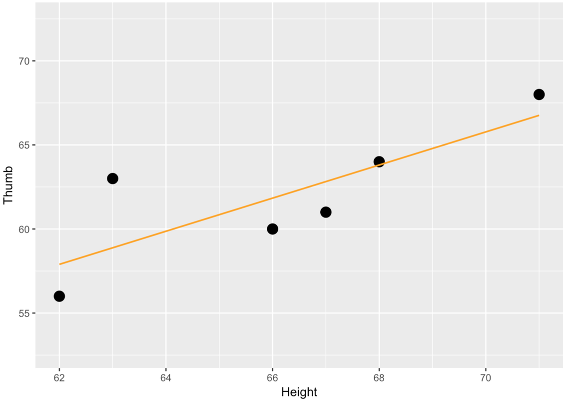
On the right, in orange, we have drawn in the best-fitting regression line, which represents the Height model, over the same TinyFingers data points. (Don’t worry for now about how to find the best-fitting regression line; R will take care of that later.) Just as the mean is the best predictor of thumb length under the empty model, and the group means are the best predictions of thumb length under the Height2Group model, the regression line represents the best predictions under the Height model.
Under the Height model, we use information about each person’s height to predict their thumb length. The orange dots on the regression line represent the predicted values for each of the six data points in the TinyFingers data set. Notice that the orange dots differ depending on height. Thus, we predict a longer thumb for someone who is 68 inches than for someone 66 inches tall.
Notice that we can even predict different thumb lengths for values of height that do not exist in our data.
To predict the thumb length of someone 64 inches tall, find 64 inches on the x-axis (see the plot below). Then go up vertically to the regression line (the red dotted line) to find the model’s prediction. The red dot corresponds to the predicted thumb length for someone who is 64 inches tall: 60 mm.
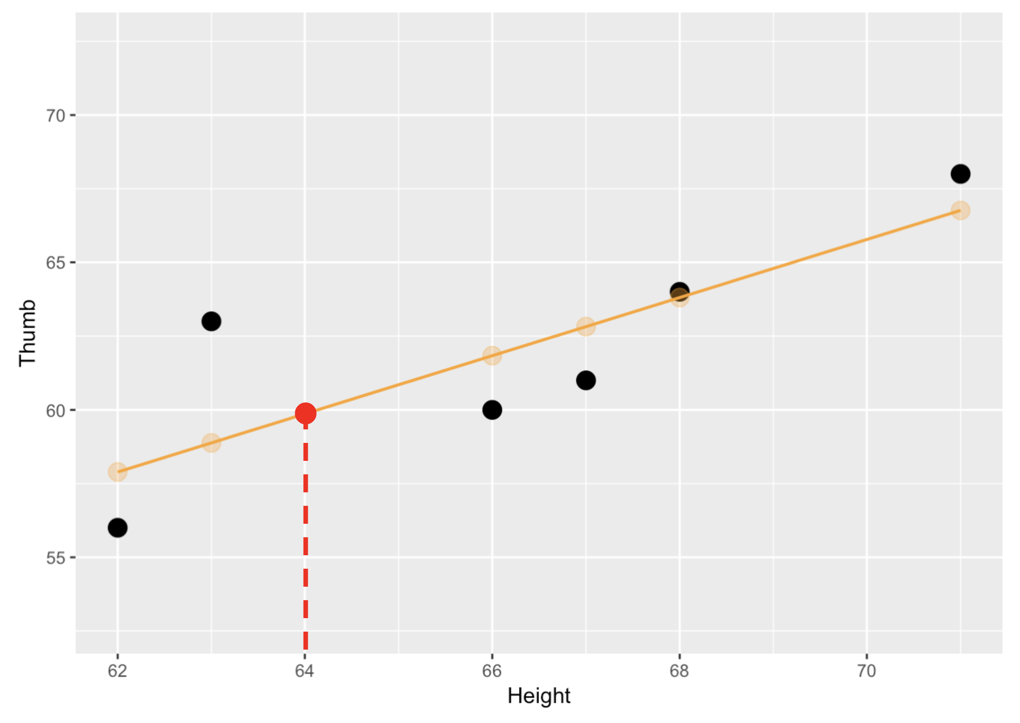
If you didn’t know someone’s height, you would need to use the empty model, in which case, the mean of Thumb would be the best predictor of thumb length.
Defining Error Around the Regression Model
As we have said all along, all models are wrong. What we are looking for is a model that is better than nothing, or, as you might by now suggest, better than the empty model. Comparing error between the Height model and the empty model lets us see which model is less wrong.
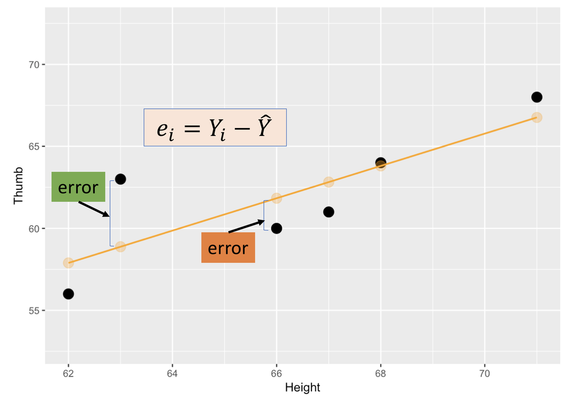
Error, under both the empty model and the regression model, is defined as the residual, or the observed score minus the score predicted by the model for each data point. Error in the empty model is the deviation of an observed score from the mean. Error in the regression model is the deviation of the observed score from the regression line, measured in vertical distance (see figure).
Recall that the mean is the middle of a univariate distribution, the pattern of variation in the values of a single quantitative variable, equally balancing the residuals above and below. In a similar way, the regression line is the middle of a bivariate distribution, the pattern of variation in two quantitative variables. Just as the sum of the residuals around the mean add up to 0, so too the sum of the residuals around the regression line also add up to 0.
Here’s another cool relationship between the mean and regression line—if someone had an average height, intuitively we would predict that their thumb length might also be average. And it turns out that the regression line passes through a point that is both the mean of the outcome variable and of the explanatory variable. So the regression line doesn’t cancel out the empty model, it enhances it!
Finally, just as the mean is the point in the univariate distribution at which the SS Error is minimized, the same is true of error around the regression line. The sum of the squared deviations of the observed points is at its lowest possible level around the best-fitting regression line.
Specifying the Model in GLM Notation
Let’s look at how we specify the model in the case where we have a single quantitative explanatory variable (such as Height). We will write the model like this:
\[Y_{i}=b_{0}+b_{1}X_{i}+e_{i}\]
It might be useful to compare this notation to that used in the previous chapter to specify the two-group model (such as Sex or Height2Group):
\[Y_{i}=b_{0}+b_{1}X_{i}+e_{i}\]
No, it’s not a joke: both of the model specifications are identical. This, in fact, is what is so beautiful about the General Linear Model. It is simple and elegant and can be applied across a wide variety of situations, including situations with categorical or quantitative explanatory variables.
Although both models are specified using the same notation, the interpretation of the notation varies from situation to situation. It is always important to think, first, about what each component of the model specification means.
As before, the \(Y_{i}\) is the DATA, and \(e_{i}\) is the ERROR. \(b_{0}+b_{1}X_{i}\) represents the complex model. Let’s think about what each of these elements means in the context of our TinyFingers data. We are trying to predict the thumb length of college students a little bit better by considering their variation in height. And let’s also consider what might be different about the interpretation in the current case, with height as a quantitative variable, with the previous case in which height was coded with categories (short vs. tall).
Both \(Y_{i}\) and \(e_{i}\) have the same interpretation in the quantitative model (regression) as in the group model. The outcome variable in both cases is the thumb length of each person, measured as a quantitative variable. And the error term is each person’s deviation from their predicted thumb length under the model.
The explanatory variable \(X_{i}\) has a different meaning under these two models. This may be more clear when we write the two models like this:
Group Model: \({Thumb}_{i}=b_{0}+b_{1}{Height2Group}_{i}+e_{i}\)
Regression Model: \({Thumb}_{i}=b_{0}+b_{1}{Height}_{i}+e_{i}\)
In the group model, the variable \(X_{i}\) was coded as 1 for tall and 0 for not tall. Because it divided people into one of two categories, the model could only make the simple prediction of one mean thumb length for short people, and another for tall people. In the regression model, in contrast, \(X_{i}\) is the actual measurement of person \(i\)’s height in inches. This model can make a different prediction of thumb length for every possible value of height.
Coding \(X_{i}\) in these different ways leads to a different, but related, interpretation of the \(b_{1}\) coefficient. In the group model, you will recall, the \(b_{1}\) coefficient represents the increment in millimeters that must to be added to the mean thumb length for short people to get the mean thumb length for tall people. This increment is added only when \(X_{i}\) is equal to 1.
Because \(X_{i}\) in the regression model represents the measured height of each individual in inches, \(b_{1}\) represents the increment that must be added to the predicted thumb length of a person for each one-inch increment in height. If that sounds familiar to you, it may be because it sounds exactly like the definition of the slope of a line (how much “rise” for each one unit of “run”). \(b_{1}\) is, in fact, the slope of the best-fitting regression line.
If \(b_{1}\) is the slope of the line, it stands to reason that \(b_{0}\) will be the y-intercept of the line—in other words, the predicted value (under the regression model) of y when x is equal to 0. Because the regression line is a line, it will need to be defined by a slope and an intercept. But in the case of a height model trying to predict thumb length, the intercept is purely theoretical—it’s impossible for someone to be 0 inches tall! So it’s pretty weird to predict their thumb length.
We have summarized these differences between the two models in the table below.
| Symbol |
Group Mean Model \({Thumb}_{i}=b_{0}+b_{1}{Height2Group}_{i}+e_{i}\) |
Regression Model \({Thumb}_{i}=b_{0}+b_{1}{Height}_{i}+e_{i}\) |
|---|---|---|
| \(Y_i\) | Person i thumb length | Person i thumb length |
| \(b_0\) | Mean thumb length for short people (59 inches in the tiny dataset) | y-intercept for regression line (predicted thumb length when Height=0) |
| \(b_1\) | Increment between short and tall group means for thumb length (6 inches in the tiny dataset) | Slope of the regression line (increment in thumb length for each one-inch increase in height) |
| \(X_i\) | Height for person i coded as short=0, tall=1 | Height for person i measured in inches |
| \(e_i\) | Error for person i (\(Y_i-\hat{Y}_i\)) | Error for person i (\(Y_i-\hat{Y}_i\)) |