10.4 The F-Distribution
So far we’ve used randomization (shuffle()) to create a sampling distribution of F. However, just like mathematicians developed mathematical models of the sampling distribution of \(b_1\) (e.g., t-distributions), they have developed a mathematical model of the sampling distribution of F. This mathematical model is called the F-distribution.
In the same way that the mathematical t-distribution can be used as a smooth idealization to model sampling distributions of \(b_1\), the F-distribution provides a smooth mathematical model that fits the sampling distribution of F. (It also fits the sampling distribution of PRE.)
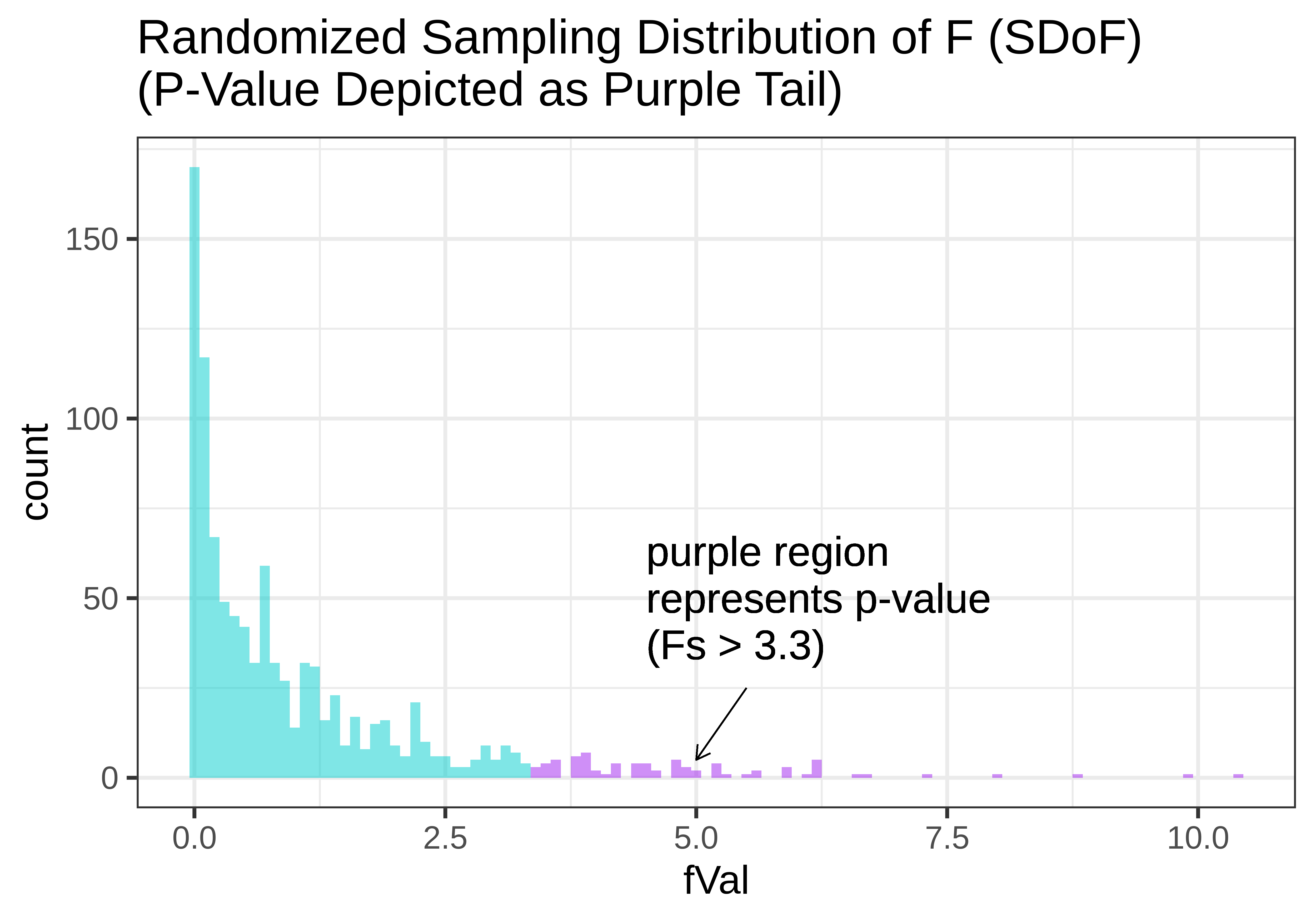
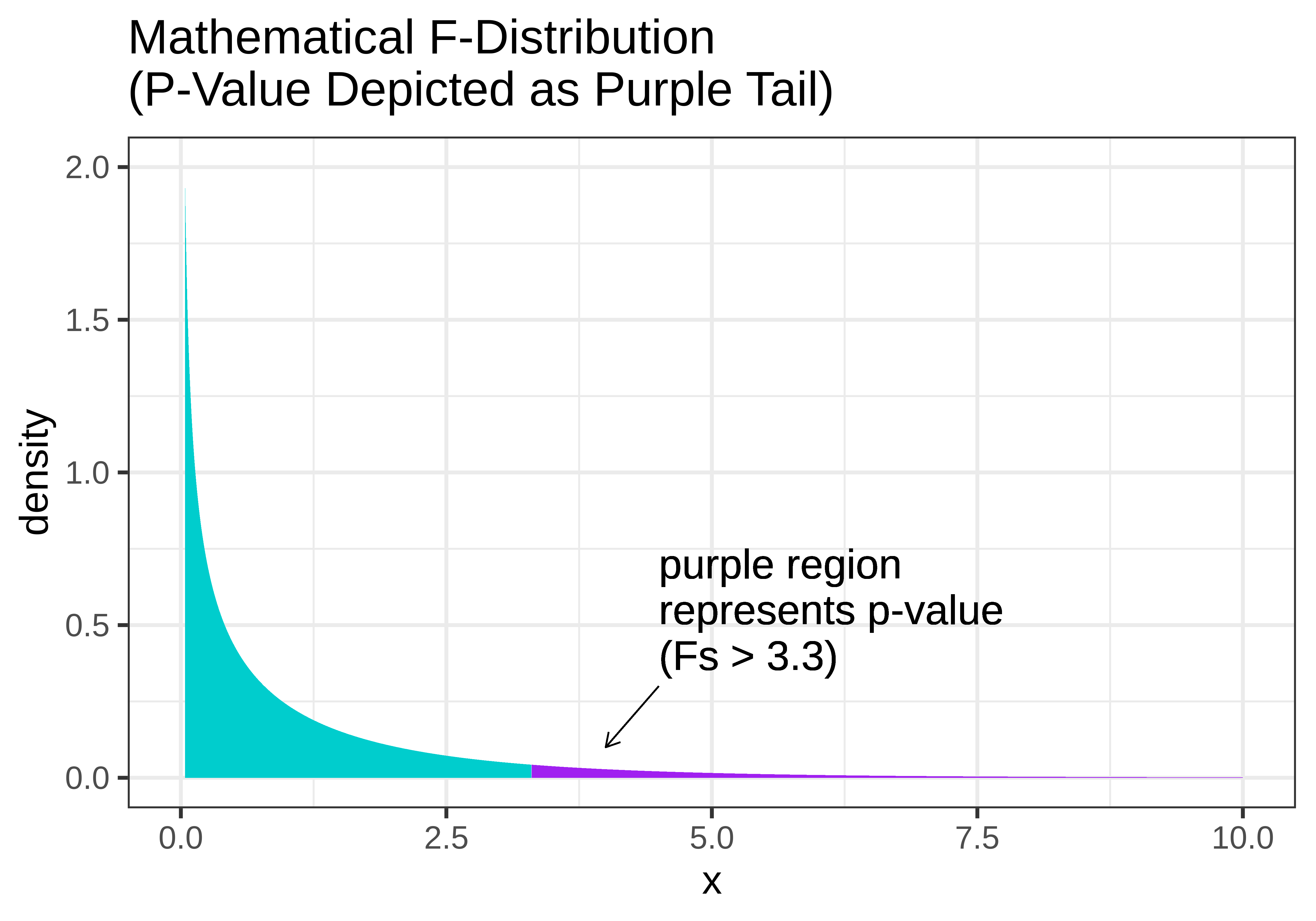
In the figure below, we show two versions of the sampling distribution of F that both assume a DGP with no effect of Condition (i.e., the empty model). On the left, we model the randomized sampling distribution using shuffle(), and on the right using the F distribution, where the area greater than our sample F is represented as the purple tail.
|
|
Notice that the shapes are very similar. The F-distribution seems like a smoothed out version of the randomized sampling distribution of F, and the p-value calculated based on the randomized sampling distribution will be very similar to the p-value based on the mathematical F-distribution.
Just as the shape of the t-distribution varies slightly according to the sample size or degrees of freedom, the shape of the F-distribution also varies by degrees of freedom. But because F is calculated as the ratio of MS Model divided by MS Error, we must specify two different degrees of freedom to get the shape of the F-distribution: the df for MS Model (1 in the ANOVA table below); and the df for MS Error, which is 42.
Analysis of Variance Table (Type III SS)
Model: Tip ~ Condition
SS df MS F PRE p
----- --------------- | -------- -- ------- ----- ------ -----
Model (error reduced) | 402.023 1 402.023 3.305 0.0729 .0762
Error (from model) | 5108.955 42 121.642
----- --------------- | -------- -- ------- ----- ------ -----
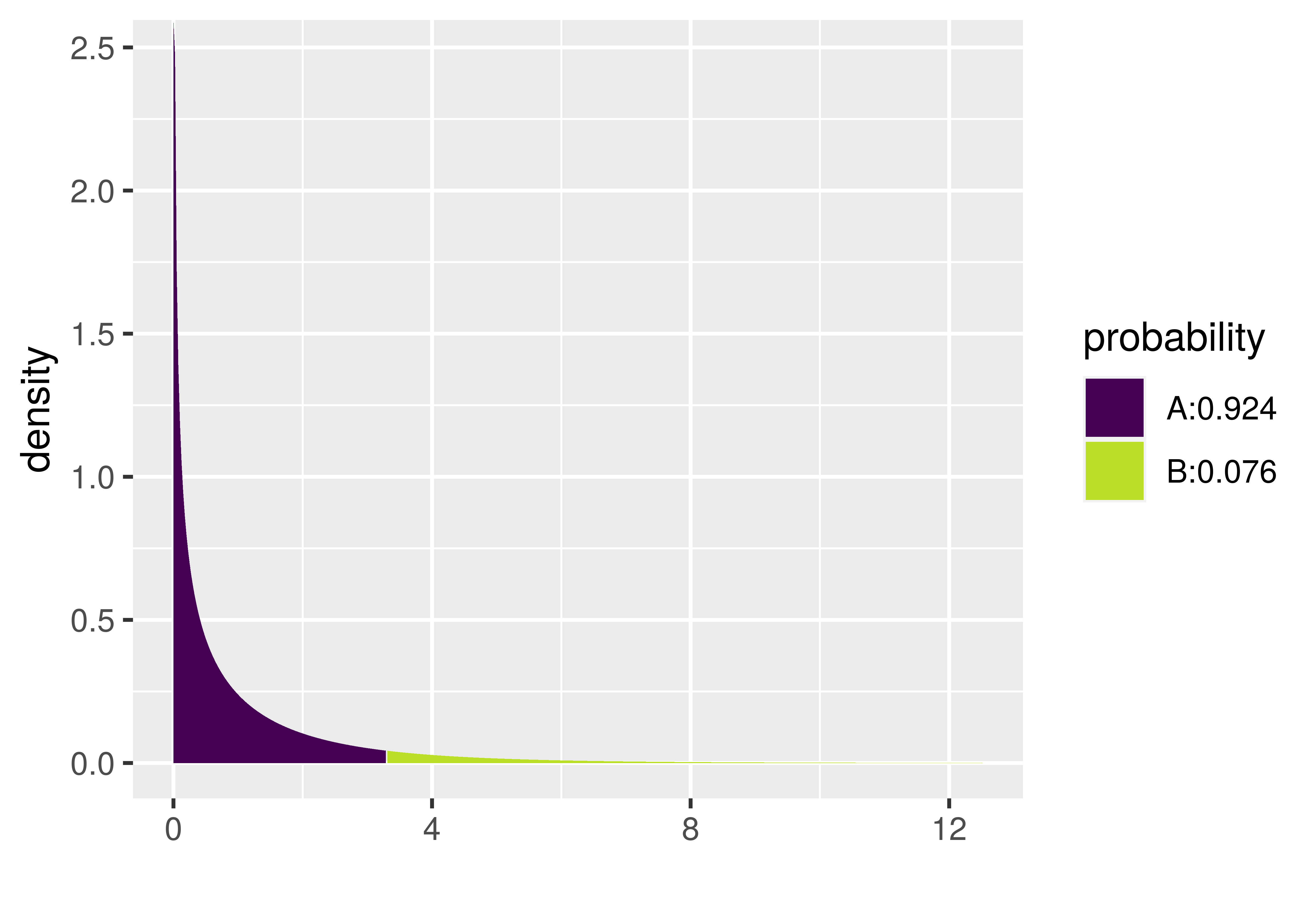
Total (empty model) | 5510.977 43 128.162 The xpf() function provides one way to calculate a p-value using the F-distribution. It requires us to enter three arguments: the sample F, the df Model (called df1) and df Error (called df2). Try it out in the code window below by filling in the values of df1 and df2 from the ANOVA table above.
require(coursekata)
# we have saved the sample F for you
sample_F <- fVal(Tip ~ Condition, data = TipExperiment)

# fill in the appropriate dfs
xpf(sample_F, df1 = , df2 = )
# we have saved the sample F for you
sample_F <- fVal(Tip ~ Condition, data = TipExperiment)

# fill in the appropriate dfs
xpf(sample_F, df1 = 1, df2 = 42)
ex() %>%
                check_function(., "xpf") %>% {
               check_arg(., "df1") %>% check_equal()
               check_arg(., "df2") %>% check_equal()
}We like the xpf() function because it shows a graph of the F distribution and marks off the region of the tail that represents the p-value. It also tells you what the p-value is in the legend. Notice in the plot below that the p-value for the Condition model of the tipping experiment data is .0762. That’s the same value reported in the ANOVA table, which is no coincidence: the supernova() function uses the mathematical F distribution to calculate the p-value.
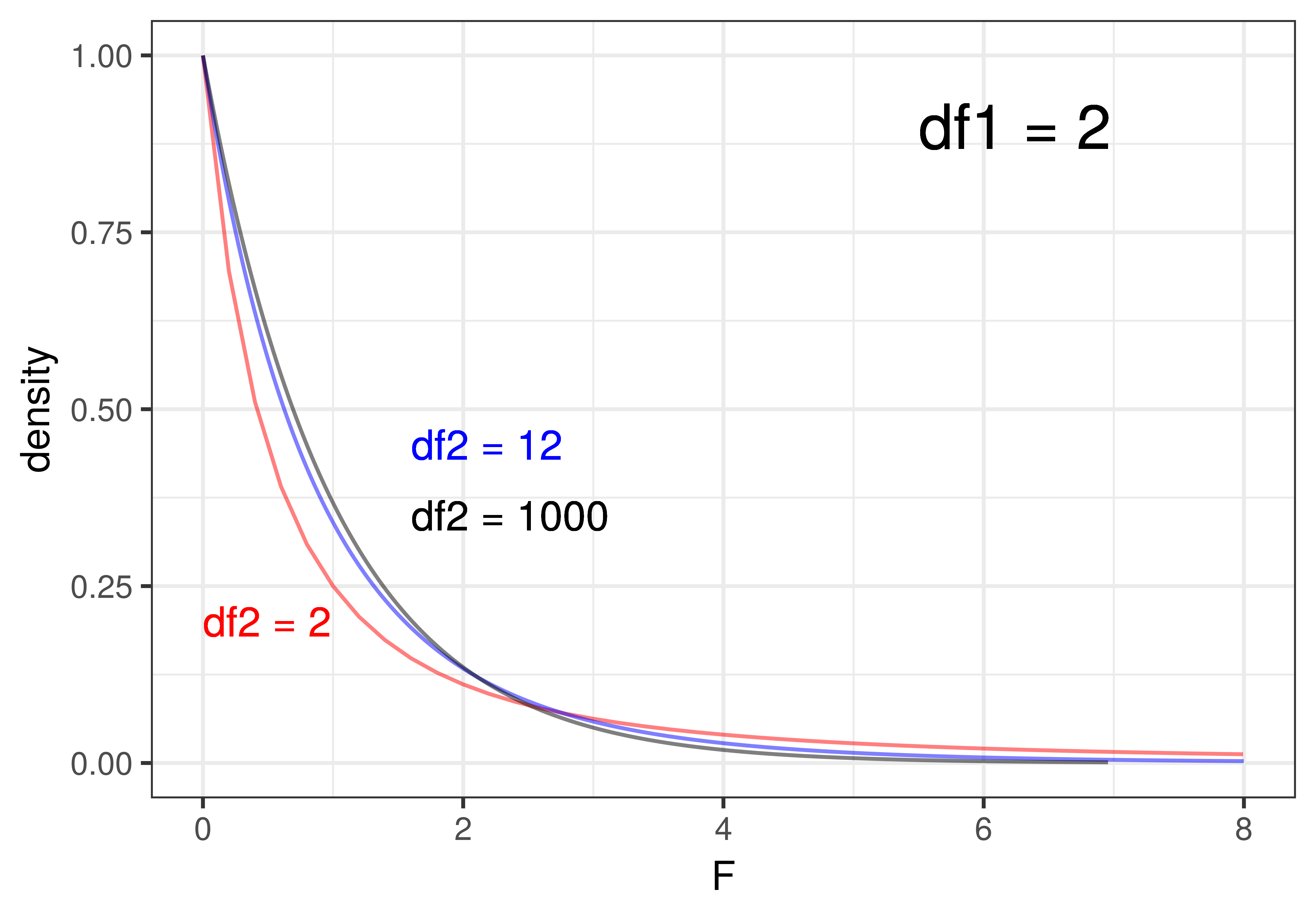
Shapes of the F-Distribution
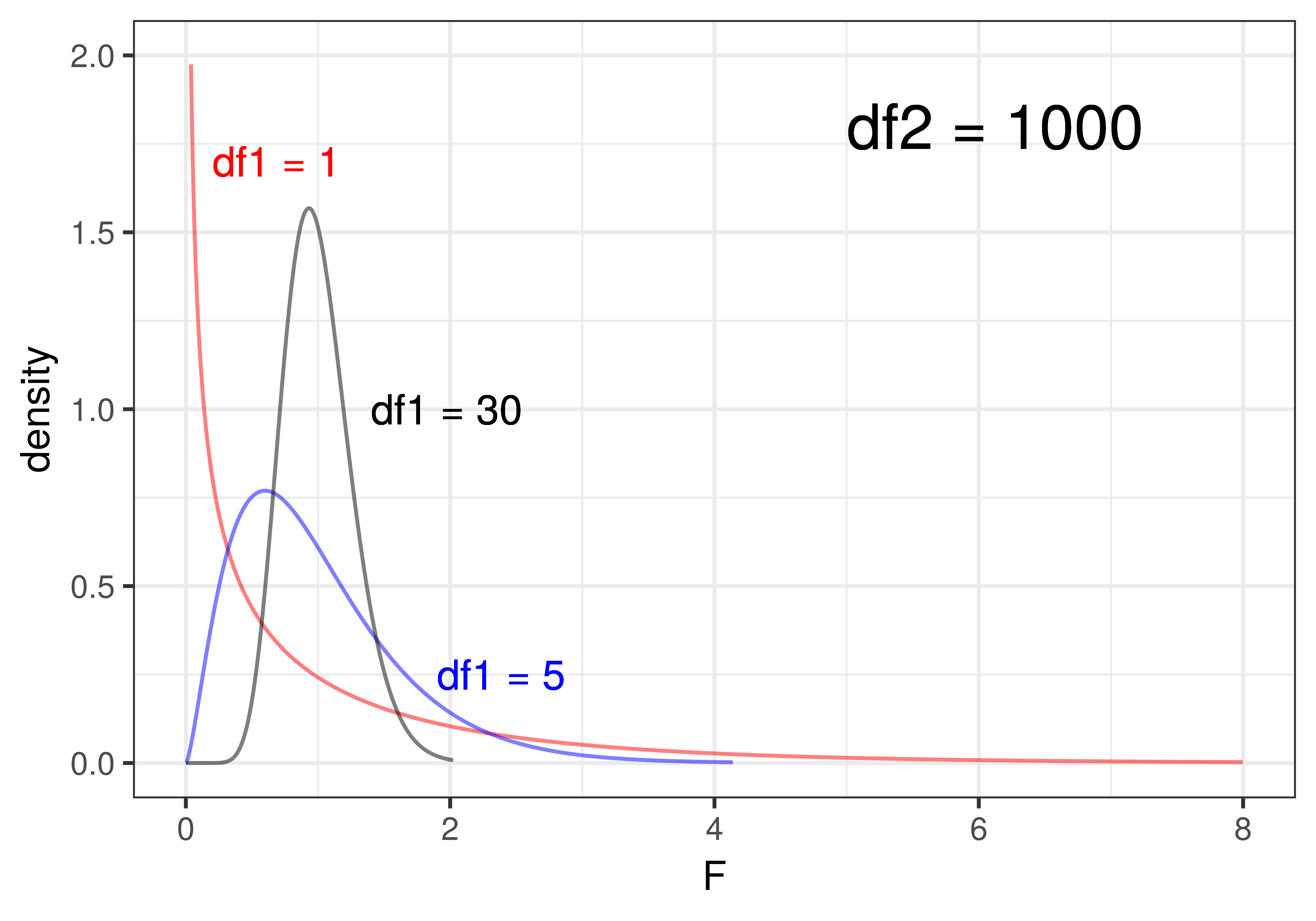
The shape of the F-distribution varies quite a bit depending on the degrees of freedom (df1 and df2). To illustrate, look at the plots below. On the left, we have depicted three F-distributions that have the same df1 (that is df1 = 2) but differ on df2 (2, 12, 1000). On the right, we have held df2 constant at 1000 and varied df1 (1, 5, 30).
|
|
When df1 (i.e., df Model) is held constant (left panel of the figure), that means that the number of parameters estimated for the model is held constant. df1 = 2 for the three-group model, 2 being the number of parameters estimated beyond the one for the empty model. We can see that changing the sample size, and thus the values of df2 (i.e., df Error), has only a slight effect on the shape of the F-distribution when df1 is held constant. Even at a df2 of 12 (the blue line), it’s very similar to the F-distribution where df2 is 1000 (black line). Once df2 gets above 30 or so, it barely changes at all.
Changing the number of parameters estimated for the model (df Model), on the other hand, has a more profound influence on the shape of the F-distribution. In the right panel of the figure above, where we hold the sample size constant at a fairly large df2 of 1000, increasing the number of parameters (df1) from 1 to 5 to 30 produces a big difference in shape. As the number of parameters goes up, e.g., as high as 30, the F-distribution starts to look almost normal in shape.
The F-Distribution and T-Distribution are Actually the Same
We have now used one mathematical model for the sampling distribution of \(b_1\) (the t-distribution) and another for the sampling distribution of PRE and F (the F-distribution). But we found that in the tipping study, whether we use t or F, the p-value comes out exactly the same (.0762).
The reason is that fundamentally, the F-distribution and the t-distribution are actually one and the same! If you randomly sample values from a t-distribution, and then square each one, you will get exactly an F-distribution!
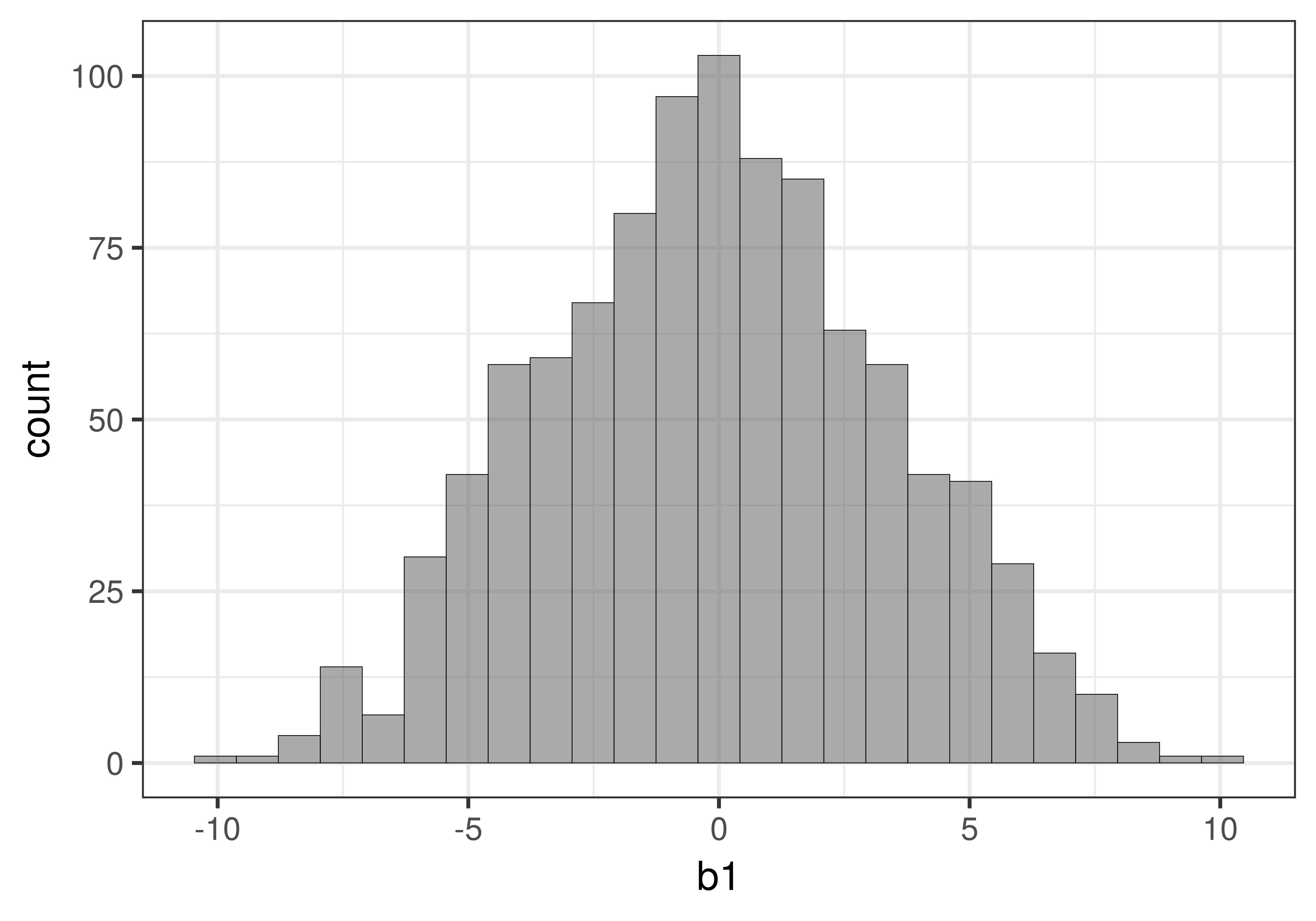
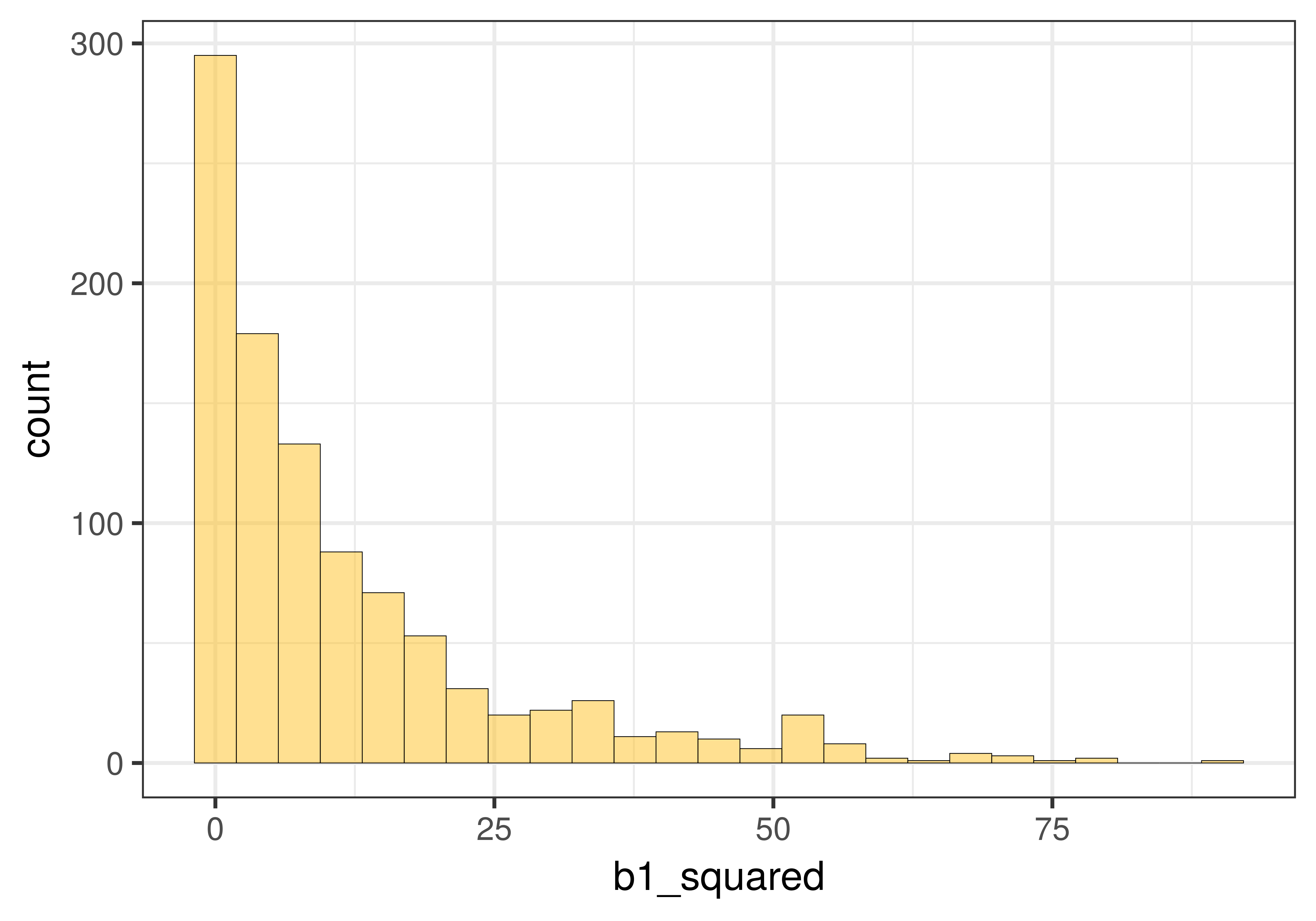
In the graph below on the left we show the distribution of 1000 \(b_1\)s that we created using shuffle(). We know from Chapter 9 that this distribution is well modelled by the t-distribution. We then squared each of the 1000 \(b_1\)s and graphed the distribution of 1000 b1_squareds. As you can see, it now looks like the F distribution.
|
|
In the case of the Condition model of Tip, we can calculate the t statistic using the t.test function, and the F statistic using supernova().
t.test(Tip ~ Condition, data = TipExperiment, var.equal=TRUE)
supernova(Tip ~ Condition, data = TipExperiment)
data: Tip by Condition
t = -1.818, df = 42, p-value = 0.0762Analysis of Variance Table (Type III SS)
Model: Tip ~ Condition
SS df MS F PRE p
----- --------------- | -------- -- ------- ----- ------ -----
Model (error reduced) | 402.023 1 402.023 3.305 0.0729 .0762
Error (from model) | 5108.955 42 121.642
----- --------------- | -------- -- ------- ----- ------ -----
Total (empty model) | 5510.977 43 128.162 Notice two things. First, the p-value is exactly the same for the two-sample t-test as it is for the model comparisons using F: .0762. Second, notice the values of t (-1.818) and F (3.305). Guess what you would get if you square -1.818? Yep, 3.305.
Instead of trying to think about how these methods are different from each other (e.g., F-test versus t-test, or the permutation test versus mathematical functions), we want you, for now, to appreciate just how similar they are to each other. They all help us locate our parameter estimates in distributions of other estimates that could have been generated by the empty model.