12.5 Predictions from the Multivariate Model
Our goal in making a multivariate model is to help us generate better predictions than we could with a single-predictor model (and by better, we mean predictions with less error).
Once we have fit the multivariate model to the data, it is useful to examine the model predictions and residuals from the model. Just like we did for single-predictor models, we can use R’s predict() and resid() functions to calculate the model predictions, and the errors from those predictions, for every home in the data frame.
Below is the multivariate model that we have been working with so far. R will use part of it for making predictions and part of it for calculating residuals.
\[PriceK_i = \underbrace{b_0 + b_1NeighborhoodEastside_i + b_2HomeSizeK_{i}}_{\mbox{predict(model)}} + \underbrace{e_i}_{\mbox{resid(model)}}\]
Predictions From the Multivariate Model
In this section we will generate predictions from our best fitting multivariate model and then plot those predictions on a graph in order to look for patterns.
Write code to save our multivariate model as multi_model. We have written some code for you that will put the predictions of this model (in triangles drawn in black) onto the scatter plot.
require(coursekata)

# delete when coursekata-r updated
Smallville <- read.csv("https://docs.google.com/spreadsheets/d/e/2PACX-1vTUey0jLO87REoQRRGJeG43iN1lkds_lmcnke1fuvS7BTb62jLucJ4WeIt7RW4mfRpk8n5iYvNmgf5l/pub?gid=1024959265&single=true&output=csv")
Smallville$Neighborhood <- factor(Smallville$Neighborhood)
Smallville$HasFireplace <- factor(Smallville$HasFireplace)
# save the multivariate model here
multi_model <-

# this puts the model predictions on the scatter plot
gf_point(PriceK ~ HomeSizeK, color = ~Neighborhood, data = Smallville) %>%
gf_point(predict(multi_model) ~ HomeSizeK, color = "black", shape = 2)
multi_model <- lm(PriceK~ Neighborhood + HomeSizeK, data = Smallville)
gf_point(PriceK ~ HomeSizeK, color = ~Neighborhood, data = Smallville) %>%
gf_point(predict(multi_model) ~ HomeSizeK, color = "black", shape = 2)
# temporary SCT
ex() %>% check_error()
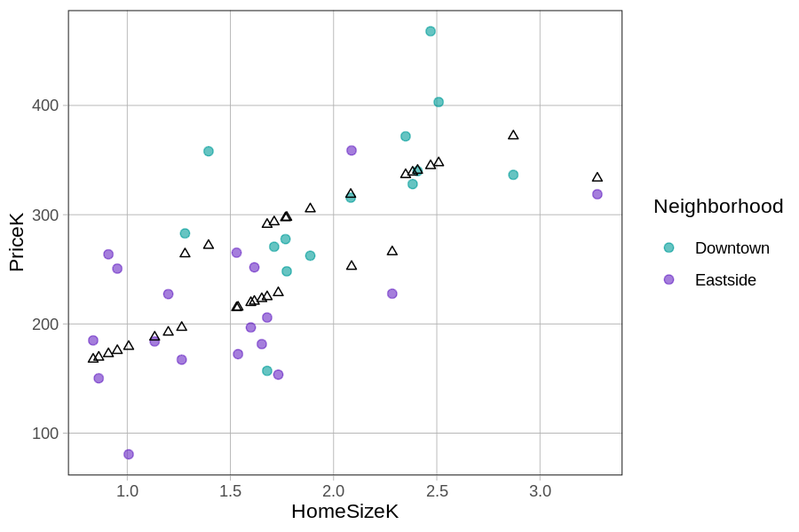
If you connect the black triangles, it sort of looks like two parallel lines. This pattern is even more clear when we use gf_model() to overlay the model predictions.
gf_point(PriceK~ HomeSizeK, color = ~factor(Neighborhood), data = Smallville) %>%
gf_model(multi_model)
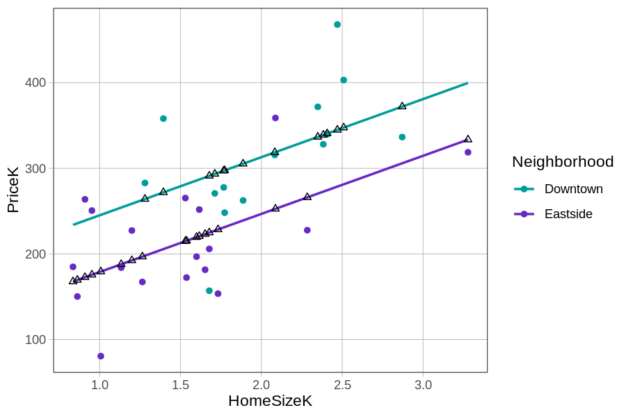
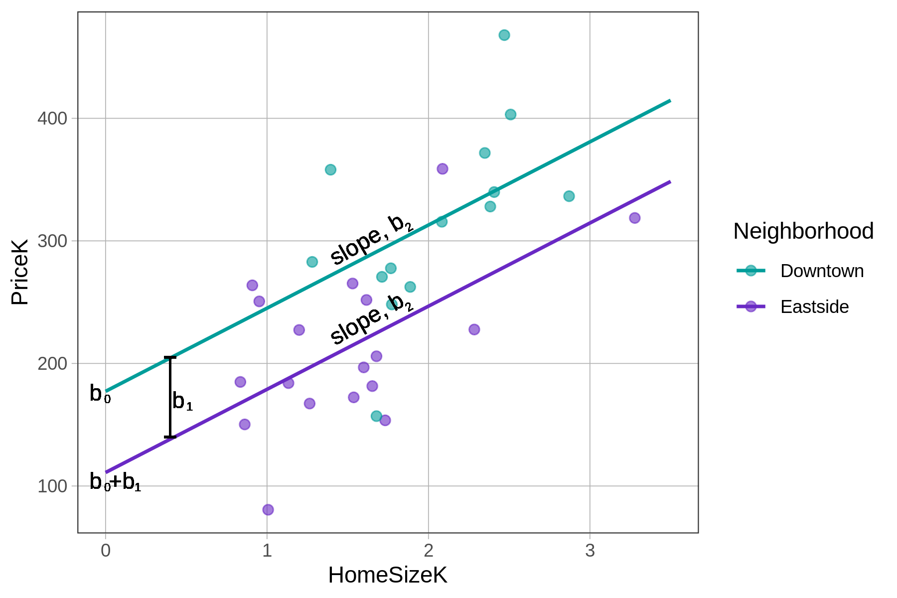
The predictions from this particular multivariate model, with one categorical and one continuous explanatory variable, can be visualized as two parallel lines, one for Downtown homes and one for Eastside homes. Interestingly, the GLM equation has actually had two parallel lines in it all along! Let us show you what we mean.
If we start with the fitted multivariate model (\(PriceK_i = 177.25 + -66.22NeighborhoodEastside_{i} + 67.85HomeSizeK_{i}\)), we can rewrite it as two separate linear equations: one for homes in Downtown, the other for homes in Eastside.
For homes in Downtown, the model can be re-written like this:
\[PriceK_i = 177.25 + \colorbox{yellow}{-66.22(0)} + 67.85HomeSizeK_{i}\]
Because \(NeighborhoodEastside_{i}=0\) for homes in Downtown, the second term drops out, which results in this equation for predicting the home prices in Downtown:
\[PriceK_i = 177.25 + 67.85HomeSizeK_{i}\]
For homes in Eastside, the second term does not drop out because in Eastside, \(NeighborhoodEastside_{1i}=1\):
\[PriceK_i = 177.25 + \colorbox{yellow}{-66.22(1)} + 67.85HomeSizeK_{i}\]
Combining the first two terms (i.e., \(177.25 + -66.22\)) yields this equation for Eastside homes:
\[PriceK_i = 111.03 + 67.85HomeSizeK_{i}\]
Both of these equations – one for Downtown and the other for Eastside – represent straight lines. Both have a slope and an intercept.
These two lines have the same slopes (which is why they appear parallel) but different y-intercepts (177 versus 111). The part of the multivariate equation bracketed below is the part that defines two different y-intercepts.
\[PriceK_i = \underbrace{b_0 + b_1NeighborhoodEastside_i}_{\mbox{y-intercept}} + b_2HomeSizeK_{i} + e_i\]
Even though this multivariate model just looks like one long equation, it contains within it two separate regression equations with the same slope, one for each neighborhood.
Summary
To summarize, there are two equivalent ways we can interpret the parameter estimates \(b_0\), \(b_1\), and \(b_2\). One set of interpretations focuses on the way the model’s predictions of home prices change based on the variables:
- \(b_0\) is the predicted price for a Downtown home with 0 square feet of home size.
- \(b_1\) is what we add to the predicted price for an Eastside home.
- \(b_2\) is what we add to the predicted price for each additional unit of home size (each 1000 square feet).
Another set of interpretations focuses on what these numbers mean in relation to the lines depicting the multivariate model:
- \(b_0\) is y-intercept for the Downtown line
- \(b_1\) is the distance between the two lines, which is constant across the different values of home size
- \(b_2\) is the slope of the lines