4.5 Even More Ways: Putting These Plots Together
gf_point() and gf_jitter() are useful. They emphasize that data are made up of individual numbers, and yet they help us to notice clusters of those individual points. There are times, however, when we want to transcend the individual data points and focus only on where the clusters are.
Boxplots, which we have seen before, are helpful in this regard, and are especially useful for comparing the distribution of an outcome variable across different levels of a categorical explanatory variable.
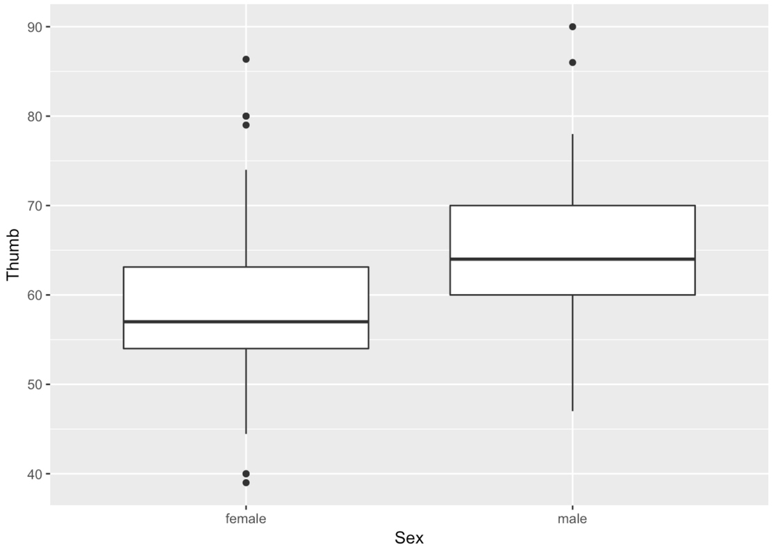
Here’s how we would create a boxplot of Thumb length broken down by Sex.
gf_boxplot(Thumb ~ Sex, data = Fingers)
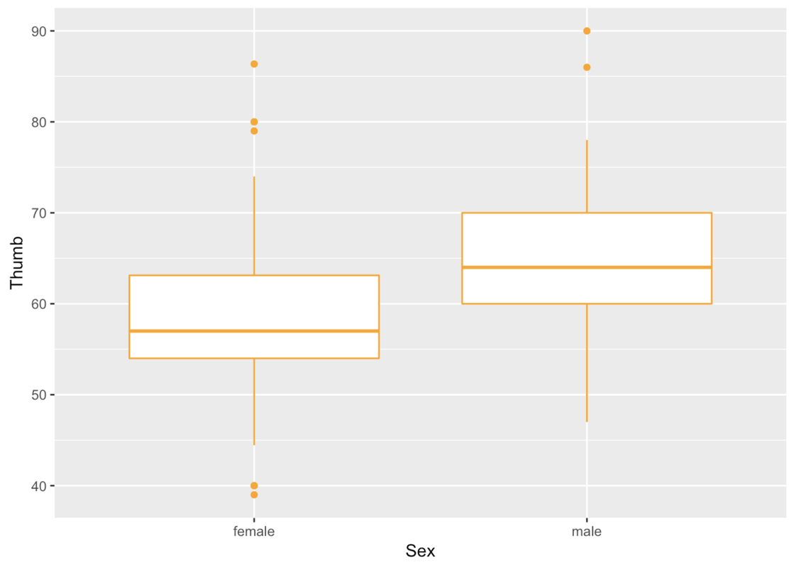
In making boxplots we can play with the arguments color and fill much like we did before.
gf_boxplot(Thumb ~ Sex, data = Fingers, color = "orange")
Recall that the rectangle at the center of the boxplot shows us where the middle 50% of the data points fall on the scale of the outcome variable. The thick line inside the box is the median.
Think back to the five-number summary. We can get the five-number summary for Thumb broken down by Sex by modifying how we previously used favstats().
favstats(Thumb ~ Sex, data = Fingers) Sex min Q1 median Q3 max mean sd n missing
1 female 39 54 57 63.125 86.36 58.25585 8.034694 112 0
2 male 47 60 64 70.000 90.00 64.70267 8.764933 45 0The big box with the thick line would contain half of the data points, the half that are closest to the middle of the distribution.
In ggformula, when we chain on multiple functions, the later functions assume the same variables and data frames so we don’t need to type those in again. Handy!
gf_boxplot(Thumb ~ Sex, data = Fingers, color = "orange") %>%
gf_jitter()
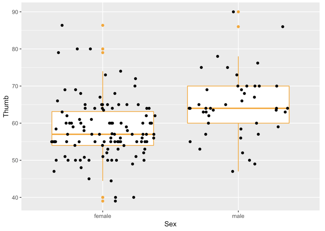
We can also add in any arguments to modify gf_jitter().
gf_boxplot(Thumb ~ Sex, data = Fingers, color = "orange") %>%
  gf_jitter(height = 0, color = "gray", alpha = .5, size = 3)
In this situation where we are looking at the variation in Thumb length by Sex, the boxes are in different vertical positions. The male box is higher than the female box.
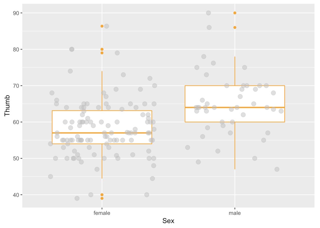
Instead of an explanatory variable like Sex, let’s try one that is unlikely to help us explain the variation in thumb length.
Modify this code to depict a boxplot for Thumb length by Job (instead of by Sex).
require(coursekata)
# Modify this boxplot to look at Thumb length by Job
gf_boxplot(Thumb ~ Sex, data = Fingers, color = ~Sex) %>%
    gf_jitter(height = 0, color = "gray", alpha = .5, size = 3)
gf_boxplot(Thumb ~ Job, data = Fingers) %>%
    gf_jitter(height = 0, color = "gray", alpha = .5, size = 3)
ex() %>% check_function(., "gf_boxplot") %>% {
        check_arg(., "data") %>% check_equal()
        check_arg(., "object") %>% check_equal()
    }
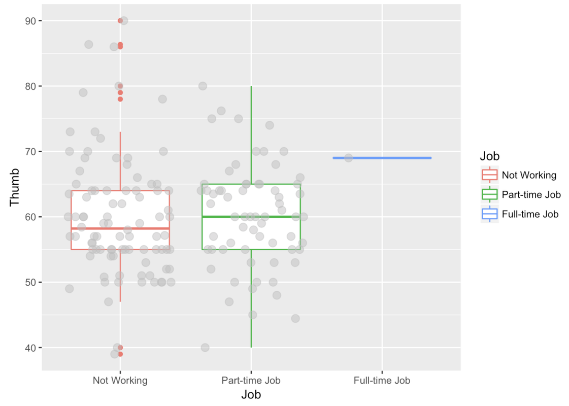
Notice that in this boxplot, the boxes are at approximately the same vertical position and are about the same size. The one exception is the box for the full-time level of Job.
The full-time box only includes one student, so, we wouldn’t want to draw any conclusions about the relationship between working full time and thumb length. Most of the students in the Fingers data frame either work part-time or not at all. The thumbs of students with no job are not much longer or shorter than thumbs of students with part-time jobs. But within each group, their thumb lengths vary a lot. There are long-thumbed and short-thumbed students with part-time jobs and with no jobs.
Now let’s return our attention to the whisker part (the lines) that go out from the box. The whiskers are drawn in relation to IQR, the interquartile range.
In gf_boxplot(), outliers, defined as observations more than 1.5 IQRs above or below the box, are represented with dots. The ends of the whiskers (the lines that extend above and below the box) represent the maximum and minimum observations that are not defined as outliers.
Any data that are greater or less than the whiskers are depicted in a boxplot as individual points. By convention, these can be considered outliers.