3.3 Shape, Center, Spread, and Weird Things
The very first thing you should always do when analyzing data is to examine the distributions of your variables. If you skip this step, and go directly to the application of more complex statistical procedures, you do so at your own peril. Histograms are a key tool for examining distributions of variables. We will learn some others, too. But first, let’s see what we can learn from histograms.
What do we look for when we explore distributions of a variable? In general, we look for four things: shape, center, spread, and weird things.
Weird Things
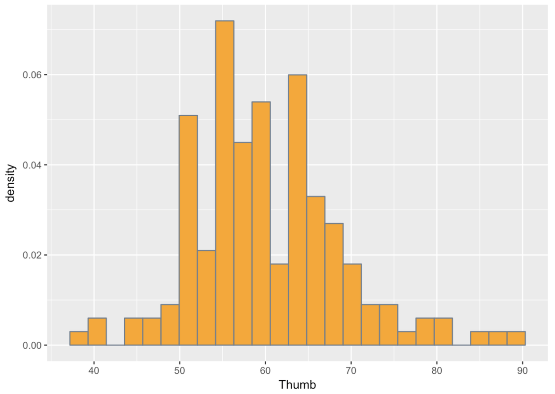
Let’s start with weird things. What do we mean by weird things? Let’s go back to the Fingers data frame, where we collected a sample of students’ thumb lengths (among other variables). This time, however, we are going to use an earlier version of the data frame, called FingersMessy.
Fingers is a cleaned up version of FingersMessy. If you look at the histogram below, of the variable Thumb in FingersMessy, you may start to get a sense of what might have needed to be cleaned up in the original data.
gf_dhistogram( ~ Thumb, data = FingersMessy, fill = "orange", color = "slategray", binwidth = 4)Whereas most of the students’ thumb lengths appear to be clustered around a point just below 60 millimeters, there is another small clump who seem to have much smaller thumbs—like one tenth the size! This doesn’t fit with what we know about the world. There aren’t two kinds of people, those with regular thumbs and those with super-short thumbs. Thumbs should be more continuously distributed, with most people having thumbs of average length, and then some a little longer and some a little shorter.
This is exactly what we mean when we say “look for weird things.” One possibility is that some of the students didn’t follow instructions, and measured their thumbs in centimeters (or maybe even inches) instead of millimeters. Given what we know about students, this seems like a reasonable theory; they don’t always listen to instructions.
The point here, though, is this: if we hadn’t looked at the distribution, we would not have noticed this oddity and might have drawn some erroneous conclusions.
Shape, Center, and Spread
Once we find something weird we must deal with it. In this case, we decided to filter in only the data from students with thumb lengths of at least 20 mm. We saved this filtered data frame under a new name, Fingers, which is the data frame you have come to love. We’ll go back to using that one.
Apart from weird things, the other features of distributions we want to explore are shape, center, and spread. Each of these characteristics tells us something about the variable we are looking at. Let’s go back to the Fingers data frame, no longer containing weirdness, and make a histogram of the variable Thumb.
Go ahead and make a density histogram of Thumb in the DataCamp window below.
require(coursekata)
# Make a density histogram of Thumb in the Fingers data frame
# Don't use any custom coloring
gf_dhistogram(~Thumb, data = Fingers)
ex() %>% check_function("gf_dhistogram") %>% check_result() %>% check_equal()
Take a look at the histogram of Thumb. To examine shape, you might try squinting your eyes and looking at the histogram as a solid, smooth object rather than a bunch of skinny bars. This can help give us a sense of the overall shape of the distribution.
R can help you see the shape by overlaying a smooth shape over your histogram, which is called a smooth density plot. We can just chain on the function gf_density() to our histogram, as in the code below.
gf_dhistogram( ~ Thumb, data = Fingers, fill = "orange", color = "slategray") %>%
  gf_density()
You can run this in your sandbox if you want. Or, you can just look at what we got when we ran the code. Note that when we add gf_density() to the plot using the %>% notation, we don’t need to fill in the arguments in the (). R just uses the same ones from the previous command.
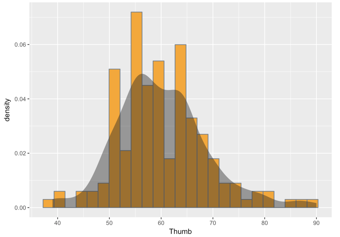
Statisticians describe the shapes of distributions using a few key features. Distributions can be symmetrical, or they can be skewed. If they are skewed, it can be to the left (the skinny longer tail is on the left) or to the right (the skinny longer tail is on the right). The distribution above has a slight skew to the right.
Distributions also could be uniform (meaning the number of observations is evenly distributed across the possible scores); they could be unimodal (meaning that most scores are clustered together around one part of the measurement scale); or they could be bimodal (having two clear clumps of scores around two parts of the measurement scale, with few in the middle).
Distributions that have a bell-shape (unimodal, symmetrical, scores mostly clumped in the center, few scores far away from center) are often called normal distributions. This is a common shape.
Usually, distributions are kind of lumpy and jagged, so many of these features should be thought of with the word “roughly” in front of them. So even if a distribution doesn’t have exactly the same number of observations across all possible scores—but has roughly the same number—we could still call that distribution uniform. If you look at the density plot above, you might see two lumps near the center (near the peak). Some people might think this is a bimodal distribution. But statisticians would consider it roughly unimodal and roughly normal because the lumps are quite small and close together.
If a distribution is unimodal, it is often quite useful to notice where the center of the distribution lies. If lots of observations are clustered around the middle, then the value of that middle could be a handy summary of the sample of scores, letting you make statements such as, “Most thumbs in our sample are around 60 mm long.”
Which brings us to spread. Spread refers to how spread out (or wide) the distribution is. It also could be thought of as a way to characterize how much variability there is in the sample on a particular variable. Saying most of our sample is around 60 mm means one thing if the range is from 50 to 70, and quite another if the range is from 2 to 200.