Course Outline
-
segmentGetting Started (Don't Skip This Part)
-
segmentStatistics and Data Science: A Modeling Approach
-
segmentPART I: EXPLORING VARIATION
-
segmentChapter 1 - Welcome to Statistics: A Modeling Approach
-
segmentChapter 2 - Understanding Data
-
segmentChapter 3 - Examining Distributions
-
3.8 Outliers on a Boxplot
-
segmentChapter 4 - Explaining Variation
-
segmentPART II: MODELING VARIATION
-
segmentChapter 5 - A Simple Model
-
segmentChapter 6 - Quantifying Error
-
segmentChapter 7 - Adding an Explanatory Variable to the Model
-
segmentChapter 8 - Digging Deeper into Group Models
-
segmentChapter 9 - Models with a Quantitative Explanatory Variable
-
segmentPART III: EVALUATING MODELS
-
segmentChapter 10 - The Logic of Inference
-
segmentChapter 11 - Model Comparison with F
-
segmentChapter 12 - Parameter Estimation and Confidence Intervals
-
segmentChapter 13 - What You Have Learned
-
segmentFinishing Up (Don't Skip This Part!)
-
segmentResources
list High School / Advanced Statistics and Data Science I (ABC)
3.8 Outliers on a Boxplot
A Boxplot from HappyPlanetIndex
We’ve been making boxplots of variables in the MindsetMatters data frame. Modify the code in the window below to create a boxplot for Population from the HappyPlanetIndex data frame.
require(coursekata)

HappyPlanetIndex$Region <- recode(
    HappyPlanetIndex$Region,
    '1'="Latin America",
    '2'="Western Nations",
    '3'="Middle East and North Africa",
    '4'="Sub-Saharan Africa",
    '5'="South Asia",
    '6'="East Asia",
    '7'="Former Communist Countries"
)
# Modify this code to create a boxplot of Population from HappyPlanetIndex
gf_boxplot(~ Age, data = MindsetMatters)
# Modify this code to create a boxplot of Population from HappyPlanetIndex
gf_boxplot(~ Population, data = HappyPlanetIndex)
ex() %>% check_function("gf_boxplot") %>% {
  check_arg(., "object") %>% check_equal()
  check_arg(., "data") %>% check_equal()
}
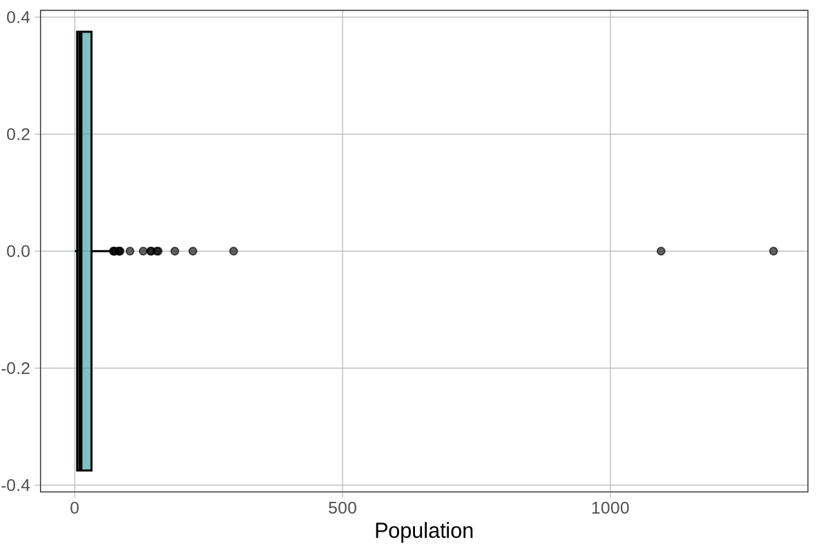
Wow, this is a strange-looking boxplot. You can hardly see the box — it’s squished over on the left. And there are all these points (dots) to the right of the whisker.
Outliers on a Boxplot
The points that appear beyond a whisker on a boxplot are the outliers. If they appear to the right of the right whisker, it means that R has checked and found these values to be greater than the \(\text{Q3} + 1.5*\text{IQR}\). If they appear to the left of the left whisker, it means that R has found these values to be smaller than the \(\text{Q1} - 1.5*\text{IQR}\). When there are outliers, the end of the whisker depicts the max or min value that is not considered an outlier.
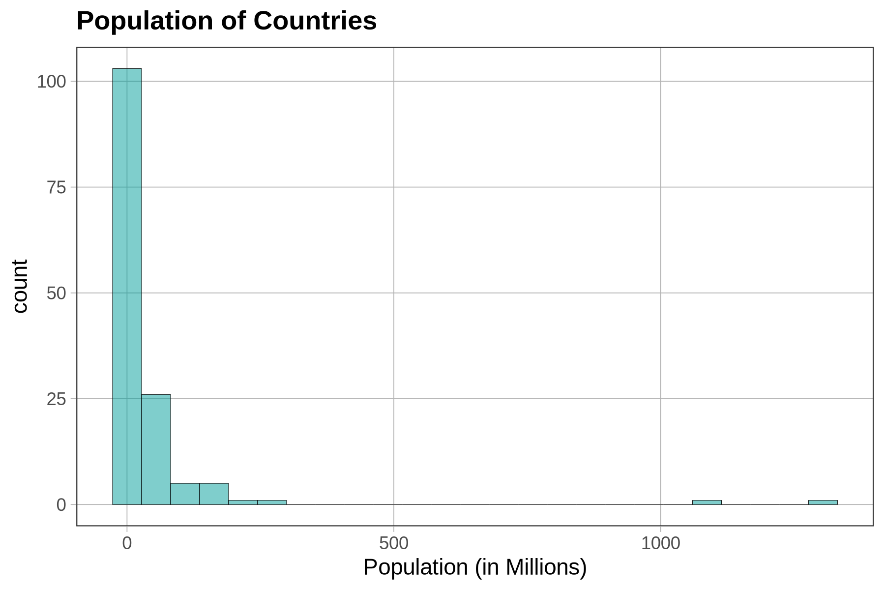
There are a lot of large outlier countries. No wonder the histogram of Population (see below) put so many countries into the same bin! By having to put the outlier countries on the same scale, the rest of the countries get squished together on the lower end of the population scale. This makes it look as though most countries have populations of 0 million people.
Excluding Outliers to See the Rest of the Distribution More Clearly
In a distribution like this, we might want to exclude the outliers from the histogram in order to get a clearer look at the distribution of most countries’ populations, without having them squished together because of the largest countries. To do this we first need to find the point on the population scale above which we would consider a country an outlier.
In the following code window, use filter() to save a new version of the data frame that includes only countries from the HappyPlanetIndex data frame with populations smaller than this upper boundary. Name this new version of the data frame SmallerCountries. Then run the code to produce a histogram of Population that only includes the smaller countries.
require(coursekata)

HappyPlanetIndex$Region <- recode(
    HappyPlanetIndex$Region,
    '1'="Latin America",
    '2'="Western Nations",
    '3'="Middle East and North Africa",
    '4'="Sub-Saharan Africa",
    '5'="South Asia",
    '6'="East Asia",
    '7'="Former Communist Countries"
)
# this calculates the Q3 + 1.5*IQR
upper_boundary <- 31.225 + 1.5*(31.225-4.455)

# use the filter function to create a data frame that only includes
# countries with population sizes less than the upper_boundary
SmallerCountries <-

# this makes a histogram of the smaller countries' populations
gf_histogram(~ Population, data = SmallerCountries) %>%
gf_labs(x = "Population (in millions)", title = "Population of Countries (Excludes Outliers)")
# this calculates the Q3 + 1.5*IQR
upper_boundary <- 31.225 + 1.5*(31.225-4.455)

# use the filter function to create a data frame that only includes
# countries with population sizes less than the upper_boundary
SmallerCountries <- filter(HappyPlanetIndex, Population < upper_boundary)

# this makes a histogram of the smaller countries' populations
gf_histogram(~ Population, data = SmallerCountries) %>%
gf_labs(x = "Population (in millions)", title = "Population of Countries (Excludes Outliers)")
ex() %>% {
    check_function(., "filter") %>% {
        check_arg(., ".data") %>% check_equal(incorrect_msg="Don't forget to filter in HappyPlanetIndex")
        check_arg(., "...") %>% check_equal(incorrect_msg="Did you use `Population < upper_boundary` as the second argument?")
        check_result(.) %>% check_equal()
    }
    check_object(., "SmallerCountries") %>% check_equal
    check_function(., "gf_histogram") %>% {
        check_arg(., "object") %>% check_equal()
        check_arg(., "data") %>% check_equal()
    }
}
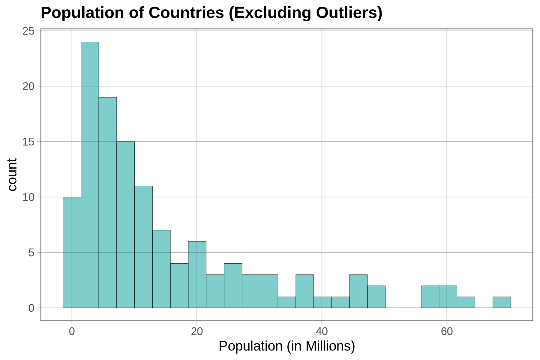
This is a very different histogram than the one that included outliers. Here we get a sense of how countries that previously got lumped together in one bin at the bottom of the distribution actually vary in their population size. Notice, too, that the scale on the x-axis has changed, from about 0 to 1500 (millions) to 0 to 70.
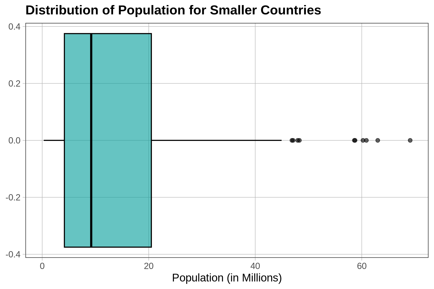
Now let’s re-make the boxplot of Population for just the countries in the SmallerCountries data frame to see what that looks like. Modify the code below to make the boxplot.
require(coursekata)

HappyPlanetIndex$Region <- recode(
    HappyPlanetIndex$Region,
    '1'="Latin America",
    '2'="Western Nations",
    '3'="Middle East and North Africa",
    '4'="Sub-Saharan Africa",
    '5'="South Asia",
    '6'="East Asia",
    '7'="Former Communist Countries"
)
pop_stats <- favstats(~ Population, data = HappyPlanetIndex)
SmallerCountries <- filter(HappyPlanetIndex, Population < (pop_stats$Q3 + 1.5*(pop_stats$Q3 - pop_stats$Q1)))
# Assume the data frame SmallerCountries has been made for you
# Modify this code to make a boxplot of Population for just the SmallerCountries
gf_boxplot(~ Population, data = HappyPlanetIndex)
# Assume the data frame SmallerCountries has been made for you
# Modify this code to make a boxplot of Population for just the SmallerCountries
gf_boxplot(~ Population, data = SmallerCountries)
ex() %>% check_function("gf_boxplot") %>% {
  check_arg(., "object") %>% check_equal()
  check_arg(., "data") %>% check_equal()
}
To check our intuitions about the relationship between histograms and boxplots, try chaining (with the pipe operator, %>%) the code for boxplot right onto our histogram of Population from SmallerCountries. Also feel free to change the fill or width arguments to make the boxplot more easily visible.
require(coursekata)

HappyPlanetIndex$Region <- recode(
    HappyPlanetIndex$Region,
    '1'="Latin America",
    '2'="Western Nations",
    '3'="Middle East and North Africa",
    '4'="Sub-Saharan Africa",
    '5'="South Asia",
    '6'="East Asia",
    '7'="Former Communist Countries"
)
pop_stats <- favstats(~ Population, data = HappyPlanetIndex)
SmallerCountries <- filter(HappyPlanetIndex, Population < (pop_stats$Q3 + 1.5*(pop_stats$Q3 - pop_stats$Q1)))
# Assume the data frame SmallerCountries has been made for you
# Modify this code to chain the boxplot onto our histogram
gf_histogram(~ Population, data = SmallerCountries)
# Assume the data frame SmallerCountries has been made for you
# Modify this code to chain the boxplot onto our histogram
gf_histogram(~ Population, data = SmallerCountries) %>%
  gf_boxplot()
ex() %>%
  check_function("gf_boxplot") %>%
  check_arg("object") %>%
  check_equal()
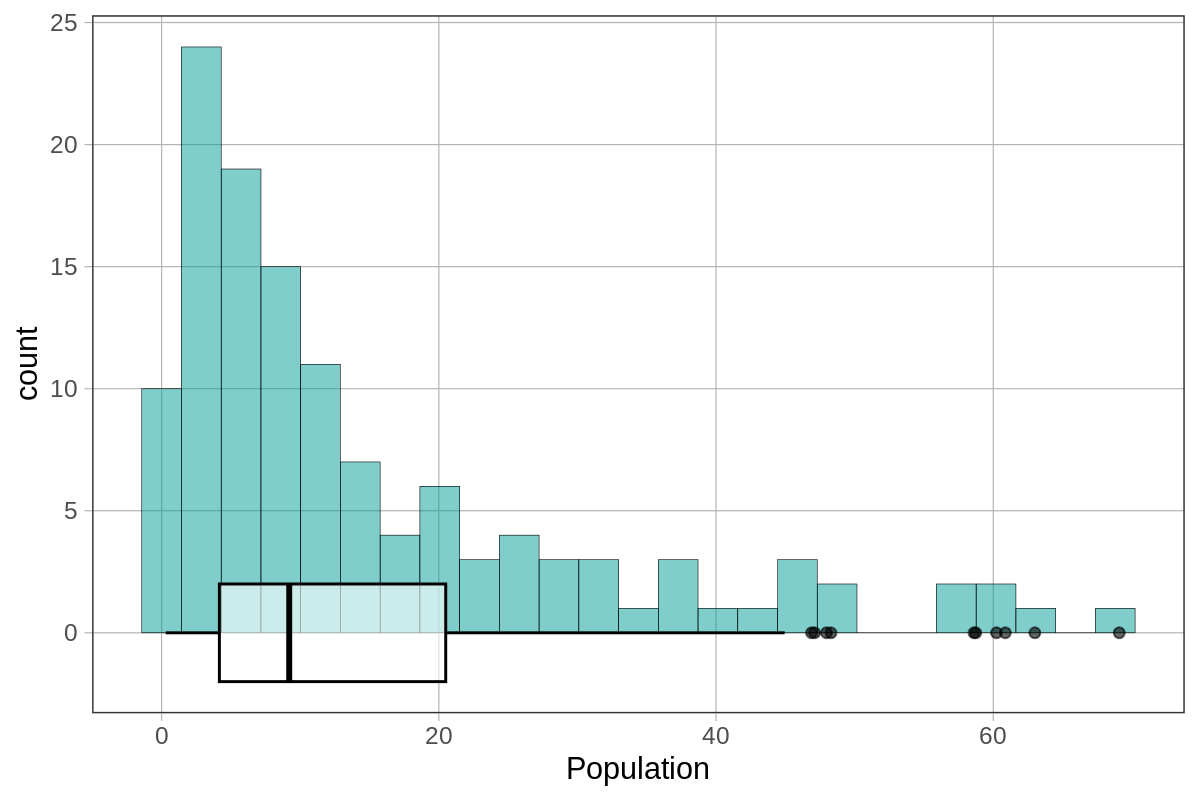
We set our fill to "white" and the width to 4 to get this visualization. The right-skewed distribution we see with a histogram is represented as a boxplot with a bigger right box and a longer whisker on the right. The outliers are represented as a “tail” in the histogram and as “dots” in the boxplot.