Course Outline
-
segmentGetting Started (Don't Skip This Part)
-
segmentStatistics and Data Science: A Modeling Approach
-
segmentPART I: EXPLORING VARIATION
-
segmentChapter 1 - Welcome to Statistics: A Modeling Approach
-
segmentChapter 2 - Understanding Data
-
segmentChapter 3 - Examining Distributions
-
3.7 Boxplots and the Five-Number Summary
-
segmentChapter 4 - Explaining Variation
-
segmentPART II: MODELING VARIATION
-
segmentChapter 5 - A Simple Model
-
segmentChapter 6 - Quantifying Error
-
segmentChapter 7 - Adding an Explanatory Variable to the Model
-
segmentChapter 8 - Digging Deeper into Group Models
-
segmentChapter 9 - Models with a Quantitative Explanatory Variable
-
segmentPART III: EVALUATING MODELS
-
segmentChapter 10 - The Logic of Inference
-
segmentChapter 11 - Model Comparison with F
-
segmentChapter 12 - Parameter Estimation and Confidence Intervals
-
segmentChapter 13 - What You Have Learned
-
segmentFinishing Up (Don't Skip This Part!)
-
segmentResources
list High School / Advanced Statistics and Data Science I (ABC)
3.7 Boxplots and the Five-Number Summary
The five-number summary gives us a snapshot of the distribution of a quantitative variable. Boxplots (also called box-and-whisker plots) give us a way to visualize the five-number summary. For example, here is a boxplot that depicts the distribution of Wt from the MindsetMatters data set. Let’s see how it relates to the five-number summary.
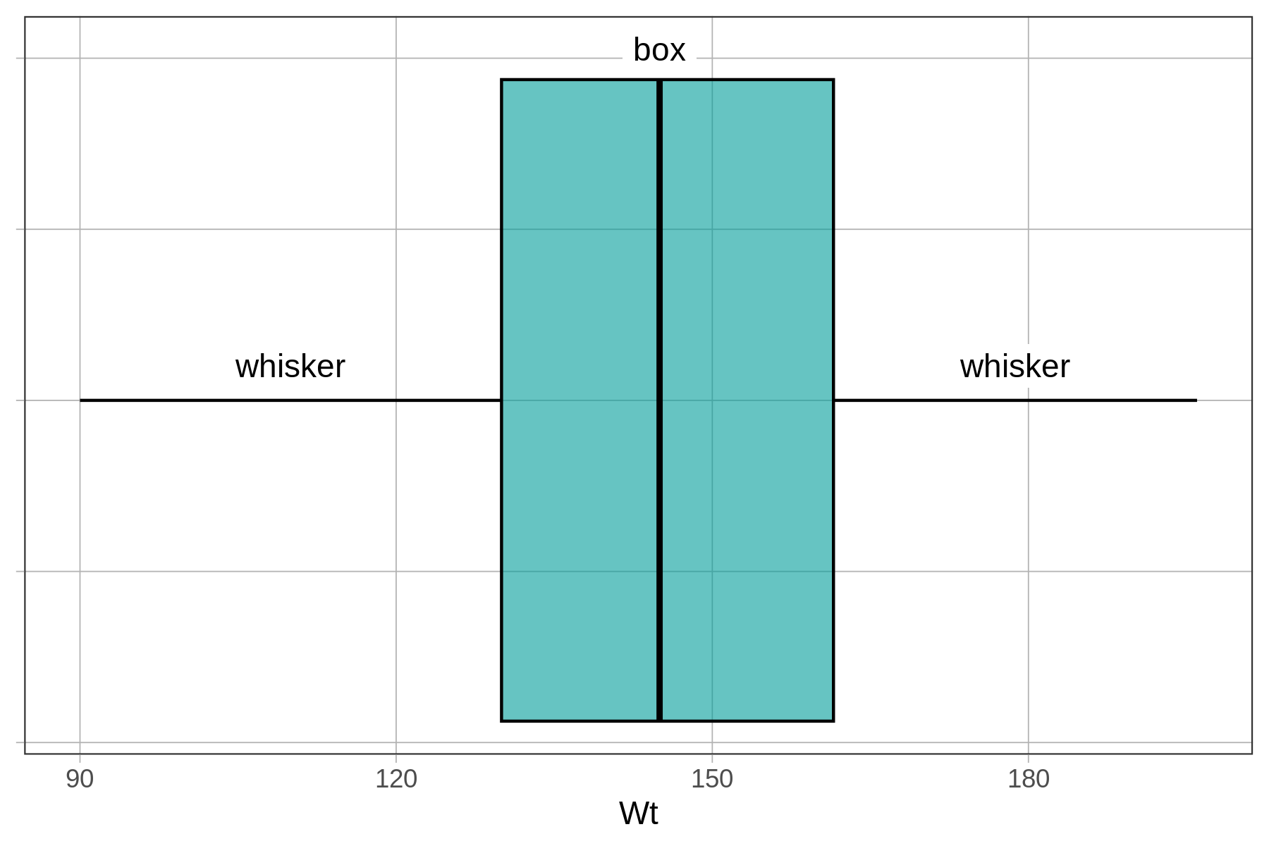
The boxplot above is a horizontal boxplot. (Later we’ll show you how to make a vertical boxplot.) The x-axis, running horizontally, shows the scale on which Wt is measured (roughly from 90 to 200 lbs). The y-axis doesn’t mean anything on this graph, which is why we removed the label from it for now.
Below, we have labeled the same boxplot of Wt to show how it visualizes the min, Q1, median, Q3, and max. We can then “read” the five-number summary off of the boxplot.
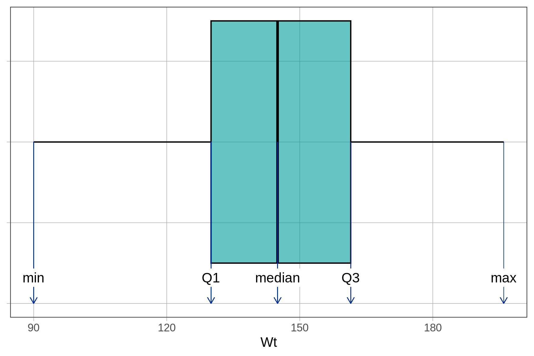
If we print out the favstats() of Wt, we will see that our estimates correspond to the values of min, Q1, median, Q3, and max.
favstats(~ Wt, data = MindsetMatters) min Q1 median Q3 max mean sd n missing
90 130 145 161.5 196 146.1333 22.46459 75 0In the distribution of Wt there are no outliers (defined as more than 1.5 IQRs above Q3 or below Q1); the whiskers simply end at the max and min values for Wt. When there are outliers, they are represented as dots off to the left or right of the whiskers.
Make Your Own Boxplot
Look at the code in the window below and you will see how we created the boxplot above. Go ahead and click <Run> to check that it works. Notice that putting the ~ before Wt is what makes this a horizontal boxplot with the variable Wt on the x-axis.
Now modify the code to create a boxplot for Age from the MindsetMatters data frame.
require(coursekata)
# Modify this code to create a boxplot of Age from MindsetMatters
gf_boxplot(~ Wt, data = MindsetMatters)
# Modify this code to create a boxplot of Age from MindsetMatters
gf_boxplot(~ Age, data = MindsetMatters)
ex() %>% check_function("gf_boxplot") %>% {
  check_arg(., "object") %>% check_equal()
  check_arg(., "data") %>% check_equal()
}

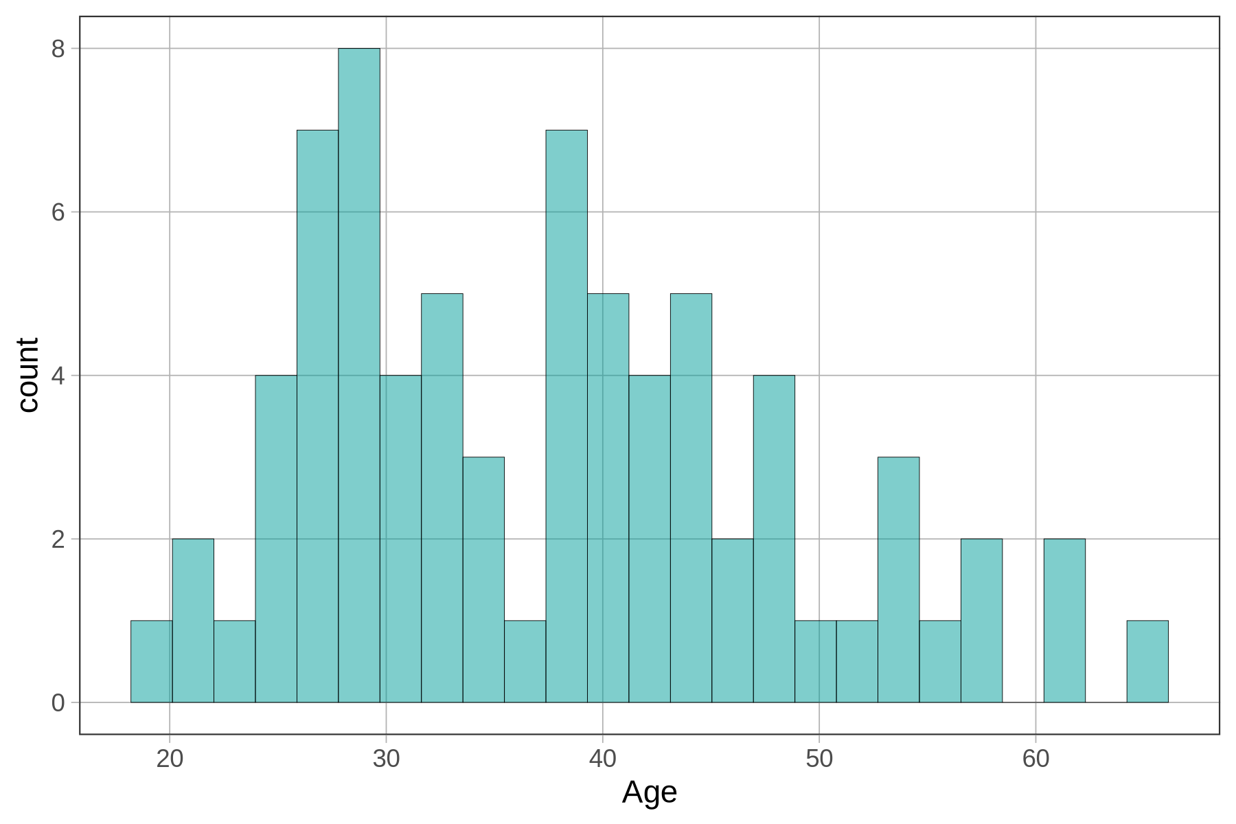
Notice how the structure of the gf_boxplot() function is just like that for gf_histogram(). Try altering the code above to make a histogram instead of a boxplot. Look at the boxplot compared with the histogram. Can you see how the same distribution gets represented by these two types of plots?
How to Overlay a Boxplot on a Histogram (change to MindsetMatters)
It’s easier to compare boxplots and histograms if you overlay one on the other. You can overlay a boxplot on a histogram of the same variable using %>%. Notice that we don’t need to include any arguments in parentheses for the gf_boxplot() function as the arguments for the gf_histogram() function are carried over. R usually makes this assumption when chaining one function onto another.
gf_histogram(~ Age, data = MindsetMatters) %>%
  gf_boxplot()
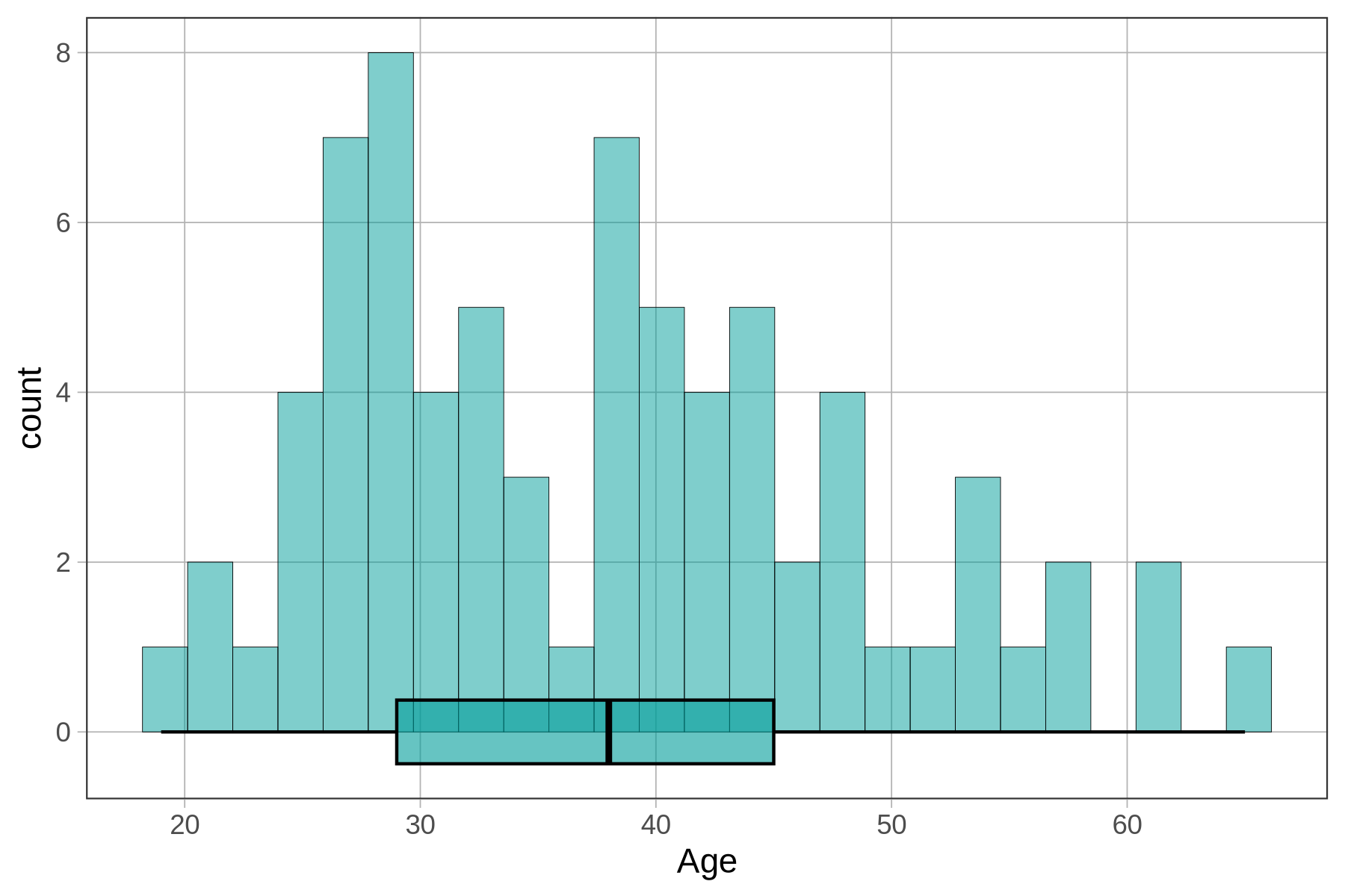
The default boxplot is a little hard to see on top of the histogram. We can get a better effect by adding arguments such as fill and width to adjust features of the plot.
gf_histogram(~ Age, data = MindsetMatters) %>%
  gf_boxplot(fill = "purple", width = 1)
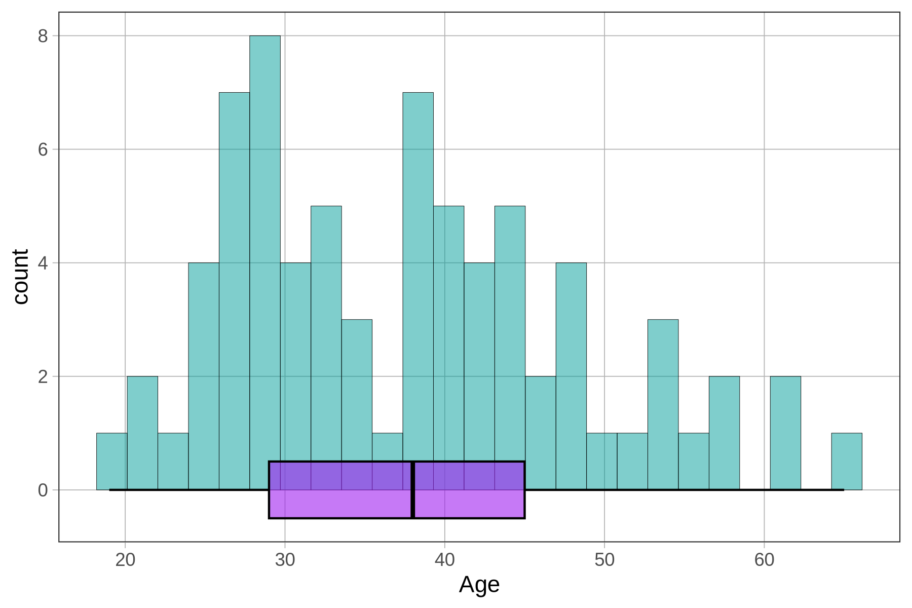
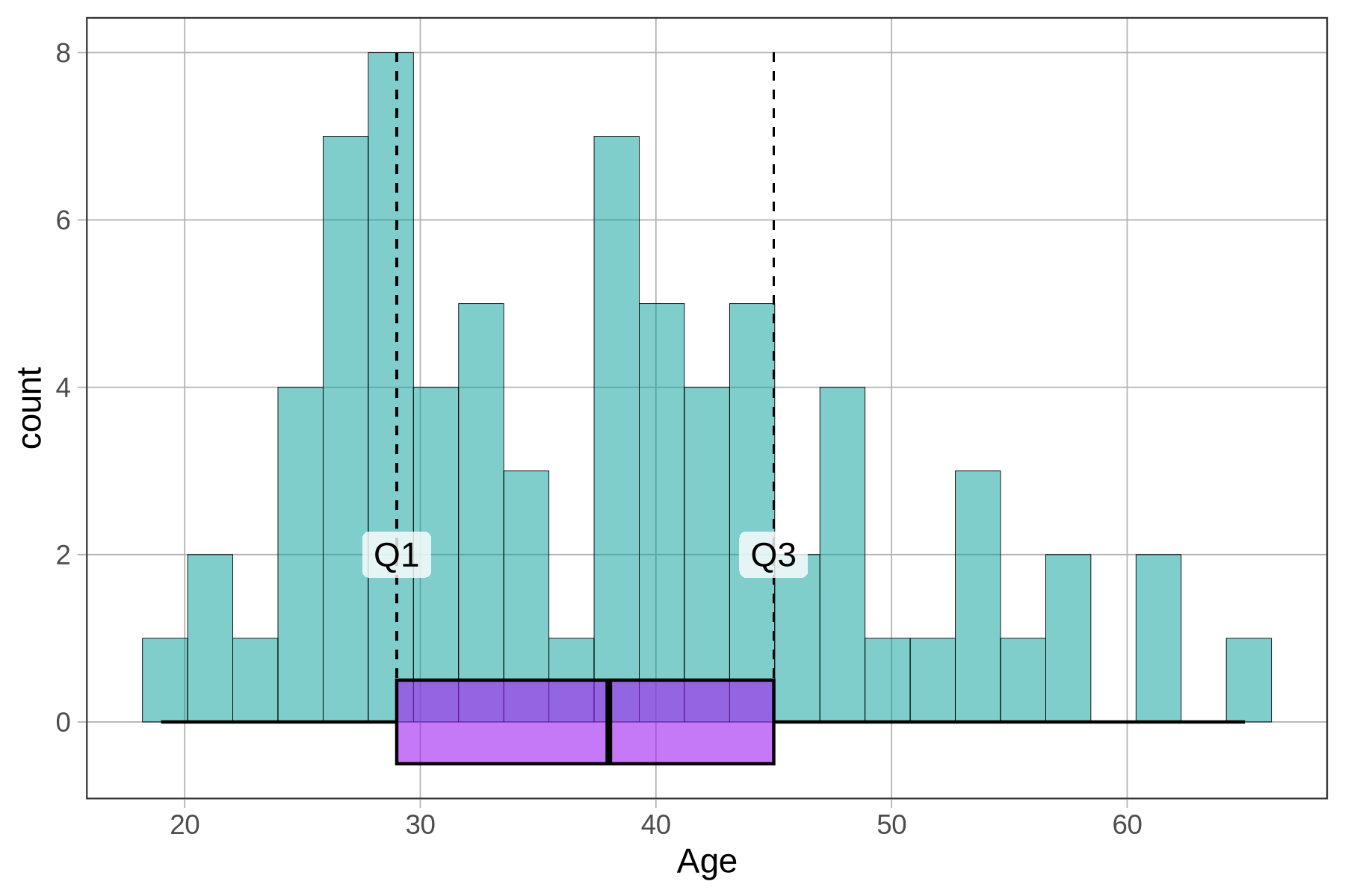
Take another look at the histogram with boxplot below. This time we have put dashed lines at Q1 and Q3 (the hinges of the box).
You can tweak how the boxplot looks in a number of ways. Run the code block below, then try changing some of the arguments. Explore what happens if you change the width argument from 1 to a different number. Predict what would happen if you change the number in front of the ~ Age in gf_boxplot(). In the code below we set it to 6. What do you think would happen if you set it to a negative number?
require(coursekata)
# run this code to see what happens
# then try modifying the 6, 1 and "purple" (one at a time)
# what do you think will happen?
gf_histogram(~ Age, data = MindsetMatters) %>%
  gf_boxplot(6 ~ Age, width = 1, fill = "purple") %>%
  gf_labs(y="count", x = "Age (in Years)")
# Assume the data frame SmallerCountries has been made for you
# try modifying the 10, 3 and "purple" (one at a time)
# what do you think will happen?
gf_histogram(~ Age, data = MindsetMatters) %>%
  gf_boxplot(-1.5 ~ Age, width = 2, fill = "orange") %>%
  gf_labs(x = "Age (in Years)")
ex() %>% check_function("gf_boxplot")