Course Outline
-
segmentGetting Started (Don't Skip This Part)
-
segmentStatistics and Data Science: A Modeling Approach
-
segmentPART I: EXPLORING VARIATION
-
segmentChapter 1 - Welcome to Statistics: A Modeling Approach
-
segmentChapter 2 - Understanding Data
-
segmentChapter 3 - Examining Distributions
-
3.3 Visualizing Data With Histograms
-
segmentChapter 4 - Explaining Variation
-
segmentPART II: MODELING VARIATION
-
segmentChapter 5 - A Simple Model
-
segmentChapter 6 - Quantifying Error
-
segmentChapter 7 - Adding an Explanatory Variable to the Model
-
segmentChapter 8 - Digging Deeper into Group Models
-
segmentChapter 9 - Models with a Quantitative Explanatory Variable
-
segmentPART III: EVALUATING MODELS
-
segmentChapter 10 - The Logic of Inference
-
segmentChapter 11 - Model Comparison with F
-
segmentChapter 12 - Parameter Estimation and Confidence Intervals
-
segmentChapter 13 - What You Have Learned
-
segmentFinishing Up (Don't Skip This Part!)
-
segmentResources
list High School / Advanced Statistics and Data Science I (ABC)
3.3 Visualizing Data With Histograms
Even though a tiny variable like outcome can help you grasp the basic concept of a histogram, it doesn’t fully demonstrate the usefulness of histograms. Histograms are most valuable when we are trying to understand distributions in real datasets with numerous values. Let’s examine some histograms of actual data to see their effectiveness.
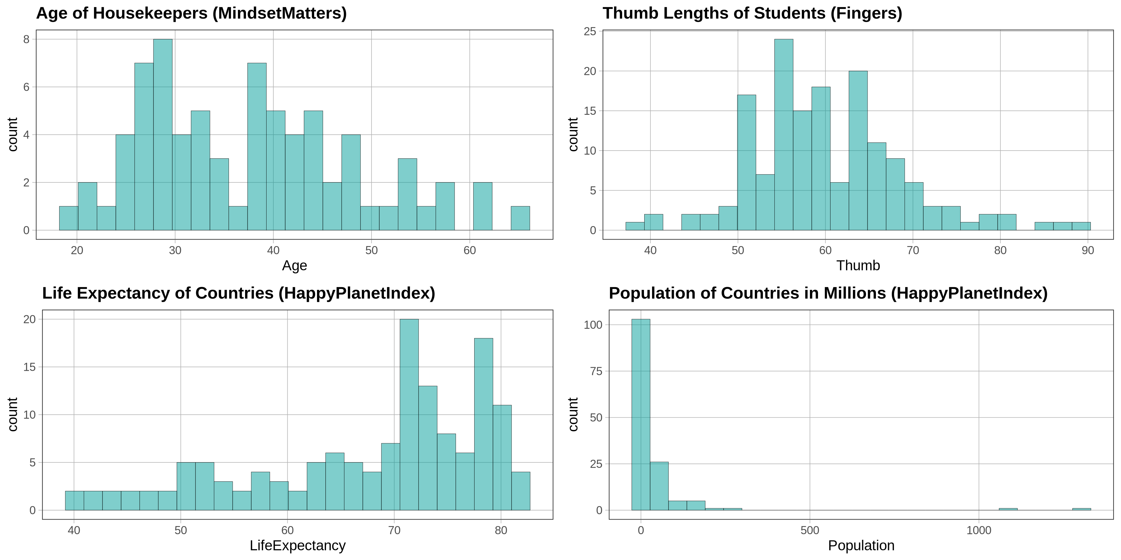
The x-axis of a histogram represents the range of possible values of these different outcome variables. In the examples above we see (clockwise from upper left): the ages of a sample of housekeepers measured in years; the thumb lengths of a sample of students measured in millimeters; the life expectancies of the citizens of countries measured in years; and the populations of countries measured in millions.
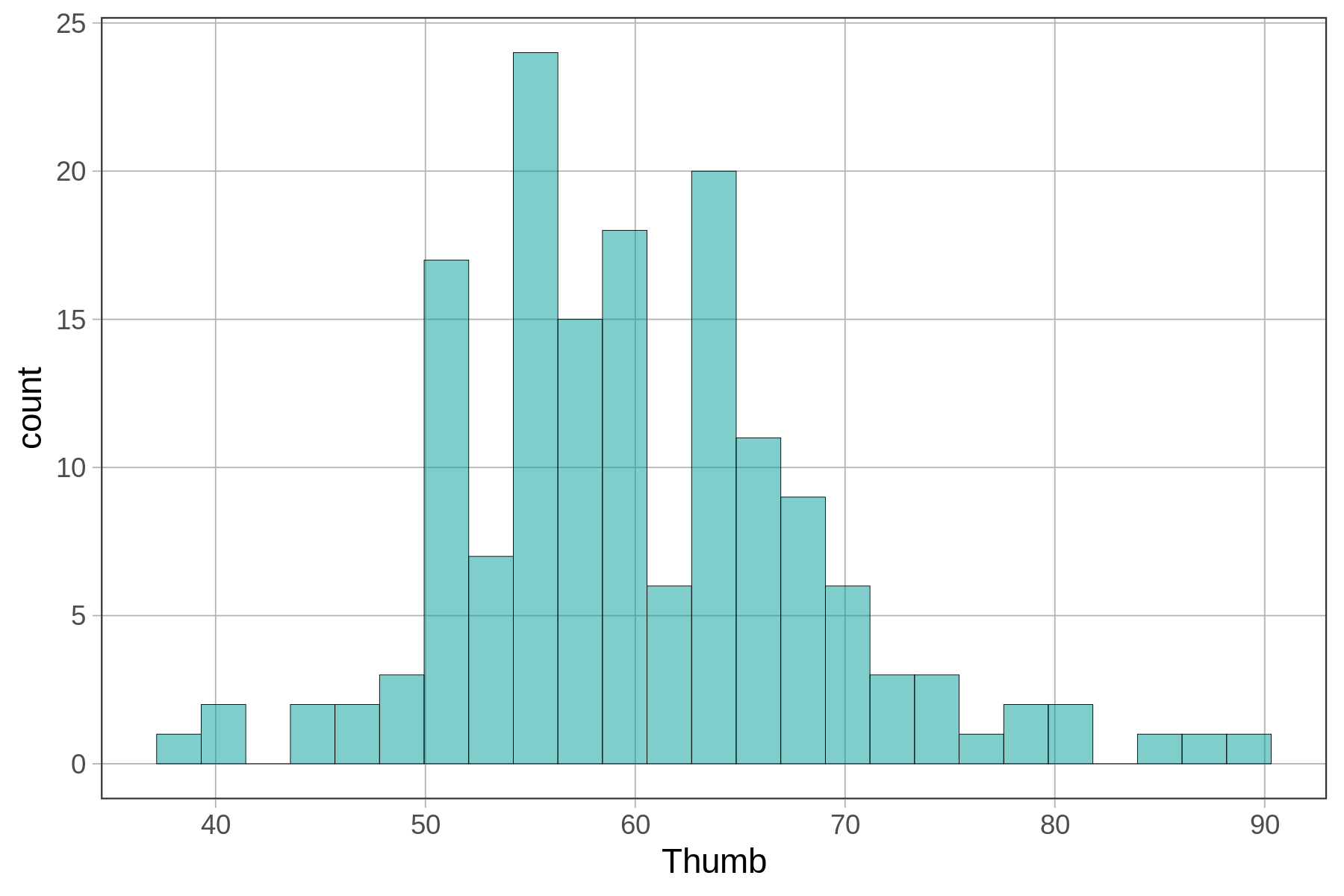
All of these variables are embedded in data frames. Here is how to use gf_histogram() to make a basic histogram of Thumb length from the Fingers data frame.
gf_histogram(~ Thumb, data = Fingers)Because the outcome variable is now housed in a data frame, we have to specify both the variable (Thumb) and the data frame (Fingers) in order for R to find the outcome variable. With vectors, we just needed to provide the name of the vector (e.g., outcome).
Try editing the code below to make a histogram of Thumb.
require(coursekata)
# edit this line of code
gf_histogram()
# edit this line of code
gf_histogram(~Thumb, data = Fingers)
ex() %>%
  check_function("gf_histogram") %>% {
    check_arg(., "object", arg_not_specified_msg = "Make sure to specify ~Thumb") %>% check_equal()
    check_arg(., "data", arg_not_specified_msg = "Make sure to specify data") %>% check_equal()
  }
Notice that the outcome variable Thumb is placed after the ~ (tilde). R functions typically follow the format y ~ x; whatever you put before the ~ will be plotted on the y-axis and whatever you put after the ~ will be plotted on the x-axis. A histogram is a special case where the y-axis is just a count related to the variable on the x-axis, not a different variable.
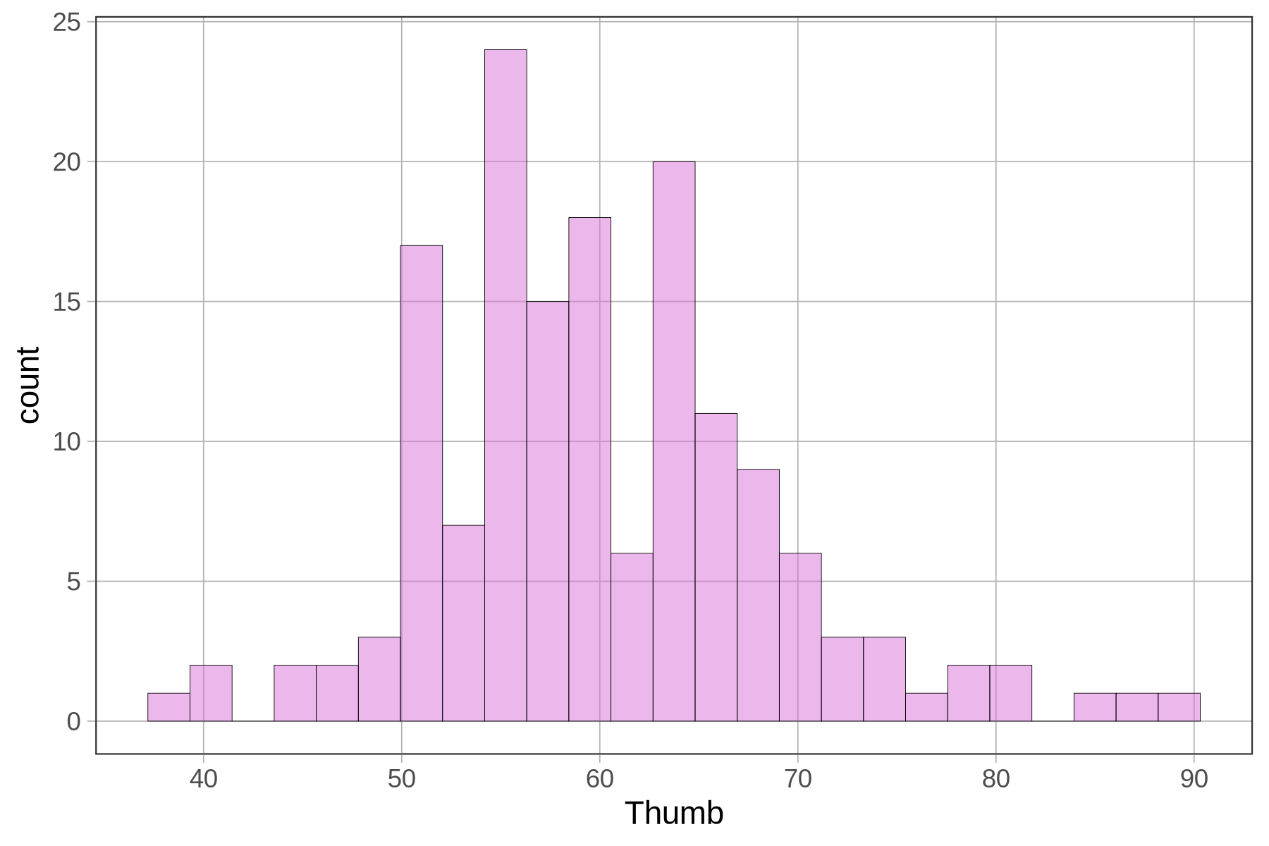
Even though it may not always matter, it is fun to change the colors of your histogram. This is pretty easy to do. We can change the fill color of the bars by adding in the option fill and putting in the name of the color in quotation marks–e.g. “red”, “black”, “pink”, etc. Here you can download a list of R color terms (PDF, 214KB) that are available to you.
gf_histogram(~ Thumb, data = Fingers, fill = "orchid")
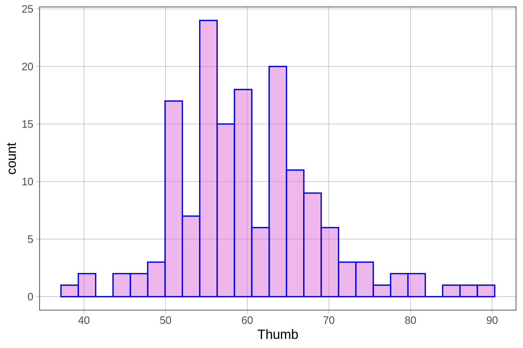
You can also change the color of the outlines around the bars using the option color. Note, in R these options (e.g., fill = or color =) are called arguments because they are added into the parentheses ( ) after the function. If you want to make the lines thicker you can add the argument linewidth and fill in a number. See what we made with the code below.
gf_histogram(~ Thumb, data = Fingers, fill = "orchid", color = "blue", linewidth=.5)
We can improve the histograms further by adding labels. For example, we can add a title. To do this we need to chain together multiple R functions: gf_histogram() and gf_labs() (which is the function that adds the labels). In R, we use the pipe operator %>% at the end of a line to chain on a second command. Here’s the code that would add a title to a histogram.
gf_histogram(~ Thumb, data = Fingers) %>%
  gf_labs(title = "Distribution of Student Thumb Lengths")
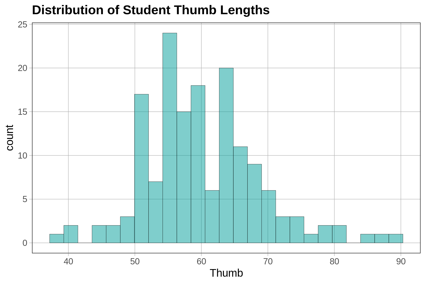
Sometimes you may want to change the labels for the axes as well. For example, we might want to label the x-axis “Thumb Length (mm)” instead of just “Thumb”. (If you don’t specify a label, R just puts in the variable name, which is Thumb.) Here’s the R code for changing the label on the x-axis.
gf_histogram(~ Thumb, data = Fingers) %>%
  gf_labs(title = "Distribution of Student Thumb Lengths", x = "Thumb Length (mm)")
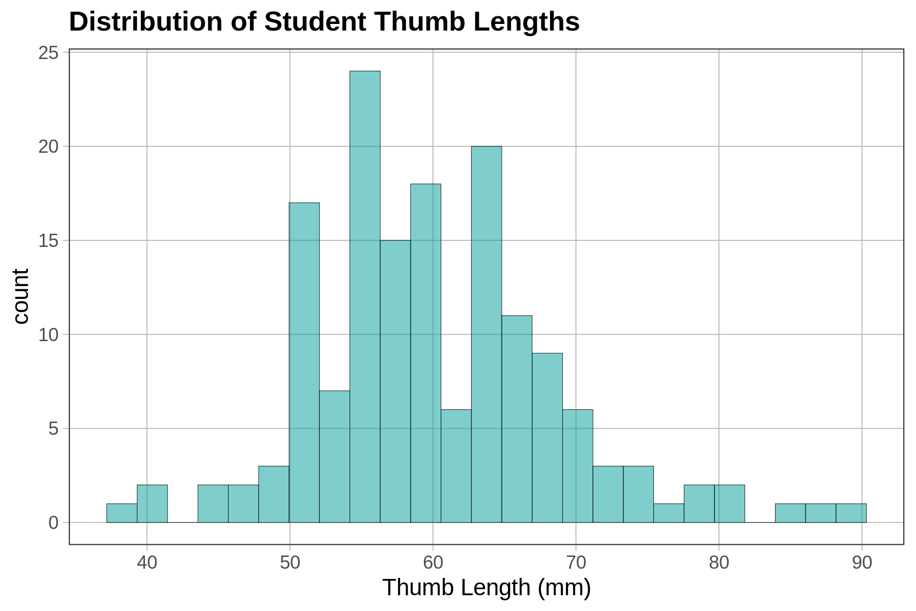
Now change the label for the y-axis (to whatever makes sense to you) by modifying the following code.
require(coursekata)
# Modify this code to play around with labeling the y-axis
gf_histogram(~ Thumb, data = Fingers) %>%
  gf_labs(x = "Thumb length (mm)", y = )
# Modify this code to play around with labeling the y-axis
gf_histogram(~ Thumb, data = Fingers) %>%
  gf_labs(x = "Thumb length (mm)", y = "Your Label")
ex() %>% {
    check_function(., "gf_labs") %>% check_arg("x") %>% check_equal(eval = FALSE)
    check_function(., "gf_labs") %>% check_arg("y")
    check_function(., "gf_histogram") %>% check_arg("object") %>% check_equal()
    check_function(., "gf_histogram") %>% check_arg("data") %>% check_equal()
}
Whenever you make histograms of data that interests you, feel free to play around with these different options regarding color, fill, or labels (and don’t forget bins or binwidth). Make R work for you.
Histograms and Density Plots
Relative frequency histograms show the proportion of cases, instead of count, on the y-axis. In the graphs below we show the distribution of our tiny outcome vector of 7 numbers (1, 2, 3, 3.2, 3.7, 4, 5) both using counts or frequencies (on the left) and proportions or relative frequencies (on the right).
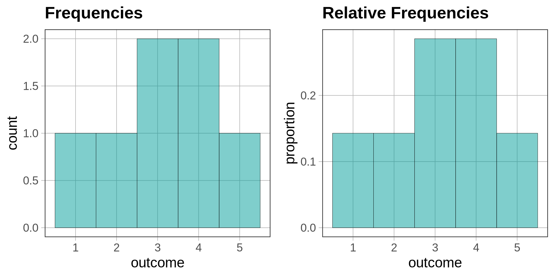
Relative frequency histograms are useful because they allow us to more easily compare distributions across samples of different sizes. If a sample of 10 people includes 5 vegetarians and 5 who are not, we could say that 0.5 of the sample are vegetarians. If we take a sample of 100 people and 50 are vegetarian, the proportion is still 0.5. Plotting proportion on the y-axis helps us see that the two distributions are similar.
When the outcome is a quantitative variable, as it is in the case of histograms, we use density instead of proportion to indicate relative frequency. Density is not exactly the same as proportion, but it’s close enough; it represents proportions visually with the area of the bars instead of just the height. It will still range from 0.0 to 1.0, and the interpretation is similar. (Note that density is exactly like proportion when the binwidth = 1 because density is proportion divided by binwidth.)
To create density histograms instead of frequency histograms, use a slightly modified function, gf_dhistogram() (the additional d stands for density). Run the code below to create a basic frequency histogram of Age variable from MindsetMatters. Then add the d to that line of code to produce a density histogram of the same variable (change the title and fill color to distinguish it).
require(coursekata)
# Modify this code to create a density histogram
# Change title and fill color to note that this is a density histogram
gf_histogram(~ Age, data = MindsetMatters, binwidth = 1, fill = "coral") %>%
  gf_labs(title = "Frequency Histogram of Age")
# Modify this code to create a density histogram
# Change title to note that this is a density histogram
gf_dhistogram(~ Age, data = MindsetMatters, binwidth = 1, fill = "orange") %>%
  gf_labs(title = "Density Histogram of Age")
ex() %>% check_function(., "gf_dhistogram") %>% {
    check_arg(., "object") %>% check_equal()
    check_arg(., "data") %>% check_equal()
}
Note that you may get a warning when you run these histograms. We got this:
Warning message: Removed 1 rows containing non-finite values (stat_bin)Don’t worry about it. It’s because there was a missing data point in this data frame.
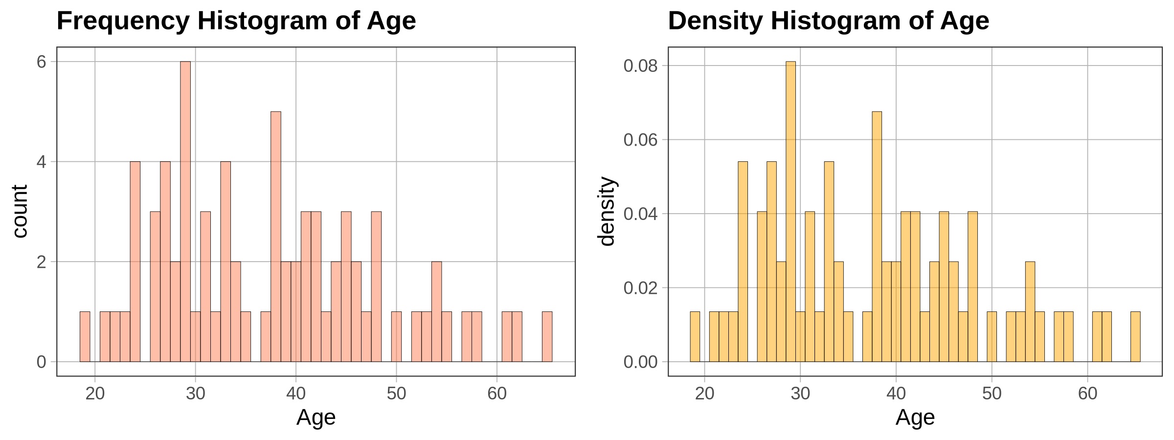
As you can see, the shapes of the two histograms look identical. This makes sense, because the same data points are being plotted with the same bins. The only thing different is the scale of measurement on the y-axis. On the left, it is frequency (or number of housekeepers); on the right, it is density (similar to proportion of housekeepers).
Right now, we are only looking at one distribution at a time so the density histogram looks basically the same as the frequency histogram. Later when we start to compare multiple groups, they may look different.