Course Outline
-
segmentGetting Started (Don't Skip This Part)
-
segmentStatistics and Data Science: A Modeling Approach
-
segmentPART I: EXPLORING VARIATION
-
segmentChapter 1 - Welcome to Statistics: A Modeling Approach
-
segmentChapter 2 - Understanding Data
-
segmentChapter 3 - Examining Distributions
-
segmentChapter 4 - Explaining Variation
-
segmentPART II: MODELING VARIATION
-
segmentChapter 5 - A Simple Model
-
segmentChapter 6 - Quantifying Error
-
segmentChapter 7 - Adding an Explanatory Variable to the Model
-
segmentChapter 8 - Digging Deeper into Group Models
-
segmentChapter 9 - Models with a Quantitative Explanatory Variable
-
segmentPART III: EVALUATING MODELS
-
segmentChapter 10 - The Logic of Inference
-
segmentChapter 11 - Model Comparison with F
-
11.6 The F-Distribution: A Mathematical Model of the Sampling Distribution of F
-
segmentChapter 12 - Parameter Estimation and Confidence Intervals
-
segmentChapter 13 - What You Have Learned
-
segmentFinishing Up (Don't Skip This Part!)
-
segmentResources
list High School / Advanced Statistics and Data Science I (ABC)
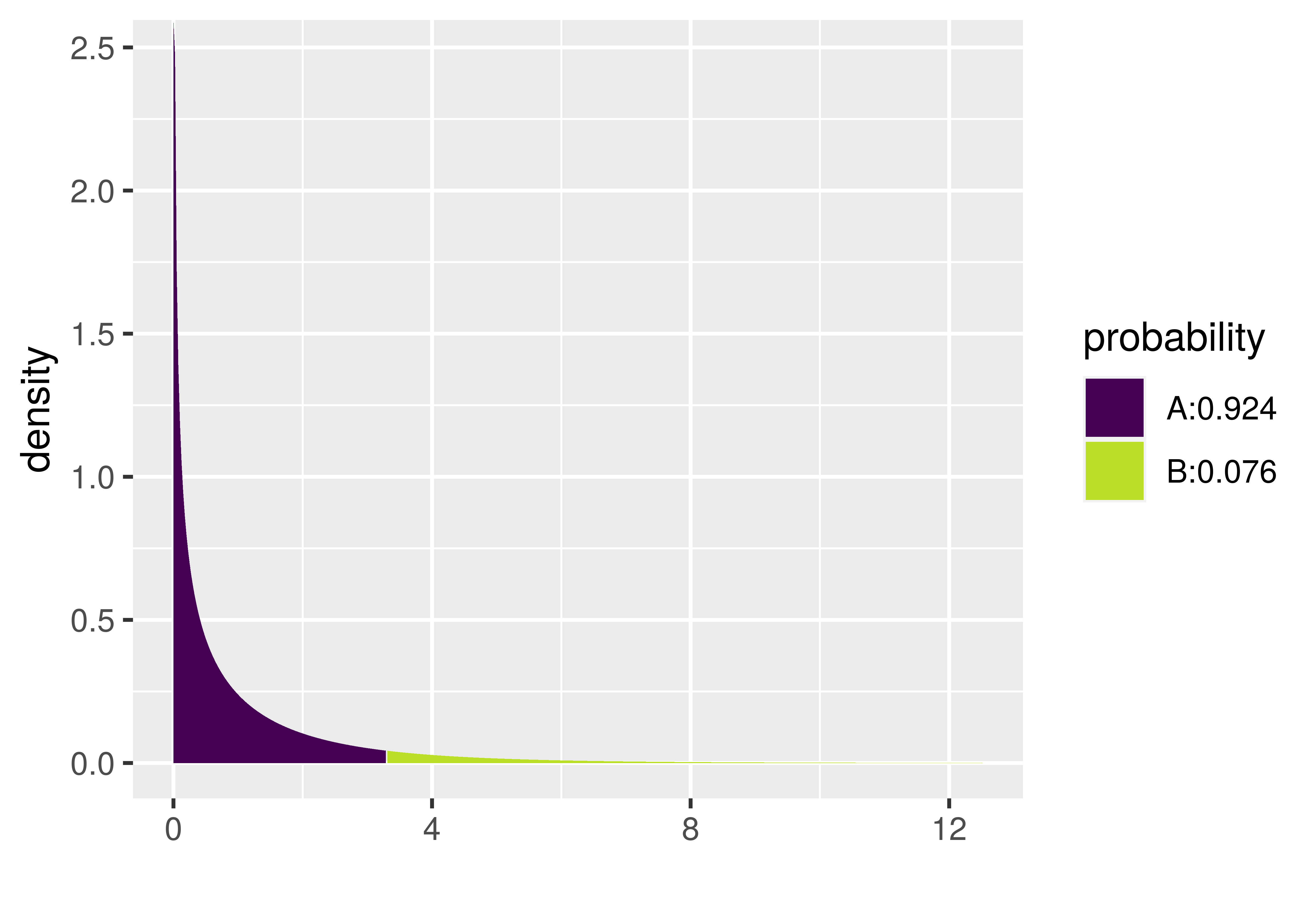
11.6 The F-Distribution: A Mathematical Model of the Sampling Distribution of F
So far we’ve used randomization (shuffle()) to create a sampling distribution of F. However, just like mathematicians developed mathematical models of the sampling distribution of \(b_1\) (e.g., t-distributions), they have developed a mathematical model of the sampling distribution of F. This mathematical model is called the F-distribution.
In the same way that the mathematical t-distribution can be used as a smooth idealization to model sampling distributions of \(b_1\), the F-distribution provides a smooth mathematical model that fits the sampling distribution of F. (It also fits the sampling distribution of PRE.)
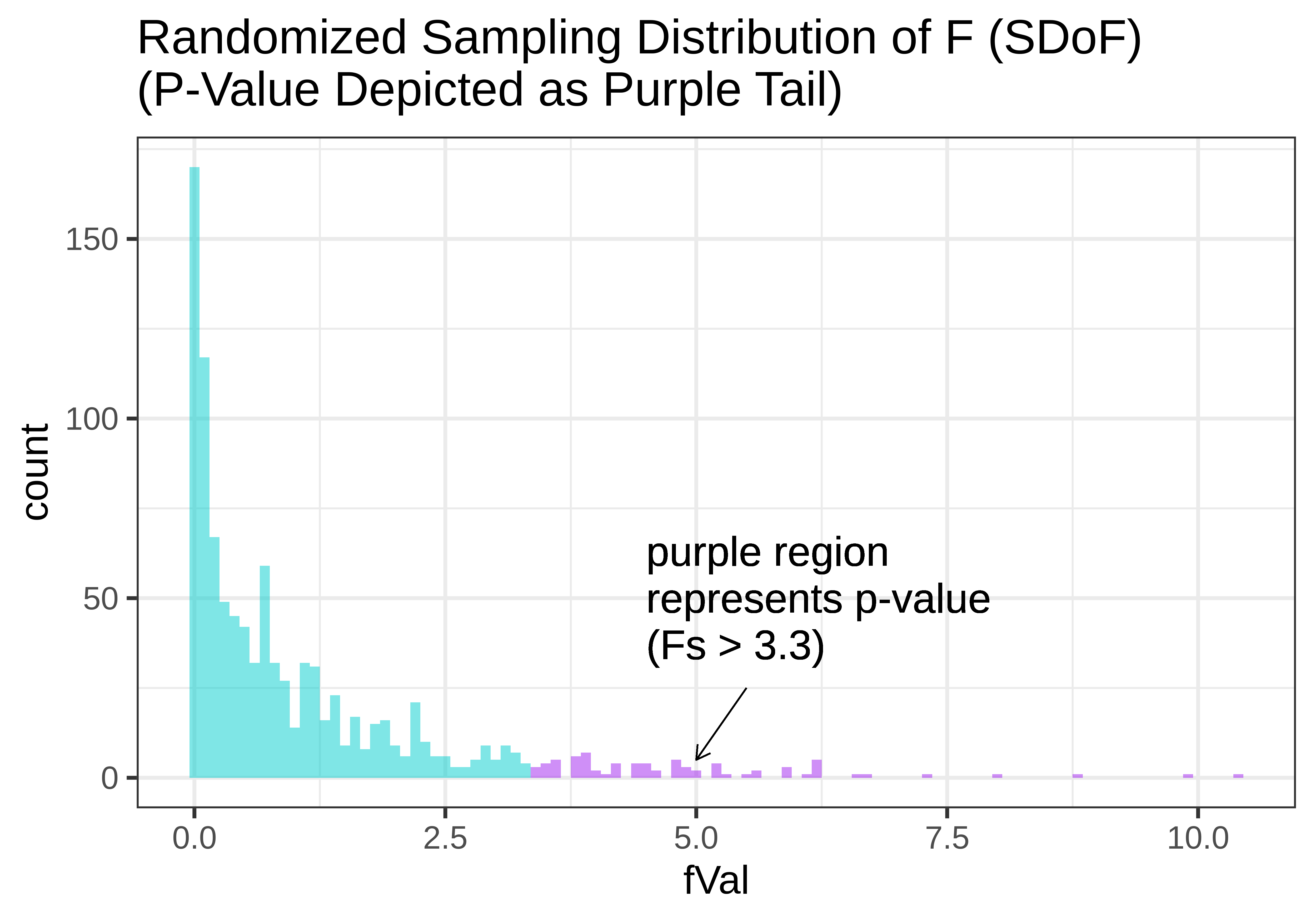
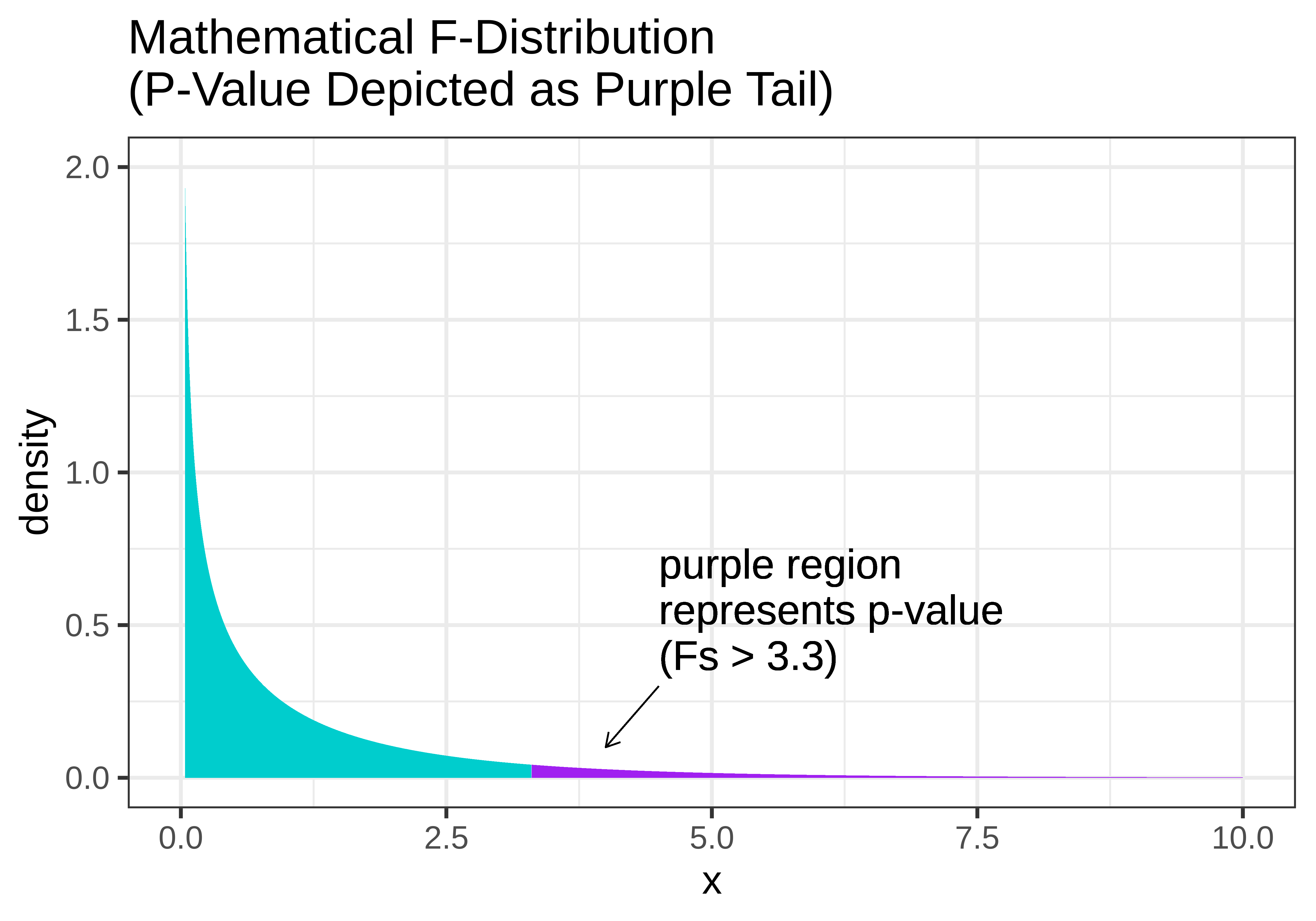
In the figure below, we show two versions of the sampling distribution of F that both assume a DGP with no effect of Condition (i.e., the empty model). On the left, we model the randomized sampling distribution using shuffle(), and on the right using the F distribution, where the area greater than our sample F is represented as the purple tail.
|
|
Notice that the shapes are very similar. The F-distribution seems like a smoothed out version of the randomized sampling distribution of F, and the p-value calculated based on the randomized sampling distribution will be very similar to the p-value based on the mathematical F-distribution.
Just as the shape of the t-distribution varies slightly according to the sample size or degrees of freedom, the shape of the F-distribution also varies by degrees of freedom. But because F is calculated as the ratio of MS Model divided by MS Error, we must specify two different degrees of freedom to get the shape of the F-distribution: the df for MS Model (1 in the ANOVA table below); and the df for MS Error, which is 42.
Analysis of Variance Table (Type III SS)
Model: Tip ~ Condition

                              SS df      MS     F    PRE     p
----- --------------- | -------- -- ------- ----- ------ -----
Model (error reduced) |  402.023  1 402.023 3.305 0.0729 .0762
Error (from model)    | 5108.955 42 121.642
----- --------------- | -------- -- ------- ----- ------ -----
Total (empty model)   | 5510.977 43 128.162
The xpf() function provides one way to calculate a p-value using the F-distribution. It requires us to enter three arguments: the sample F, the df Model (called df1) and df Error (called df2). Try it out in the code window below by filling in the values of df1 and df2 from the ANOVA table above.
require(coursekata)
# we have saved the sample F for you
sample_F <- f(Tip ~ Condition, data = TipExperiment)

# fill in the appropriate dfs
xpf(sample_F, df1 = , df2 = )
# we have saved the sample F for you
sample_F <- f(Tip ~ Condition, data = TipExperiment)

# fill in the appropriate dfs
xpf(sample_F, df1 = 1, df2 = 42)
ex() %>%
         check_function(., "xpf") %>% {
               check_arg(., "df1") %>% check_equal()
               check_arg(., "df2") %>% check_equal()
       }
We like the xpf() function because it shows a graph of the F distribution and marks off the region of the tail that represents the p-value. It also tells you what the p-value is in the legend. Notice in the plot below that the p-value for the Condition model of the tipping experiment data is .0762. That’s the same value reported in the ANOVA table, which is no coincidence: the supernova() function uses the mathematical F distribution to calculate the p-value.