Course Outline
-
segmentGetting Started (Don't Skip This Part)
-
segmentStatistics and Data Science: A Modeling Approach
-
segmentPART I: EXPLORING VARIATION
-
segmentChapter 1 - Welcome to Statistics: A Modeling Approach
-
segmentChapter 2 - Understanding Data
-
segmentChapter 3 - Examining Distributions
-
segmentChapter 4 - Explaining Variation
-
segmentPART II: MODELING VARIATION
-
segmentChapter 5 - A Simple Model
-
segmentChapter 6 - Quantifying Error
-
segmentChapter 7 - Adding an Explanatory Variable to the Model
-
segmentChapter 8 - Digging Deeper into Group Models
-
segmentChapter 9 - Models with a Quantitative Explanatory Variable
-
segmentPART III: EVALUATING MODELS
-
segmentChapter 10 - The Logic of Inference
-
10.5 The p-Value
-
segmentChapter 11 - Model Comparison with F
-
segmentChapter 12 - Parameter Estimation and Confidence Intervals
-
segmentChapter 13 - What You Have Learned
-
segmentFinishing Up (Don't Skip This Part!)
-
segmentResources
list High School / Advanced Statistics and Data Science I (ABC)
10.5 The P-Value
Locating the Sample \(b_1\) in the Sampling Distribution
We have now spent some time looking at the sampling distribution of \(b_1\)s assuming the empty model is true (i.e., \(\beta_1=0\)). We have developed the idea that simulated samples, generated by random shuffles of the tipping experiment data, are typically clustered around 0. Samples that end up in the tails of the distribution – the upper and lower .025 of values – are considered unlikely.
Let’s place our sample \(b_1\) right onto our histogram of the sampling distribution and see where it falls. Does it fall in the tails of the distribution, or in the middle .95?
Here’s some code that will save the value of our sample \(b_1\) as sample_b1.
sample_b1 <- b1(Tip ~ Condition, data = TipExperiment)If we printed it out, we would see that the sample \(b_1\) is 6.05: tables in the smiley face condition, on average, tipped $6.05 more than tables in the control condition.
Let’s find out by overlaying the sample \(b_1\) onto our histogram of the sampling distribution. Chaining the code below onto the histogram above (using the %>% operator) will place a black dot right at the sample \(b_1\) of 6.05:
gf_point(x = 6.05, y = 0)If you have already saved the value of \(b_1\) (as we did before, into sample_b1), you can also write the code like this:
gf_point(x = sample_b1, y = 0)
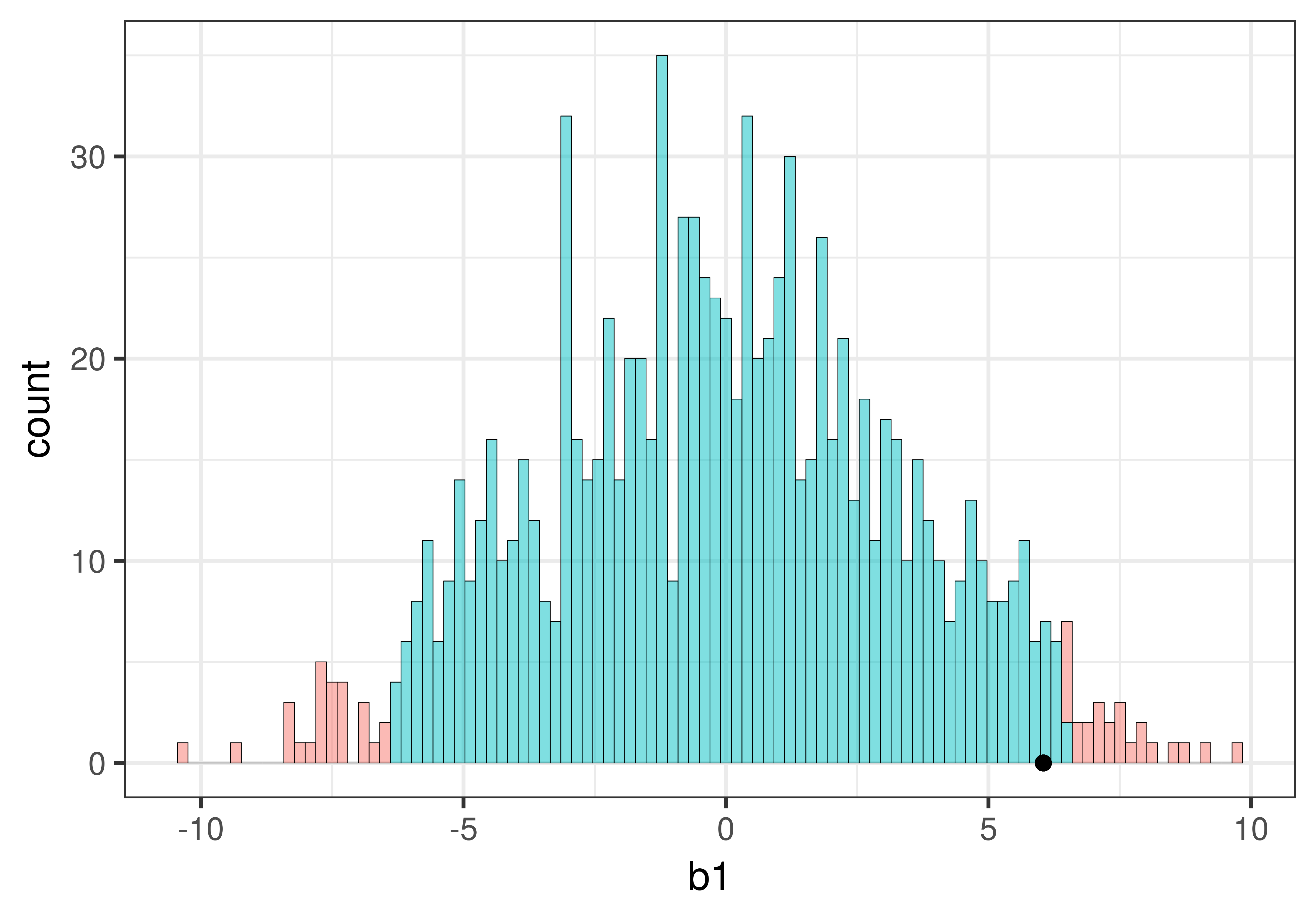
We can see that our sample is not in the unlikely zone. It’s within the middle .95 of \(b_1\)s generated from the empty model of the DGP.
Recap of Logic with the Distribution Triad
The hard thing about inference is that we have to keep all three distributions (sample, DGP, and sampling distribution) in mind. It’s really easy to lose track. We’re going to introduce a new kind of picture that shows all three of these distributions together in relation to one another.
The picture below represents how we’ve used sampling distributions so far to evaluate the empty model (or null hypothesis). Let’s start from the top of this image. The top blue horizontal line represents the possible values of \(\beta_1\) in the DGP. The true value of \(\beta_1\) is unknown; it’s what we are trying to find out. But we’ve hypothesized that it might be 0, so we have represented that in the red box.
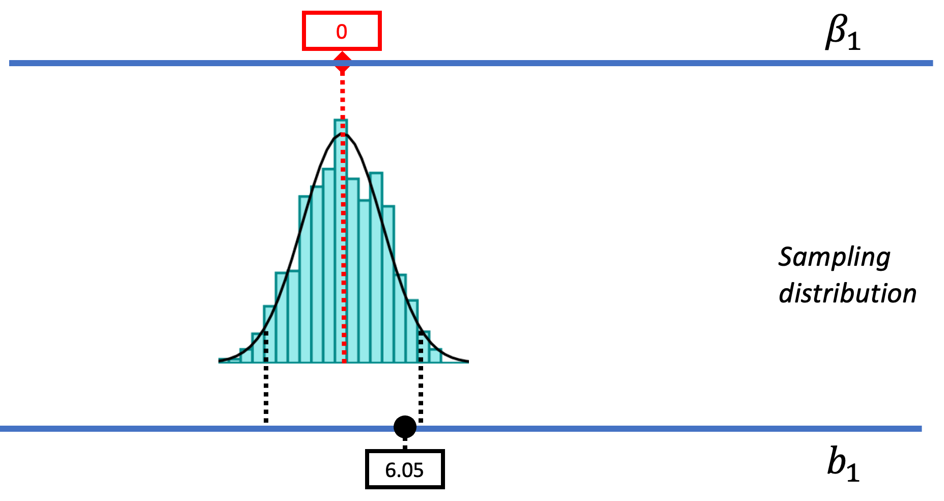
Based on this hypothesized DGP, we simulated samples, generated by random shuffles of the tipping experiment data. These sample \(b_1\)s tend to be clustered around 0 because we were simulating the empty model in which \(\beta_1=0\). Samples that end up in the tails of the distribution – the upper and lower .025 of values – are considered unlikely. We have drawn in black dotted lines to represent the cutoffs, the boundaries separating the middle values (not considered unlikely) from the values in the upper and lower tails (considered unlikely).
The Concept of P-Value
We have located the sample \(b_1\) in the context of the sampling distribution generated from the empty model, and we have seen that it falls in the middle .95 of \(b_1\)s. If it had fallen in either of the two tails, we would judge it unlikely to have been generated by the empty model, which might lead us to reject the empty model.
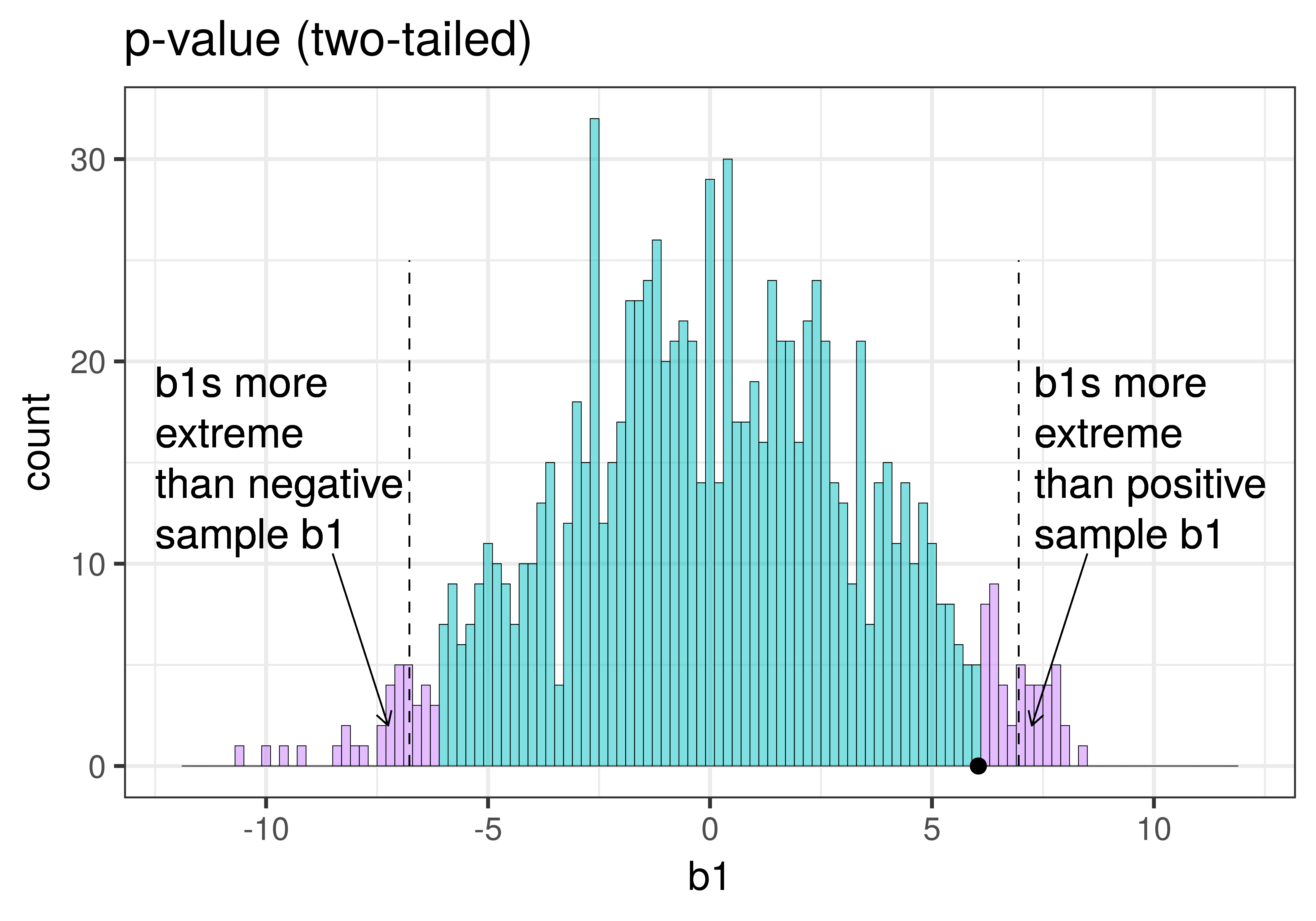
But we can do better than this. We don’t have to just ask a yes/no question of our sampling distribution. Instead of asking whether the sample \(b_1\) is in the unlikely area or not (yes or no), we could instead ask, what is the probability of getting a \(b_1\) as extreme as the one observed in the actual experiment? The answer to this question is called the p-value.
Before we teach you how to calculate a p-value, let’s do some thinking about what the concept means.
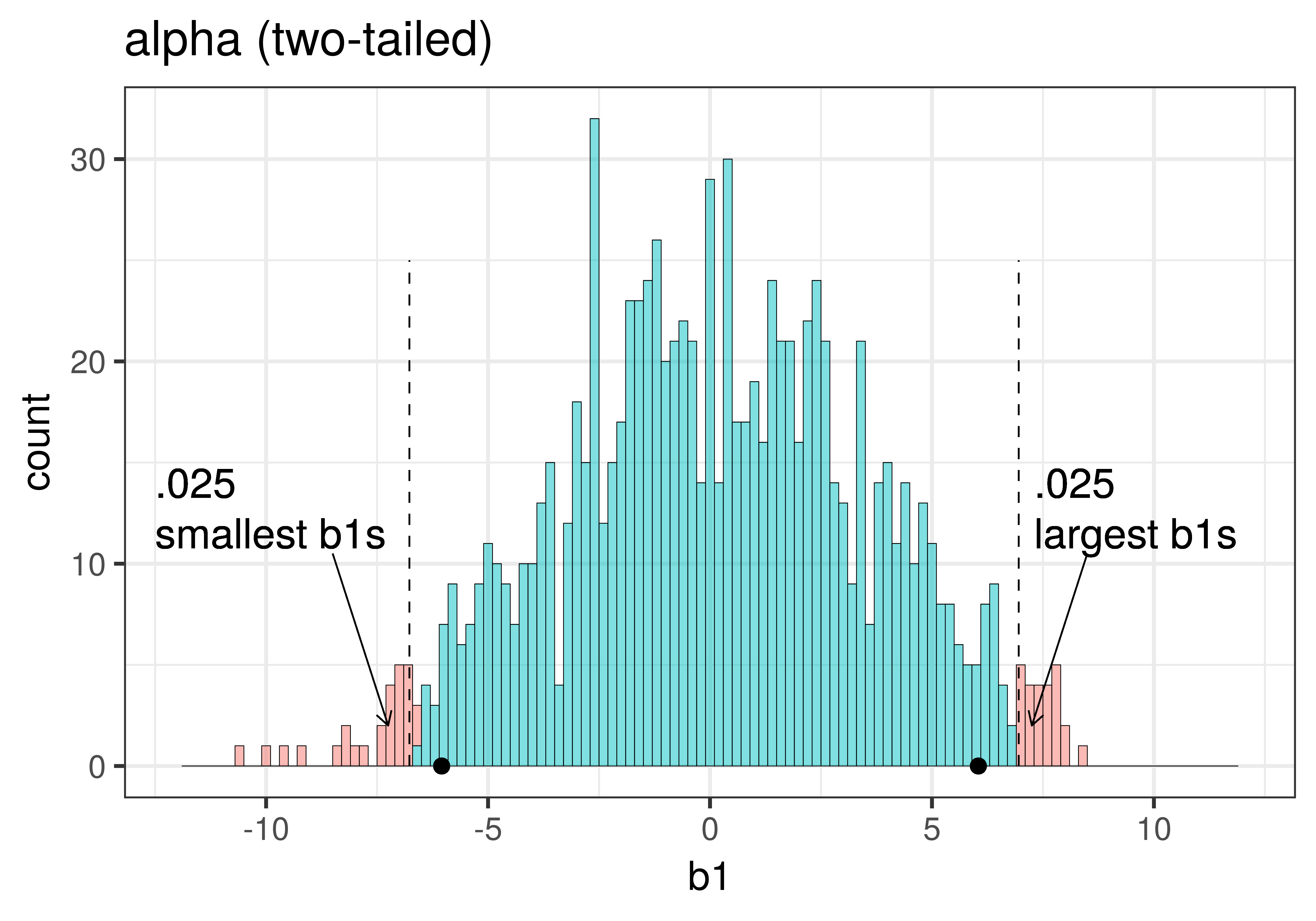
The total area of the two tails shaded red in the histogram above represent the alpha level of .05. These regions represent the \(b_1\)s generated from the empty model that we have decided to judge as unlikely based on our alpha. This means that if the empty model is true, as we assumed when we constructed the sampling distribution, then the probability of getting a sample \(b_1\) in the red region would be .05.
Whereas we know what alpha is before we even do a study – it’s just a statement of our criterion for deciding what we will count as unlikely – the p-value is calculated after we do a study, based on actual sample data. We can illustrate the difference between these two ideas in the plots below, which zero in on just the upper tail of the sampling distribution of \(b_1\).
| alpha | p-value |
|---|---|
| This plot illustrates the concept of alpha. Having decided to set alpha as .05, the red area in the upper tail of the sampling distribution represents .025 of the largest \(b_1\)s generated by the empty model. | This plot illustrates the concept of p-value. While p-value is also a probability, it is not dependent on alpha. P-value is represented by the purple area beyond our sample \(b_1\) and is the probability of getting a \(b_1\) greater than our sample \(b_1\). |
|
|
|
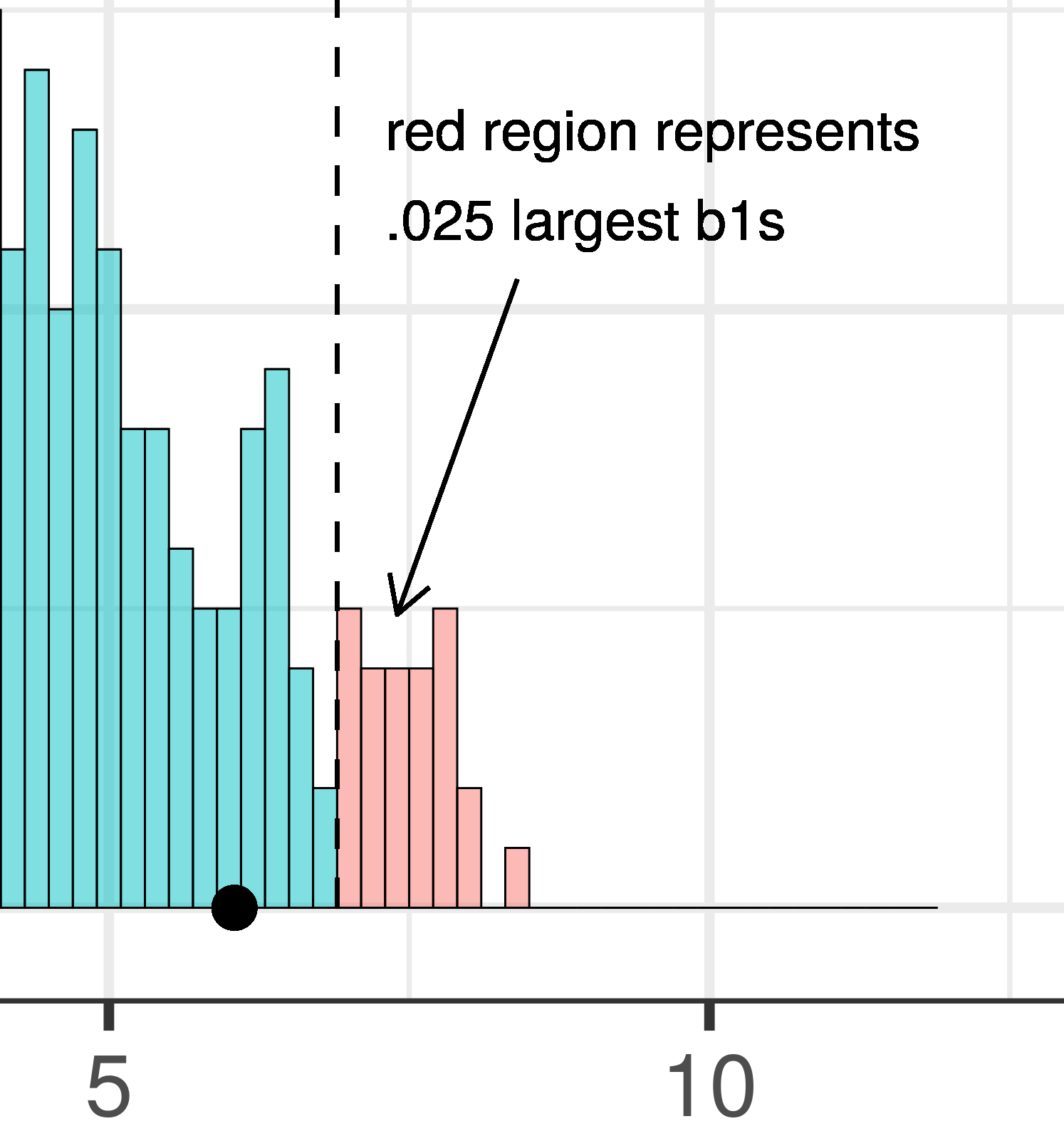
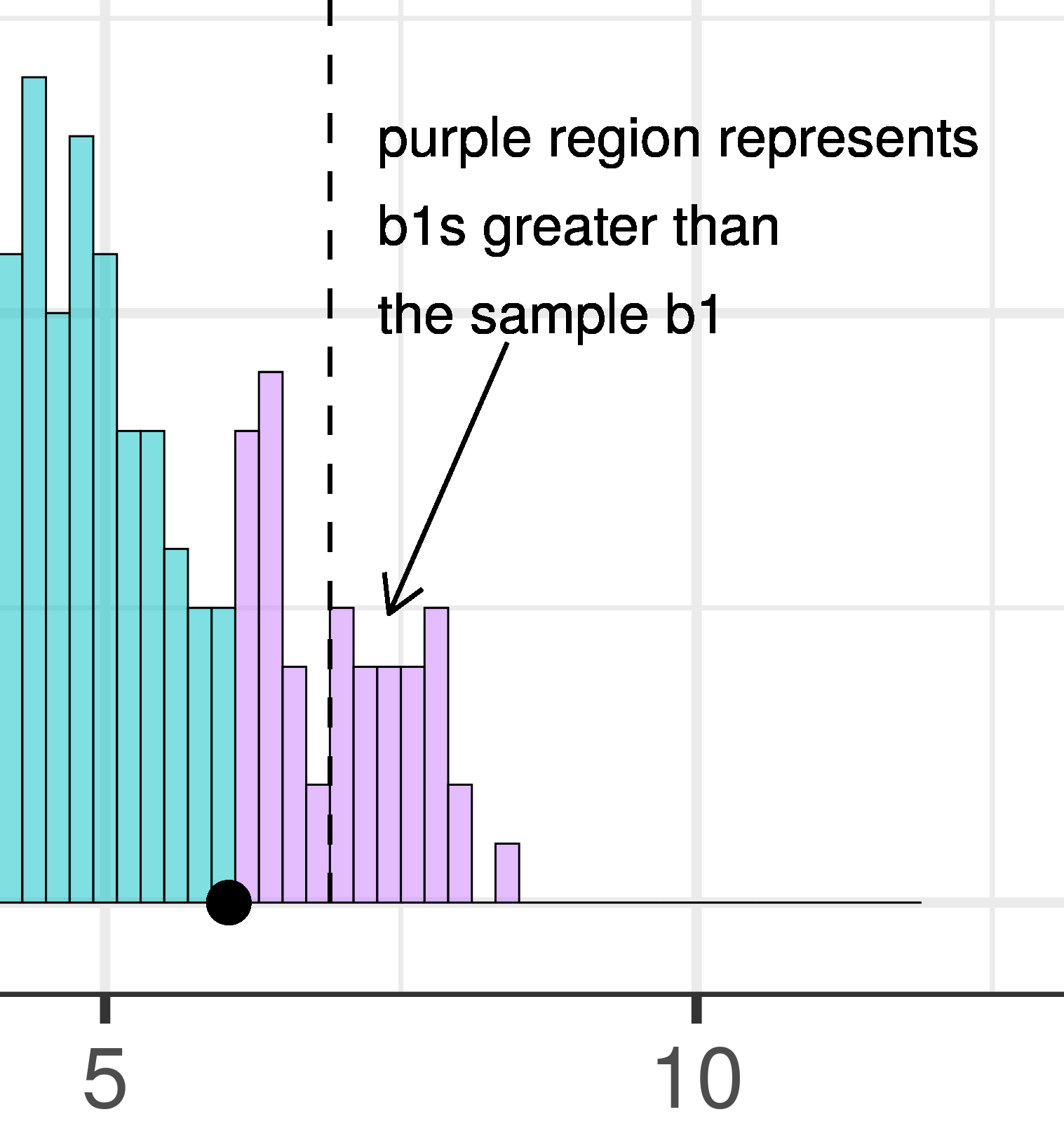
The dashed line in the plot on the left has been added to demarcate the cutoff beyond which we will consider unlikely, and the middle .95 of the sampling distribution which we consider not unlikely. We have kept the dashed line in the plot on the right to help you remember where the red alpha region started.
In the pictures above, we showed only the upper tail of the sampling distribution. But because a very low \(b_1\) (for example, -9) would also make us doubt the empty model of the DGP, we will want to do a two-tailed test. In the plots below we have zoomed out to show both tails of the sampling distribution, again illustrating alpha (with the red tails) and p-value (with the purple tails).
|
|---|
|
Because the purple tails, which represent the area beyond the sample \(b_1\), are a bit larger than the red tails, which represent the alpha of .05, we would guess that the p-value is a bit bigger than .05. But it’s not that much bigger – certainly not as large as .40 or .80!
The p-value is the probability of getting a parameter estimate as extreme or more extreme than the sample estimate given the assumption that the empty model is true.
Thus, the p-value is calculated based on both the value of the sample estimate and the shape of the sampling distribution of the parameter estimate under the empty model. In contrast, alpha does not depend on the value of the sample estimate.