Course Outline
-
segmentGetting Started (Don't Skip This Part)
-
segmentStatistics and Data Science: A Modeling Approach
-
segmentPART I: EXPLORING VARIATION
-
segmentChapter 1 - Welcome to Statistics: A Modeling Approach
-
segmentChapter 2 - Understanding Data
-
segmentChapter 3 - Examining Distributions
-
segmentChapter 4 - Explaining Variation
-
segmentPART II: MODELING VARIATION
-
segmentChapter 5 - A Simple Model
-
segmentChapter 6 - Quantifying Error
-
segmentChapter 7 - Adding an Explanatory Variable to the Model
-
segmentChapter 8 - Digging Deeper into Group Models
-
segmentChapter 9 - Models with a Quantitative Explanatory Variable
-
segmentPART III: EVALUATING MODELS
-
segmentChapter 10 - The Logic of Inference
-
segmentChapter 11 - Model Comparison with F
-
11.4 Using the Sampling Distribution of F
-
segmentChapter 12 - Parameter Estimation and Confidence Intervals
-
segmentChapter 13 - What You Have Learned
-
segmentFinishing Up (Don't Skip This Part!)
-
segmentResources
list High School / Advanced Statistics and Data Science I (ABC)
11.4 Using the Sampling Distribution of F
Having constructed a sampling distribution of F, let’s use it to evaluate the empty model of Tip. Our approach will be similar to the one we used in the previous chapter based on the sampling distribution of \(b_1\). We first construct a sampling distribution of F assuming the empty model is true (e.g., with shuffle()), and then look to see how likely the sample F would be to have occurred by chance if the empty model were true.
Because the sampling distribution of F clearly has a different shape than the sampling distribution of \(b_1\), however, we will need to adjust our method for judging likelihood.
Samples with extremely high Fs (e.g., an F of 8 or 12) are unlikely to be generated from a random DGP. But low sample Fs are quite common from a purely random DGP. Only high values of F – those in the upper tail – would make us doubt that the empty model produced our data.
With the sampling distribution of F, we only need to look at one tail of the distribution. We know that the F ratio can never be less than 0. We just want to know how likely it is to get an F as high as the one we observed.
We can use a function called lower() to fill the lower .95 of a sampling distribution in a different color than the upper .05 tail by adding this argument to a histogram: fill = ~lower(f, .95). Try adding this argument to the sampling distribution in the code window below.
library(coursekata)

# this creates sample_F and sdoF
sample_F <- f(Tip ~ Condition, data = TipExperiment)
sdoF <- do(1000) * f(shuffle(Tip) ~ Condition, data = TipExperiment)
# sdoF has already been saved for you
# modify this code to fill the lower .95 in a different color
gf_histogram(~f, data=sdoF)
# sdoF has already been saved for you
# modify this code to fill the lower .95 in a different color
gf_histogram(~f, data=sdoF, fill=~lower(f, .95))
ex() %>%
  check_function("gf_histogram") %>%
  check_arg("fill") %>%
  check_equal()
We used a similar function called middle() before and there’s a related upper() function as well.
Interpreting the Sample F from the Tipping Experiment
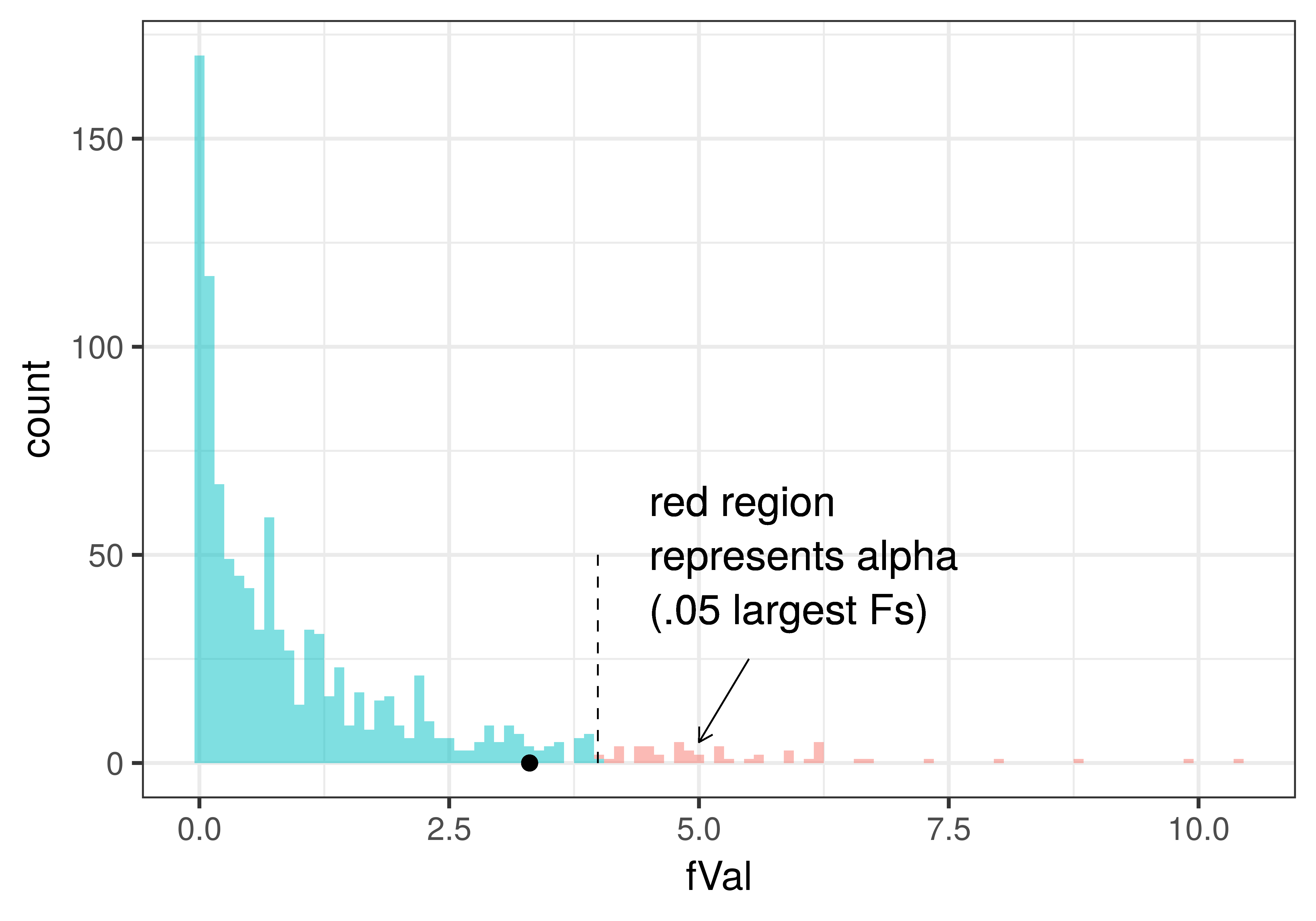
In the plot below we have added a dotted line to show the alpha criterion (the point that divides the unlikely Fs (i.e., .05 of the largest Fs generated by the empty model, which are colored red) from those considered not unlikely . We also have added in a black point to show where the sample F from the tipping experiment was. Because the sample F falls in the not unlikely region of the sampling distribution, we would probably decide to not reject the empty model based on the results of the experiment.
We can color the same plot a little differently to represent the p-value for the actual F found in the tipping experiment. In the plot below, p-value is represented in purple: all the randomly generated Fs from the empty model that were greater than or equal to the observed sample F of 3.30. For reference we have left in the dashed line to show the alpha criterion of .05.
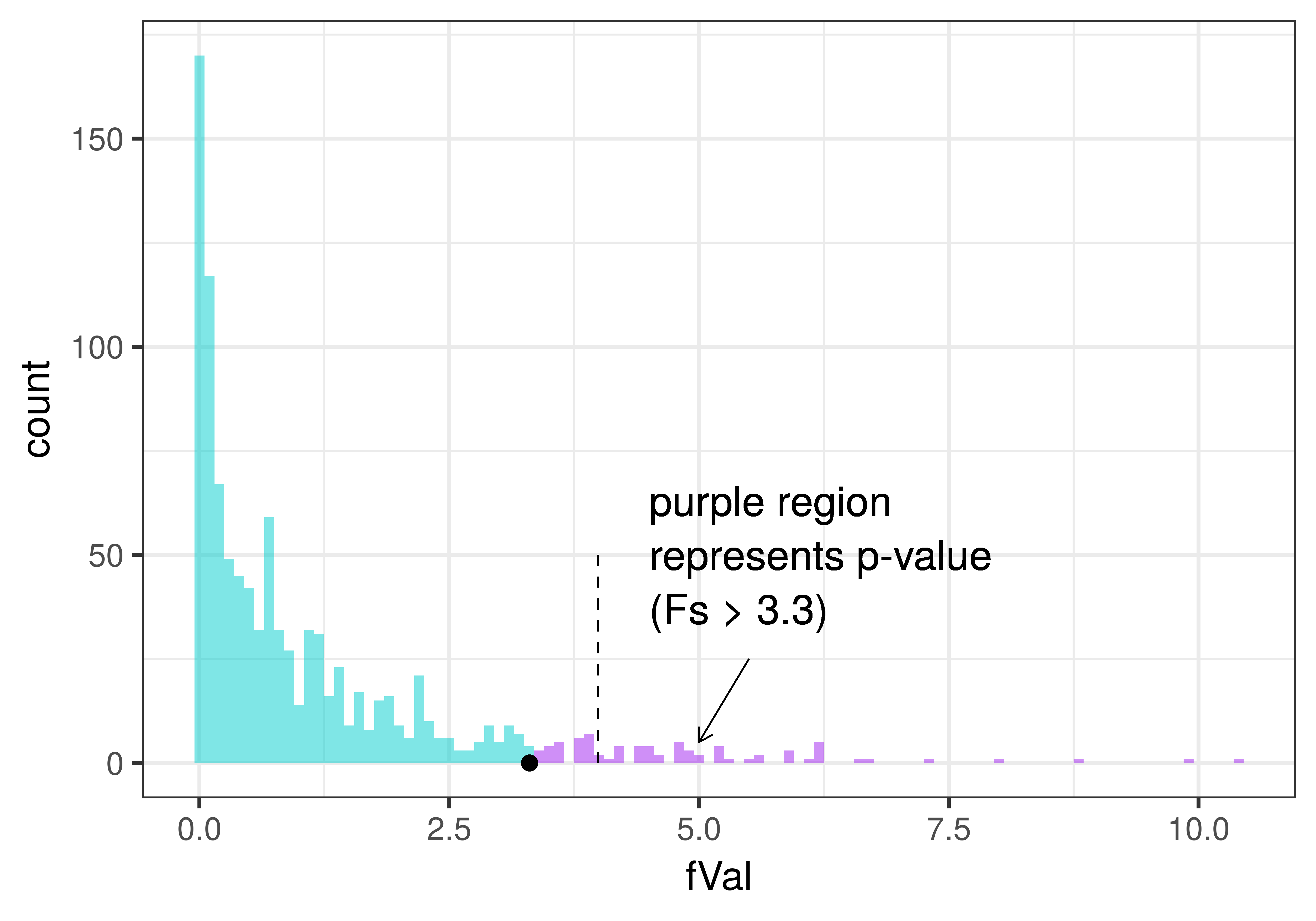
We can see from the plot that the p-value (purple area) will be greater than .05 (represented by the dashed line), which is another way of saying that the observed F is not in the unlikely region of the sampling distribution.