Course Outline
-
segmentGetting Started (Don't Skip This Part)
-
segmentStatistics and Data Science: A Modeling Approach
-
segmentPART I: EXPLORING VARIATION
-
segmentChapter 1 - Welcome to Statistics: A Modeling Approach
-
segmentChapter 2 - Understanding Data
-
segmentChapter 3 - Examining Distributions
-
3.2 Histograms
-
segmentChapter 4 - Explaining Variation
-
segmentPART II: MODELING VARIATION
-
segmentChapter 5 - A Simple Model
-
segmentChapter 6 - Quantifying Error
-
segmentChapter 7 - Adding an Explanatory Variable to the Model
-
segmentChapter 8 - Digging Deeper into Group Models
-
segmentChapter 9 - Models with a Quantitative Explanatory Variable
-
segmentPART III: EVALUATING MODELS
-
segmentChapter 10 - The Logic of Inference
-
segmentChapter 11 - Model Comparison with F
-
segmentChapter 12 - Parameter Estimation and Confidence Intervals
-
segmentChapter 13 - What You Have Learned
-
segmentFinishing Up (Don't Skip This Part!)
-
segmentResources
list High School / Advanced Statistics and Data Science I (ABC)
3.2 Histograms
Statistics provides us with a host of tools we can use for exploring distributions. Many of these tools are visual—e.g., histograms, boxplots, scatterplots, bar graphs, and so on. Being skilled at using these tools to look at distributions is an important part of the statistician’s toolbox—something you can take with you from this course!
We will start with histograms. Histograms are one of the most powerful tools we have for examining distributions. To see how they work, we will create a pretend outcome variable and save it in a vector called outcome. The code we used to create outcome is below; note it’s just 5 numbers. Let’s see how this simple distribution can be visualized with a histogram.
outcome <- c(1, 2, 3, 4, 5)Making a Histogram from a Vector
There are lots of ways to make histograms in R. We will use the package ggformula to make our visualizations. ggformula is a weird name, but that’s what the authors of this package called it. Because of that, many of the ggformula commands are going to start with gf_; the g stands for the gg part and the f stands for the formula part. We will start by making a histogram with the gf_histogram() command.
Here’s the code to make a histogram of the vector outcome.
gf_histogram(~ outcome)Note that the ~ (tilde) is usually found to the left of the 1 on most keyboards. The vector (or variable) outcome is placed after the tilde. Try it yourself in the code block below.
require(coursekata)
# This sets up our outcome vector
outcome <- c(1, 2, 3, 4, 5)

# Write code to create a histogram of outcome
# This sets up our outcome vector
outcome <- c(1, 2, 3, 4, 5)

# Write code to create a histogram of outcome
gf_histogram(~outcome)
ex() %>% check_function(., "gf_histogram") %>% {
            check_arg(., "object") %>% check_equal(eval = FALSE, incorrect_msg = "Make sure you specify `~outcome` as the first argument.")
}
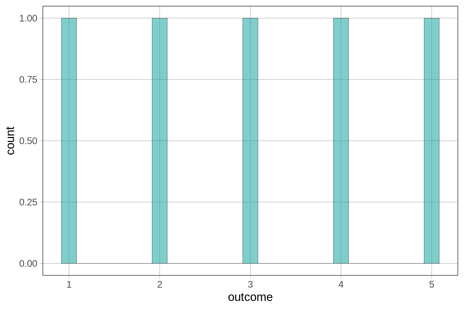
The x-axis of the histogram (labeled “outcome”) represents the range of possible values of the outcome variable (in this case, 1 to 5). The variable on the x-axis of a histogram is always quantitative, i.e., measured on a continuous scale.
The y-axis (labeled “count”) represents the frequency of a particular range of scores in a sample. In this case, there is one 1, one 2, one 3, one 4, and one 5. The height of the bars in a histogram represents the number of observations that fall within a certain interval on the outcome variable. The interval is called a bin. The boundaries of the bins are set by dividing the entire range of values into intervals of equal size.
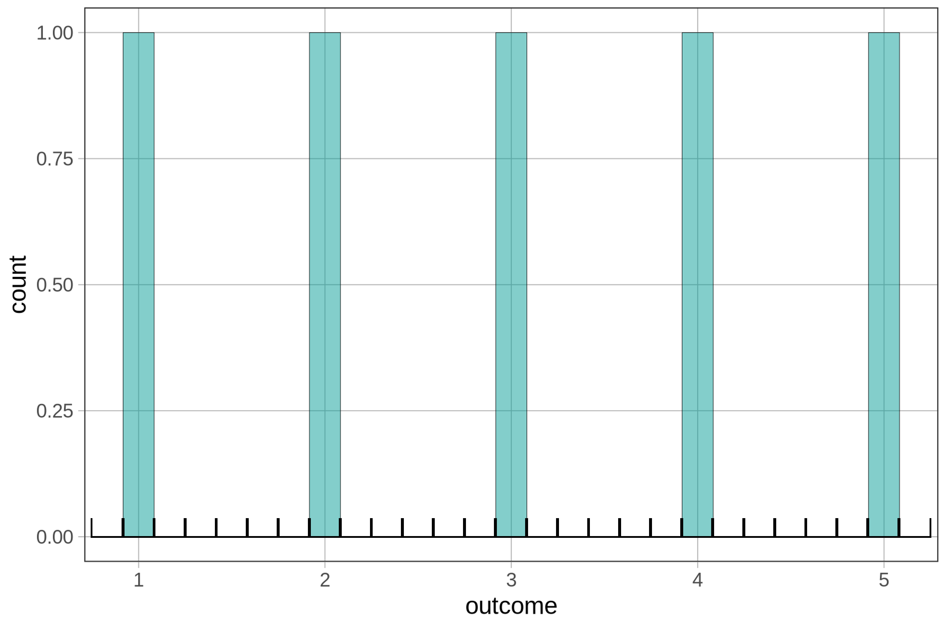
The histogram above shows gaps between the bars because, by default, gf_histogram() tries to make 30 bins (in this case it was able to make 27). But because we only have five possible numbers in our outcome variable, many of these bins are empty. We’ve added black brackets along the bottom of the histogram below to show where the empty bins are.
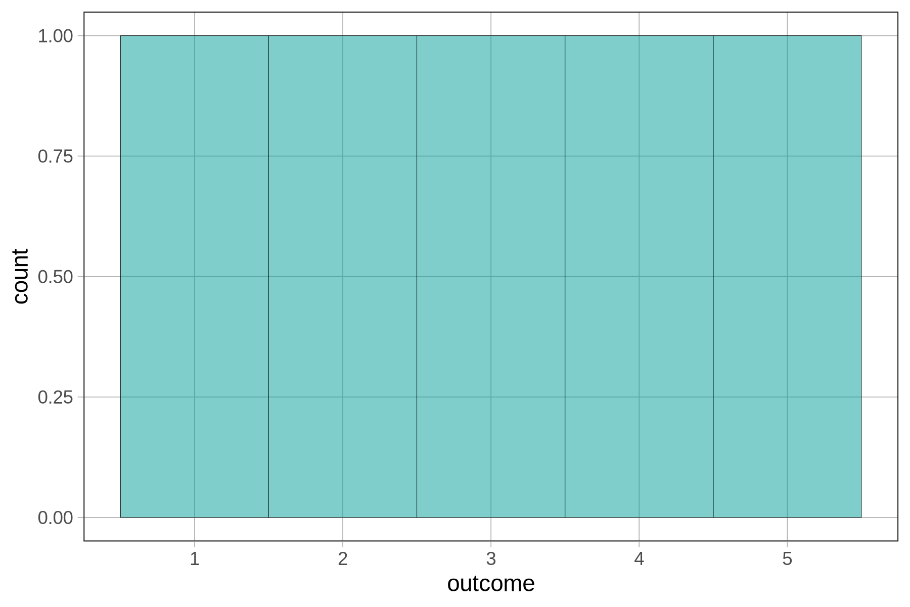
If we add some code to tell gf_histogram() to make just 5 bins (after all, we only have the 5 numbers) it will get rid of the gaps between the bars, like this:
gf_histogram(~ outcome, bins = 5)
Try editing and running the following code.
require(coursekata)
# This is the same code as before but we added in another outcome value, 3.2
outcome <- c(1, 2, 3, 4, 5, 3.2)

# Try making a histogram with 5 bins
gf_histogram(~ outcome, bins = 30)
# This is the same code as before but we added in another outcome value, 3.2
outcome <- c(1, 2, 3, 4, 5, 3.2)

# Try making a histogram with 5 bins
gf_histogram(~ outcome, bins = 5)
ex() %>% check_object("outcome", undefined_msg = "Make sure not to delete 'outcome'") %>% check_equal(incorrect_msg = "Make sure not to change the content of 'outcome'")

ex() %>% check_function("gf_histogram") %>%
    check_arg(., "object") %>% check_equal()
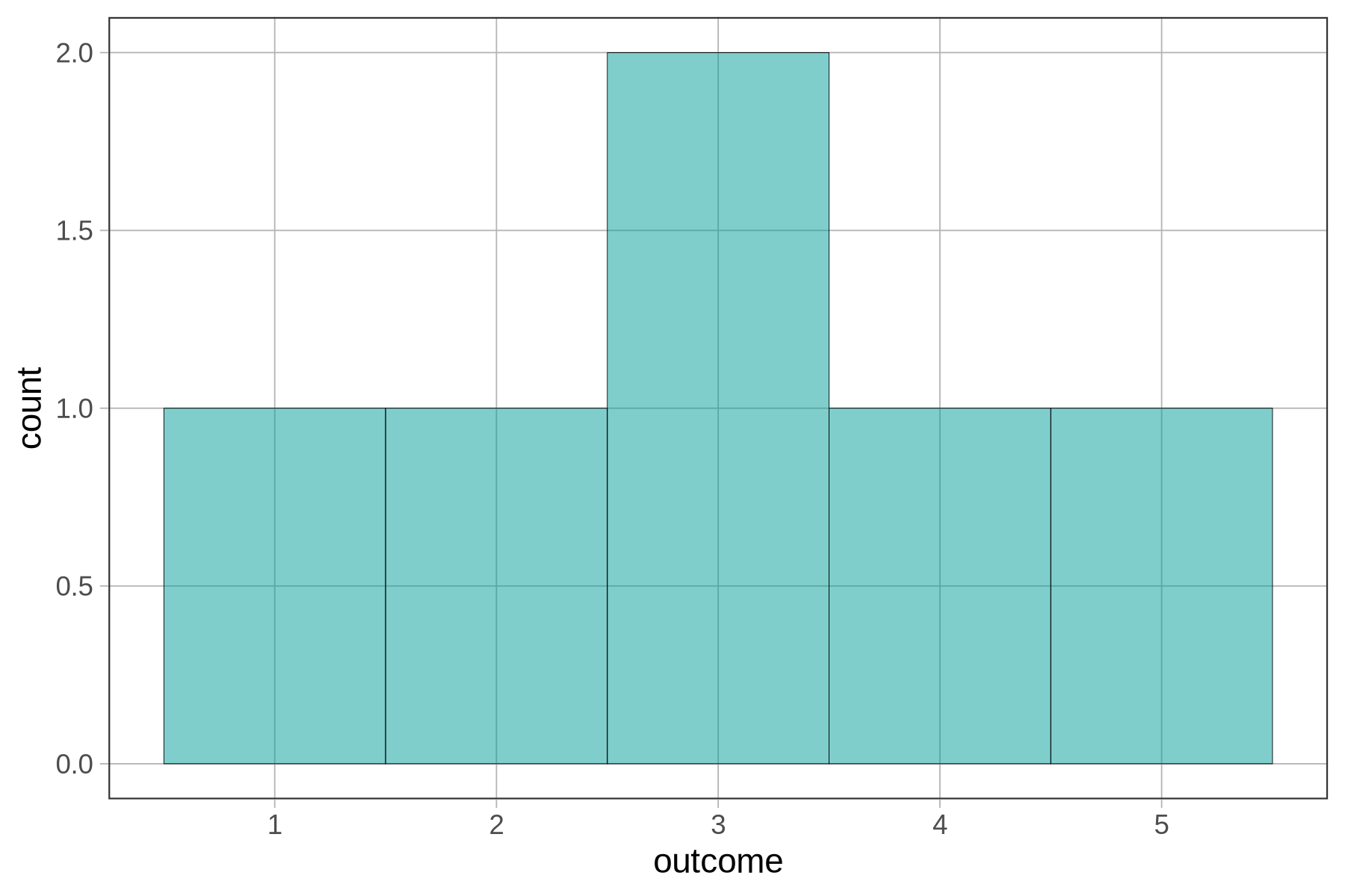
The new number (3.2) went into the bin labeled 3, which represents the interval 2.5 to 3.5. The height of that bar (which is now 2) represents the frequency of observations that fall within that interval (both the 3 and 3.2 are in that bin). Below, we’ve annotated the histogram to show which values of outcome fall into each bin.

Add the number 3.7 to our outcome values. Run the code to see what the histogram would look like then.
require(coursekata)
# add 3.7 to the outcome values, then run this code
outcome <- c(1, 2, 3, 4, 5, 3.2)

# this makes a histogram with 5 bins
gf_histogram(~ outcome, bins = 5)
# add 3.7 to the outcome values, then run this code
outcome <- c(1, 2, 3, 4, 5, 3.2, 3.7)

# this makes a histogram with 5 bins
gf_histogram(~ outcome, bins = 5)
inc_msg = "Don't alter the other code in this exercise -- only the contents of `outcome`."
ex() %>% {
    check_object(., "outcome") %>% check_equal(incorrect_msg = "Did you add 3.7 to the outcome vector?")
    check_function(., "gf_histogram")
}
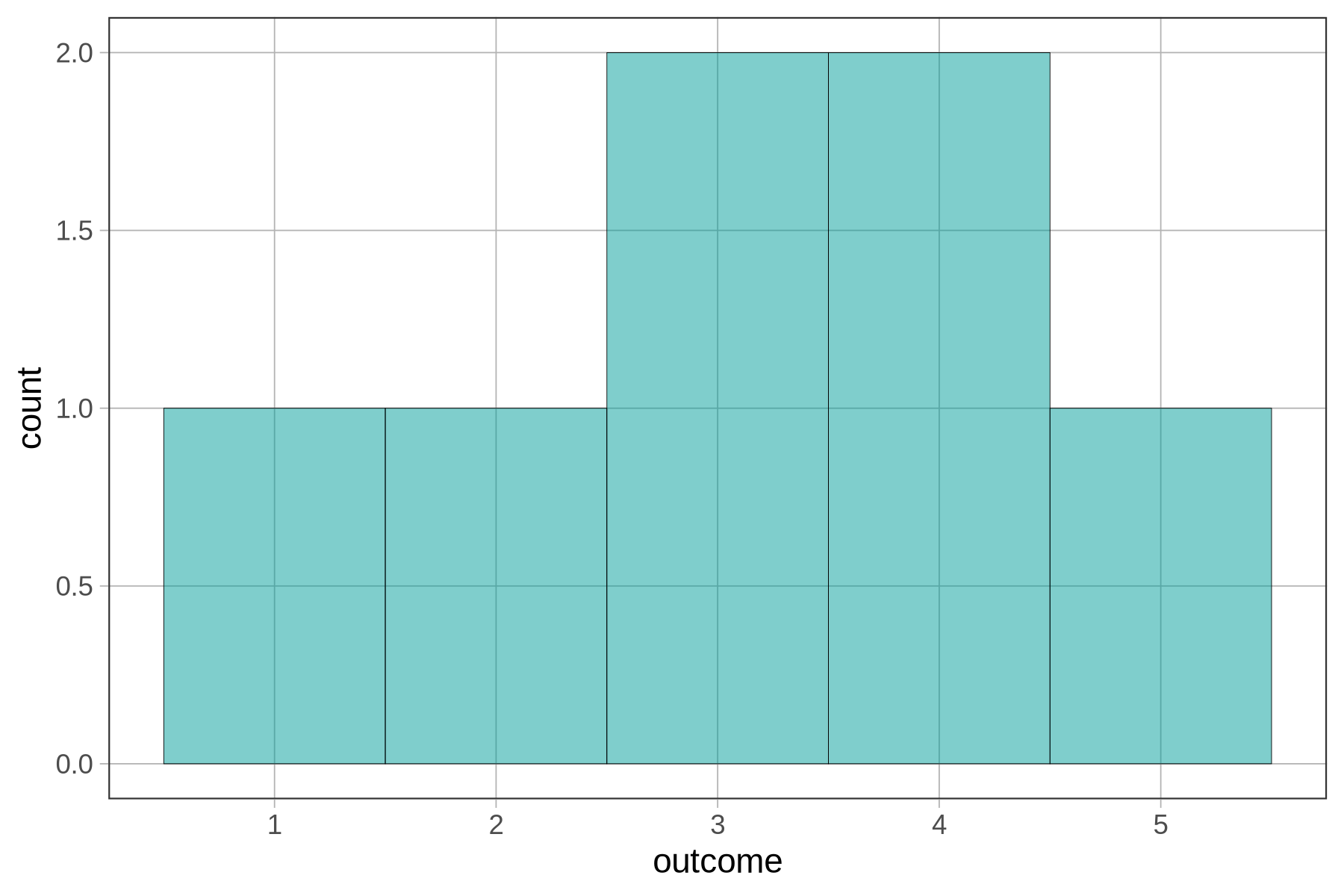
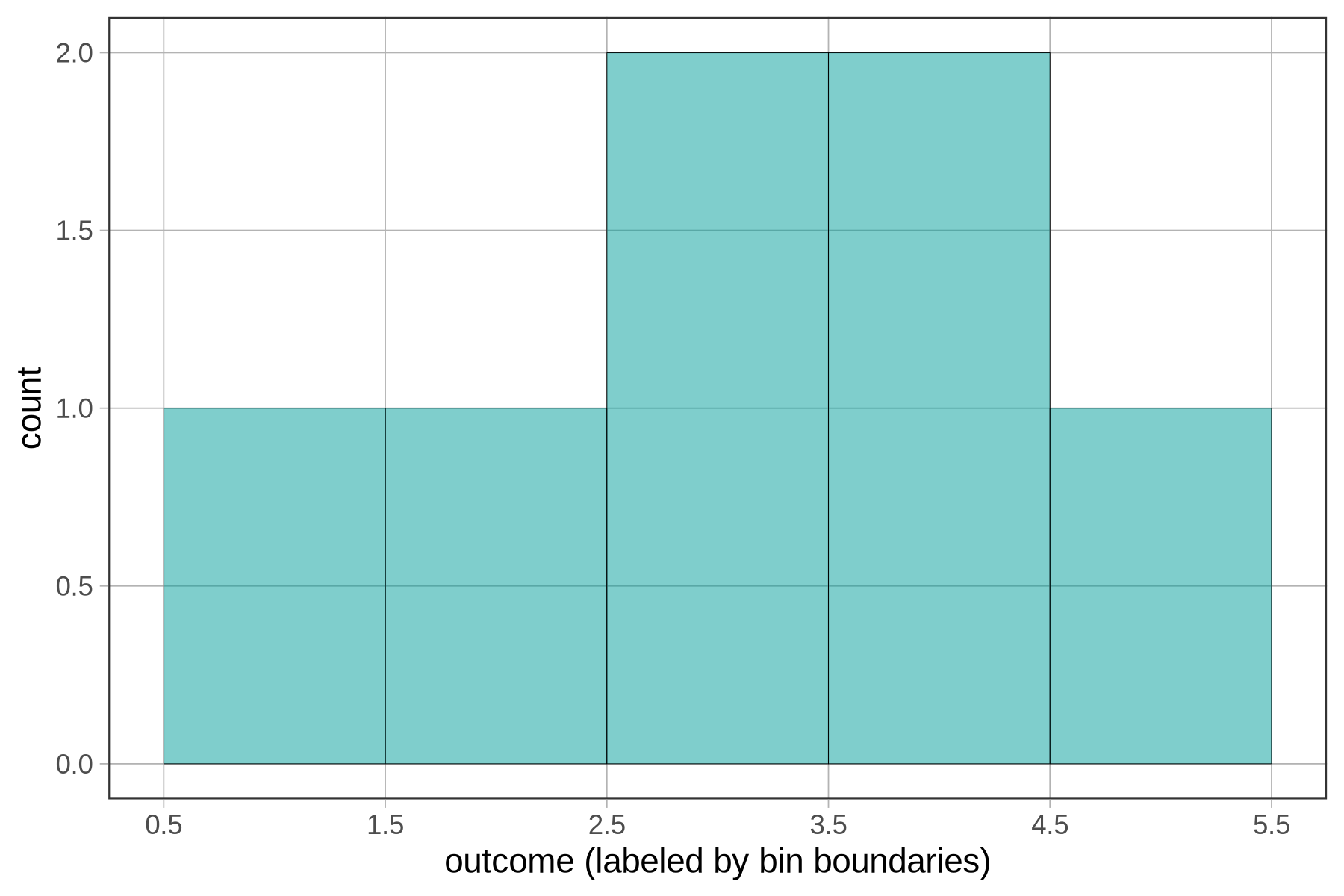
The new number, 3.7, was added to the bin labeled 4, which seems to go from 3.5 to 4.5.
Below, we have re-labeled the x-axis to show the boundaries of the bins instead of their centers. If you look closely at the x-axis, you’ll see that the bin previously labeled 4 actually goes from 3.5 to 4.5.
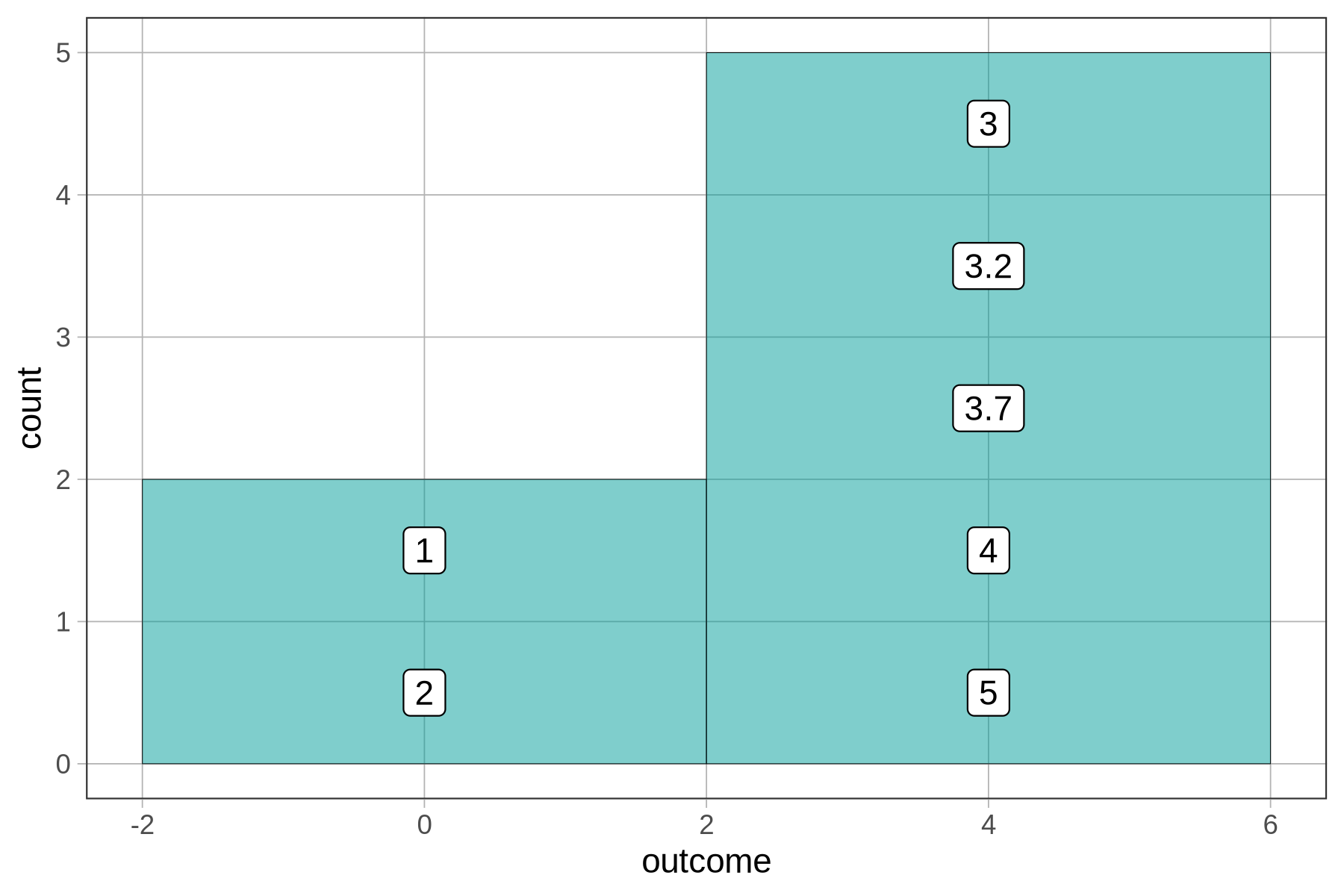
You can also adjust the binwidth, or how big the bin is. We can add in binwidth (like bins) as an argument. Here’s an example:
gf_histogram(~ outcome, binwidth = 4)
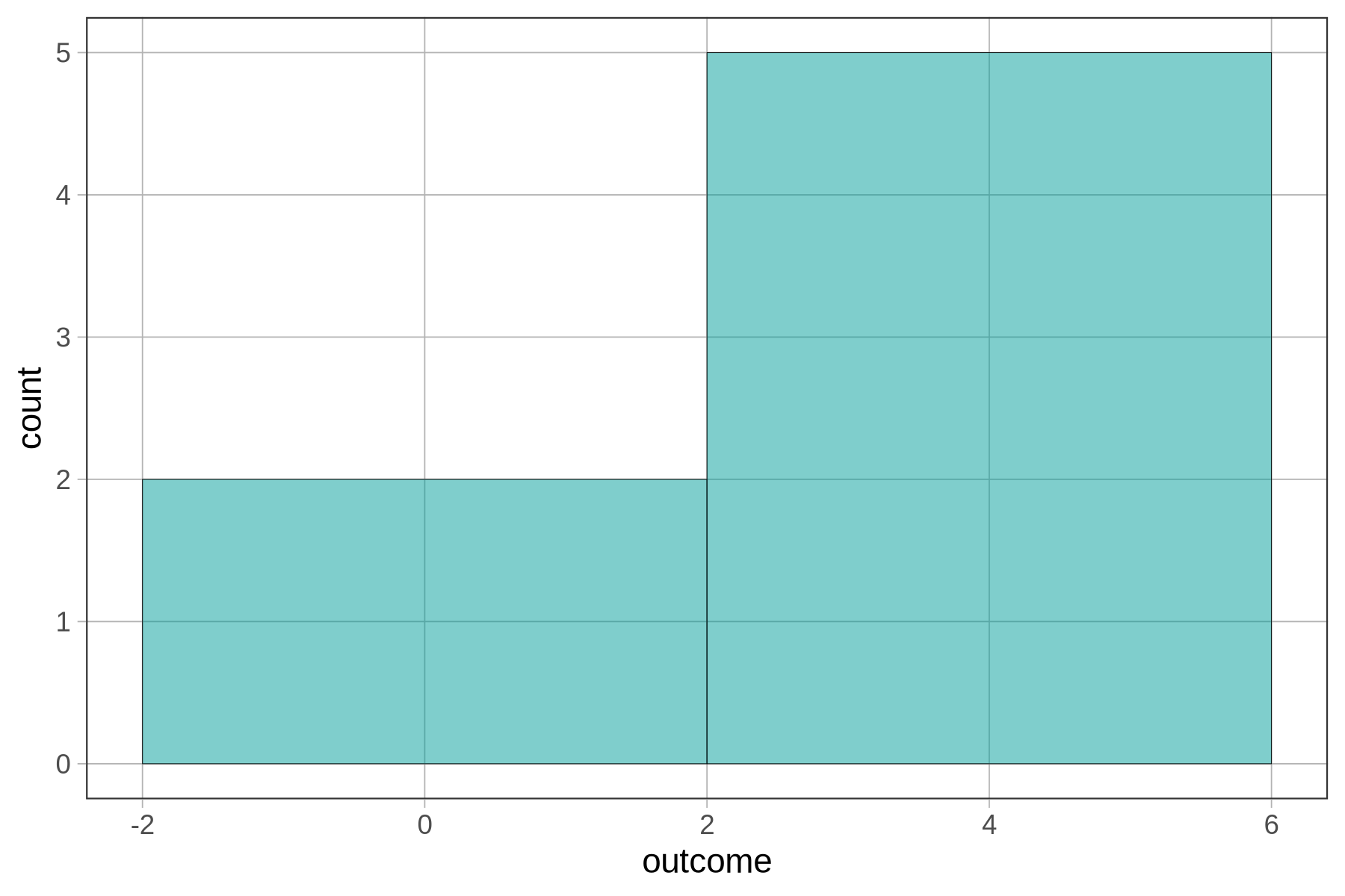
There are two columns because we told gf_histogram() to make the binwidth 4, and the numbers from 1 to 5 won’t fit into a single bin of width 4. R had no choice but to create a second bin. The first bin goes from -2 to 2 and there are only two numbers that go in that bin from our tiny set of outcomes. All the other numbers go in the bin from 2 to 6.
You may have been surprised to see the x-axis go from -2 to +6. After all, none of our numbers were negative. R did this because we put it in a difficult position. It had to include numbers as high as 5, and we required it to have a binwidth of 4. Not all of the numbers could fit within a single bin of width 4, so R had to make two bins of equal intervals. R just does its best to follow your commands!