10.3 Exploring the Sampling Distribution of b1
It’s hard to look at a long list of \(b_1\)s and make any sense of them. But if we think of these numbers as a distribution – a sampling distribution – we can use the same tools of visualization and analysis here that we use to help us make sense of a distribution of data. For example, we can use a histogram to take a look at the sampling distribution of \(b_1\)s.
The code below will save the \(b_1\)s (estimates for \(\beta_1\)) for 1000 shuffles of the tipping study data into a data frame called sdob1, which is an acronym for sampling distribution of b1s. (We made up this name for the data frame just to help us remember what it is. You could make up your own name if you prefer.) Add some code to this window to take a look at the first 6 rows of the data frame, and then run the code.
require(coursekata)
sdob1 <- do(1000) * b1(shuffle(Tip) ~ Condition, data = TipExperiment)
sdob1 <- do(1000) * b1(shuffle(Tip) ~ Condition, data = TipExperiment)
head(sdob1)
# the instructions in the text above the exercise say that they can change the name of the object (sdob1) if they want, and the sdob1 contents are shuffled, so the easiest thing here is to just check that they called head
ex() %>% check_function("head")
b1
1 -0.1363636
2 6.7727273
3 0.6818182
4 -0.5909091
5 -5.7727273
6 7.5000000In the window below, write an additional line of code to display the variation in b1 in a histogram.
require(coursekata)
# we created the sampling distribution of b1s for you
sdob1 <- do(1000) * b1(shuffle(Tip) ~ Condition, data = TipExperiment)

# visualize that distribution in a histogram
# we created the sampling distribution of b1s for you
sdob1 <- do(1000) * b1(shuffle(Tip) ~ Condition, data = TipExperiment)

# visualize that distribution in a histogram
gf_histogram(~b1, data = sdob1)
ex() %>% check_or(
  check_function(., "gf_histogram") %>% {
    check_arg(., "object") %>% check_equal()
    check_arg(., "data") %>% check_equal(eval = FALSE)
  },
  override_solution(., '{
    sdob1 <- do(1000) * b1(shuffle(Tip) ~ Condition, data = TipExperiment)
    gf_histogram(sdob1, ~b1)
  }') %>%
    check_function(., "gf_histogram") %>% {
      check_arg(., "object") %>% check_equal(eval = FALSE)
      check_arg(., "gformula") %>% check_equal()
    },
  override_solution(., '{
    sdob1 <- do(1000) * b1(shuffle(Tip) ~ Condition, data = TipExperiment)
    gf_histogram(~sdob1$b1)
  }') %>%
    check_function(., "gf_histogram") %>% {
      check_arg(., "object") %>% check_equal(eval = FALSE)
    }
  )
Although this looks similar to other histograms you have seen in this book, it is not the same! This histogram visualizes the sampling distribution of \(b_1\)s for 1000 random shuffles of the tipping study data. There are a few things to notice about this histogram. The shape is somewhat normal (clustered in the middle and symmetric), the center seems to be around 0, and most of the values are between -10 and 10.
Because the sampling distribution is based on the empty model, where \(\beta_1=0\), we expect the parameter estimates to be clustered around 0. But we also expect them to vary because of sampling variation. Even if we generated a \(b_1\) as high as $10, it would just be the result of random sampling variation.
You can see from the histogram that while it’s not impossible to generate a \(b_1\) of 9 or 10, values such as 9 or 10 are much less frequent than values such as -1 or 1. In this case, the \(b_1\) represents a mean difference between the two conditions. Thus, another way to say this is that it’s easy to randomly generate small mean differences (e.g., -1 or 1) but harder to randomly generate large ones (e.g., -10 or 10).
Just eyeballing the histogram can give us a rough idea of the probability of getting a particular sample \(b_1\) from this DGP where we know \(\beta_1\) is equal to 0. When we use these frequencies to estimate probability, we are using this distribution of shuffled \(b_1\)s as a probability distribution.
Using the Sampling Distribution to Evaluate the Empty Model
We used R to simulate a world where the empty model is true in order to construct a sampling distribution. Now let’s return to our original goal, to see how this sampling distribution can be used to evaluate whether the empty model might explain the data we collected, or whether it should be rejected.
The basic idea is this: using the sampling distribution of possible sample \(b_1\)s that could have resulted from a DGP in which the empty model is true (i.e., in which \(\beta_1=0\)), we can look at the actual sample \(b_1\) and gauge how likely such a \(b_1\) would be if the empty model is, in fact, true.
If we judge the \(b_1\) we observed to be unlikely to have come from the empty model, we then would reject the empty model as our model of the DGP. If, on the other hand, we judge our observed \(b_1\) to be likely, then we would probably just stick with the empty model, at least until we have more evidence to suggest otherwise.
Let’s see how this works in the context of the tipping study, where \(b_1\) represents the average difference in tips between tables that got the hand-drawn smiley faces and those that did not.
Samples that are extreme in either a positive (e.g., average tips that are $8 higher in the smiley face group) or negative direction (e.g., -$8, representing much lower average tips in the smiley face group), are unlikely to be generated if the true \(\beta_1=0\). Both of these kinds of unlikely samples would make us doubt that the empty model had produced our data.
Put another way: if we had a sample that fell in either the extreme upper tail or extreme lower tail of the sampling distribution (see figure below), we might reject the empty model as the true model of the DGP.
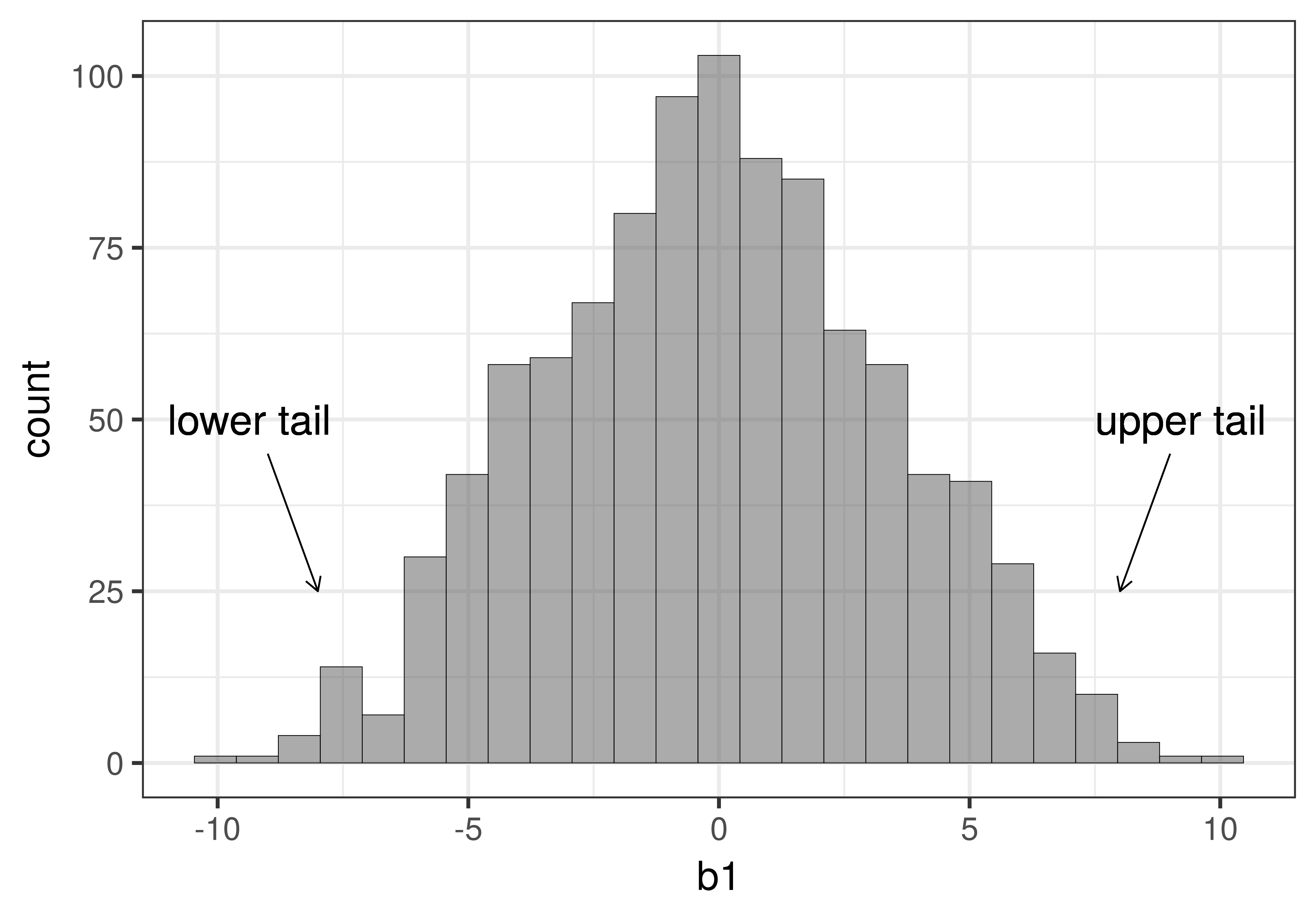
In statistics, this is commonly referred to as a two-tailed test because whether our actual sample falls in the extreme upper tail or extreme lower tail of this sampling distribution, we would have reason to reject the empty model as the true model of the DGP. By rejecting the model in which \(\beta_1=0\), we would be deciding that some version of the complex model in which \(\beta_1\) is not equal to 0 must be true. We wouldn’t know exactly what the true \(\beta_1\) is, but only that it is probably not 0. In more traditional statistical terms, we would have found a statistically significant difference between the smiley face group and the control group.
Of course, even if we observe a \(b_1\) in one of the extreme tails and decide to reject the empty model, we could be wrong. Just by chance alone, some of the \(b_1\)s in the sampling distribution will end up in the tails even if the empty model is true in the DGP. Being fooled like this is what is called a Type I Error.