3.13 Weird DGPs and Their Samples
Weird Populations
Even though small samples are unreliable and sometimes misleading, large samples usually tend to look like the parent population that they were drawn from. This is true even when you have a population with a weird distribution.
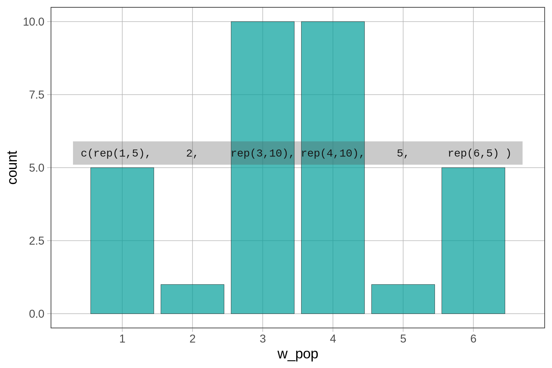
To illustrate this point, we made a vector to simulate a population that, unlike die rolls, has a “W” shape. We called the vector w_pop (for a W-shaped population). Here’s the code we used to make the population and to depict the distribution on a bar graph.
w_pop <- c(rep(1,5), 2, rep(3,10), rep(4,10), 5, rep(6,5))
gf_bar(~ w_pop)

In the figure below, we’ve illustrated how the code works to create this distribution. From the left, rep(1,5) means that R repeated 1 five times in the vector, then R put in a 2, then R repeated 3 ten times, etc. It’s worth looking back and forth between the bar graph and the code to see the connections; do this will help you learn.
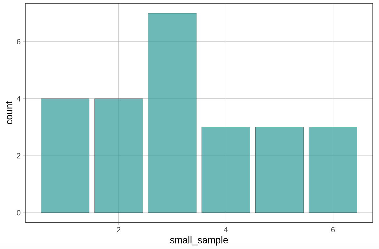
Now try drawing a relatively small sample (n = 24) from w_pop (with replacement) and save it as small_sample. Let’s observe whether we can detect the weird W-shape in our small-sample distribution.
require(coursekata)
model_pop <- 1:6
w_pop <- c(rep(1,5), 2, rep(3,10), rep(4,10), 5, rep(6,5))
# w_pop has already been made for you
# Create a small sample by resampling 24 times from w_pop
small_sample <-

# This will create a bar graph of small_sample
gf_bar(~ small_sample)
# w_pop has already been made for you
# Create a small sample by resampling 24 times from w_pop
small_sample <- resample(w_pop, 24)

# This will create a bar graph of small_sample
gf_bar(~ small_sample)
ex() %>% override_solution_code('{
# w_pop has already been made for you
# Create a small sample by resampling 24 times from w_pop
small_sample <- resample(w_pop, 24)

# This will create a bar graph of small_sample
gf_bar(~ small_sample)
}') %>% {
    check_object(., "small_sample") %>% check_equal()
    check_function(., "gf_bar") %>%
        check_arg("object") %>%
        check_equal()
}
Now try drawing a large sample (n = 1,000) and save it as large_sample. Will the large sample look more like the W-shaped population distribution it came from than did the small sample?
require(coursekata)

model_pop <- 1:6
w_pop <- c(rep(1,5), 2, rep(3,10), rep(4,10), 5, rep(6,5))
# create a sample that draws 1000 times from w_pop
large_sample <-

# this will create a bar graph of large_sample
gf_bar(~ large_sample)
# create a sample that draws 1000 times from w_pop
large_sample <- resample(w_pop, 1000)

# this will create a bar graph of large_sample
gf_bar(~ large_sample)
ex() %>% override_solution_code('{
    # create a sample that draws 1000 times from w_pop
    large_sample <- resample(w_pop, 1000)

# this will create a bar graph of large_sample
gf_bar(~ large_sample)
}') %>% {
    check_object(., "large_sample") %>% check_equal()
    check_function(., "gf_bar") %>%
        check_arg("object") %>%
        check_equal()
}

This distribution looks very close to the W-shape of the simulated population we started off with.
This finding – that large samples tend to look like the population distributions they come from – is so reliable in statistics that it is referred to as a law: the law of large numbers. This law says that, in the long run, either by collecting lots of data or by doing a study many times, we will get closer to understanding the true population and the DGP that generates it.
More specifically, the law of large numbers states that as a sample gets larger, the closer the mean of the sample will be to the mean of the population. This fact results naturally from the fact that as a sample gets larger, the more similar the sample distribution will be to the population distribution.
Lessons Learned
In the case of dice rolls (or any other DGP we create with R), we know what the true DGP looks like because we made it up ourselves. When we generated random samples from these simulated populations, we learned that smaller samples will vary, with very few of them looking exactly like the population from which they were drawn. Large samples, on the other hand, will look more like the population from which they are drawn.
In many fields of research, however, there is rarely the opportunity to collect truly large samples of data. In the typical case, we only have access to relatively small samples, and usually only one sample. The realities of sampling variation, which you have now seen up close, make our job very challenging. It means we cannot just look at a sample distribution and infer, with confidence, what the parent population and DGP look like.
On the other hand, if we think we have a good guess as to what the DGP looks like, we shouldn’t be too quick to give up our theory just because the sample distribution doesn’t appear to support it. In the case of die rolls, this is easy advice to take: even if something really unlikely happens in a sample — e.g., 24 die rolls in a row all come up 5 — we will probably stick with our theory of the DGP! After all, a 5 coming up 24 times in a row is still possible to occur by random chance, although very unlikely.
But when we are dealing with real-life variables, variables for which the true DGP is fuzzy and unknown, it is more difficult to know if we should dismiss a sample as mere sampling variation just because the sample is not consistent with our theory. In these cases, it is important that we have a way to look at our sample distribution and ask: how reasonable is it to assume that our data could have been generated by our current theory of the DGP?
Simulations can be really helpful in this regard. By looking at what a variety of random samples look like, we can get a sense as to whether our particular sample looks like natural variation, or if, instead, it sticks out as wildly different. If the latter, we may need to revise our understanding of the DGP.