Chapter 7 - Adding an Explanatory Variable to the Model
7.1 Explaining Variation
Having now spent some time with the empty model, you may be wondering, “What is the point of that model?” Statistics is supposed to help us explain variation and make better predictions of the outcome based on other variables. But the empty model doesn’t seem to make very good predictions. Yes, the mean is the point in the distribution that reduces the sum of squares to its lowest point. But surely that doesn’t count as an explanation of variation!
Indeed it does not. We started with the empty model but that’s not where we want to end up. We will use the empty model as a reference point to help us see if more complex models that include explanatory variables are better. Note that even though we will refer to models in this chapter as “complex” – they are still relatively simple. We just mean that these models are more complex than the empty model.
Explaining Variation in Thumb Lengths
Let’s start by reviewing what we mean by explaining variation. Earlier in the course, we developed an intuitive idea of what it means to explain variation by comparing the distribution of an outcome variable across two different groups.
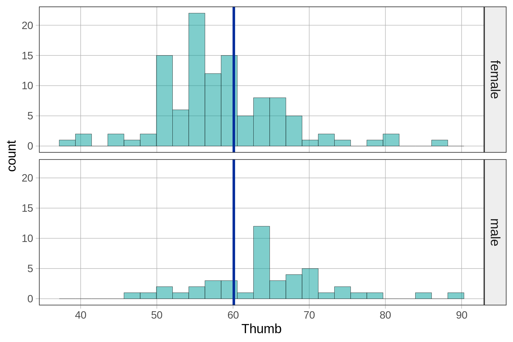
For example, we looked at the distribution of thumb length broken down by sex, which we can see in the two density histograms below. We’ve added the empty model prediction (the grand mean of thumb length) for reference. The empty model prediction would be the one we would use if we didn’t know someone’s sex.
empty_model <- lm(Thumb ~ NULL, data = Fingers)

gf_dhistogram(~ Thumb, data = Fingers) %>%
 gf_facet_grid(Sex ~ .) %>%
 gf_model(empty_model)
We can look at the same relationship (and empty model) in a jitter plot.
empty_model <- lm(Thumb ~ NULL, data = Fingers)

gf_jitter(Thumb ~ Sex, data = Fingers, width = .1) %>%
  gf_model(empty_model)
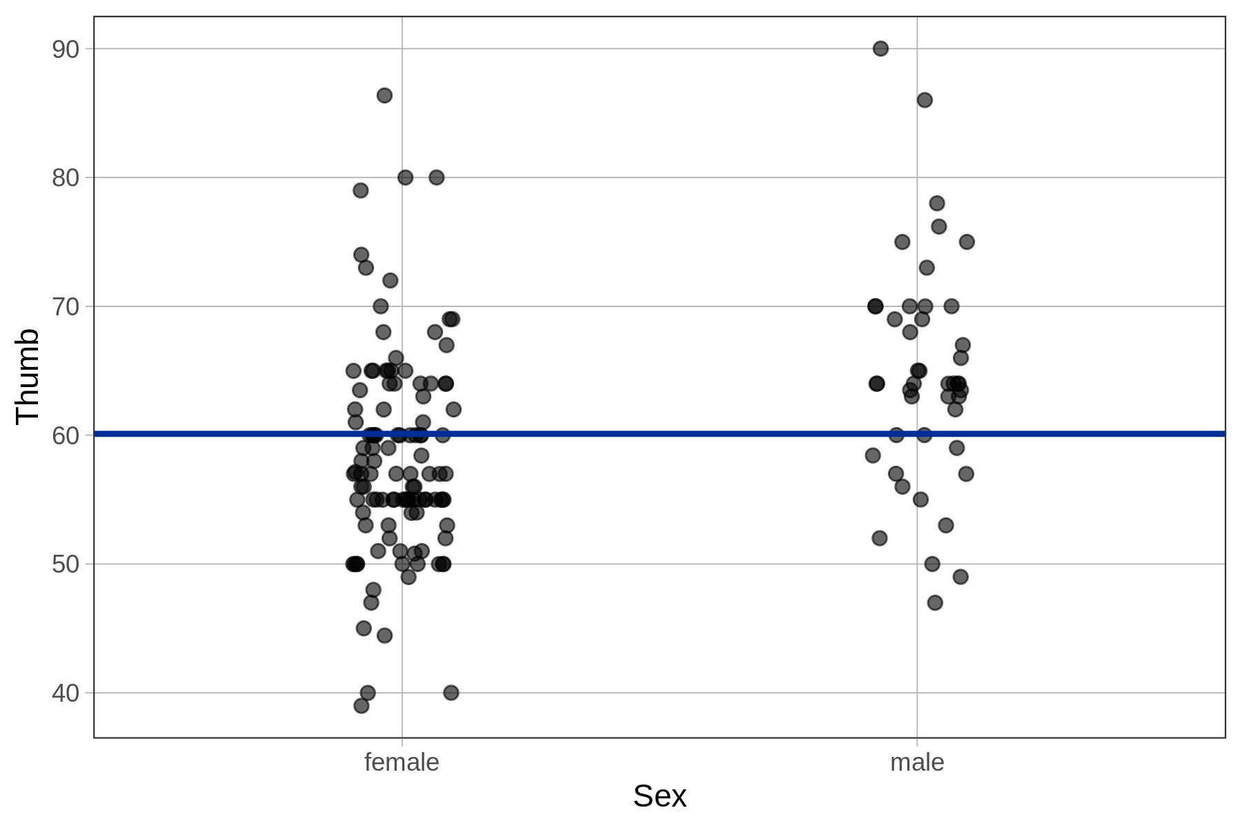
Graphing the data by sex helps us see that there appears to be a relationship in the data between sex and thumb length. Applying our informal definition of explain variation, it appears from the graph that if we know the sex of a student, we can make a slightly better guess about their thumb length.
We can express this relationship between Sex and Thumb informally with a word equation:
Thumb = Sex + Error
We will refer to this as the Sex model of Thumb. Sex doesn’t explain all of the variation in thumb lengths (there still is error), but it does appear to explain some.
Quantifying the Sex Model
In the previous chapter we developed our first real statistical model, the empty model. As it turned out, the best prediction of a future thumb length if we know nothing about the student is just the mean of the outcome variable Thumb. We called this empty model a one-parameter model because our prediction was based on a single estimate: the mean.
Let’s see if we can follow a similar approach to go from our informal Sex model expressed as a word equation to a true statistical model that we can use to make specific quantitative predictions of the thumb lengths of other students not in our sample.
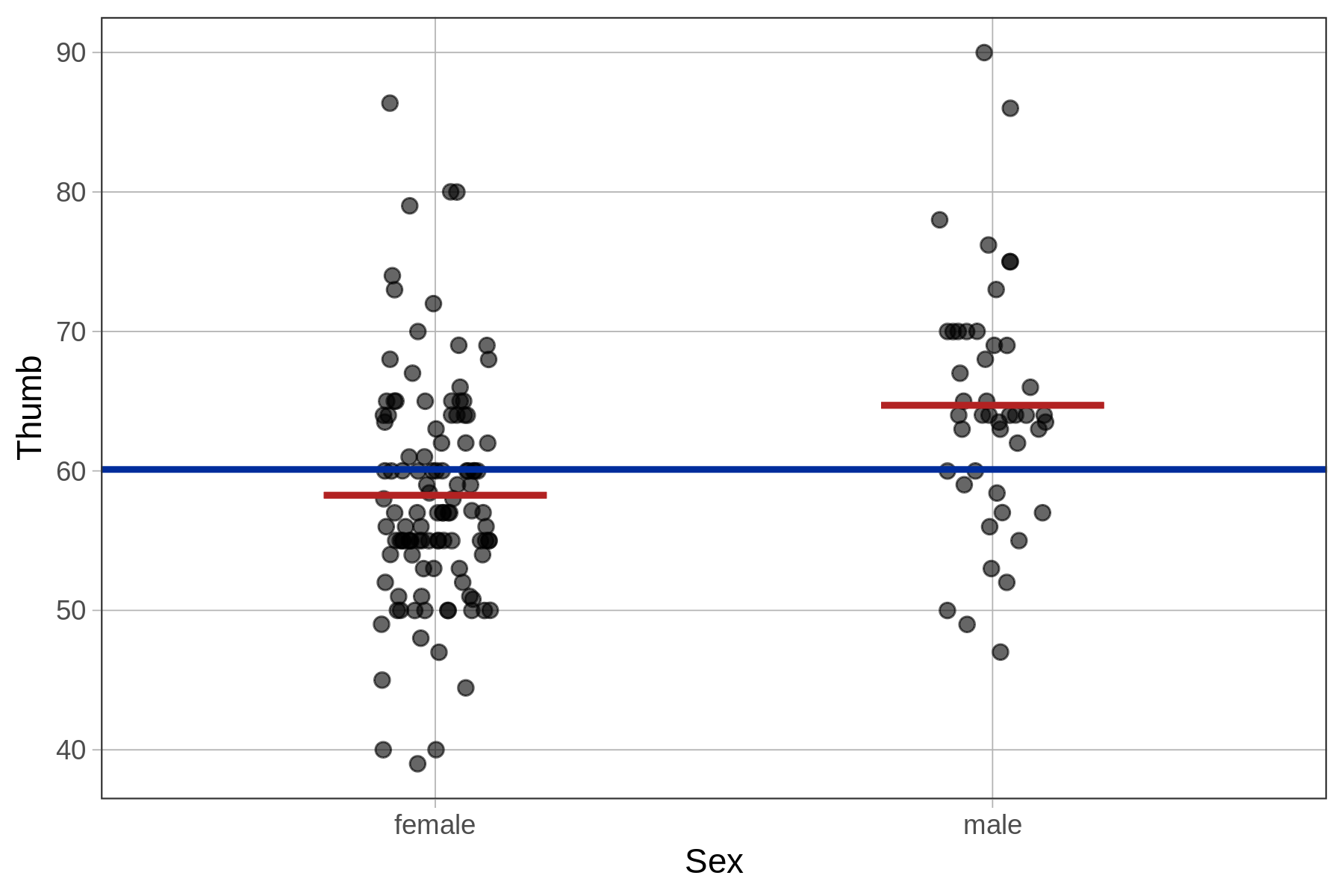
We can turn the Sex model into a statistical model in much the same way we did for the empty model. This time, instead of predicting a student’s thumb length to be the mean of Thumb we will predict it to be the mean thumb length given their sex. Thus, if the student is female, we will predict her thumb length as the mean of female thumb lengths, and if male, the mean of males.
This is a two-parameter model, because it will require us to make two estimates, one for each of the sexes. We have added a visualization of the Sex model to the plot below (the red horizontal lines), in addition to a visualization of the empty model (the blue horizontal line).
In the following pages we will learn how to use R to fit the Sex model to the Fingers data; how to interpret the parameter estimates; how to write the model in GLM notation; how to quantify error around the model; and how to compare the model to the empty model.