3.2 Using R to Fit the Neighborhood Model
Now that we know what the Neighborhood model does – i.e., that it produces two different values for the predictions, one for homes in each neighborhood – let’s use R to fit the model to the data and see how the model makes these predictions.
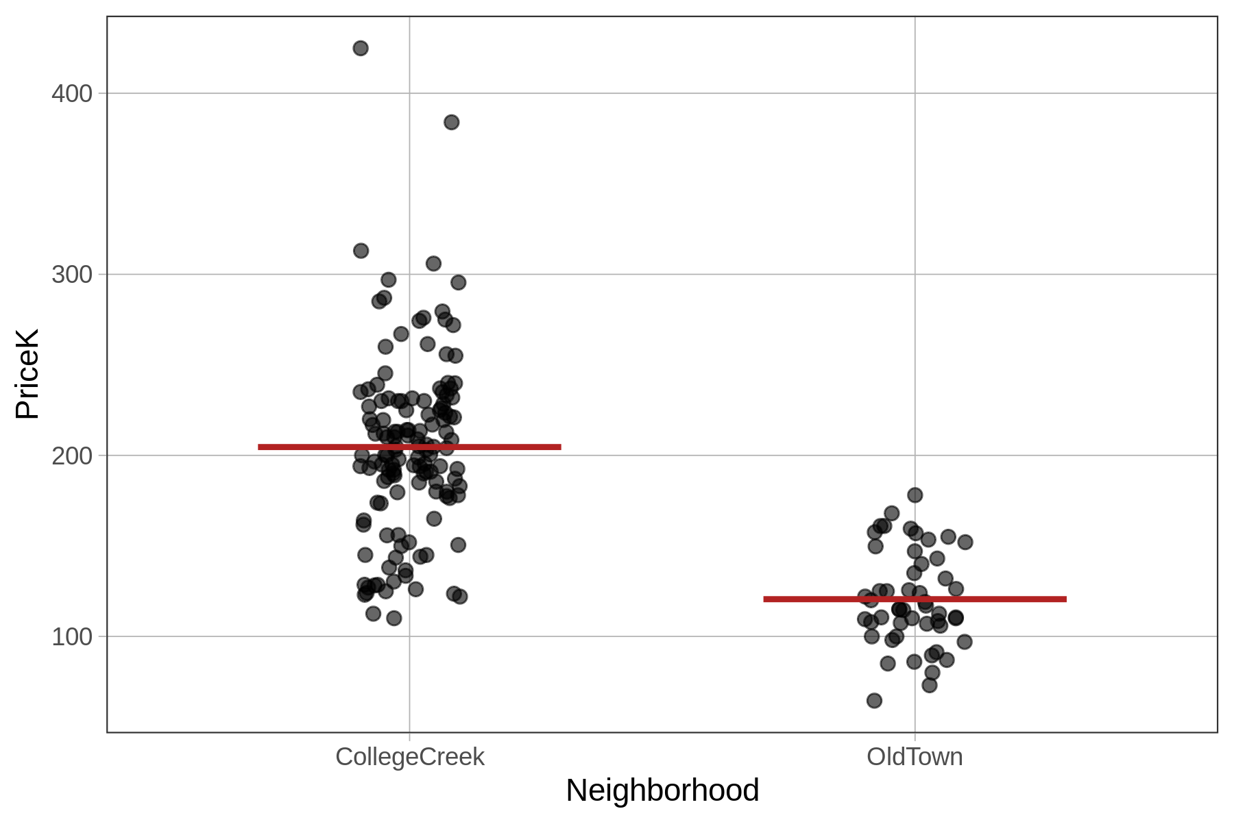
In the code block below, we have filled in the code to fit the Neighborhood model and save it as Neighborhood_model. Chain on gf_model(Neighborhood_model), which will overlay the predictions of the new model on the jitter plot.
require(coursekata)
# find best fitting model
Neighborhood_model <- lm(PriceK ~ Neighborhood, data = Ames)

# add code to visualize the new model on the jitter plot
gf_jitter(PriceK ~ Neighborhood, data = Ames, width = .1)
# find best fitting model
Neighborhood_model <- lm(PriceK ~ Neighborhood, data = Ames)

# add code to visualize the new model on the jitter plot
gf_jitter(PriceK ~ Neighborhood, data = Ames, width = .1) %>%
  gf_model(Neighborhood_model)
# temporary SCT
ex() %>% check_function("gf_model") %>%
  check_result() %>% check_equal()
If you want to change the color of the model (as we did for the figure above), you can add in the argument color = "firebrick" to the gf_model() function.
Generating Predictions from the Neighborhood Model
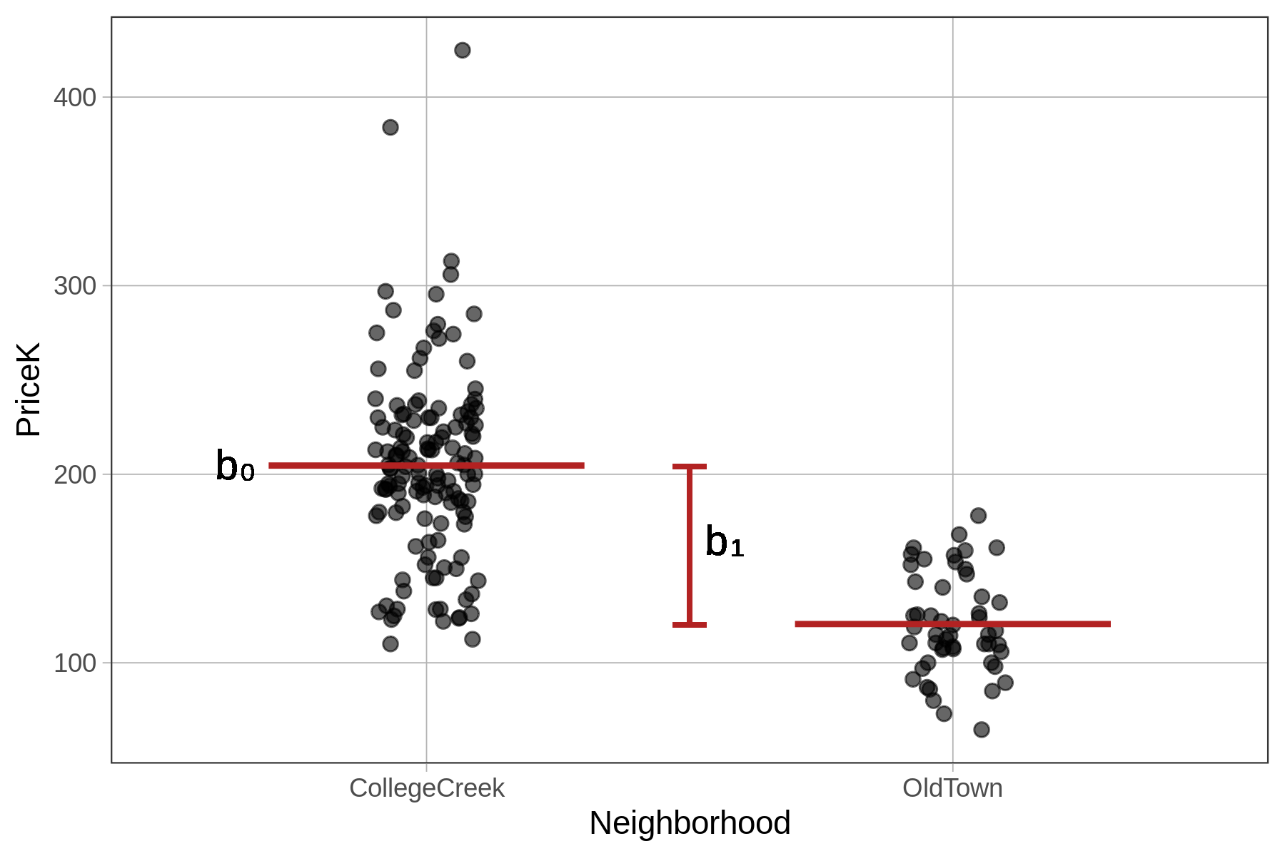
The Neighborhood model in the visualization is represented by two lines because it generates two different predictions depending on which neighborhood the house is in. Let’s use the predict() function to see how this works.
require(coursekata)
# we have saved the Neighborhood model for you
Neighborhood_model <- lm(PriceK ~ Neighborhood, data = Ames)

# write code to generate predictions using this model
# no need to save the predictions
predict(Neighborhood_model)
ex() %>% check_function("predict") %>%
check_result() %>% check_equal()Notice that now, instead of just generating a single number (like the empty model’s 181.4), these predictions are a mix of two numbers (204.6 and 120.56). Using the code below, we have saved these predictions back into Ames as a new variable called Neighborhood_predict and printed out Neighborhood, PriceK, and Neighborhood_predict for 6 of the homes.
Ames$Neighborhood_predict <- predict(Neighborhood_model)
head(select(Ames, Neighborhood, PriceK, Neighborhood_predict))
Neighborhood PriceK Neighborhood_predict
1 CollegeCreek 260 204.5960
2 CollegeCreek 210 204.5960
3 OldTown 155 120.5555
4 OldTown 125 120.5555
5 CollegeCreek 110 204.5960
6 OldTown 100 120.5555
The Neighborhood model looks at the neighborhood of each home before making its prediction. If the home is in College Creek, the model predicts the home will be sold for 204.6K, and if in Old Town, it predicts 120.6K.
We can run favstats() to confirm that these two model predictions are, in fact, the mean prices for homes in each neighborhood.
favstats(PriceK ~ Neighborhood, data=Ames)
  Neighborhood   min      Q1 median    Q3    max     mean       sd   n missing
1 CollegeCreek 110.0 179.675  203.5 230.0 424.87 204.5960 50.38751 134       0
2      OldTown  64.5 106.450  115.0 141.5 178.00 120.5555 26.51013  51       0
Yes, they are: the means of the two neighborhoods in the favstats() output are the same as the model predictions generated by the Neighborhood_model.
Interpreting the lm() Output for the Neighborhood Model
We have fit the Neighborhood model using lm() and then used this model to generate predictions. However, we have not yet looked at the best-fitting parameter estimates for the model.
Recall that for the empty model we estimated one parameter (\(b_0\)), the mean. For the two-group Neighborhood model we are going to estimate two parameters (\(b_0\) and \(b_1\)). Based on the model predictions, we might expect these parameter estimates to be the mean for each neighborhood. Let’s find out.
In the code block below we have fit and saved the Neighborhood model in the R object Neighborhood_model. Add some code to print out the model so we can look at the parameter estimates.
require(coursekata)
# we have saved the Neighborhood model for you
Neighborhood_model <- lm(PriceK ~ Neighborhood, data = Ames)

# print out the best fitting parameter estimates
# we have saved the Neighborhood model for you
Neighborhood_model <- lm(PriceK ~ Neighborhood, data = Ames)

# print out the best fitting parameter estimates
Neighborhood_model
ex() %>% check_output_expr("Neighborhood_model")Call:
lm(formula = PriceK ~ Neighborhood, data = Ames)
Coefficients:
(Intercept) NeighborhoodOldTown
204.60 -84.04 As expected, we see two parameter estimates. But these are not the two estimates we might have expected from looking at the graph and predictions. We expected to get the two neighborhood means: 204.6 and 120.6.
The estimate labeled Intercept in the output (204.60) is the mean price for homes in College Creek. But how should we interpret the second estimate (-84.04), the one labeled NeighborhoodOldTown?
Call:
lm(formula = PriceK ~ Neighborhood, data = Ames)
Coefficients:
(Intercept) <mark>NeighborhoodOldTown</mark>
204.60 <mark>-84.04</mark> Taking a closer look at the output of the model created by using lm(), the label NeighborhoodOldTown for the second parameter estimate is actually useful. Although it might have been nice for R to insert some punctuation between Neighborhood and OldTown, it nevertheless tells us that the second estimate is the adjustment needed to get from the mean of the first group, which is referred to as Intercept, to the mean of the second group, OldTown.
Sure enough, this works: 204.6 + (-84.04) = 120.56. This is the model’s predicted price for a home in Old Town.
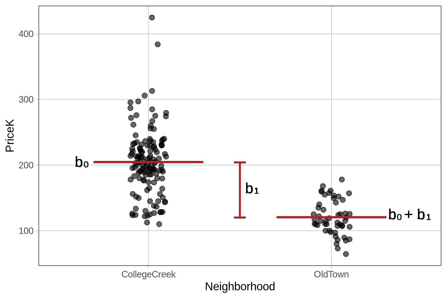
The Parameter Estimates \(b_0\) and \(b_1\)
Whereas the empty model was a one-parameter model (producing only one estimate, \(b_0\), for the grand mean), the Neighborhood model is a two-parameter model (\(b_0\) and \(b_1\)). One of the parameters is the mean for College Creek, the other is the amount that must be added to get the mean for Old Town (as seen in the picture below).
The output of lm() shows us the best fitting values of \(b_0\) and \(b_1\).
Call:
lm(formula = PriceK ~ Neighborhood, data = Ames)

Coefficients:
        (Intercept)  NeighborhoodOldTown
204.60 -84.04 The \(b_0\) parameter estimate represents the mean of the first group (CollegeCreek). The \(b_1\) represents the quantity that must be added to \(b_0\) in order to get the model prediction for the second group, which in this case is OldTown.