1.9 Visualizing & Summarizing Quantitative Variables in R
One of the most important concepts in statistics is the concept of distribution. A distribution is the pattern of variation in a variable. Though a distribution of data is made up of many data points, the overall pattern of variation is often not obvious until you visualize all the data points together as a whole.
We have a host of tools we can use for exploring distributions. Many of these tools are visual—e.g., histograms, boxplots, scatterplots, bar graphs, and so on. Being skilled at using these tools to look at distributions is an important part of the statistician’s toolbox—and R can help you do it.
Let’s start by looking at distributions of quantitative variables (also called numeric variables). Histograms are one of the most powerful tools we have for examining distributions.
There are lots of ways to make histograms in R. We will use the package ggformula to make our visualizations. ggformula is a weird name, but that’s what the authors of this package called it. Because of that, many of the ggformula commands are going to start with gf_; the g stands for the gg part and the f stands for the formula part.
We will start by making a histogram with the gf_histogram() command. Here is how to make a basic histogram of PriceK from the Ames data frame.
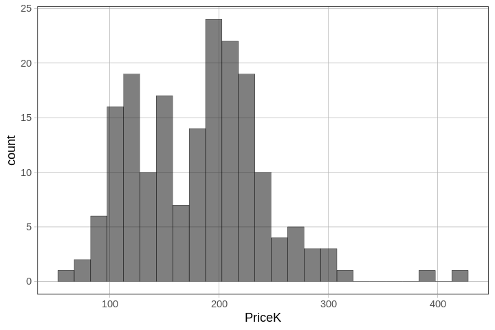
gf_histogram(~ PriceK, fill = "darkgray", data = Ames)
Try running it in R.
require(coursekata)
# try running this code
gf_histogram(~ PriceK, fill = "darkgray", data = Ames)
# try running this code
gf_histogram(~ PriceK, fill = "darkgray", data = Ames)
ex() %>% {
  check_function(., "gf_histogram") %>% check_arg("object", arg_not_specified_msg = "Make sure to keep ~PriceK") %>% check_equal()
  check_function(., "gf_histogram") %>% check_arg("data", arg_not_specified_msg = "Make sure to specify data") %>% check_equal()
  check_function(., "gf_histogram") %>% check_result() %>% check_equal(incorrect_msg = "For this exercise, make sure not to change the code")
}
Notice that there is a ~ (tilde) before the outcome variable PriceK. This is our way of telling R that we want the values of PriceK on the x-axis. We’ll talk more about the tilde and what it is for later.
In a histogram, the columns or bars represent the number of data values that fall within specified intervals of our measured variable (e.g., sale prices). These intervals are called bins, and the width of the intervals on the measurement scale is called the binwidth.
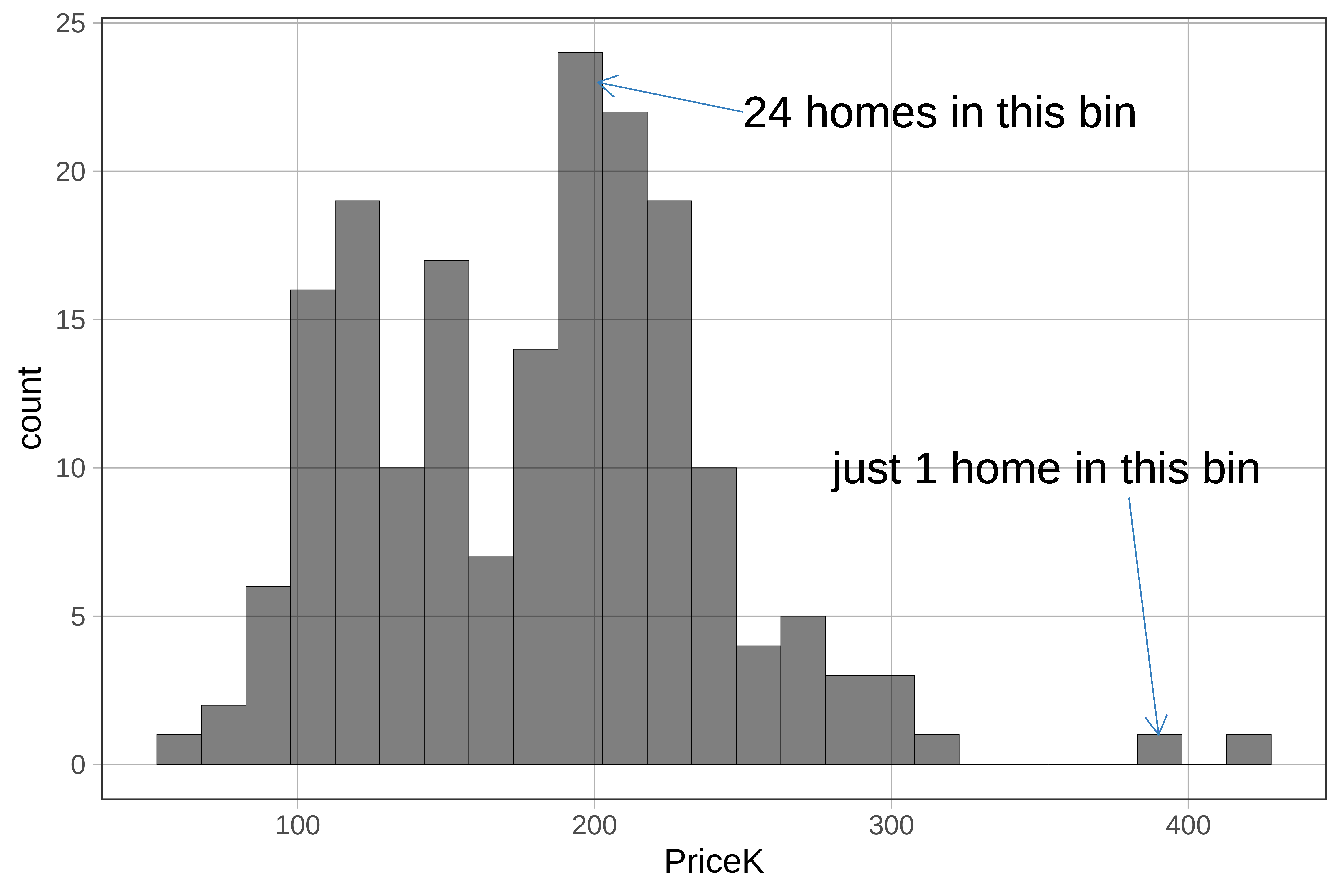
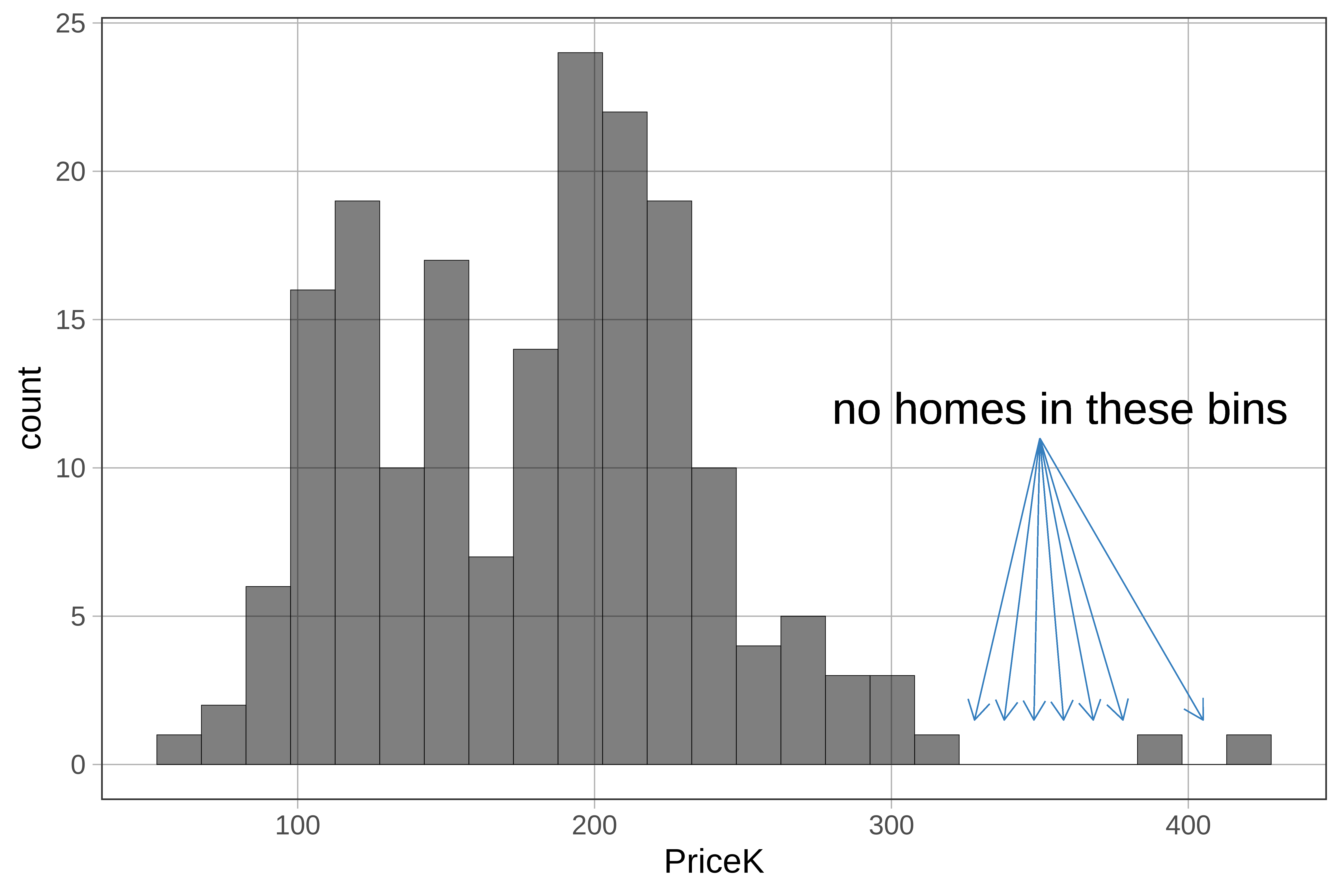
The default number of bins for gf_histogram() is 30. That means there will be approximately 30 bars on the histogram. If you see a blank space with no bar it means that no cases fell within that bin.
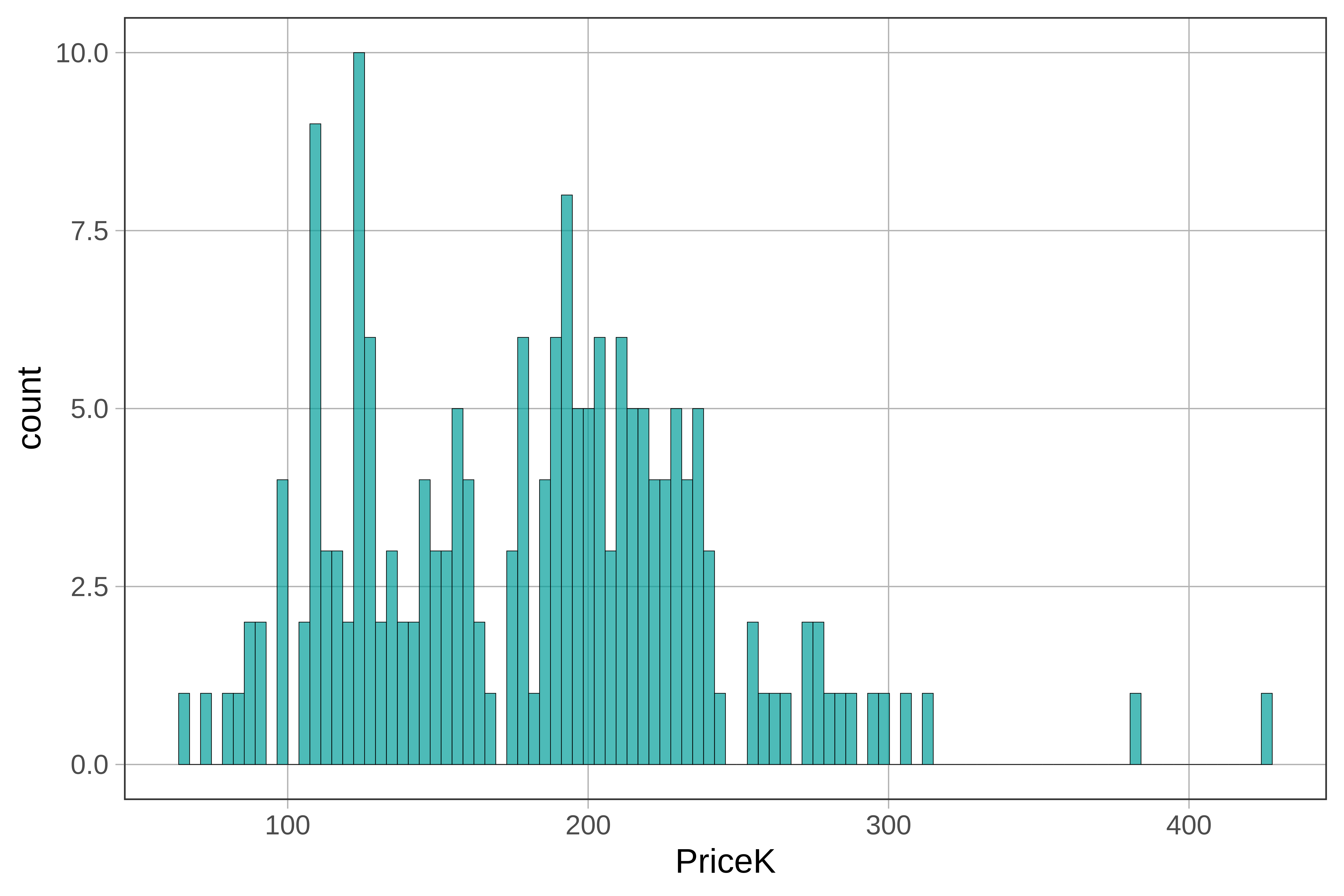
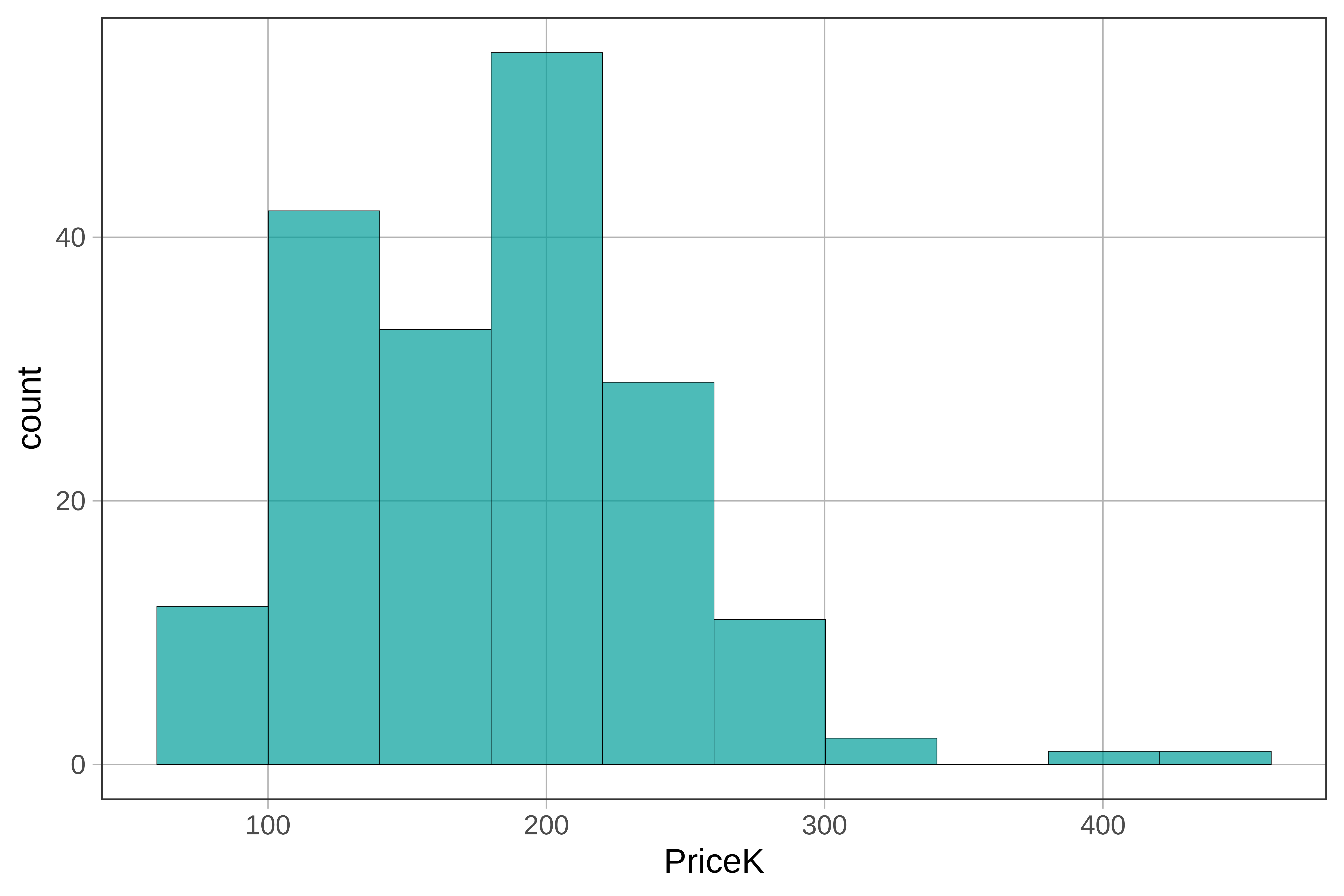
We can adjust the number of bins by adding the argument bins to the histogram code. Run the code below, then change the number of bins from 30 to 100. What happens to the histogram?
require(coursekata)
# modify this code for 100 bins
gf_histogram(~ PriceK, bins = 30, data = Ames)
# modify this code for 100 bins
gf_histogram(~ PriceK, bins = 100, data = Ames)
# temporary SCT
ex() %>% check_function("gf_histogram") %>%
  check_arg("bins") %>%
check_equal()Here we show the histogram with 100 bins (on the left) next to the same histogram with just 10 bins. (Because we did not include a fill= argument, R uses our default color, which is kind of a teal or blue-green.)
|
|
|---|---|
|
|
The histogram provides a nice way of visualizing the overall distribution of sale prices. We see that most homes sold for between $100K and $300K, with just a couple of homes way up around $400K.
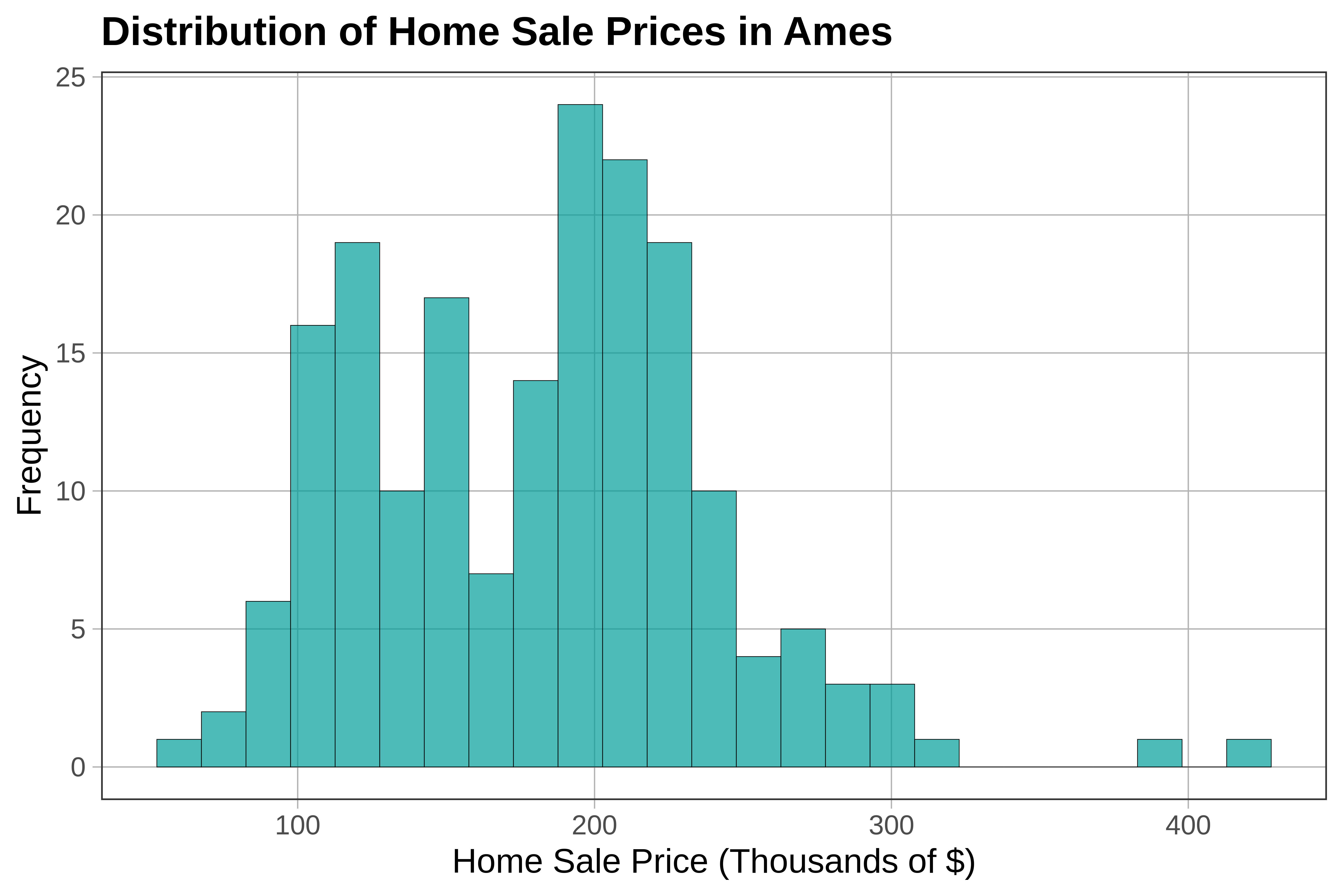
It’s usually a good idea to include clear labels and titles on our plots. One way to do this is to use the pipe operator (%>%) to chain on additional code. Below, we start with a line of code to make a histogram. By adding %>% at the end of that line, we can connect another command, gf_labs(), to overlay labels:
gf_histogram(~ PriceK, data = Ames) %>%
  gf_labs(title = "Distribution of Home Sale Prices in Ames", x = "Home Sale Price (Thousands of $)", y = "Frequency")
TheThe Five-Number Summary
One way to get a quick overview of the distribution of a quantitative variable is by generating a five-number summary. The favstats() command (for favorite statistics) is an easy way to generate this summary. Here is how to get the favstats for PriceK from Ames.
favstats(~ PriceK, data = Ames) min Q1 median Q3 max mean sd n missing
64.5 128.5 188 219.5 424.87 181.4281 58.68659 185 0The favstats() function automatically gives you the five-number summary: min, Q1, median, Q3, and max. It also shows the mean, standard deviation (sd), number of observations (n), and missing, which in this example is the number of homes with missing values for PriceK (none in this dataset).
If we arrange all the values of a variable in order from lowest to highest, the median is the value of the middle observation. 50% of all data points fall below the median, and 50% above. Q1 (or the first quartile) is the middle value for the lower 50% of observations, Q3 the middle value for the upper 50%. Quartiles, therefore, divide the data points into four equal-sized groups based on their values on the variable.
The five-number summary can also be visualized with a boxplot. In the code below, we have used %>% to overlay a boxplot on the histogram of PriceK:
gf_histogram(~ PriceK, data = Ames) %>%
gf_boxplot(fill = "white", width=3)
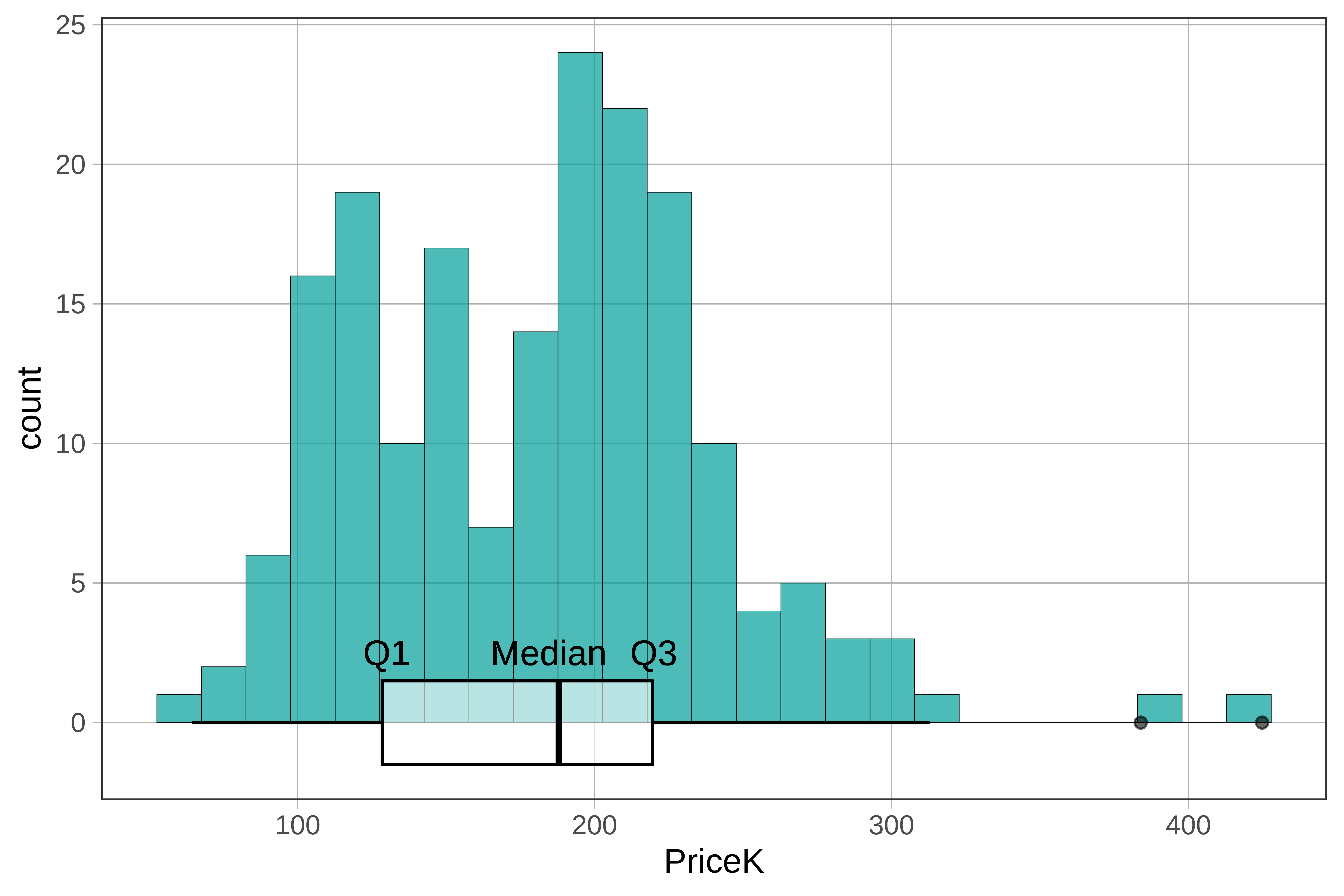
Note: We added in the labels Q1, Median, and Q3. Usually the code just depicts the histogram and boxplot.