7.2 Visualizing Price = Home Size + Neighborhood
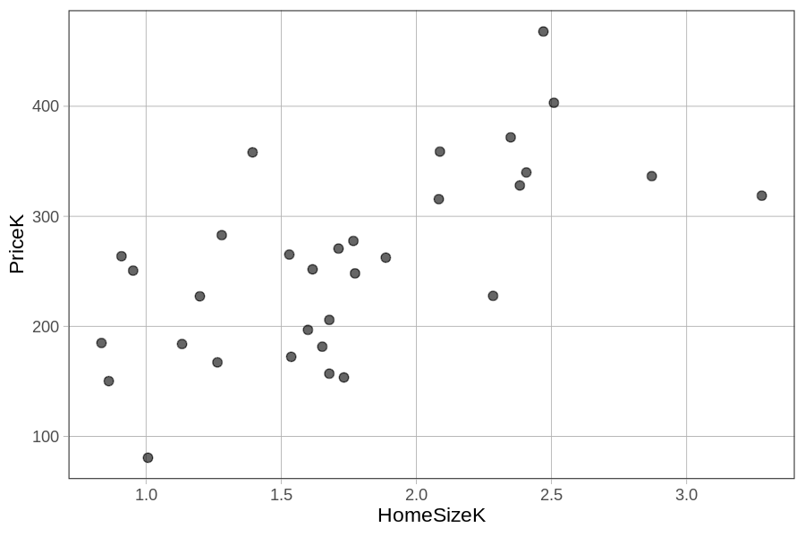
Let’s explore this idea with some visualizations. We will start with a graph of the home size model, plotting PriceK by HomeSizeK, with this code: gf_point(PriceK ~ HomeSizeK, data = Smallville). We will then explore some ways we could visualize the effect of Neighborhood above and beyond that of HomeSizeK.
Using Facet Grids
Here’s a scatter plot of PriceK by HomeSizeK for the 32 homes in Smallville.
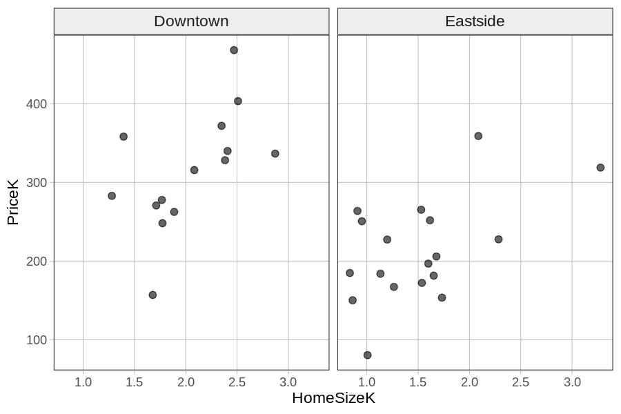
One way to integrate Neighborhood into the same visualization is to make a grid of scatter plots, each one representing a different neighborhood. We can do this by chaining on gf_facet_grid(Neighborhood ~ .) on top of the scatter plot.
Because we put Neighborhood before the tilde (Neighborhood ~ .) the two graphs will be stacked vertically (i.e., along the y-axis). To put the graphs side-by-side (i.e., in a grid along the x-axis), we would put the variable after the tilde: . ~ Neighborhood. Notice that in R, as in GLM notation, we usually follow the form Y ~ X.
In the code block below, try putting the two scatter plots, one for each Neighborhood, side by side in a horizontal grid.
require(coursekata)

# delete when coursekata-r updated
Smallville <- read.csv("https://docs.google.com/spreadsheets/d/e/2PACX-1vTUey0jLO87REoQRRGJeG43iN1lkds_lmcnke1fuvS7BTb62jLucJ4WeIt7RW4mfRpk8n5iYvNmgf5l/pub?gid=1024959265&single=true&output=csv")
Smallville$Neighborhood <- factor(Smallville$Neighborhood)
Smallville$HasFireplace <- factor(Smallville$HasFireplace)
# Make a horizontal grid of scatter plots using Neighborhood
gf_point(PriceK~ HomeSizeK, data = Smallville)
gf_point(PriceK~ HomeSizeK, data = Smallville) %>%
gf_facet_grid(. ~ Neighborhood)
# temporary SCT
ex() %>% check_error()
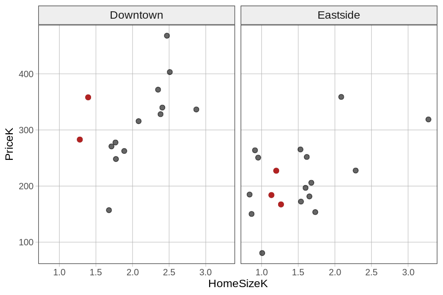
Based on these plots, you can see that knowing both neighborhood and home size would improve your predictions. One way to see this is to look, within each neighborhood, at the prices of homes that are between 1000 and 1500 square feet (i.e., HomeSizeK between 1.0 and 1.5). We have colored them differently in the faceted plot below. You can see that even for homes the same size, there still are higher prices in Downtown than in Eastside.
Using Color
Another approach to adding neighborhood to the scatter plot of PriceK by HomeSizeK is to assign different colors to points representing homes from the different neighborhoods. You can do this by adding color = ~Neighborhood to the scatter plot. (The ~ tilde tells R that Neighborhood is a variable.) Try it in the code block below.
require(coursekata)

# delete when coursekata-r updated
Smallville <- read.csv("https://docs.google.com/spreadsheets/d/e/2PACX-1vTUey0jLO87REoQRRGJeG43iN1lkds_lmcnke1fuvS7BTb62jLucJ4WeIt7RW4mfRpk8n5iYvNmgf5l/pub?gid=1024959265&single=true&output=csv")
Smallville$Neighborhood <- factor(Smallville$Neighborhood)
Smallville$HasFireplace <- factor(Smallville$HasFireplace)
# Add in the color argument
gf_point(PriceK ~ HomeSizeK, data = Smallville)
gf_point(PriceK ~ HomeSizeK, data = Smallville, color = ~Neighborhood)
# temporary SCT
ex() %>% check_error()We used this code (also overlaying the HomeSizeK regression line on the scatter plot) to get the graph below.
HomeSizeK_model <- lm(PriceK ~ HomeSizeK, data = Smallville)
gf_point(PriceK ~ HomeSizeK, data = Smallville, color= ~ Neighborhood) %>%
gf_model(HomeSizeK_model, color = "black")
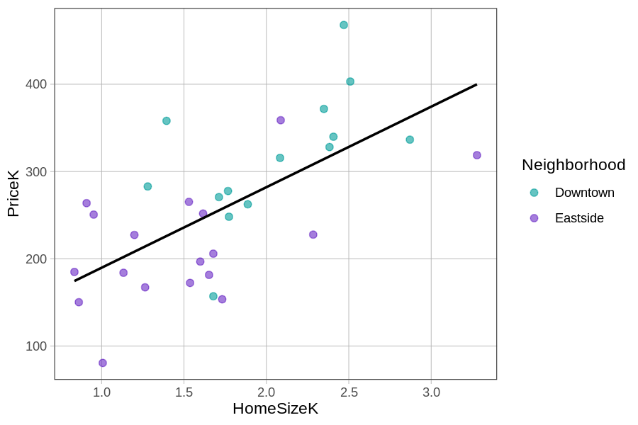
Adding the regression line makes it easier to see the error (or residuals) leftover from the HomeSizeK model. Notice that the teal dots (homes from Downtown) are mostly above the regression line (i.e., with positive residuals from the HomeSizeK model) while the purple dots (from Eastside) are mostly below the line (negative residuals).
This indicates that Downtown homes are generally more expensive than what the home size model would predict, while Eastside homes are less expensive. This pattern is a clue that tells us that adding Neighborhood into the HomeSizeK model will explain additional variation in PriceK above and beyond that explained by just the home size model alone.