1.10 Visualizing & Summarizing Categorical Data in R
So far we have focused on examining the distributions of quantitative variables. For categorical variables we will use different methods.
Consider a variable such as Foundation which tells us what kind of foundation a house has (e.g., brick and tile, poured concrete, or cinder blocks).
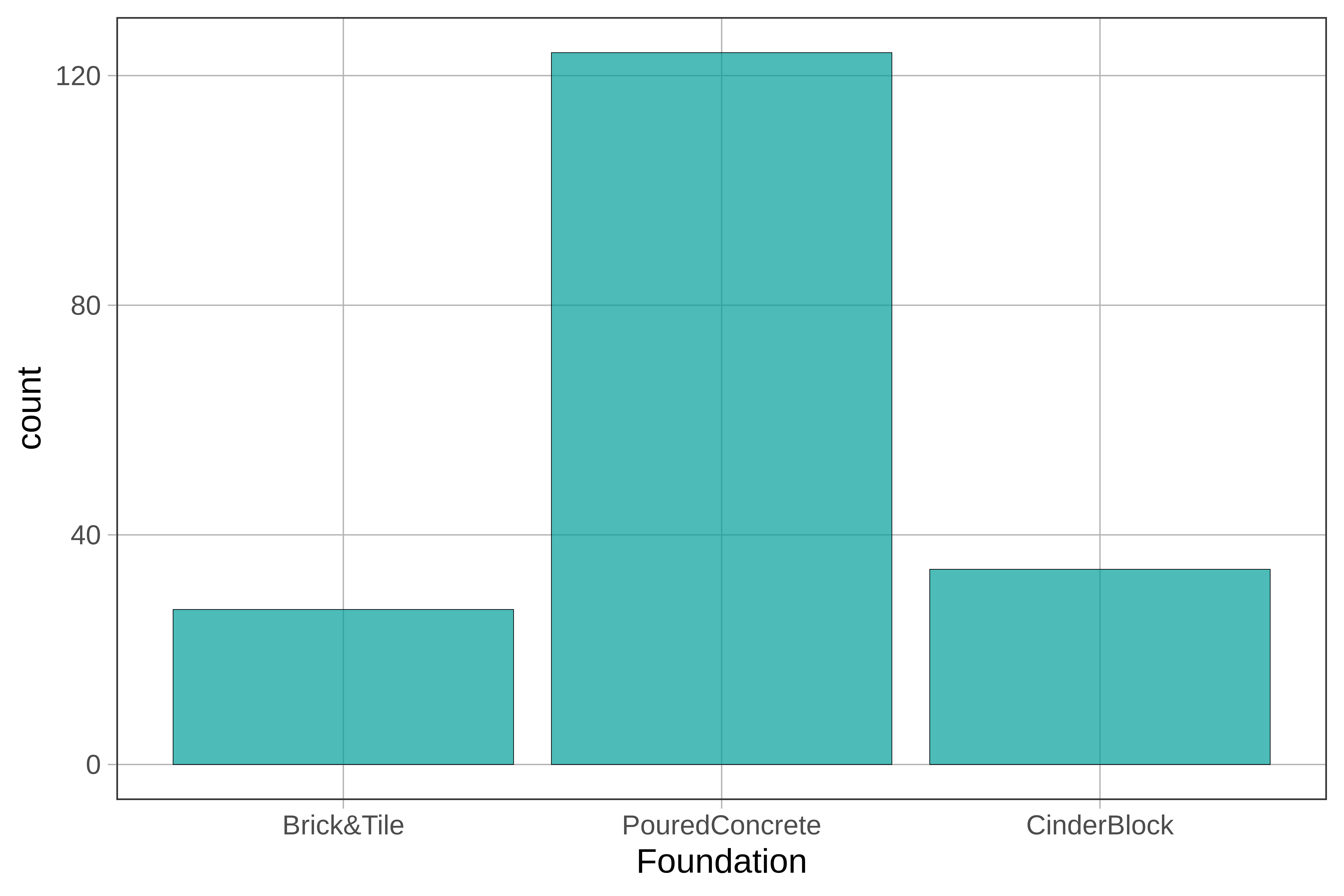
Although we might be tempted to call this a normal distribution, isn’t it a little strange to say the center of this distribution is Poured Concrete? What is the range of this distribution? Is it CinderBlock minus Brick&Tile? These descriptions of this distribution don’t seem to make sense!
We have thus far used histograms to examine the distribution of a variable. But histograms aren’t appropriate for categorical variables. And if R knows a variable is categorical (if, for example, you have specified it as a factor), it won’t even run the histogram, and will give you an error message instead.
Bar Graphs
When a variable is categorical you can visualize the distribution with a bar graph. It looks like a histogram, but it’s not. There is no such thing as bins, for example, in a bar graph. The number of bars in a bar graph will always equal the number of categories in your variable.
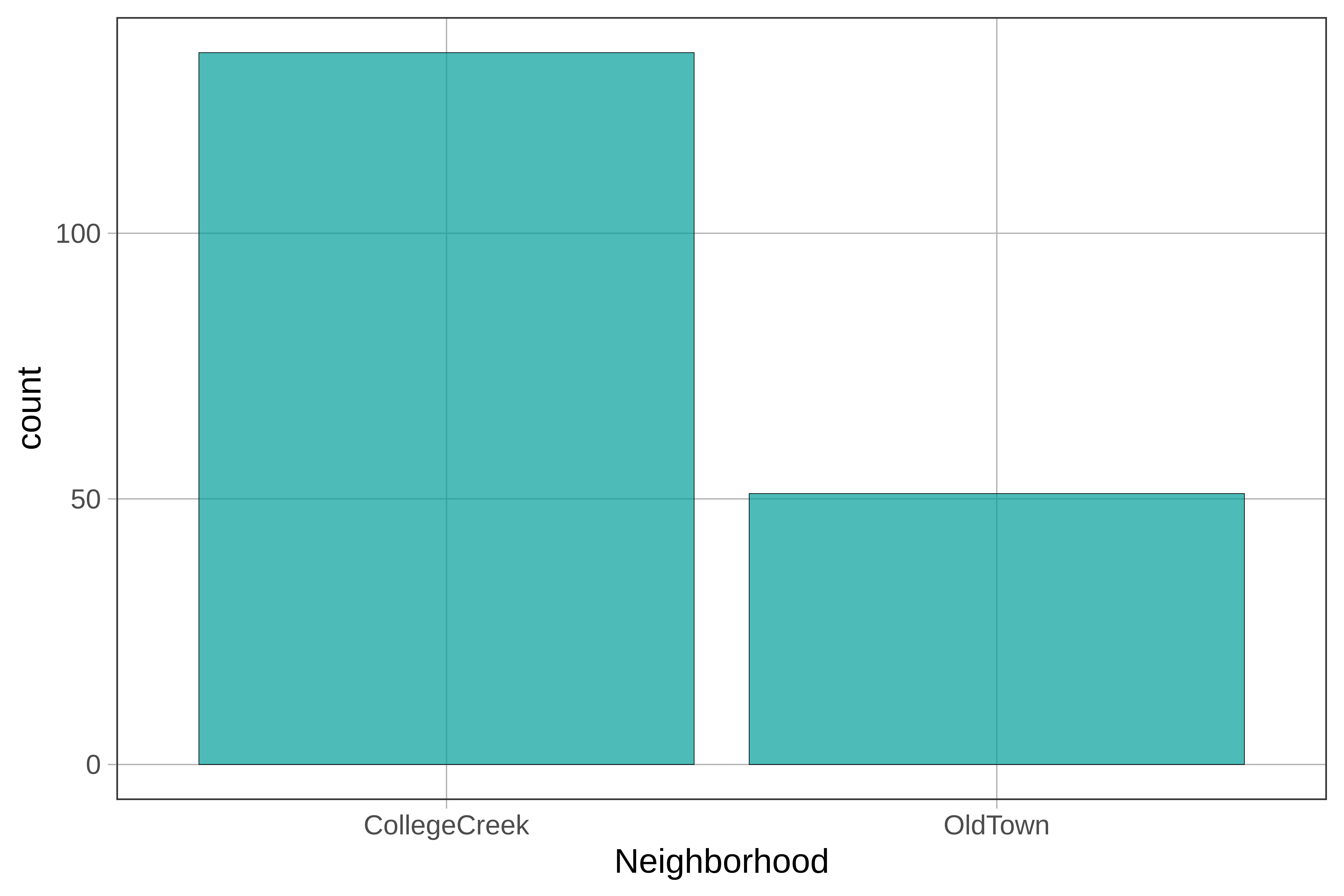
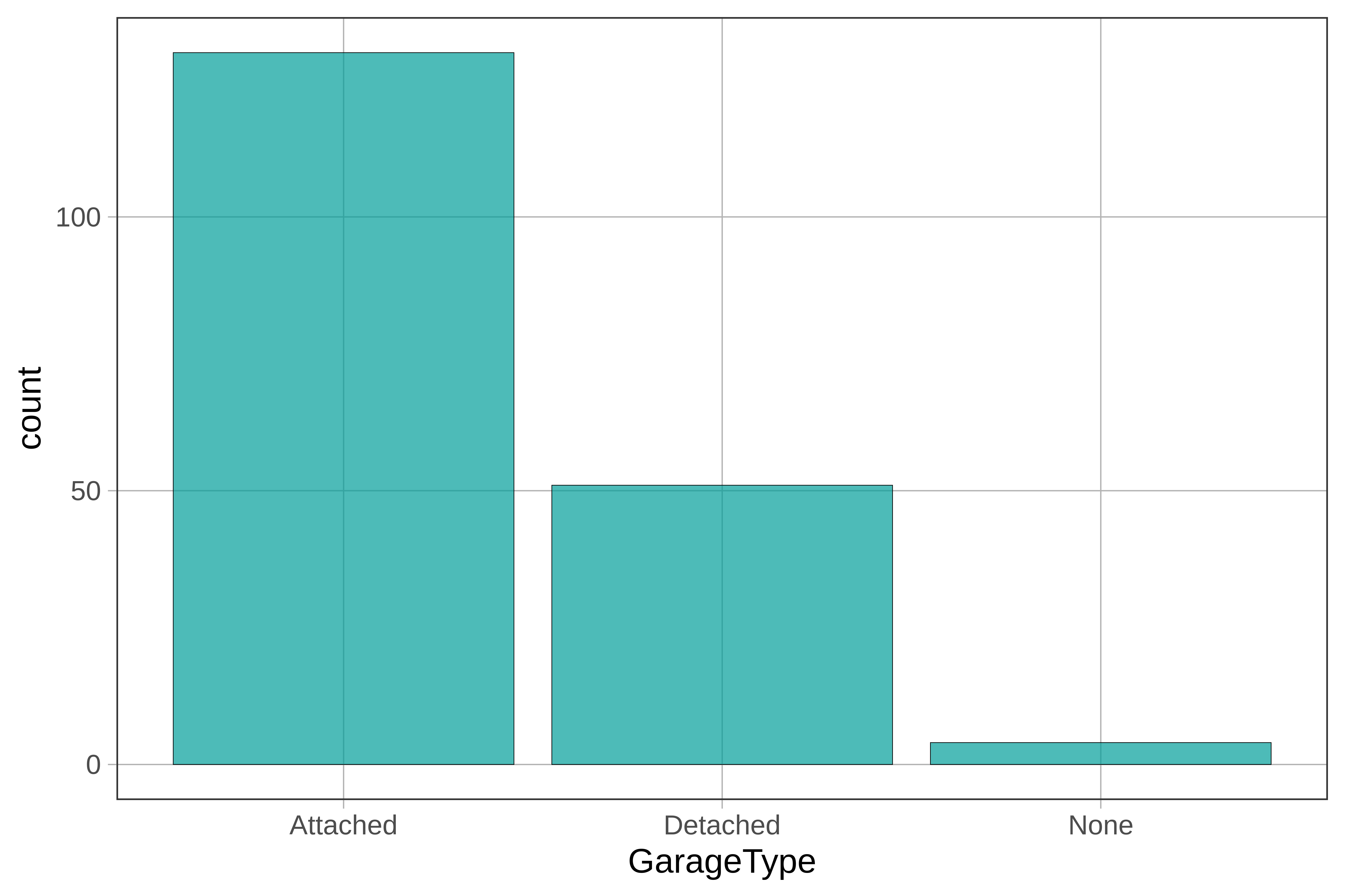
Let’s take a look at some categorical variables from the Ames data frame: Neighborhood and GarageType. Both of these have been specified as factors and the levels have been labeled already.
Here’s some code to make a bar graph in R:
gf_bar(~ Neighborhood, data = Ames)
Use the code window below to create a bar graph of GarageType.
require(coursekata)
# Create a bar graph of GarageType in the Ames data frame. Use the gf_bar() function
gf_bar(~ GarageType, data = Ames)
ex() %>% check_function("gf_bar") %>% {
  check_arg(., "data") %>% check_equal(incorrect_msg="Don't forget to set `data = Ames`")
  check_result(.) %>% check_equal(incorrect_msg = "Did you use `~GarageType`?")
}
You can change the width of these bars by adding the argument width and setting it to some number between 0 and 1. You can also use the arguments color and fill to change the colors of the bars. Try playing with the width and colors here.
require(coursekata)
# Add arguments color and fill and width to this bar graph
gf_bar(~ GarageType, data = Ames)
# any values of arguments are acceptable
gf_bar(~ GarageType, color = "yellow", fill = "navyblue", width = .4, data = Ames)
ex() %>% {
  check_function(., "gf_bar", index = 1) %>% {
    check_arg(., "color")
    check_arg(., "fill")
    check_arg(., "width")
  }
}gf_props() or gf_percents(). Sometimes, instead of counts, we’d like to see the relative proportions of homes with certain characteristics. For example, from gf_bar() we can see that there are a bit fewer than 150 homes in the College Creek neighborhood versus about 50 homes in Old Town. To show proportions instead of counts on the y-axis, use gf_props() instead of gf_histogram() in the code block below.
require(coursekata)
# change this to a bar chart with proportions
# don’t change the fill color
gf_bar(~ GarageType, data = Ames, fill = "royalblue")
gf_props(~ GarageType, data = Ames, fill = "royalblue")
ex() %>% check_function("gf_props") %>%
  check_result() %>% check_equal()
