2.3 More Two-Variable Visualizations
Scatter Plots and Jitter Plots
Another common way to show the relationship between two variables is a scatter plot. A scatter plot shows each data point as a dot in two-dimensional space, with one variable (usually the explanatory variable) on the x-axis, and the other (the outcome variable) on the y-axis.
To make a scatter plot in ggformula we use the gf_point() function. Let’s try using gf_point() to examine home prices by neighborhood.
gf_point(PriceK ~ Neighborhood, data = Ames)
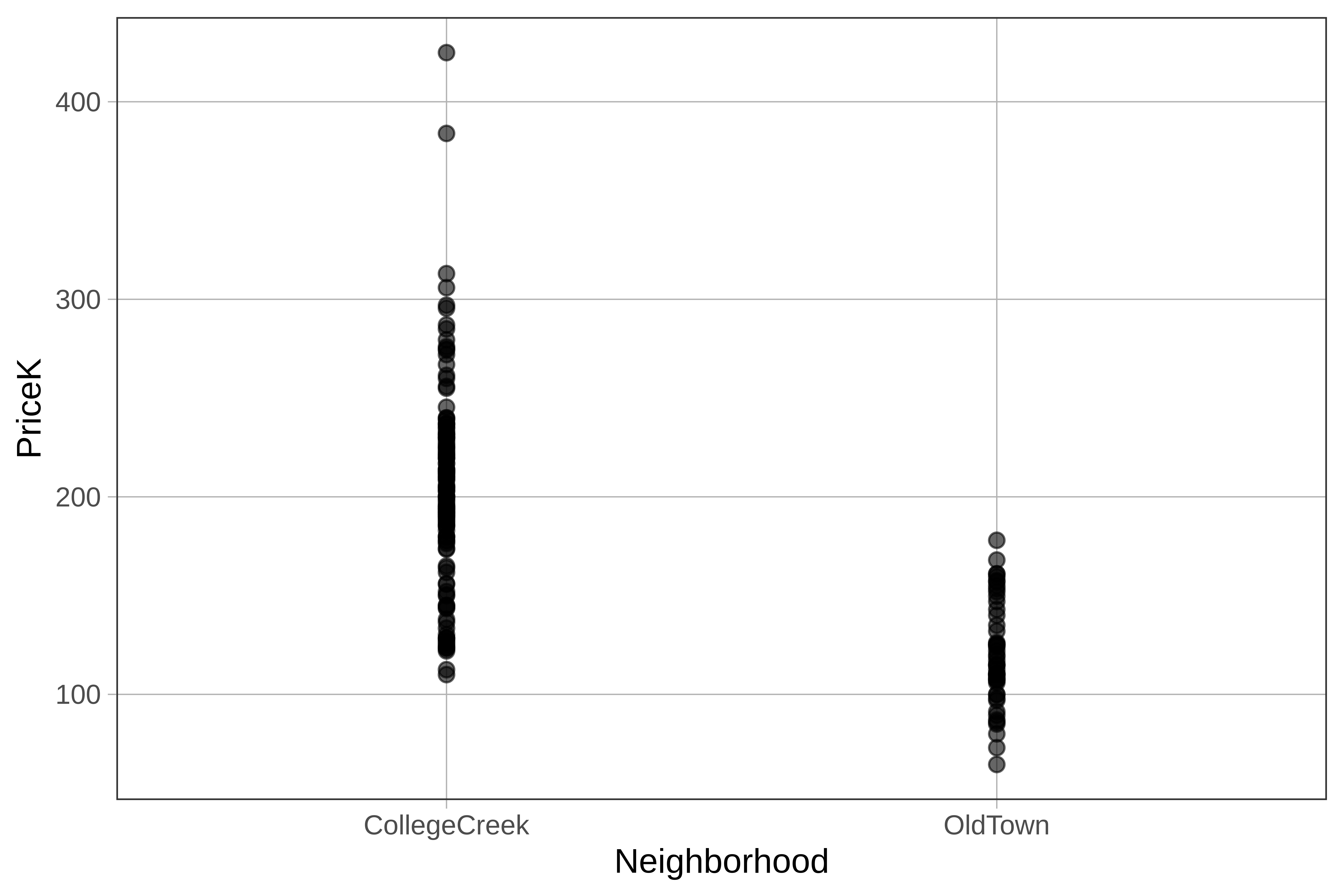
When one of your variables is categorical (e.g. Neighborhood), the points can get bunched up on top of each other, making it hard to see them, especially if you have a lot of data points. Thankfully, there’s a solution to this problem: gf_jitter().
gf_jitter() adds some random noise to the plot, either horizontally, vertically, or both. This spreads the points out so you can see them better. We’ll usegf_jitter() to create a jitter plot of home prices by neighborhood.
gf_jitter(PriceK ~ Neighborhood, data = Ames, width = 0.1)
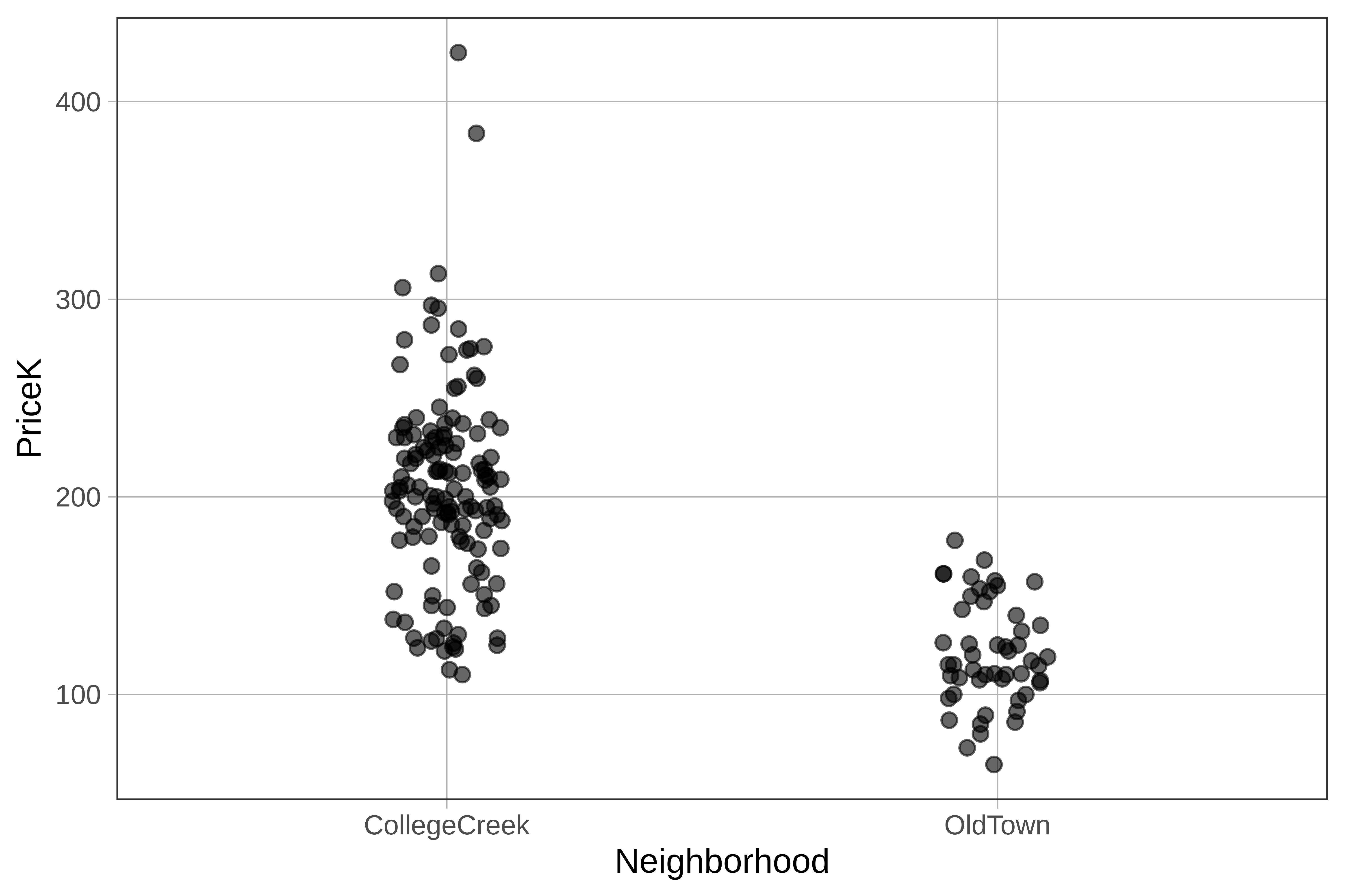
Note that we set the width argument to control how much the points get jittered on the horizontal axis. width can take a number between 0 and 1. You can try experimenting with different values to get the plot that’s most useful to you.
If a point is in the Old Town column, it’s a home in Old Town. But being more to the left or right within the Old Town column doesn’t mean anything. The jitter is there just so the points do not overlap too much and obscure how many Old Town homes there are at a certain price.
Sometimes we may want to jitter one direction but not the other. For example, we could include the argument height=0 to tell R that we don’t want the points jittered vertically.
Boxplots
gf_point() and gf_jitter() are useful. They give us a way to see each individual data point, yet at the same time notice clusters and patterns across all the points. There are times, however, when we want to transcend the individual data points and just see the pattern. Boxplots are helpful in this regard.
Here’s how we would create a boxplot of home prices broken down by neighborhood.
gf_boxplot(PriceK ~ Neighborhood, data = Ames)
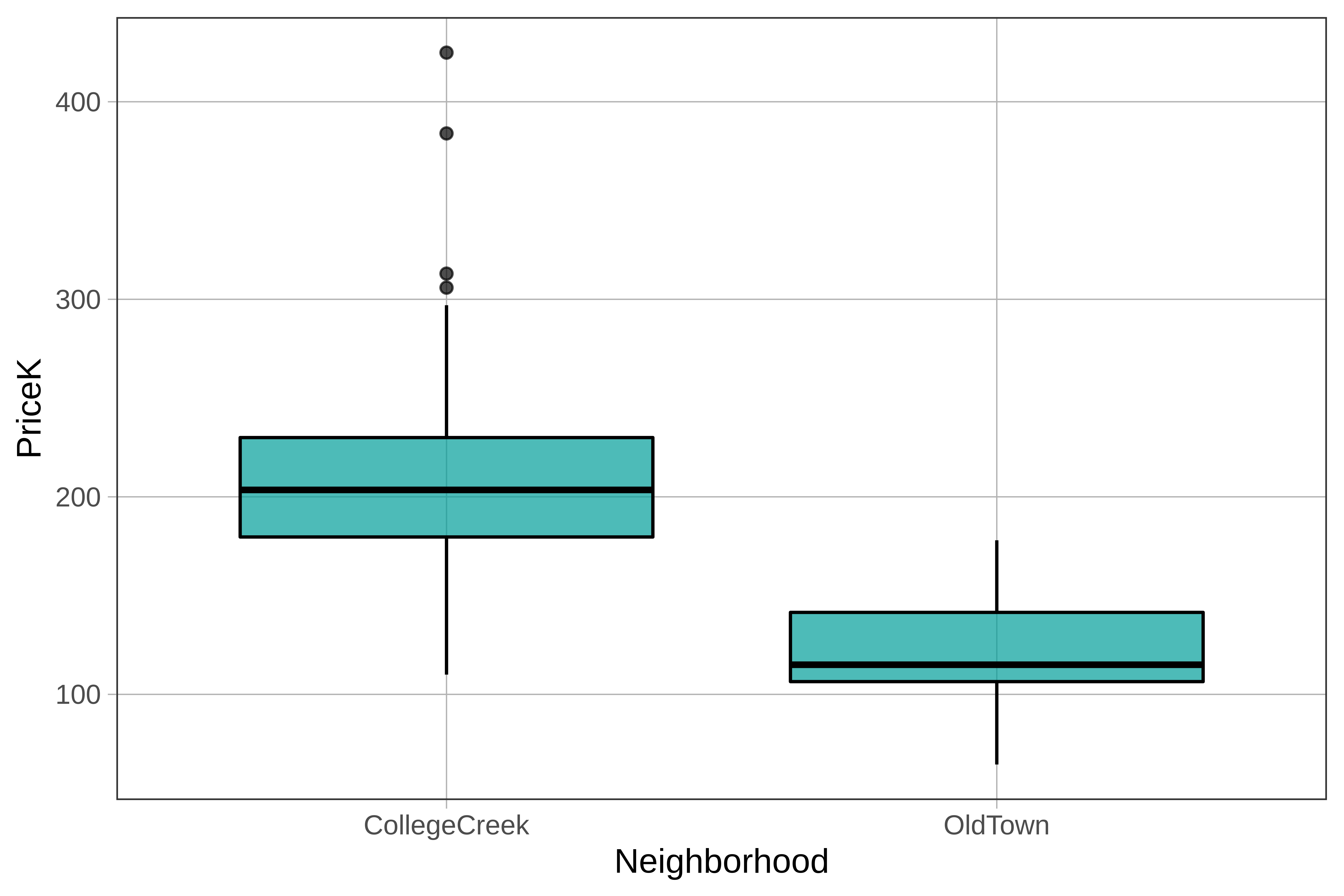
Recall from the previous chapter that boxplots are a way of visually representing the five number summary: min, Q1, median, Q3, and max. By adding in an explanatory variable (in this case Neighborhood), we tell R to create two boxplots side by side, one for each neighborhood.
If we want to get the five-number summary broken down by neighborhood we can simply add an explanatory variable into the favstats() function, like this:
favstats(PriceK ~ Neighborhood, data = Ames) Neighborhood min Q1 median Q3 max mean sd n missing
1 CollegeCreek 110.0 179.675 203.5 230.0 424.87 204.5960 50.38751 134 0
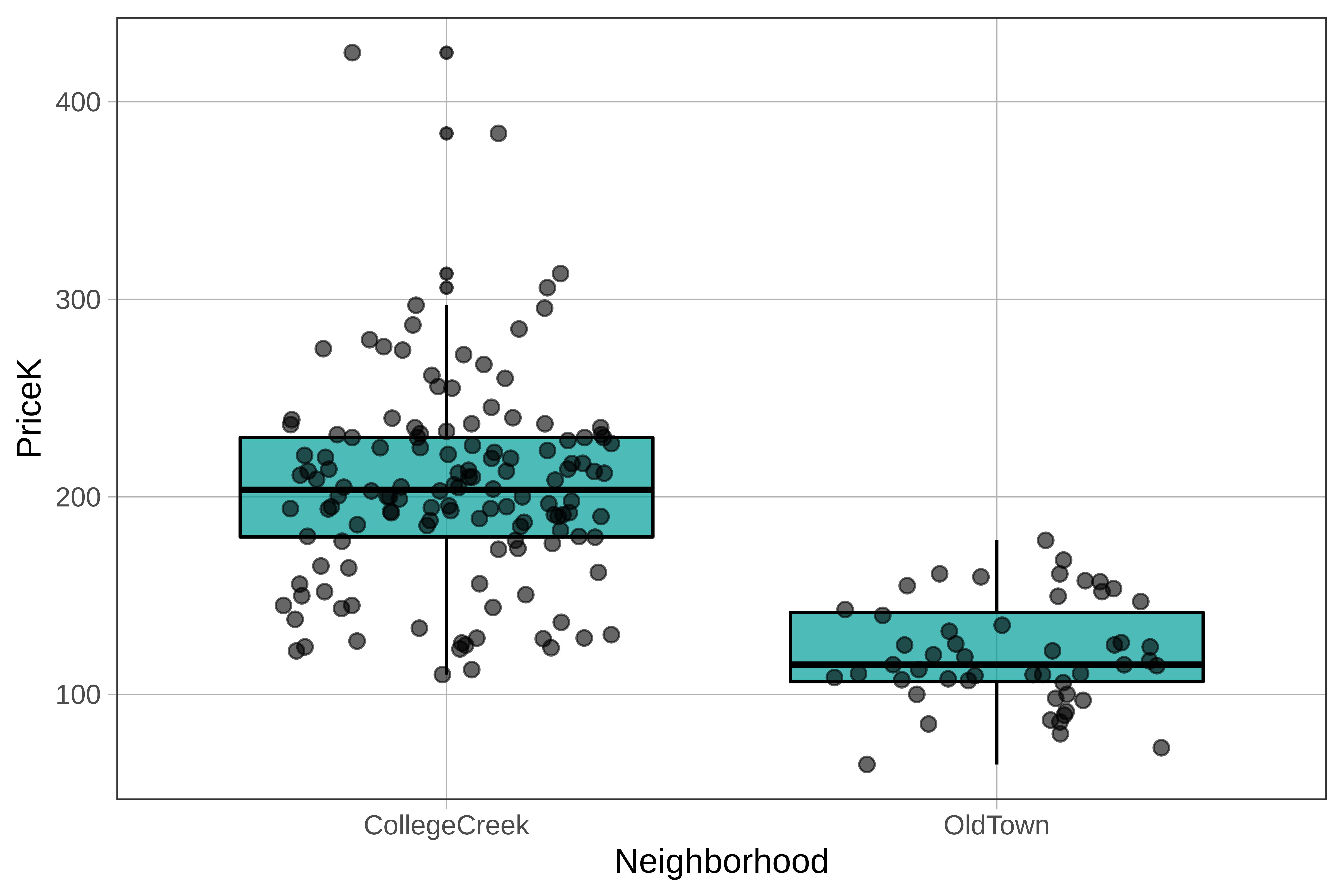
2 OldTown 64.5 106.450 115.0 141.5 178.00 120.5555 26.51013 51 0Here’s the code that generated the boxplots of price broken down by neighborhood. Use the pipe operator (%>%) to overlay a jitter plot on top of the boxplot.
require(coursekata)
gf_boxplot(PriceK ~ Neighborhood, data = Ames)
gf_boxplot(PriceK ~ Neighborhood, data = Ames) %>%
  gf_jitter()
ex() %>%
  check_function("gf_jitter") %>%
  check_result() %>%
check_equal()You didn’t have to but we adjusted the width argument of the jitter plot (to .3) so that the points would stay mostly within the columns defined by the boxes. Notice that in each neighborhood, about 50% of the dots are in the boxes, with about 25% of the dots above, and 25% below, the boxes.
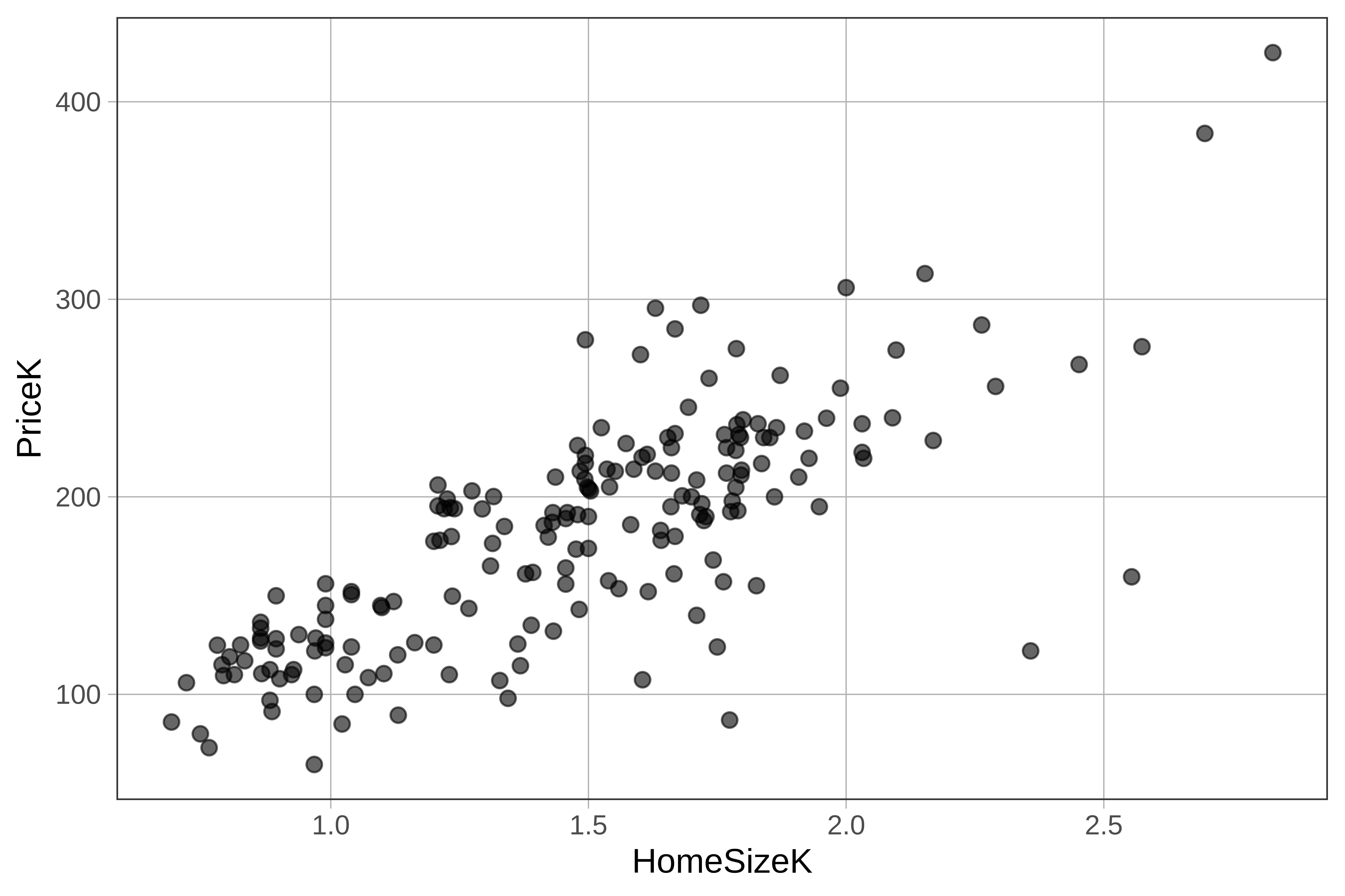
Visualizing the Relationship Between Two Quantitative Variables
Thus far we’ve focused on visualizing the relationship between PriceK and Neighborhood*. But there are other variables that might explain variation in PriceK, for example,HomeSizeK, which is the price of the home in thousands of dollars.
Scatter plots are usually the best way to explore the relationship between two quantitative variables (e.g., PriceK and HomeSizeK). Try making one in the code window below.
require(coursekata)
# make a scatter plot to explore the relationship between PriceK and HomeSizeK
gf_point(PriceK ~ HomeSizeK, data = Ames)
ex() %>% check_function("gf_point") %>%
  check_result() %>% check_equal()