2.4 Explaining Variation in an Outcome Variable
Word Equations
We’ve learned several ways to visualize the relationship between an outcome variable and an explanatory variable in a data frame, including gf_point(), gf_jitter(), and gf_boxplot().
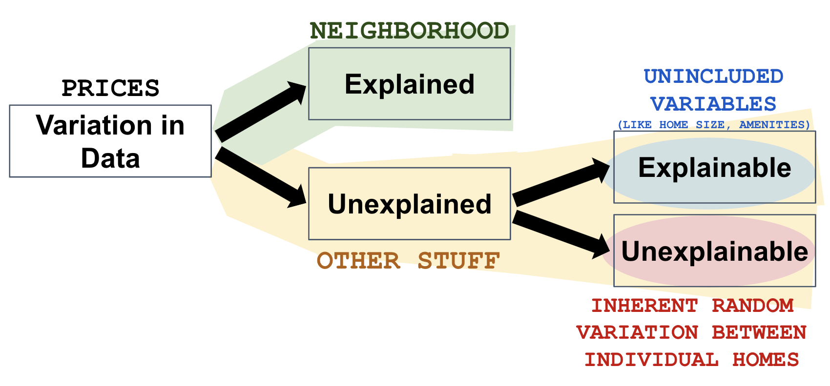
We saw from our visualizations that Neighborhood explained some of the variation in home prices, with prices in College Creek being generally higher than prices in Old Town. We could also say there is a relationship between neighborhood and home prices.
Another way to represent relationships is with word equations. Here is a word equation that represents the relationship between home prices and neighborhood:
PriceK = Neighborhood + Other Stuff
We can read this equation like this: “Variation in PriceK is explained by variation in Neighborhood plus other stuff.” By convention, the outcome variable, PriceK, is written on the left of the equal sign and the explanatory variable, Neighborhood, is written to the right. (Note the similarity in structure to the R code: PriceK ~ Neighborhood.)
It’s important to note that this word equation can be used to convey two different, but related, ideas. On one hand, it can be used to describe a relationship we see in data, for example, a pattern we might see in the kinds of visualizations we have been making. But it also can be used to represent a hypothesis about what might be true in the Data Generating Process (or DGP), even if we don’t have the relevant data.
This kind of equation is not the same as a mathematical equation. It doesn’t mean, for example, that home prices and neighborhoods are the same thing or are “equal.” It is, instead, an informal way of representing the idea that some of the variation in home prices is explained by variation between neighborhoods.
We saw that some of the variation in home prices could be explained by neighborhood. But neighborhood doesn’t explain all the variation. There is plenty of variation even within each neighborhood and there is overlap between the prices in College Park and Old Town. That’s why the equation includes Other Stuff at the end. Neighborhood explains some, but not all, of the variation in PriceK.
In the next section, we will discuss what this Other Stuff might be. But for now, it’s useful to think of the total variation in our outcome variable as the sum of variation due to an explanatory variable, plus variation due to other stuff.
We sometimes refer to these word equations as informal models. We will talk more about why we call them models later, but it’s helpful to start thinking of them as models.
Sources of Variation
This is a good time to think a little more about where variation in data comes from. There are three important points we want to make about sources of variation.
(1) Variation Can Be Either Explained or Unexplained
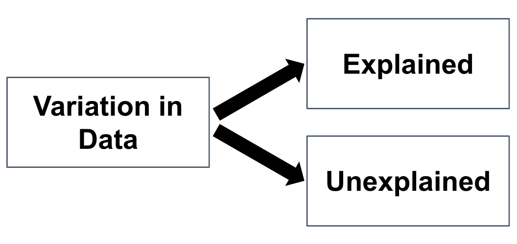
In the word equation we presented before, PriceK = Neighborhood + Other Stuff, explained variation is the portion of the total variation in prices we can attribute to neighborhood. The rest of the variation (or remaining variation after accounting for neighborhood) is left unexplained. Other stuff represents this unexplained variation. It’s useful to think of total variation as the sum of explained and unexplained variation.
(2) Some Unexplained Variation is Explainable
Some of the unexplained variation in an outcome variable is explainable, if only we could add the right variables to our model. For example, if we added home size to our model in addition to neighborhood, it might explain some of the remaining variation in home prices beyond what neighborhood alone explains.
We call this the explainable part of the unexplained variation. Before we added home size to the model, it was just part of Other Stuff. But once we add it, if we do, it becomes explained. See? That part of Other Stuff was explainable all along.
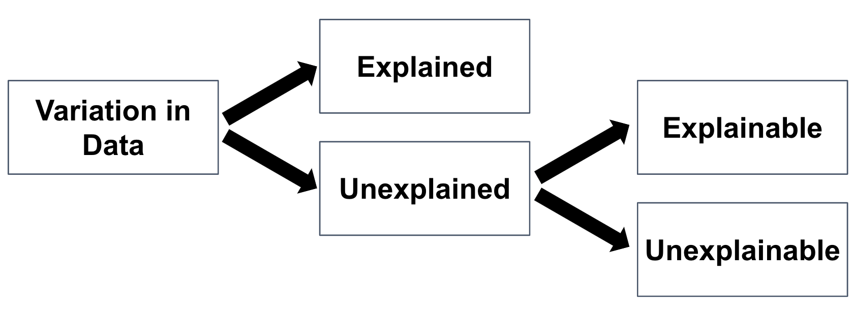
(3) Not All Unexplained Variation is Explainable
Even if we measured a lot of variables (from roof quality to garage size to beauty of garden, or even the crankiness of the previous home owner) and added them to our model, there would still be some variation between individual home prices that we could not explain. We call this variation unexplainable, and we usually conceptualize it as random.
To tie it all together, here is the diagram again, this time labeled with variables related to our simple word equation: PriceK = Neighborhood + Other Stuff