2.2 Visualizing Two-Variable Relationships
One variable that might explain some of the variation in sale price is Neighborhood. In the world of real estate, home prices often vary across neighborhoods, meaning that home prices in one neighborhood are higher, on average, than those in a different neighborhood. But then again, home prices vary a lot within the same neighborhood, too.
Using Color to Visualize Relationships
Unfortunately, the variable Neighborhood is not included in our previous histogram, so we can’t see how PriceK varies by Neighborhood. But we can visualize the relationship between PriceK and Neighborhood in a few ways. One way is by coloring or filling in the data in the histogram by Neighborhood, assigning College Creek one color and Old Town another.
To do this we use the fill = argument, but instead of putting in a color we put a tilde (~) and then the name of a variable: fill = ~Neighborhood.

Faceted Histograms
Another way to examine the effect of Neighborhood on PriceK is to split the histogram we made into two—one for College Creek and another for Old Town. Using %>%, we can chain on the command gf_facet_grid() after gf_histogram(). The following code will put the histograms of PriceK for College Creek and Old Town in a grid, one above the other.
gf_histogram(~ PriceK, data = Ames) %>%
  gf_facet_grid(Neighborhood ~ .)

Another way of thinking about Neighborhood explaining variation in PriceK is to see the distribution of PriceK as made up of two different distributions, one from College Creek and one from Old Town. Although these distributions overlap, we can see that the whole College Creek distribution is shifted higher (to the right) along the x-axis, which indicates that the average price of a home in College Creek is higher than in Old Town.
The variation we see by neighborhood can be called between-group variation. This variation among observations in the same neighborhood is an example of within-group variation.

Just for comparison, we’ve put the original histogram (showing all the homes all together in one histogram) along with the separate histograms for each neighborhood.
Notice that each neighborhood’s histogram appears to have less variation than the “all together” histogram. It’s as if some of the variation in PriceK has been accounted for or reduced by Neighborhood. Because we can only see the within-group variation after we separate the distribution according to Neighborhood, another name for within-group variation is leftover variation.
Even though there is still a lot of variation in home prices left over after accounting forNeighborhood, it is still true that if we know a home’s neighborhood, we can be a little better at predicting its value. A little better may not be great, but it is better than nothing.
Using the Tilde (~) to Rearrange Plots
Let’s take a closer look at the R code for making these facet grids of histograms.
gf_histogram(~ PriceK, data = Ames) %>%
  gf_facet_grid(Neighborhood ~ .)
Putting PriceK after the ~ in the gf_histogram() function above tells R to put the values of PriceK on the x-axis (think y ~ x).
gf_facet_grid() works the same way. Putting the variable Neighborhood before the ~ stacks the graphs for each neighborhood vertically, along the y-axis. In this case, it’s easier to compare the graphs when we arrange them vertically, one above the other..
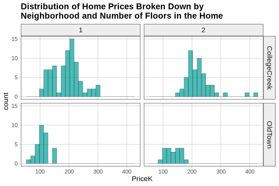
Notice also that gf_facet_grid() has a . (period) after the ~ (tilde). The period is a placeholder, which you could replace with another variable. Try replacing the . with the variable Floors (whether the home has 1 or 2 floors) in the code below. This will create a faceted grid of homes in different neighborhoods split up by whether they have 1 or 2 floors.
require(coursekata)
# replace the . with Floors
gf_histogram(~ PriceK, data = Ames) %>%
  gf_facet_grid(Neighborhood ~ .)
# replace the . with Floors
gf_histogram(~ PriceK, data = Ames) %>%
  gf_facet_grid(Neighborhood ~ Floors)
ex() %>%
  check_function(., "gf_histogram") %>% {
    check_arg(., "object") %>% check_equal()
    check_arg(., "data") %>% check_equal()
  }