4.8 Randomness
Let’s take a little detour into the notion of randomness. First let’s make a distinction between what we mean by “random” in regular life and what we mean by “random” in statistics.
To start, let’s look at what humans consider “random”. Students were asked to think of a random number between 1 and 20 and enter it into a survey.
The result of 211 students entering in a random number between 1 and 20 are provided for you in a data frame called survey. The variable any1_20 holds the number that they entered. Take a look at a few rows of this data frame and make a histogram of any1_20. Note: you probably want to have 20 bins for the 20 possible values of this variable.
require(coursekata)
survey <- data.frame(any1_20 = Survey$Any1_20)
# Make a histogram of any1_20
gf_histogram(~ any1_20, data = survey)
ex() %>%  {
  check_or(.,
    check_function(., "gf_histogram") %>% {
      check_arg(., "object") %>% check_equal()
      check_arg(., "data") %>% check_equal()
    },
    override_solution_code(., 'gf_histogram(~survey$any1_20)') %>%
      check_function("gf_histogram") %>%
      check_arg("object") %>%
      check_equal()
  )
} any1_20
1 7
2 7
3 7
4 7
5 5
6 17
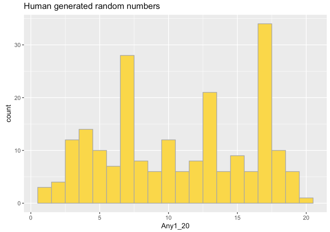
Students have many ideas of randomness including “unpredictable,” “unexpected,” “unlikely,” or “weird.” To the students in this survey, some particular numbers sound more random than others. They seem to think, for example, that 17 and 7 sound more random than 10 or 15.
The mathematical concept of random is different. Whereas we often think that random means unpredictable, random processes (the way statisticians think of them) are actually highly predictable, governed by a probability distribution. A probability distribution shows us the probability for every possible event, and thus allows us to estimate the probability of a particular event.
If each of the numbers 1 to 20 had an equal likelihood of being selected, we could model that as a random process, just like we did die rolls. Although it is hard to predict which number would be generated on a single trial (we’d be wrong, on average, 19 out of 20 times), it is highly predictable that we would have a uniform distribution in the long run.
Exploring Randomness
Let’s use resample() like we did before to explore what the results of a random process can look like. We will start with the task we just discussed: 211 students asked to generate a random number between 1 and 20. But this time we will simulate the data being generated by a random process in which each number has an equal probability of being selected.
We can do this in two ways. One way we could do this is to create a vector to represent a 20-sided die and then resample from it 211 times.
side20 <- c(1:20)
resample(side20, 211)
Another option to simulate our random data is to skip the extra step of creating the R object side20, and just resample directly from the numbers 1:20 a bunch of times.
resample(1:20, 211)Of course, if we don’t save the results of this resample into a vector, we’ll have done this for nothing. So modify the code below to save the 211 random numbers into any1_20. Then, we’ll create a data frame called computer and put any1_20 in it. Create a histogram of the computer-generated any1_20.
require(coursekata)
set.seed(13)
# create a random sample of 211 numbers between 1 and 20
any1_20 <-

# this puts any1_20 into a new data frame called computer
computer <- data.frame(any1_20)

# make a histogram of any1_20 from computer
# create a random sample of 211 numbers between 1 and 20
any1_20 <- resample(1:20, 211)

# this puts any1_20 into a new data frame called computer
computer <- data.frame(any1_20)

# make a histogram of any1_20 from computer
gf_histogram(~ any1_20, data = computer, bins = 20)
ex() %>%  {
  check_object(., "any1_20") %>% check_equal()
  check_object(., "computer") %>% check_equal()
  check_or(.,
    check_function(., "gf_histogram") %>% {
      check_arg(., "object") %>% check_equal()
      check_arg(., "data") %>% check_equal()
    },
    override_solution_code(., '{
      any1_20 <- resample(1:20, 211)
      computer <- data.frame(any1_20)
      gf_histogram(~computer$any1_20)
    }') %>%
      check_function("gf_histogram") %>%
      check_arg("object") %>%
      check_equal()
  )
}
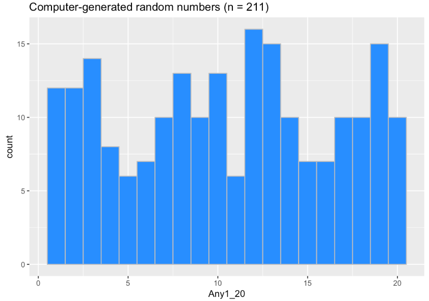
Just a note, n in the title just stands for “how many values” in this distribution.
The computer-generated random numbers are much more uniform compared to the human-generated random numbers. And it’s definitely more rectangular than the human-generated distribution. However, it’s not exactly rectangular either.
Make a prediction. What would the histogram look like if the computer-generated 10,000 samples instead of 211? Change the code below to try that out. Make sure to change the title as well!
require(coursekata)
set.seed(13)
# modify this to generate a random sample of 10,000
any1_20 <- resample(1:20, 211)

# modify this to put any1_20 into a new data frame called computer
computer <-

# this makes a histogram of any1_20 from computer
gf_histogram(~ any1_20, data = computer, fill = "dodgerblue", color = "gray", bins = 20) %>%
  gf_labs(title = "Computer generated random numbers")
# modify this to generate a random sample of 10,000
any1_20 <- resample(1:20, 10000)

# modify this to put any1_20 into a new data frame called computer
computer <- data.frame(any1_20)

# this makes a histogram of any1_20 from computer
gf_histogram(~any1_20, data = computer, fill = "dodgerblue", color = "gray", bins = 20) %>%
  gf_labs(title = "Computer generated random numbers")
ex() %>%  {
  check_object(., "any1_20") %>% check_equal()
  check_object(., "computer") %>% check_equal()
  check_or(.,
    check_function(., "gf_histogram") %>% {
      check_arg(., "object") %>% check_equal()
      check_arg(., "data") %>% check_equal()
    },
    override_solution_code(., '{
      any1_20 <- resample(1:20, 10000)
      computer <- data.frame(any1_20)
      gf_histogram(~computer$any1_20)
    }') %>%
      check_function("gf_histogram") %>%
      check_arg("object") %>%
      check_equal()
  )
}
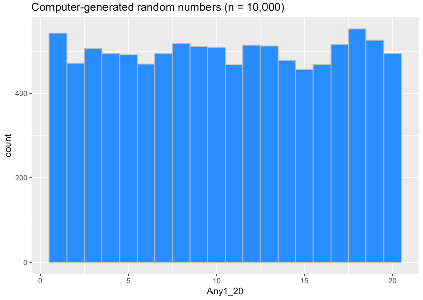
We can see that even the distribution of 10,000 randomly-generated numbers from a simulated 20-sided die is not perfectly even. But it is more even than the smaller sample of 211 numbers in the previous histogram.
This results from what we previously called the Law of Large Numbers. Provided each of the 20 numbers truly has an equal probability of coming up, the distribution will be perfectly rectangular in the long run. As you can see, the long run would need to be pretty long—more than 10,000 rolls of the die in this case.
This leads us to a critical feature of random processes. Even though they are very unpredictable in the short run—for example, if we asked you to predict what the next roll would be of a 20-sided die, you would only have a 1 in 20 chance of predicting correctly—they are actually very predictable in the long run.
This uniform distribution is a probability distribution because we can see the probability associated with every possible event (each value, 1 through 20). The shape is uniform because each of these probabilities are equal. We can use this probability distribution to estimate the probability of a particular event (e.g., the likelihood of generating the number 14).
In fact, a truly random DGP is one of the easiest kinds of DGPs for us to model as statisticians. Although we only consider an example of a uniform random process here, there are lots of other models of randomness. Models of randomness, when represented as a distribution with features like shape, center, and spread, are called probability distributions. We will learn about other models of randomness—such as the normal distribution—as we go.
Statisticians tend to model unexplained variation, whether real or induced by data collection, as though it were generated by a random process (e.g., uniform, or normal, or some other probability distribution). They do this because this helps them make some progress. It is easy to predict what unexplained variation might look like if the DGP is random. Then they can compare what they predicted, assuming a random process, with what the data distribution actually looks like.
There are actually even more reasons to model unexplained variation as random. This will turn out to be a very useful strategy, an idea we will continue to explore in later chapters.