7.2 Using R to Fit the Group Model
Now that we know what the Sex model does – i.e., that it produces two different values for the predictions, one for students of each sex – let’s use R to fit the model to the data and see how the model makes these predictions.
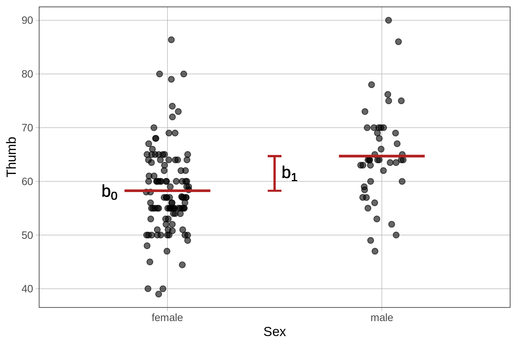
In the code block below, we have filled in the code to fit the Sex model and save it as Sex_model. Use the pipe operator (%>%) to overlay model predictions of the Sex model on the jitter plot: gf_model(Sex_model).
require(coursekata)
# find best fitting model
Sex_model <- lm(Thumb ~ Sex, data = Fingers)

# add code to visualize the new model on the jitter plot
gf_jitter(Thumb ~ Sex, data = Fingers, width = .1)
# find best fitting model
Sex_model <- lm(Thumb ~ Sex, data = Fingers)

# add code to visualize the new model on the jitter plot
gf_jitter(Thumb ~ Sex, data = Fingers, width = .1) %>%
  gf_model(Sex_model)
ex() %>% {
  check_function(., "gf_model") %>%
    check_arg("object") %>%
    check_equal()
  check_or(.,
    check_function(., "gf_model") %>%
      check_arg("model") %>%
      check_equal(),
    override_solution(., "gf_jitter(Thumb ~ Sex, data = Fingers) %>% gf_model(Thumb ~ Sex)") %>%
      check_function(., "gf_model") %>%
        check_arg("model") %>%
        check_equal()
  )
}
If you want to change the color of the model (as we did for the figure above), you can add in the argument color = "red" to the gf_model() function.
Generating Predictions from the Sex Model
The Sex model in the visualization is represented by two lines because it generates two different predictions depending on the Sex of the person. Let’s use the predict() function to see how this works.
require(coursekata)
# we have saved the Sex model for you
Sex_model <- lm(Thumb ~ Sex, data = Fingers)

# write code to generate predictions using this model
# no need to save the predictions
# we have saved the Sex model for you
Sex_model <- lm(Thumb ~ Sex, data = Fingers)

# write code to generate predictions using this model
# no need to save the predictions
predict(Sex_model)
ex() %>%
  check_function("predict") %>%
  check_result() %>%
check_equal()Notice that now, instead of just generating a single number (like the empty model’s 60.1), these predictions are a mix of two numbers (64.7 and 58.3). Using the code below, we have saved these predictions back into Fingers as a new variable called Sex_predict and printed out Sex, Thumb, and Sex_predict for 6 of the students.
Fingers$Sex_predict <- predict(Sex_model)
head(select(Fingers, Sex, Thumb, Sex_predict))
Sex Thumb Sex_predict
1 male 66.00 64.70267
2 female 64.00 58.25585
3 female 56.00 58.25585
4 male 58.42 64.70267
5 female 74.00 58.25585
6 female 60.00 58.25585The Sex model looks at the sex of each student before making its prediction. If the student is male, the model predicts the thumb length as 64.7 mm, and if female, it predicts 58.3 mm.
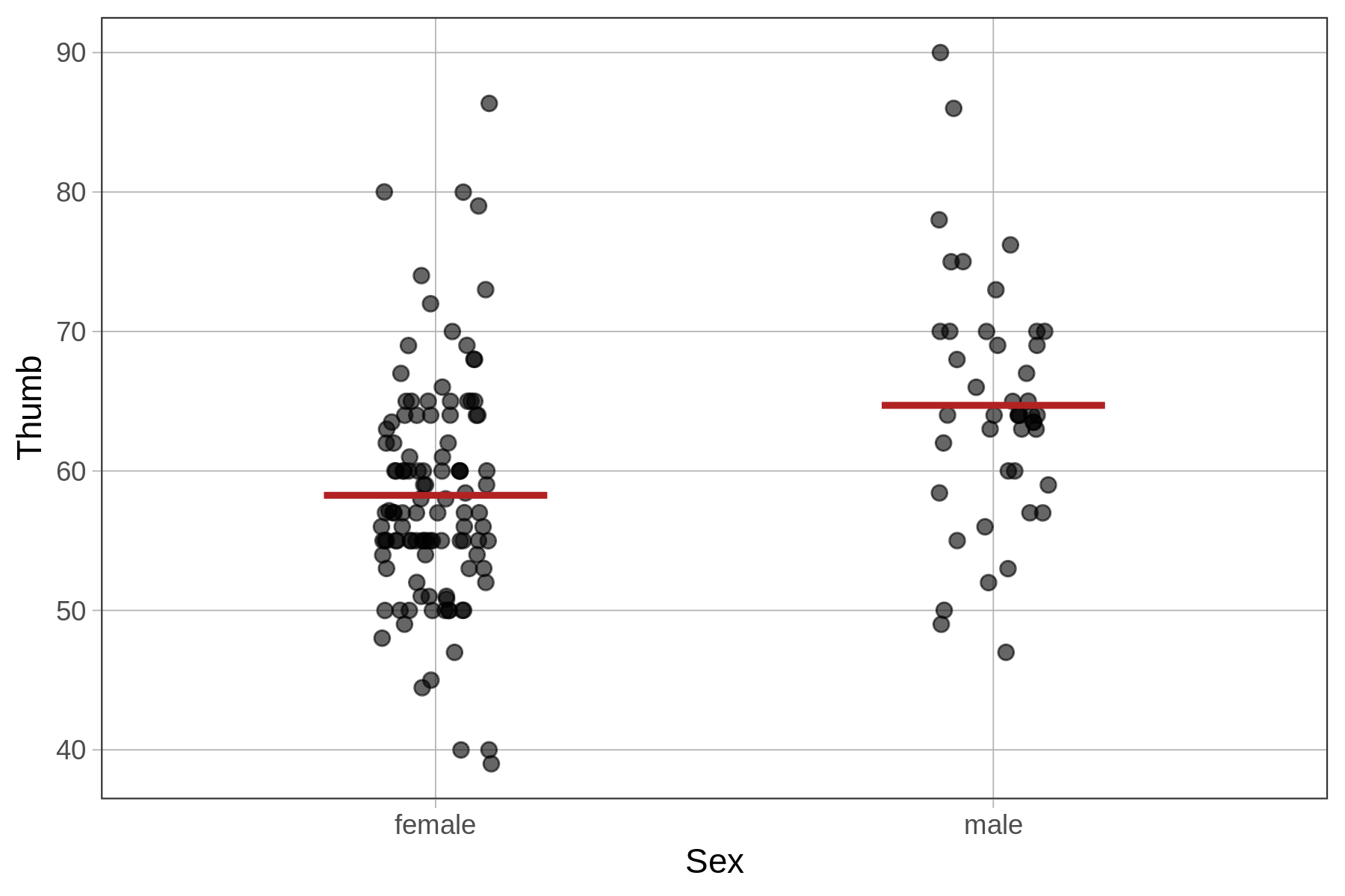
We can run favstats() to confirm that these two model predictions are, in fact, the mean thumb lengths for students of each sex.
favstats(Thumb ~ Sex, data=Fingers) Sex min Q1 median Q3 max mean sd n missing
1 female 39 54 57 63.125 86.36 58.25585 8.034694 112 0
2 male 47 60 64 70.000 90.00 64.70267 8.764933 45 0Yes, they are: the means of the two sex groups in the favstats() output are the same as the model predictions generated by the Sex_model.
Interpreting the lm() Output for the Sex Model
We have fit the Sex model using lm() and then used this model to generate predictions. However, we have not yet looked at the best-fitting parameter estimates for the model.
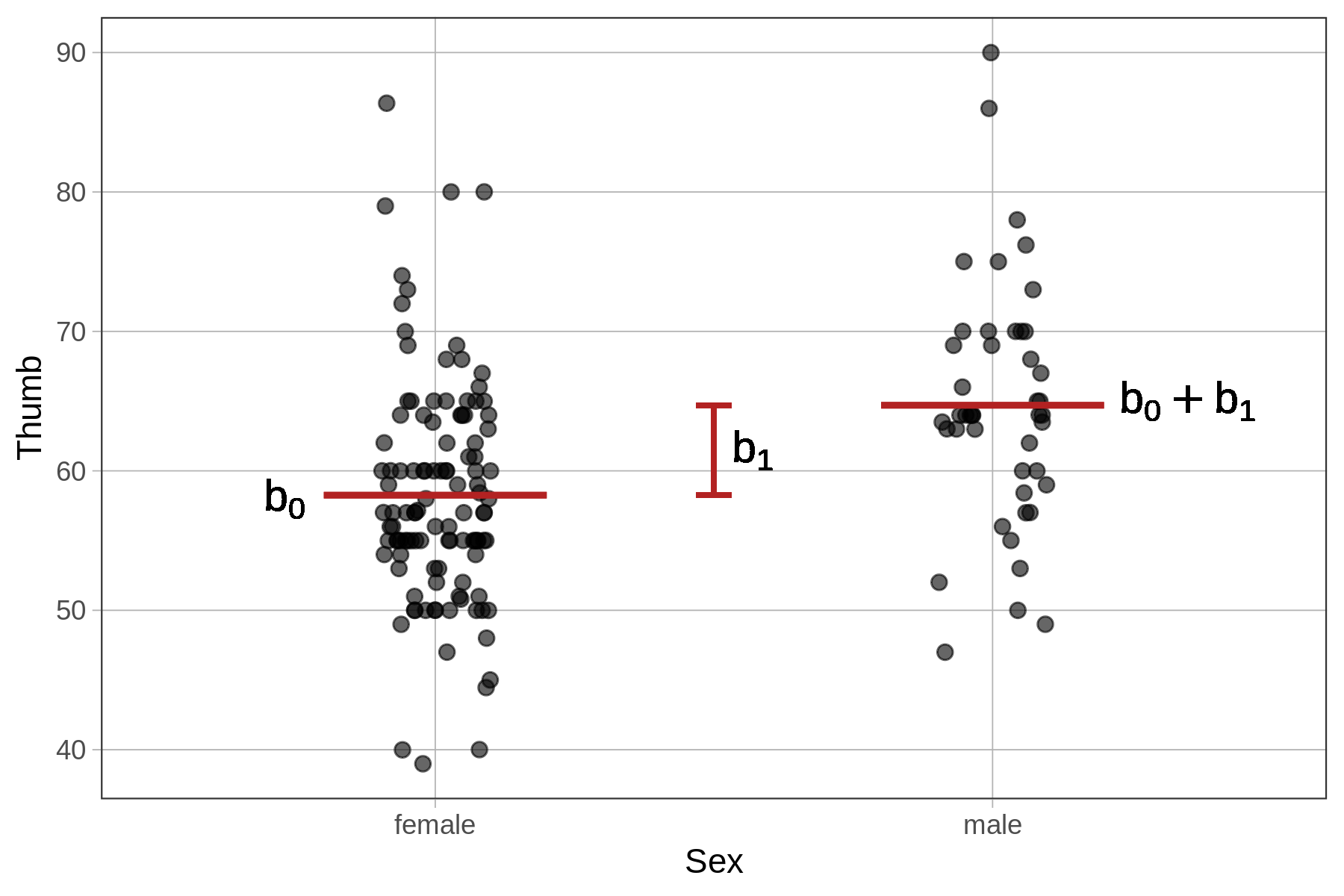
Recall that for the empty model we estimated one parameter (\(b_0\)), the mean. For the two-group Sex model we are going to estimate two parameters (\(b_0\) and \(b_1\)). Based on the model predictions, we might expect these parameter estimates to be the mean for each sex. Let’s find out.
In the code block below we have fit and saved the Sex model in the R object Sex_model. Add some code to print out the model so we can look at the parameter estimates.
require(coursekata)
# we have saved the Sex model for you
Sex_model <- lm(Thumb ~ Sex, data = Fingers)

# print out the best fitting parameter estimates
# we have saved the Sex model for you
Sex_model <- lm(Thumb ~ Sex, data = Fingers)

# print out the best fitting parameter estimates
Sex_model
ex() %>% check_output_expr("Sex_model")Call:
lm(formula = Thumb ~ Sex, data = Fingers)
Coefficients:
(Intercept) Sexmale
58.256 6.447 As expected, we see two parameter estimates. But these are not the two estimates we might have expected from looking at the graph and predictions. We expected to get the two sex group means: around 58 and 65.
The estimate labeled Intercept in the output (58.256) seems like the mean thumb length of female students. But how should we interpret the second estimate (6.447), the one labeled Sexmale?
Call:
lm(formula = Thumb ~ Sex, data = Fingers)

Coefficients:
(Intercept)      Sexmale
     58.256        6.447
Taking a closer look at the output of the model created by using lm(), the label Sexmale for the second parameter estimate is actually useful. Although it might have been nice for R to insert some punctuation between Sex and male, it nevertheless tells us that the second estimate is the adjustment needed to get from the mean of the first group, which is referred to as Intercept, to the mean of the second group, male.
Sure enough, this works: 58.3 + 6.4 = 64.7. This is the sex model’s predicted thumb length for a male student.
The Parameter Estimates \(b_0\) and \(b_1\)
Whereas the empty model was a one-parameter model (producing only one estimate, \(b_0\), for the grand mean), the Sex model is a two-parameter model (\(b_0\) and \(b_1\)). One of the parameters is the mean for female students, the other is the amount that must be added to get the mean for males (as seen in the picture below).
The output of lm() shows us the values of \(b_0\) and \(b_1\) that best fit the data.
Call:
lm(formula = Thumb ~ Sex, data = Fingers)

Coefficients:
(Intercept)      Sexmale
58.256 6.447 The \(b_0\) parameter estimate represents the mean of the first group (female). The \(b_1\) represents the quantity that must be added to \(b_0\) in order to get the model prediction for the second group, which in this case is male.