9.8 Correlation
You might have heard of Pearson’s r, often referred to as a “correlation coefficient.” Correlation is just a special case of regression in which both the outcome and explanatory variables are transformed into z-scores prior to analysis.
Working with Standardized Variables
When we do a z-transformation on every value of a variable it is sometimes referred to as standardizing the variable. Let’s see what happens when we standardize the two variables we have been working with (Thumb and Height).
Use the code window below to create two new variables in the Fingers data frame: zThumb and zHeight. The function zscore() will standardize a variable by converting all of its values to z-scores.
require(coursekata)

Fingers <- filter(Fingers, Thumb >= 33 & Thumb <= 100)
# this transforms all Thumb lengths into z-scores
Fingers$zThumb <- zscore(Fingers$Thumb)

# modify this to do the same for Height
Fingers$zHeight <-
# this transforms all Thumb lengths into z-scores
Fingers$zThumb <- zscore(Fingers$Thumb)

# modify this to do the same for Height
Fingers$zHeight <- zscore(Fingers$Height)
ex() %>% check_object("Fingers") %>% {
  check_column(., "zThumb") %>% check_equal()
  check_column(., "zHeight") %>% check_equal()
}Because both variables are transformed into z-scores, the mean of each distribution will be 0, and the standard deviation will be 1.
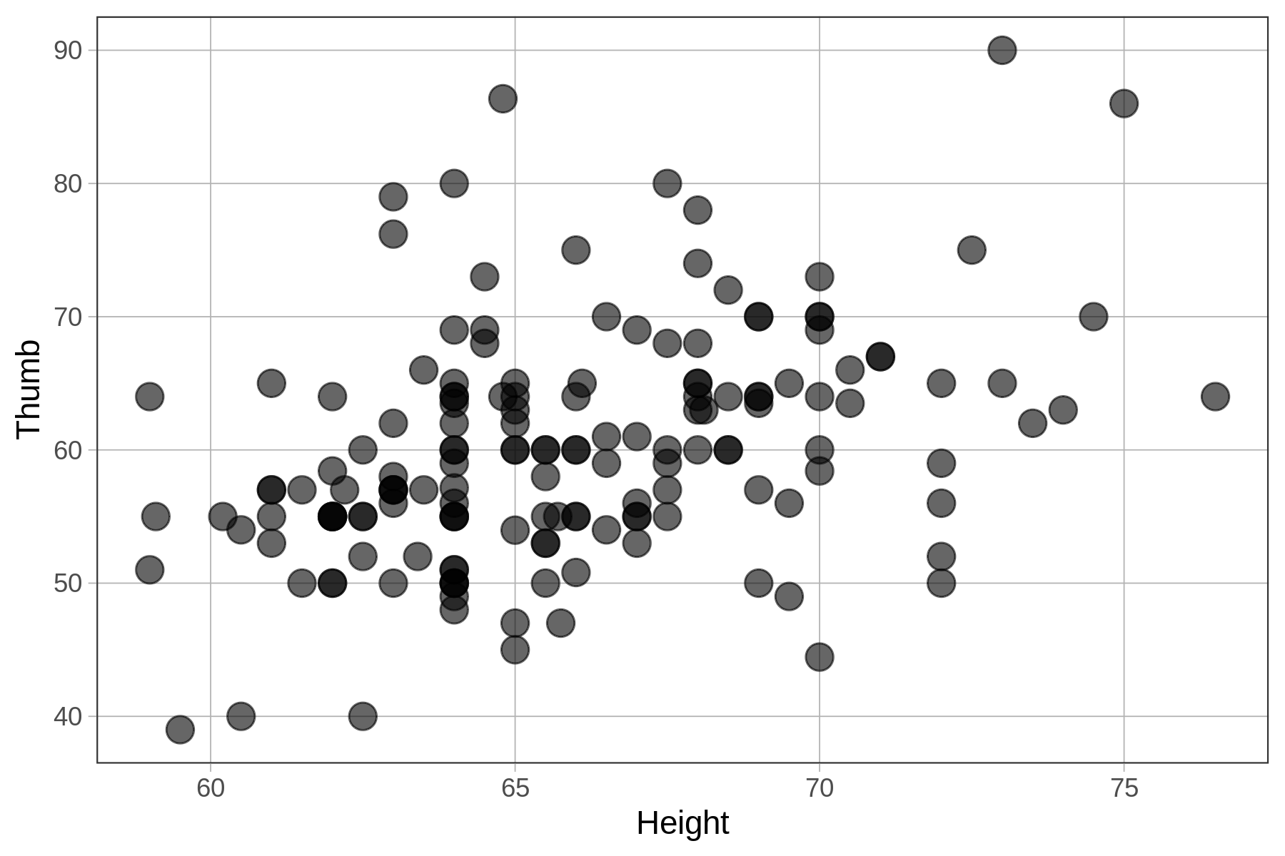
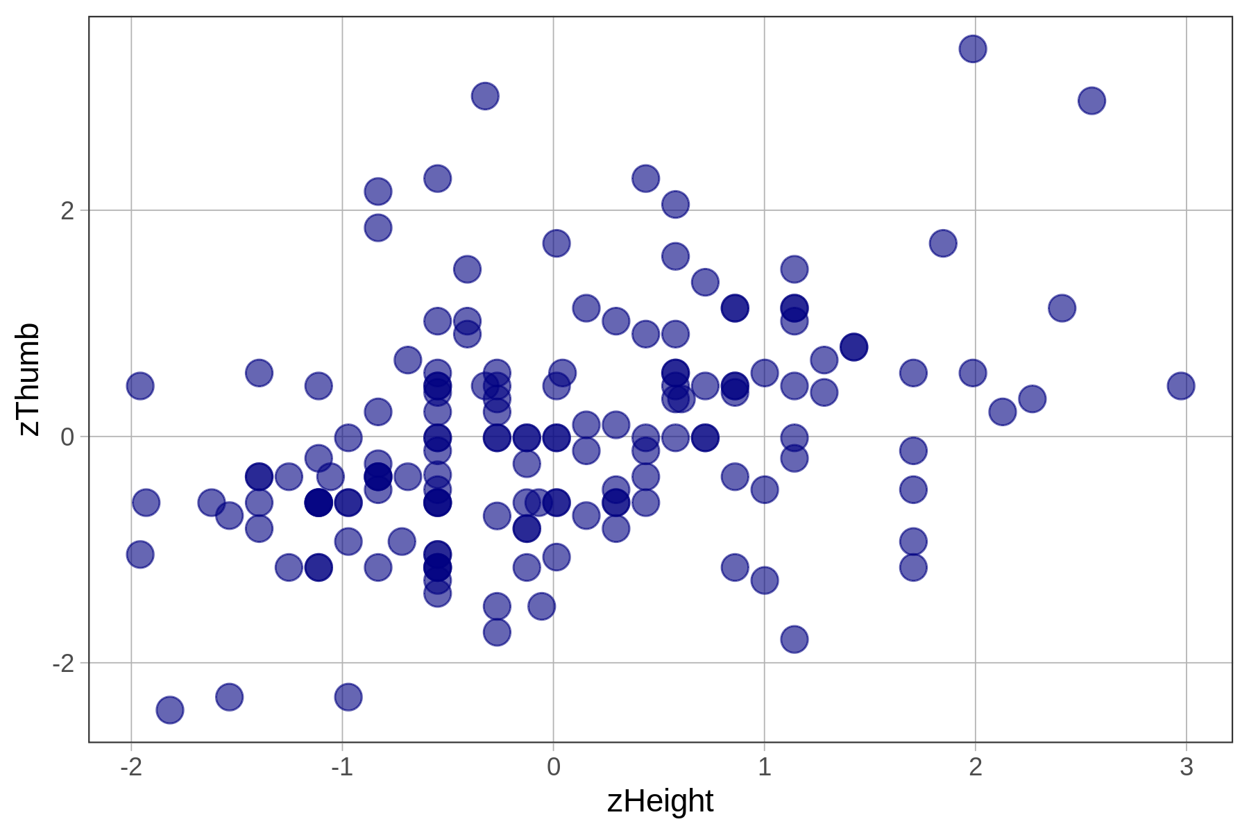
In this chapter we have been using height to explain the variation we see in thumb lengths. In the code window below, we have provided code to make a scatterplot of Thumb and Height. Modify the second line to make a scatterplot of zThumb by zHeight.
Make two scatterplots by modifying the code below.
require(coursekata)

Fingers <- Fingers %>%
  filter(Thumb >= 33 & Thumb <= 100) %>%
  mutate(
    zThumb = zscore(Thumb),
    zHeight = zscore(Height)
  )
# this makes a scatterplot of the raw scores
# size makes the points bigger or smaller
gf_point(Thumb ~ Height, data = Fingers, size = 4)

# zThumb and zHeight have already been created for you
# modify the code below to make a scatterplot of the z-scores
gf_point( , data = Fingers, size = 4, color = "navy")
# this makes a scatterplot of the raw scores
# size makes the points bigger or smaller
gf_point(Thumb ~ Height, data = Fingers, size = 4)

# zThumb and zHeight have already been created for you
# modify the code below to make a scatterplot of the z-scores
gf_point(zThumb ~ zHeight, data = Fingers, size = 4, color = "navy")
ex() %>% {
  check_function(., "gf_point", index = 1) %>% {
    check_arg(., "object") %>% check_equal()
    check_arg(., "data") %>% check_equal()
  }
  check_function(., "gf_point", index = 2) %>% {
    check_arg(., "object") %>% check_equal()
    check_arg(., "data") %>% check_equal()
  }
}
Thumb ~ Height
|
zThumb ~ zHeight
|
|---|---|
|
|
|
Fitting the Regression Model to Standardized Variables
In the code window below we’ve provided the code to fit a regression line for Thumb based on Height. Add code to fit a regression model to the two transformed variables, predicting zThumb based on zHeight.
require(coursekata)
Fingers <- Fingers %>%
  filter(Thumb >= 33 & Thumb <= 100) %>%
  mutate(
    zThumb = zscore(Thumb),
    zHeight = zscore(Height)
  )
Height_model <- lm(Thumb ~ Height, data = Fingers)
# this fits a regression model of Thumb by Height
lm(Thumb ~ Height, data = Fingers)

# write code to fit a regression model predicting zThumb with zHeight
# this fits a regression model of Thumb by Height
lm(Thumb ~ Height, data = Fingers)

# write code to fit a regression model predicting zThumb with zHeight
lm(zThumb ~ zHeight, data = Fingers)
ex() %>%
  check_function("lm", index = 2) %>%
  check_result() %>%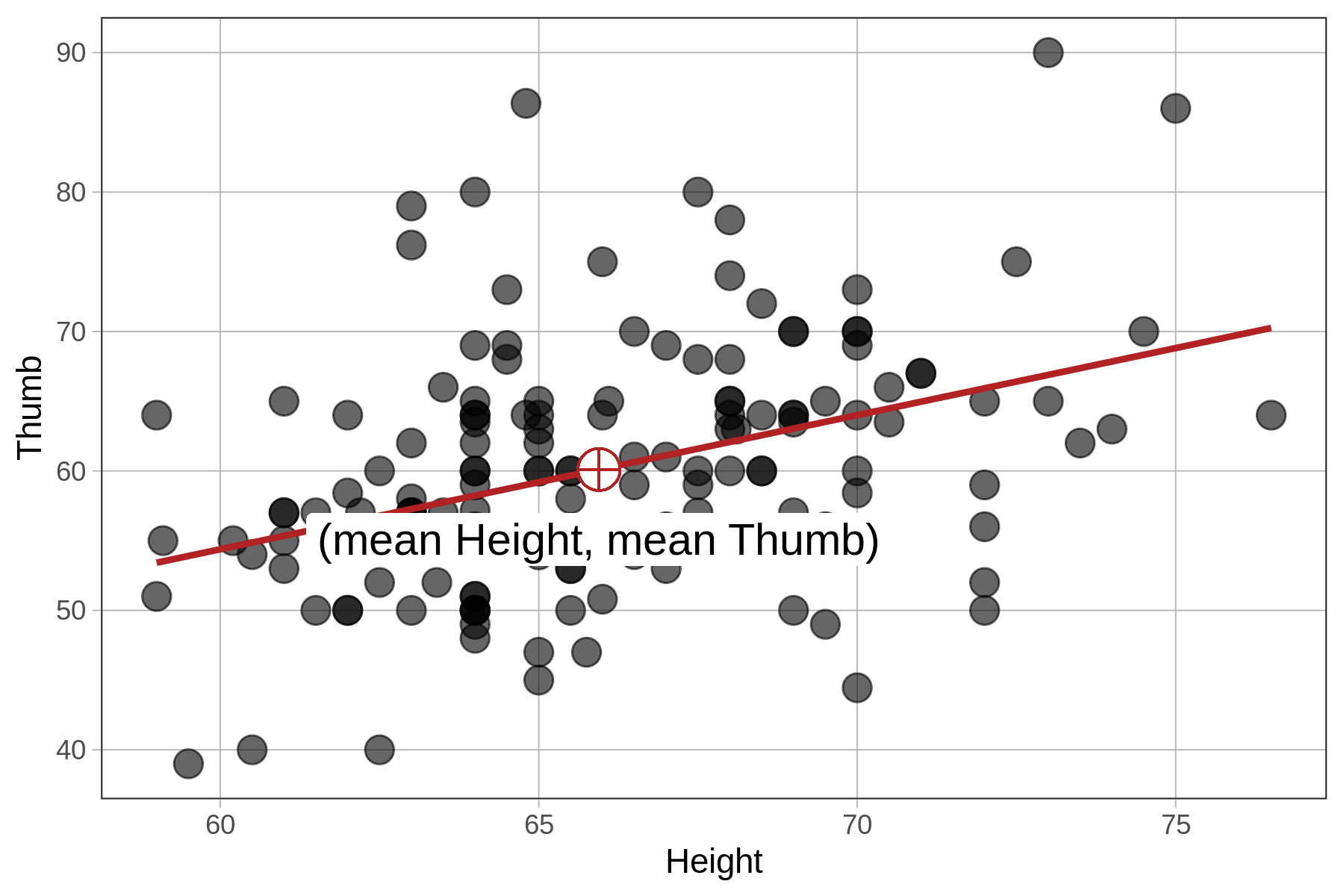
check_equal()In the table below we show the best-fitting parameter estimates along with the two scatterplots, this time with the best-fitting regression lines overlaid.
Thumb ~ Height
|
zThumb ~ zHeight
|
|---|---|
|
|
|
|
|
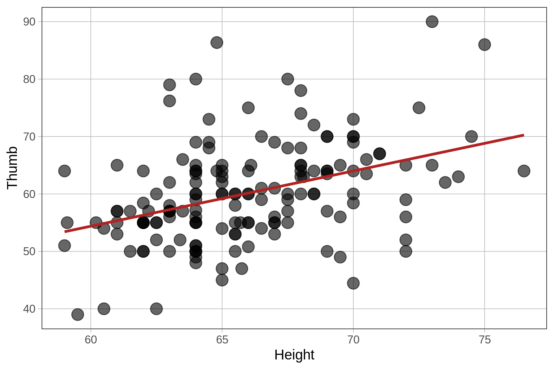
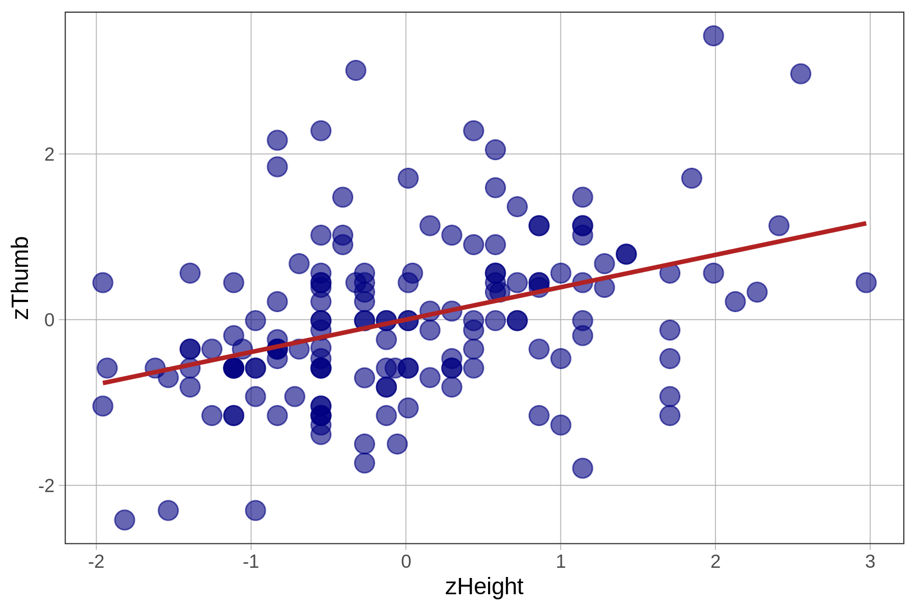
Note that R will sometimes express parameter estimates in scientific notation. Thus, -2.074e-16 means that the decimal point is shifted 16 digits to the left. So, the actual y-intercept of the best-fitting regression line is -.00000000000000018, which is, for all practical purposes, 0.
We know from earlier that the best-fitting regression line passes through the point of means, which is the point defined by the mean of both the outcome and explanatory variables, shown on the scatterplots below. Note that in the case of zThumb and zHeight, the mean of each is 0 and the point of means is (0,0).
| \(\text{Thumb}_i = 3.33 + .96\text{Height}_i + e_i\) | \(\text{zThumb}_i = .39\text{zHeight}_i + e_i\) |
|---|---|
|
|
|
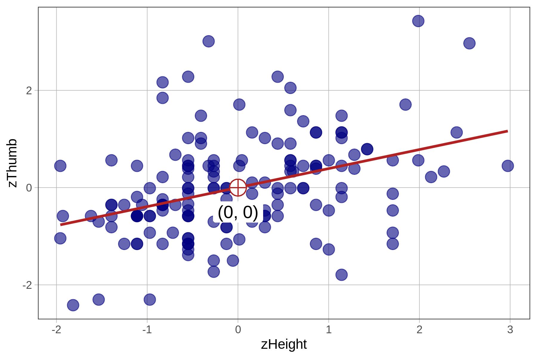
Because the mean of any standardized variable is 0, a regression line based on standardized variables will always have a y-intercept of 0, meaning that when x is 0, y will also be 0.
Correlation coefficient: The slope of the standardized regression line
Let’s now turn our attention to the slopes (the \(b_1\) estimates) of both models, the one based on unstandardized variables and the one based on standardized variables.
Notice that the slopes are different for the unstandardized and standardized regression lines (.96 versus .39). To interpret the unstandardized slope, you need to know something about how thumbs and heights are measured (e.g., mm and inches). But the standardized slope does not require that additional knowledge.
The slope of the regression line between the standardized variables is called the correlation coefficient, or Pearson’s \(r\). The correlation coefficient is useful for assessing the strength of a bivariate relationship between two quantitative variables independent of the units on which each variable is measured.
To save you from having to transform variables into z-scores and then fit a regression line just to find out the correlation coefficient, R provides an easy way to directly calculate the correlation coefficient (Pearson’s \(r\)) from the raw scores: the cor() function. Try running the code in the window below.
require(coursekata)

Fingers <- Fingers %>%
    filter(Thumb >= 33 & Thumb <= 100) %>%
    mutate(
        zThumb = zscore(Thumb),
        zHeight = zscore(Height)
    )
# this calculates the correlation of Thumb and Height
cor(Thumb ~ Height, data = Fingers)
cor(Thumb ~ Height, data = Fingers)
ex() %>% check_function("cor") %>% check_result() %>% check_equal()[1] 0.3910649Notice that the result of .39 is, exactly, the slope of the standardized regression line, meaning that an increase of 1 standard deviation in height will result in a .39 standard deviation in thumb length.
Correlation coefficients, because they are calculated using standardized variables, have certain characteristics. The most useful of these is that \(r\) will always range from -1 to +1. An \(r\) of 0 means that the two variables are not related. A positive \(r\) means that the variables are positively and linearly related, while a negative \(r\) means they are negatively and linearly related.
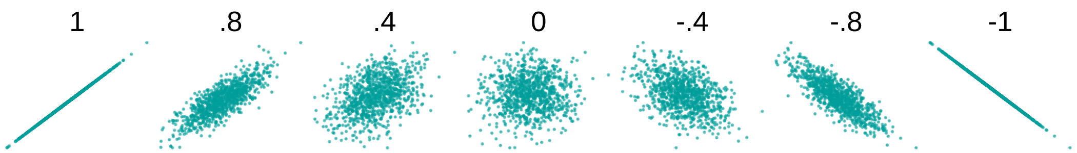
The further away from 0 \(r\) is, the stronger the linear relationship between the two variables. Two variables with a correlation of +1 are perfectly related, meaning that a 1 SD increase in one of the variables will produce a 1 SD increase in the other. A correlation of -1 means that two variables are perfectly negatively related.
Note that a relationship between two variables can be highly systematic, but not linear, for example, in the plots on the left and center below. In these cases, even though there is a clear pattern in the scatterplots, the \(r\) is close to 0 because the relationship is not linear.
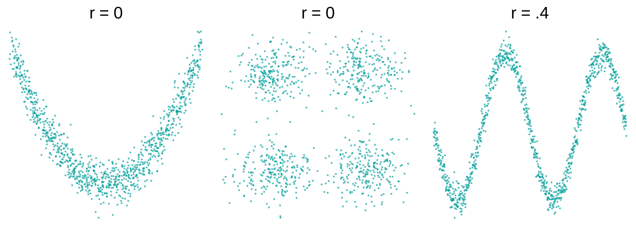
Even when the \(r\) isn’t necessarily close to 0, as in the plot on the right where the \(r = .4\), it doesn’t mean that a straight regression line is the best model for it (perhaps a curved one will be better).