4.12 Considering Randomness as a Possible DGP
Let’s take a break from this praise-fest for the random assignment experiment, and talk about why we might still be fooled, even with the most powerful of all research designs. We will ground our discussion in a new data set called TipExperiment.
The Tipping Experiment
The TipExperiment data comes from a study carried out by a group of researchers and published in a 1996 paper. In this experiment, 44 restaurant tables were randomly assigned to either receive smiley faces on their checks or not. The researchers hypothesized that tables would tip a higher percentage of the check if they got a hand-drawn smiley face on the check than if they did not.
Here is a sample of 6 of the tables in the data frame.
head(TipExperiment) TableID Tip Condition
1 1 39 Control
2 4 34 Control
3 7 31 Control
4 24 65 Smiley Face
5 27 41 Smiley Face
6 44 17 Smiley FaceComplete the jitter plot code below to visualize the relationship between Tip and Condition in the TipExperiment data frame. We have added code to generate a red line showing the middle (in this case, the average) tip given by tables in each condition.
require(coursekata)
# complete the jitter plot
gf_jitter( ~ , data = , width = .1)  %>%
  gf_model(Tip ~ Condition, color = "red")
# complete the jitter plot
gf_jitter(Tip ~ Condition, data = TipExperiment, width = .1) %>%
  gf_model(Tip ~ Condition, color = "red")
ex() %>% {
  check_function(., "gf_jitter") %>%
    check_arg("data") %>% check_equal()
  check_or(.,
    check_function(., "gf_jitter") %>%
      check_arg("object") %>% check_equal(),
    override_solution(., "gf_jitter(Condition ~ Tip, data = TipExperiment)") %>%
      check_function(., "gf_jitter") %>%
        check_arg("object") %>% check_equal()
  )
}
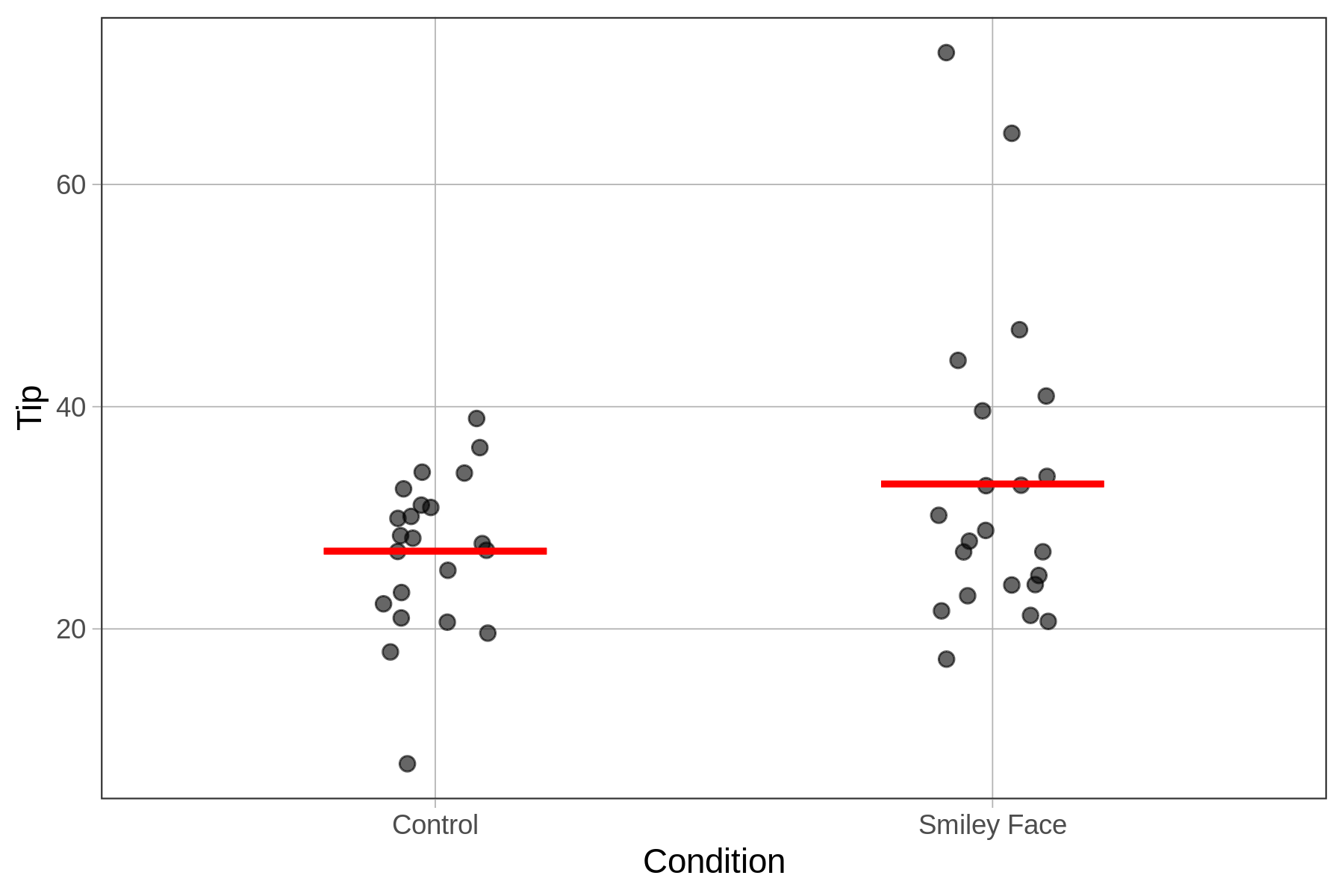
As a group, tables in the smiley face condition appear to tip just a little bit more than those in the control group, though there is a lot of overlap between the two distributions. For example, there are a few tables in the smiley face group that tip a very large percentage of their check, and the lowest tipping table is in the control group.
Unfortunately, even in a perfectly done experiment, there are two possible reasons why the smiley face group might have given bigger tips on average. The first and most interesting possible reason is that there is a causal relationship between drawing a smiley face and tips! That would be cool if a little drawing really does make people tip more generously.
There is a second reason as well for any observed difference between the groups: random sampling variation. If we just randomly assigned tables to one of two groups and did not do anything special to the two groups (no tables get smiley faces), we would still expect some difference in tips across the two groups just by chance.
The differences in distributions between the control condition and the smiley face condition could be due to either the causal effect of smiley faces, or randomness, or a combination of the two. How can we tell which it is? One tool that can help here is simulation, using R, and particularly, the simulation of randomness. Let’s explore this tool, and see how it could help us.
Maybe It’s All Just Randomness
It’s easy to understand the hypothesis that maybe smiley faces caused tables to tip slightly higher percentages of the check. But how could randomness cause the smiley face group to tip larger percentages of their checks?
Using R, we don’t have to just wonder about randomness as a data generating process. We can actually simulate it. There is a function called shuffle() that we can use to randomly shuffle the 44 Tip percentages from the data frame into the two conditions.
To see how this works, let’s look at 6 tables from the TipExperiment data frame (see table below). On the left, we see that the three tables in the control condition tipped 39, 34, and 31 percent, respectively. Notice that although there is overlap in tipping behavior between the two groups, the smiley face group seems to have tipped a bit more.
original Tip data
|
shuffled Tip data
|
|---|---|
|
|
On the right, the percentages are shuffled, though everything else remains the same. The table IDs are still in the same order; and the first three tables are still in the control condition, the next three in the smiley face condition. The tips, though, have been randomly paired with tables. Notice that the tip percentages 39 and 34, which originally were in the control group, are now in the smiley face group.
For the actual data, differences between the two groups could either be due to the smiley face or to randomness. But in the case of the shuffled data, any differences between the two groups can only be due to random chance. Even when the only cause is randomness, the groups can still look different from one another.