10.6 Predictions of the Interaction Model with Two Categorical Predictors
The predictions of the interaction model turn out to be the four group means. You can check that by using functions like favstats() or mean() like this:
mean(tip_percent ~ condition|gender, data = tip_exp) control.female smiley face.female control.male smiley face.male
27.79391 33.91818 22.63667 17.86043
female male
30.78800 20.14000
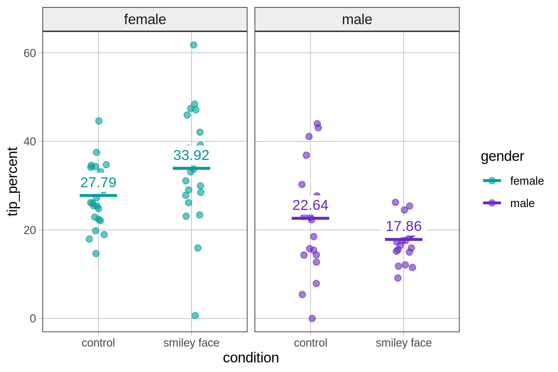
Overlaying the model predictions on the graph helps us see that there is, in fact, an interaction in the data: the size of the effect of one predictor variable (e.g., condition) depends on the value of the second predictor variable (gender).
For female servers, drawing a smiley face increases the tip percent, whereas for male servers it appears to have the opposite effect. This pattern is sometimes referred to as a crossover interaction because the effect is not just larger for one group than another, but actually is in a different direction for the two groups.
Of course, we always want to remember that this is the effect we see in the data; it may or may not accurately reflect the Data Generating Process.
Parameter Estimates for the Interaction Model
We have looked at the model predictions of the interaction model on a graph. Use the code block below to fit the interaction model and print out the parameter estimates.
require(coursekata)
# nothing has been saved for you
# the data frame is called tip_exp
# nothing has been saved for you
# the data frame is called tip_exp
lm(tip_percent ~ condition * gender, data = tip_exp)

# alternatively: lm(tip_percent ~ gender * condition, data = tip_exp)
ex() %>% check_or(
  check_function(., "lm") %>%
    check_result() %>%
    check_equal(),
  override_solution(., "lm(tip_percent ~ gender * condition, data = tip_exp)") %>%
    check_function("lm") %>%
    check_result() %>%
    check_equal()
)Call:
lm(formula = tip_percent ~ condition * gender, data = tip_exp)
Coefficients:
(Intercept) conditionsmiley face
27.794 6.124
gendermale conditionsmiley face:gendermale
-5.157 -10.901If we substitute the best-fitting parameter estimates back into the model, we get this function, which we can use for generating predictions from the interaction model:
\(\text{tip_percent} = 27.79 + 6.12\text{conditionsmiley} + -5.16\text{gendermale}\)
\(\hspace{60pt} + -10.9\text{conditionsmiley}*\text{gendermale}\)
Stated again in more generic form:
\(\text{tip_percent} = b_0 + b_1\text{conditionsmiley} + b_2\text{gendermale}\)
\(\hspace{60pt} + \hspace{2pt} b_3\text{conditionsmiley}*\text{gendermale}\)
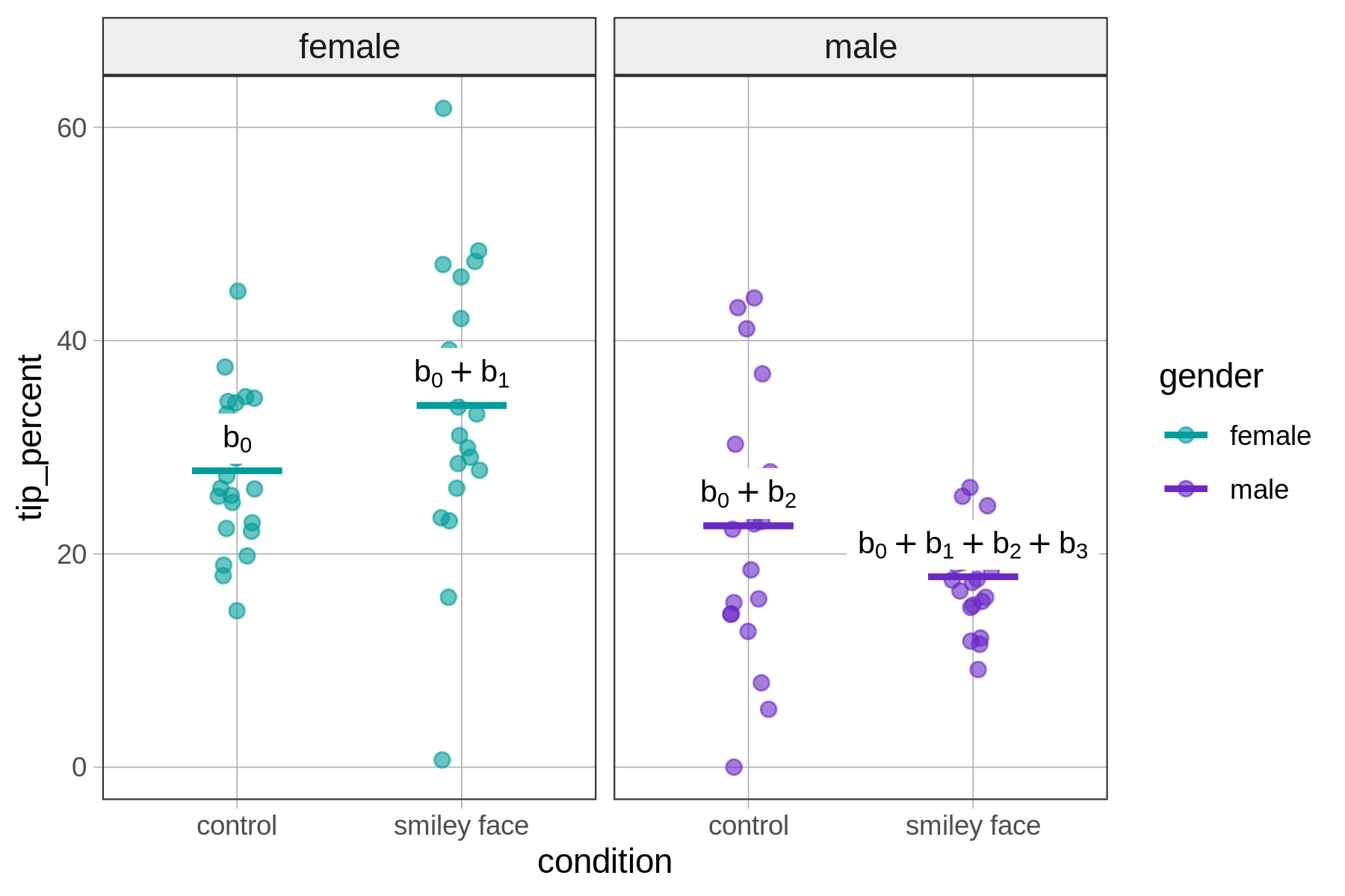
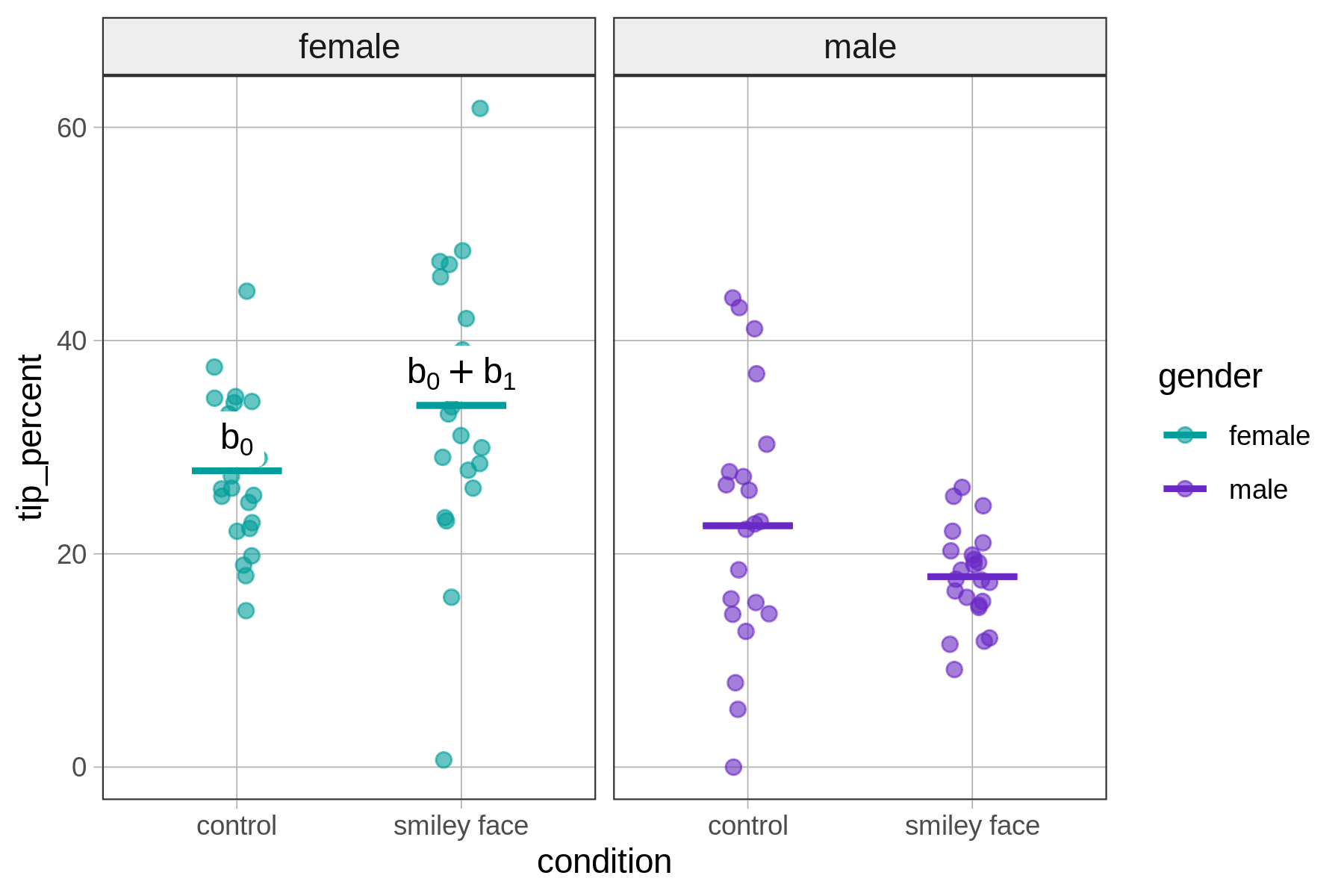
The \(b_0\) ($27.79) is the predicted tip percent for tables that have a value of 0 on both of the variables in the GLM equation (\(\text{conditionsmiley} = 0\) and \(\text{gendermale} = 0\)). These are tables in the control condition with a female server.
\[\text{tip_percent} = b_0 + b_1\underbrace{\text{conditionsmiley}}_{0} + b_2\underbrace{\text{gendermale}}_{0} + b_3\underbrace{\text{conditionsmiley}*\text{gendermale}}_{0*0}\]
You can see in the function above that everything drops out except \(b_0\) when both \(\text{conditionsmiley}\) and \(\text{gendermale}\) are 0.
The graph below summarizes how model predictions are generated for tables with females servers.
Now let’s consider how the interaction model comes up with a prediction for a table in the control condition with a male server. Such a table would have these values on the predictor variables: \(\text{conditionsmiley} = {0}\) and \(\text{gendermale}={1}\), as shown in the function below.
\[\text{tip_percent} = b_0 + b_1\underbrace{\text{conditionsmiley}}_{0} + b_2\underbrace{\text{gendermale}}_{1} + b_3\underbrace{\text{conditionsmiley}*\text{gendermale}}_{0*1}\]
To summarize, here is a figure that depicts how the model generates predictions – the group means – for the four groups.