8.8 Models with Multiple Categorical Predictors
Now that you have learned to add on new predictor variables, you can go out there and make all kinds of multivariate models. We have mostly focused on a model that has two predictors but you can now make models with 3, 4 or 10 explanatory variables! Just know that each additional parameter you estimate is going to cost you degrees of freedom.
The multivariate model we have focused on so far has one categorical predictor (Neighborhood) and one quantitative predictor (HomeSizeK). But the General Linear Model does not limit us. We could build models with multiple categorical predictors, multiple quantitative predictors, or both. On this page we’ll fit a model with two categorical predictors, and on the next page, one with two quantitative predictors.
Investigating the Effects of Smiley Face and Gender on Tips
In earlier chapters we analyzed data from the tipping experiment, in which tables of diners in a restaurant were randomly assigned to one of two conditions: in the Smiley Face condition the server drew a smiley face on the check at the end of the meal; in the other condition they did not. We were interested in whether tables in the smiley face condition tipped more than tables with no smiley face.
Here we are going to analyze data from a follow-up study with two predictor variables. As before, tables were randomly assigned to get a smiley face or not on the check. But this time, tables within each condition were also randomly assigned to get either a female or male server. This kind of experiment is sometimes called a “two-by-two factorial design.” There are two predictor variables (condition and gender), and each predictor has two levels.
The data are saved in a data frame called tip_exp. Here’s some code we ran to see what’s in the data, and to see how many tables were in each of the four different cells of the two-by-two design.
str(tip_exp)
tally(gender ~ condition, data=tip_exp)
'data.frame': 89 obs. of 3 variables:
$ gender : chr "male" "male" "male" "male" ...
$ condition : chr "control" "control" "control" "control" ...
$ tip_percent: num 14.3 18.5 41.1 22.3 23 …
condition
gender control smiley face
female 23 22
male 21 23We can see that there were 89 tables included in the study. We also can see that there are approximately the same number of tables in each of the four groups (from 21 to 23). This is a result of the experimental design. But it’s important because it means we are likely to have very little redundancy between the two predictor variables when we create a model of tip_percent.
Explore Variation in tip_percent
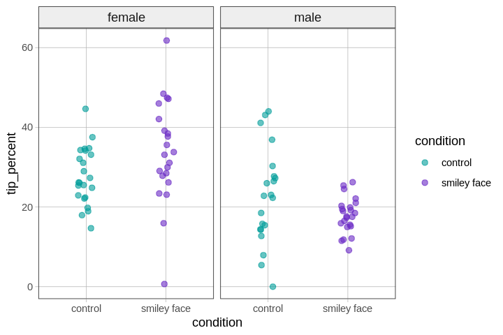
We can visualize this hypothesis with a number of different plots (e.g., histograms, boxplots, jitter plots, scatterplots). We’ve selected a jitter plot, faceted by gender, using color to highlight the comparison between tables that did versus did not get the smiley face.
gf_jitter(tip_percent ~ condition, color = ~condition, data = tip_exp, width = .2) %>%
gf_facet_grid(. ~ gender)
Model Variation in tip_percent
In the code window below, use lm() to fit the tip percent = condition + gender model to the data.
require(coursekata)
# find the best-fitting parameter estimates
# find the best-fitting parameter estimates
lm(tip_percent ~ condition + gender, data = tip_exp)
ex() %>%
  check_function("lm") %>%
  check_result() %>%
check_equal()Call:
lm(formula = tip_percent ~ condition + gender, data = tip_exp)
Coefficients:
(Intercept) conditionsmiley face gendermale
30.4264 0.7395 -10.6730 If we save our multivariate model as multi_model, we can use gf_model(multi_model) to ovelay the model predictions on our jitter plot. Try it in the code window below.
require(coursekata)
# write code to save this model as multi_model
lm(formula = tip_percent ~ condition + gender, data = tip_exp)

# this makes a faceted jitter plot of our data
# write code to overlay the multi_model onto it
gf_jitter(tip_percent ~ condition, color = ~condition, data = tip_exp, width = .1)  %>%
  gf_facet_grid(. ~ gender)
# write code to save this model as multi_model
multi_model <- lm(formula = tip_percent ~ condition + gender, data = tip_exp)

# this makes a faceted jitter plot of our data
# write code to overlay the multi_model onto it
gf_jitter(tip_percent ~ condition, color = ~condition, data = tip_exp, width = .1)  %>%
  gf_facet_grid(. ~ gender) %>%
  gf_model(multi_model)
ex() %>% {
  check_object(., "multi_model") %>% check_equal()
  check_function(., "gf_model") %>% {
    check_arg(., "object") %>% check_equal()
    check_arg(., "model") %>% check_equal()
  }
}
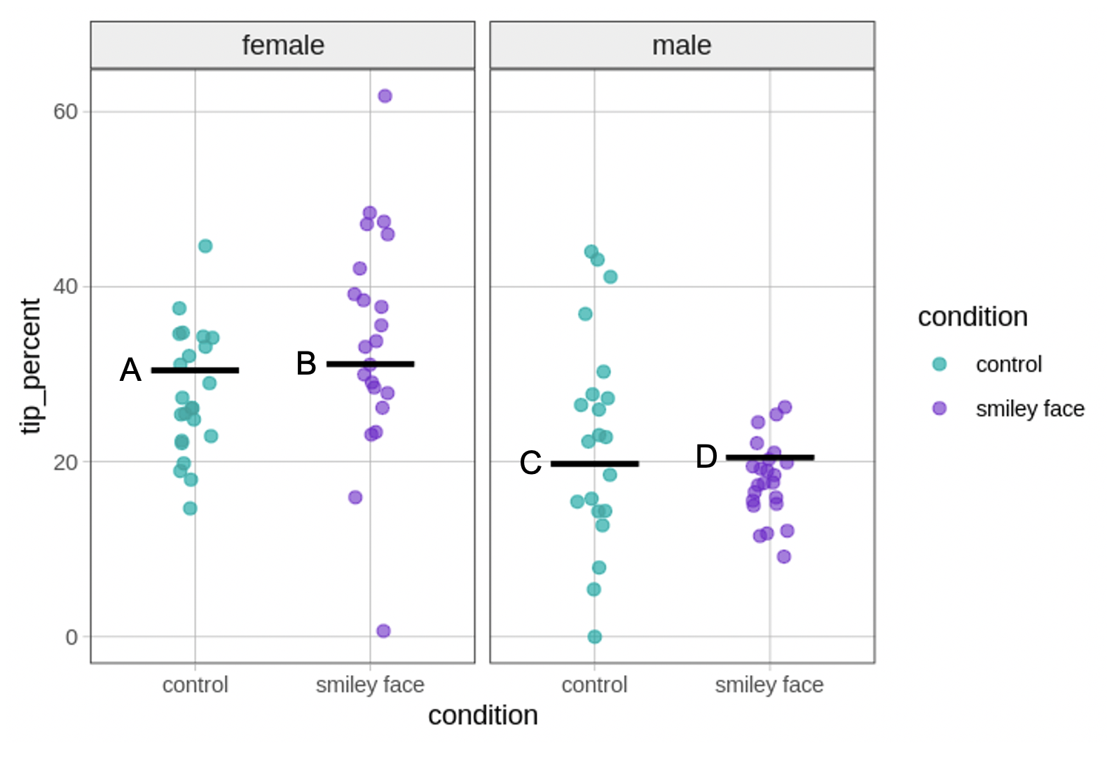
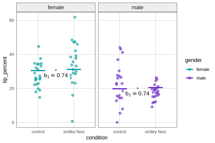
We have put some letters on our version of the plot to make it easier to refer to. Let’s take a moment to connect the parameter estimates in our model to the model predictions shown as black lines (labeled A, B, C, D) in the visualization.
The \(b_1\) estimate (0.74) represents the amount added to the prediction of tip_percent for tables in the smiley face condition controlling for gender. The \(b_2\) estimate (-10.67) represents the amount added to the prediction of tip_percent for tables with a male server controlling for condition.
We can summarize the connections between the parameter estimates and the plot we made by labeling the four model predictions with their corresponding parameter estimates in the figure below.
Thinking in Terms of Intercepts and Slopes
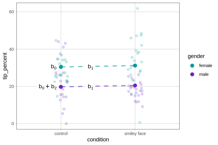
One thing to notice about this model is that it assumes that the difference between conditions is the same (\(b_1= \$0.74\)), regardless of whether the servers are female or male, as shown in the graph below. Likewise, the difference between female and male servers, which is -10.67 (\(b_2\)), is assumed to be the same for tables in the control condition as for those in the smiley face condition.
This assumption is what makes this an additive model: the effects of one predictor are the same for every level of the second predictor. We will relax this assumption in the next chapter, when we turn our attention to models with interactions.
Note that this is the same assumption we made earlier when we modeled home prices as a function of neighborhood and home size. The effect of neighborhood was constant across all values of HomeSizeK, and the effect of a one unit increase in HomeSizeK was the same in both neighborhoods. This additivity was represented as two parallel regression lines, one for homes in one neighborhood, the other for homes in the other.
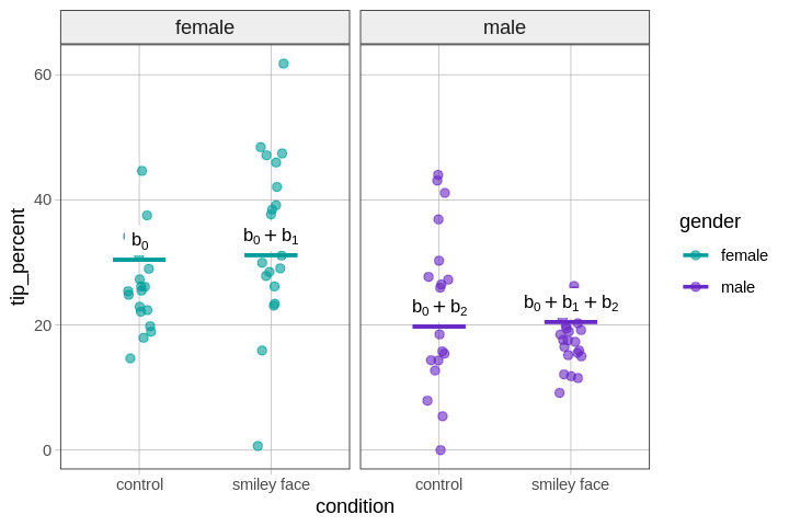
Even though there are no regression lines (only group means) in a model with two categorical predictors (i.e., condition and gender), it might still be helpful to think of the additivity of the model in terms of intercept and slope.
To help us visualize this, we’ve plotted the same data and model predictions as above, but this time drawn dotted lines to connect females across conditions (green), and males across conditions (purple).
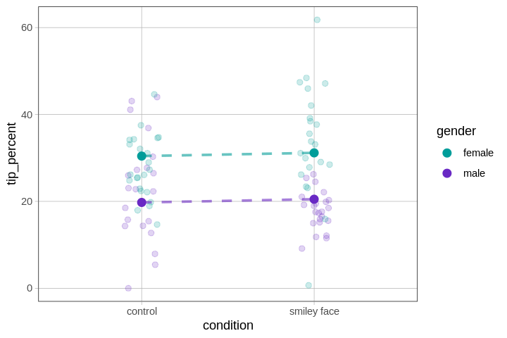
Some people would say it is wrong to draw these lines, because they give the false impression that there are values in between control and smiley face. But leaving that objection aside, the lines help us see the additivity of the model.
The effect of going from control to smiley face is the same for females and males, hence the parallel lines (both with the same tiny slope, \(b_1=0.74\)); and the effect of gender on tips is the same in the control condition as in the smiley face condition (\(b_2=-10.67\)).
We can summarize the connections between the parameter estimates and this new plot by labeling the y-intercepts and slopes with their corresponding parameter estimates in the figure below.