7.7 Using Venn Diagrams to Conceptualize Sums of Squares, PRE, and F
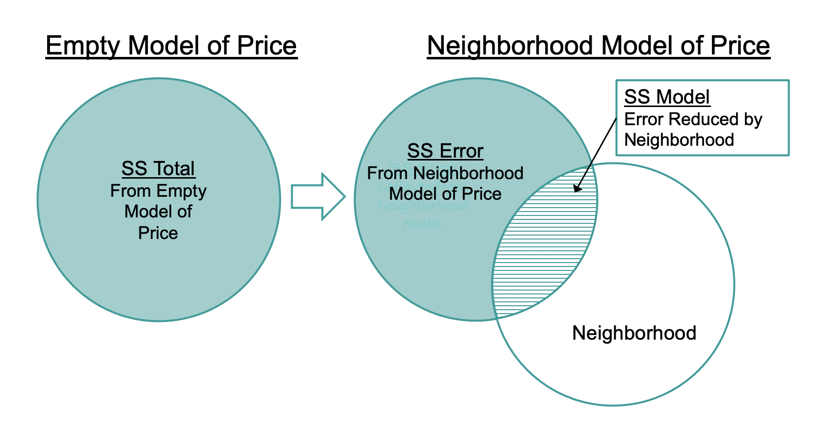
Venn diagrams are a useful way to help us understand sums of squares for multivariate models. The empty model of PriceK, shown at the left in the figure, can be represented by a single circle. This is the SS Total. When we add a predictor variable into the model (e.g., Neighborhood, as shown on the right), it reduces some of that total error. This reduction in error (i.e., SS Model) is represented by the overlap between the two circles, shown with horizontal stripes.
Now let’s visualize what happens when we add HomeSizeK to the model (see figure below). Adding HomeSizeK reduces more error, beyond that already reduced by Neighborhood.
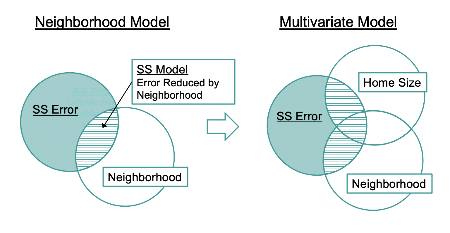
As SS Error gets smaller, SS Model gets larger. (Because SS Total = SS Model + SS Error, as one gets larger, the other must get smaller in order to add up to the same SS Total.) SS Model, the amount of variation explained by the model (represented as the three regions with stripes), is larger for the multivariate model than for the single-predictor model (which includes only Neighborhood).
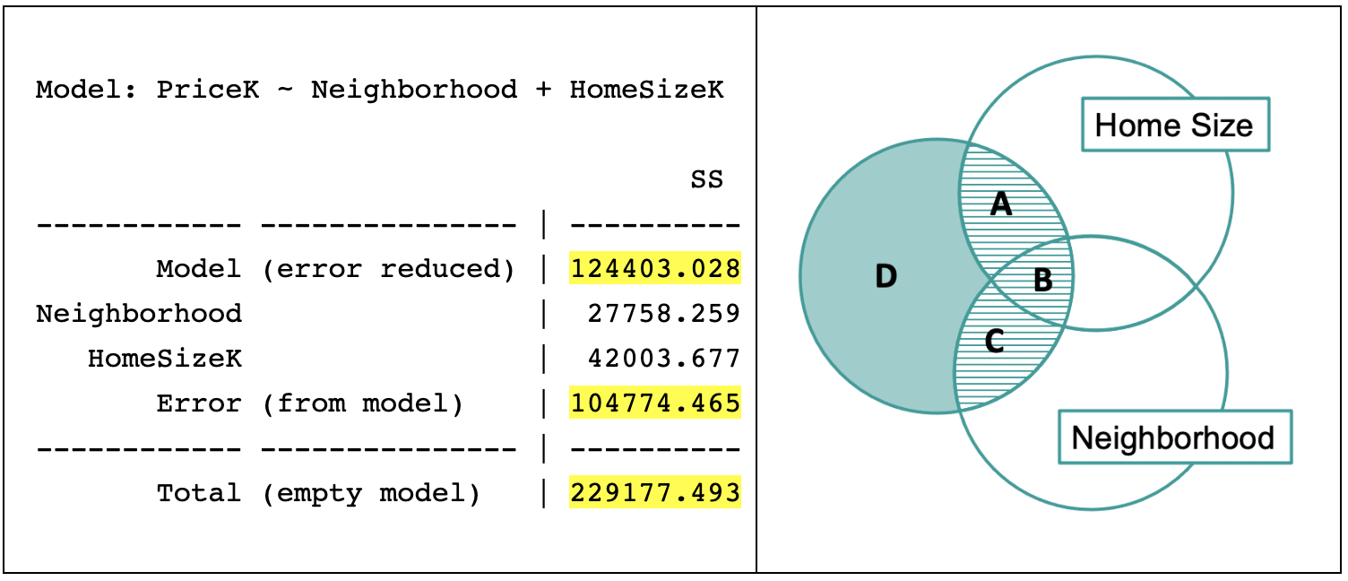
In the Venn diagram above, we have labeled the three regions of the area with horizontal stripes as A, B, and C, and the remaining region colored in teal as D.
SS Model, the error reduced by the multivariate model, is represented by the combined area of regions A, B, and C. Some of the error is uniquely reduced by HomeSizeK (region A), some uniquely reduced by Neighborhood (region C), and some reduced by both (region B)!
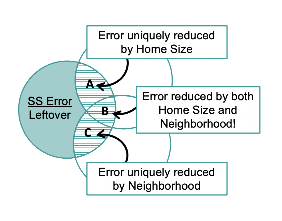
Region B exists because home size and neighborhood are related. Just as the parameter estimates had to be adjusted to account for this fact, the sum of squares also must be adjusted. We will talk more about this later, but for now it is worth noting one implication of this fact: The SS Model for the multivariate model cannot be found by simply adding together the SS Model numbers that result from fitting from the two single-predictor models separately (neighborhood and home size). If you added them separately you would be counting region B twice, and thus would overestimate SS Model for the multivariate model.
Using PRE to Compare the Multivariate Model to the Empty Model
We started with residuals, then squared and summed them to get our sums of squares. But sums of squares by themselves are of limited use. The multivariate model produced a SS Model of 124,403, for example. Although that sounds like a large reduction in error, we really can’t tell how large it is unless we compare it with the SS Total.
Model: PriceK ~ Neighborhood + HomeSizeK

                                        SS df        MS      F    PRE     p
 ------------ --------------- | ---------- -- --------- ------ ------ -----
        Model (error reduced) | 124403.028  2 62201.514 17.216 0.5428 .0000
 Neighborhood                 |  27758.259  1 27758.259  7.683 0.2094 .0096
    HomeSizeK                 |  42003.677  1 42003.677 11.626 0.2862 .0019
        Error (from model)    | 104774.465 29  3612.913
 ------------ --------------- | ---------- -- --------- ------ ------ -----
        Total (empty model)   | 229177.493 31  7392.822
Just as we did with single-predictor models, we can use PRE, or Proportional Reduction in Error, as a more interpretable indicator of how well our model fits the data. The PRE in the Model (error reduced) row in the ANOVA table tells us the proportion of total error from the empty model that is reduced by the overall multivariate model. We can see that for the model that includes both Neighborhood and HomeSizeK, the PRE is 0.54.
Using F to Compare the Multivariate Model to the Empty Model
From the PRE, we can see that the multivariate model has reduced 54% of the error compared to the empty model. This is a huge PRE! But we have to remember that this model is also a lot more complicated than the empty model. Was that reduction in error worth the degrees of freedom we spent? As before we will use the F ratio, which takes degrees of freedom into account, to help us make this judgment.
Let’s start by looking at how many degrees of freedom are used by the multivariate model compared to the empty model.
| PriceK = Neighborhood + HomeSizeK + Error | PriceK = Mean + Error |
|---|---|
| \[Y_i = b_0 + b_1X_{1i} + b_2X_{2i} + e_i\] | \[Y_i = b_0 + e_i\] |
You can see in the ANOVA table for the multivariate model that the number of parameters being estimated and the numbers in the df (degrees of freedom column) are related. It costs one degree of freedom to estimate the empty model, which is why the df Total (31) is one less than the sample size (32 homes). The df Model is 2 because the multivariate model estimates two more parameters than the empty model. After fitting the multivariate model, we have 29 degrees of freedom left, shown in the ANOVA table as df Error.
Model: PriceK ~ Neighborhood + HomeSizeK

                                        SS df        MS      F    PRE     p
 ------------ --------------- | ---------- -- --------- ------ ------ -----
        Model (error reduced) | 124403.028  2 62201.514 17.216 0.5428 .0000
 Neighborhood                 |  27758.259  1 27758.259  7.683 0.2094 .0096
    HomeSizeK                 |  42003.677  1 42003.677 11.626 0.2862 .0019
        Error (from model)    | 104774.465 29  3612.913
 ------------ --------------- | ---------- -- --------- ------ ------ -----
        Total (empty model)   | 229177.493 31  7392.822
While PRE relies on SS, the F statistic relies on the mean square (MS) which takes the SS and divides it by the degrees of freedom that were spent. This way the complexity of the model and how many degrees of freedom were used to estimate the parameters gets taken into account. As a reminder, the F is the reduction in error per degree of freedom spent (MS Model) divided by the error left per degree of freedom left (MS Error).
This relatively large F value tells us that this multivariate model is a pretty good deal compared to our empty model. We got a lot of “bang for our buck” (a lot of reduction in error for the degrees of freedom spent).