10.5 Interactions with Two Categorical Predictors
We’ve looked at interactions between a quantitative predictor and a categorical predictor (ANCOVA models), and between two quantitative predictors (multiple regression models). Let’s explore what interaction models look like when there are two categorical predictor variables (sometimes called factorial models).
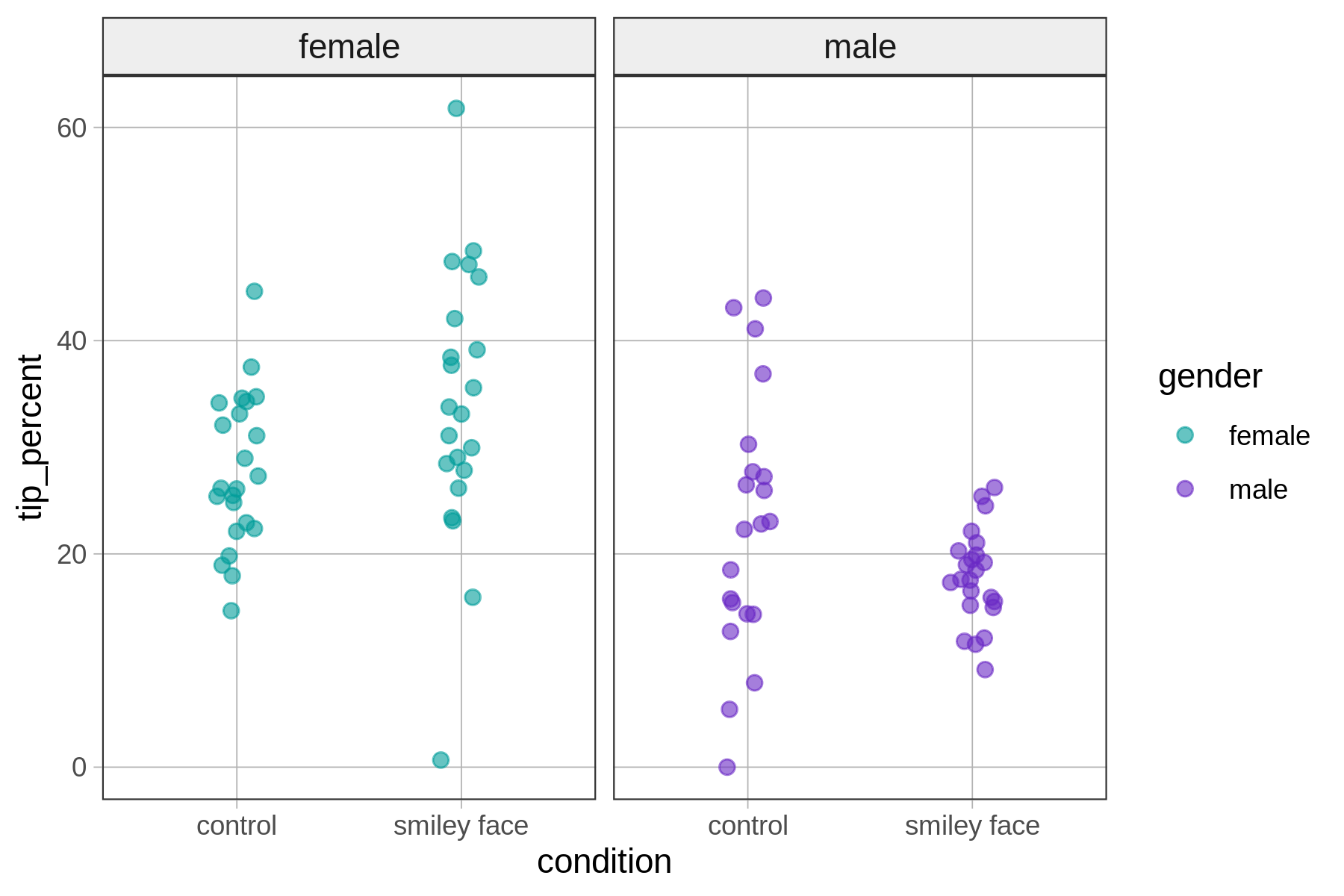
Let’s return to the tipping experiment. This experiment, recall, was one in which tables in a restaurant were randomly assigned to either get a hand-drawn smiley face on their check or not (condition), and to either get a female server or male server (gender). The researchers were interested in whether drawing a smiley face on the check would induce diners to leave a higher tip (tip_percent).
Here’s a sample of rows from the data frame (called tip_exp); it’s always good to remember what the raw data look like.
 gender condition   tip_percent
  <fct>  <fct>             <dbl>
1 female control            26.2
2 female control            34.7
3 female smiley face        33.1
4 female smiley face        30.0
5 male   control            23.0
6 male   control            26.5
7 male   smiley face        20.3
8 male   smiley face        17.6
Exploring the Data
Let’s start by visualizing the data. In the code window below we’ve written code to produce a jitter plot with tip_percent on the y-axis and condition on the x-axis. We used the argument color to add in information about the gender of the server. Run it and take a look at the resulting visualization.
require(coursekata)
# run this first before modifying
gf_jitter(tip_percent ~ condition, data = tip_exp, width = .1, color = ~gender)
# run this first before modifying
gf_jitter(tip_percent ~ condition, data = tip_exp, width = .1, color = ~gender) %>%
  gf_facet_grid(. ~ gender)
ex() %>% check_function("gf_facet_grid") %>% {
  check_arg(., "object") %>% check_equal()
  check_arg(., 2) %>% check_equal()
}You’ll see that although the color information is helpful, it might be nice to have two panels (or facets), with separate jitter plots for female and male servers. Try adding gf_facet_grid() to the graph in the code block above – using the %>% pipe operator – to create side-by-side jitter plots broken down by gender.
Fitting and Visualizing the Interaction Model
Let’s go ahead and fit the interaction model to the data, and then overlay the model predictions on top of the jitter plot.
In the code block below, fit and save the interaction model of tip_percent by condition and gender. Use gf_model() to overlay the interaction model predictions onto the jitter plot. Run the code and take a look at what the best-fitting interaction model looks like.
require(coursekata)
# fit and save the interaction model
interaction_model <-

# add code to put the interaction model on this plot
gf_jitter(tip_percent ~ condition, data = tip_exp, width = .1, color = ~gender) %>%
  gf_facet_grid(. ~ gender)
# fit and save the interaction model
interaction_model <- lm(tip_percent ~ condition * gender, data = tip_exp)

# add code to put the interaction model on this plot
gf_jitter(tip_percent ~ condition, data = tip_exp, width = .1, color = ~gender) %>%
  gf_facet_grid(. ~ gender) %>%
  gf_model(interaction_model)
ex() %>% check_or(
  check_function(., "gf_model") %>%
    check_arg("model") %>%
    check_equal(),
  override_solution(., "gf_jitter(tip_percent ~ condition, data = tip_exp, width = .1, color = ~gender) %>% gf_facet_grid(. ~ gender) %>% gf_model(lm(tip_percent ~ gender * condition, data = tip_exp))") %>%
  check_function("gf_model") %>%
  check_arg("model") %>%
  check_equal()
)
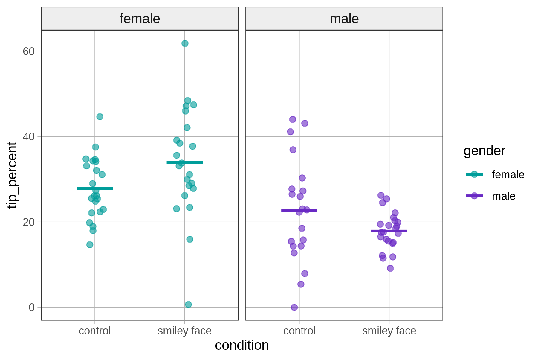
As you can see in this graph, the interaction model produces a separate model prediction for each of the four groups of tables defined by crossing all levels of condition and gender: female-control, female-smiley face, male-control, male-smiley face.