Chapter 10 - More Models with Interactions
10.1 Interactions with Two Quantitative Predictors
We have so far explored interaction models that have one categorical explanatory variable (e.g., condition) and one quantitative explanatory variable (e.g., base_anxiety), for example:
later_anxiety ~ condition + base_anxiety + condition*base_anxiety
Such interaction models, also called ANCOVA models, are easy to graph, resulting in two lines (one for each level of condition), each with its own slope and y-intercept.
But what if both of the explanatory variables were quantitative (models sometimes called multiple regression models). The slope of the line for base_anxiety predicting later_anxiety is different for the two levels of condition. But if condition were replaced with a quantitative predictor, you would need a different slope for every possible value of the quantitative variable! We will unpack this idea with a different example.
Visualizing a Model with Two Quantitative Predictors
Let’s go back to the Ames data frame with housing prices in Ames, Iowa. This time let’s explore a model that we can informally express like this:
PriceK = HomeSizeK + YearBuilt
All three of these variables are quantitative: PriceK is the sale price of the home (in thousands of dollars); HomeSizeK is the square footage of the home (in thousands of dollars); and YearBuilt is the year the house was built, which ranged from 1872 to 2009, with the average around 1978.
In the code window below, we’ve put some code to visualize the effect of home size on price. Add the effect of YearBuilt into the graph using the color = argument.
require(coursekata)
# add color to see how YearBuilt relates to this data
gf_point(PriceK ~ HomeSizeK, data = Ames)
# add color to see how YearBuilt relates to this data
gf_point(PriceK ~ HomeSizeK, data = Ames, color = ~YearBuilt)
ex() %>% check_function("gf_point") %>% {
  check_arg(., "object") %>% check_equal()
  check_arg(., "data") %>% check_equal()
  check_arg(., "color") %>% check_equal()
}

Two things are evident from the scatterplot: larger homes (with more square footage represented with dots further to the right) sell for more than smaller homes; and newer homes (those represented by the yellow dots) sell for more than older homes. Adding color to represent YearBuilt allows us to see the effects of both explanatory variables in the same graph.
Let’s think about the relationship between home size and price: in general, larger homes sell for more than the smaller homes. Relationships can be stronger or weaker. If larger homes sell for a lot more than smaller homes we would say it is a strong relationship. If they only sell for a little more, we would call that a weaker relationship.
In the visualization below we have roughly sketched in two separate regression lines by hand – one for the newer homes (i.e., the yellow dots) and another for the older homes (the blue and purple dots).
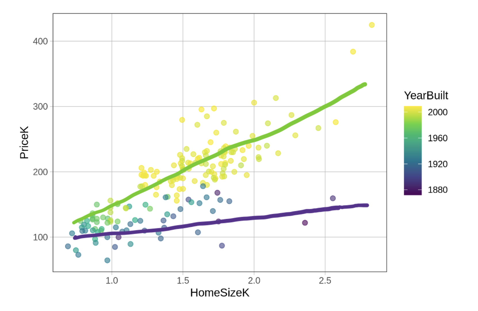
Sketching in these lines helps us see that the effect of home size on price may be stronger for newer homes (a steeper sloping line) and weaker for older homes (a less steep slope). We could say that the effect of home size on price depends on the age of the home. (When we use the word “effect” in this context we are not implying that there is a causal effect, just that there is a relationship between the two variables.)
This pattern perfectly fits the definition of an interaction effect. In an interaction, the effect of one variable on an outcome differs depending on the value of a second variable. Just looking at the sketched in lines suggests we might want to fit a model that includes the HomeSizeK by YearBuilt interaction term.