6.8 Using the Normal Model to Make Predictions
Let’s go back now to the question we asked earlier: Given the distribution of thumb length, what is the probability that the next randomly sampled student would have a thumb length at least 65.1 mm long? (The “at least” phrase indicates a thumb length 65.1 mm or even longer!) How could we use the smoothed out normal model to answer this question?
Fitting the Normal Model to a Distribution of Data
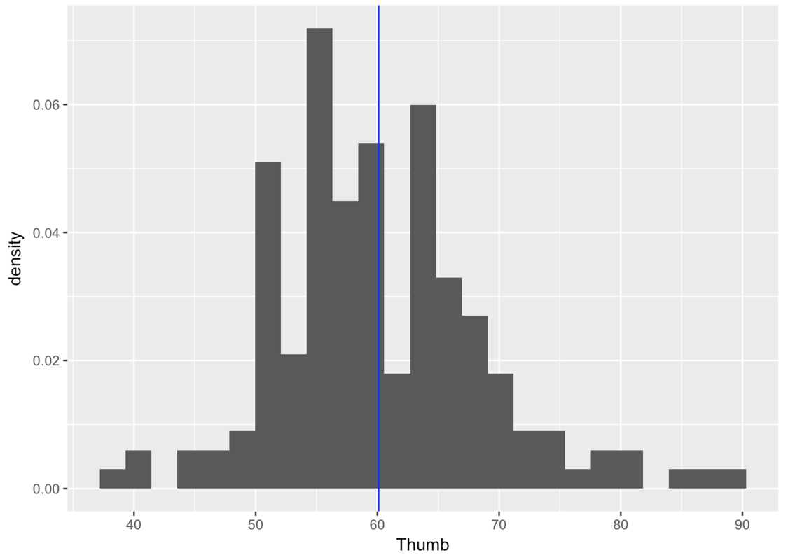
We first need to fit the normal model to the distribution of thumb length in our data (much like how we fit simple shapes over the irregularly shaped state of California). Below is the jagged distribution of Thumb. We have represented the mean of the distribution (60.1) as a blue line to serve as a reference point.
Thumb_stats <- favstats(~ Thumb, data = Fingers)
gf_dhistogram(~ Thumb, data = Fingers) %>%
gf_vline(xintercept = ~Thumb_stats$mean, color = "blue")
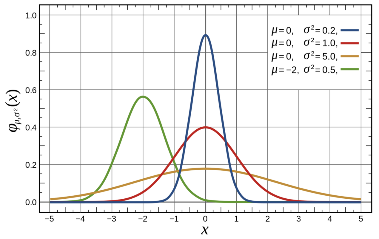
The normal distribution is actually a family of theoretical distributions, each having a different mean and a different standard deviation. To find the particular normal distribution that best fits our data, we need to find the two parameters (mean and standard deviation) that define the best-fitting curve, i.e. the curve that minimizes the squared residuals of our data from the model.
The figure below can give you a sense of how normal distributions can vary from each other, depending on their means and standard deviations. Note that three of the four distributions pictured have the same mean, which is 0, but quite different shapes. The fourth distribution has a mean that is below the other three.
Finding the normal curve that best fits our distribution of data is fairly straightforward. First we use our sample mean and standard deviation (\(\bar{Y}\) and \(s\)) as estimates of the population mean and standard deviation (\(\mu\) and \(\sigma\)). Then, using these estimates we can use the gf_dist() function to graphically overlay the best-fitting normal model on the distribution of data.
The gf_dist() function can overlay a number of different mathematical probability distributions. Because we want to overlay the normal distribution, we’ll have to specify that with the argument “norm”, and then enter in the mean and standard deviation as parameters.
gf_dhistogram(~ Thumb, data = Fingers) %>%
gf_vline(xintercept = ~Thumb_stats$mean, color = "blue") %>%
gf_dist("norm", color="blue", params=list(Thumb_stats$mean, Thumb_stats$sd))
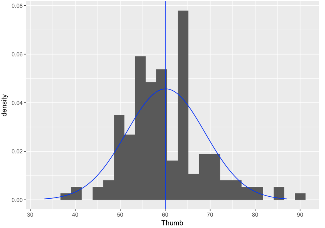
You might be thinking—hmm, the normal curve doesn’t fit that well over the data. You are correct! But remember, our goal is not just to model our data, but to model the long-term results of the DGP. Even when our data look jagged, the population distribution may not be.
And, the goal of a model is not to fit perfectly, but to balance the fit of the model with the simplicity and elegance of the model. By modeling error with the normal curve, we can trade in the complexity of 157 jagged values for an elegant, two-parameter model—the normal curve.
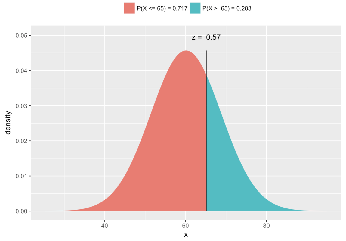
Finally, remember our original question? We wanted to know the exact probability that the next randomly sampled student would have thumb length of more than 65.1 mm. To help visualize this question, let’s add one more thing to the graph: a red line to locate 65.1 mm in reference to the distribution.
gf_dhistogram(~ Thumb, data = Fingers) %>%
gf_vline(xintercept = ~Thumb_stats$mean, color = "blue") %>%
gf_dist("norm", color="blue", params=list(Thumb_stats$mean, Thumb_stats$sd)) %>%
gf_vline(xintercept = 65.1, color = "red")
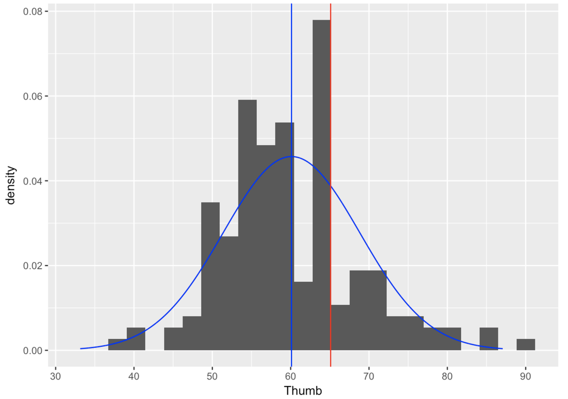
With the help of this picture, we can restate our question as: What proportion of the area under the blue normal curve falls to the right of the red vertical line? This proportion, which we will calculate below, would tell us the probability that the next randomly sampled student would have a thumb length longer than 65.1 mm.
Using the Normal Distribution to Calculate Probabilities
Once you have fit a smooth normal curve over a data distribution, you can use mathematical properties of the curve (don’t worry, we’ll let R handle that!) to find the probability of scores falling into specific regions. This is exactly like what we did when we used rectangles to model the area of California. Once we fit a rectangle, we could simply use the formula for the area of a rectangle (\(l \times w\)) to calculate the area.
In the graph below, we have removed the distribution of data, and left only the best-fitting normal curve. The answer to the question, “What is the probability that the next student will have a thumb length more than 65.1 mm?,” is represented by the region colored green under the curve. If we can find the proportion of total area that is colored green, we can use that proportion as our probability estimate for the next observation being greater than 65.1.
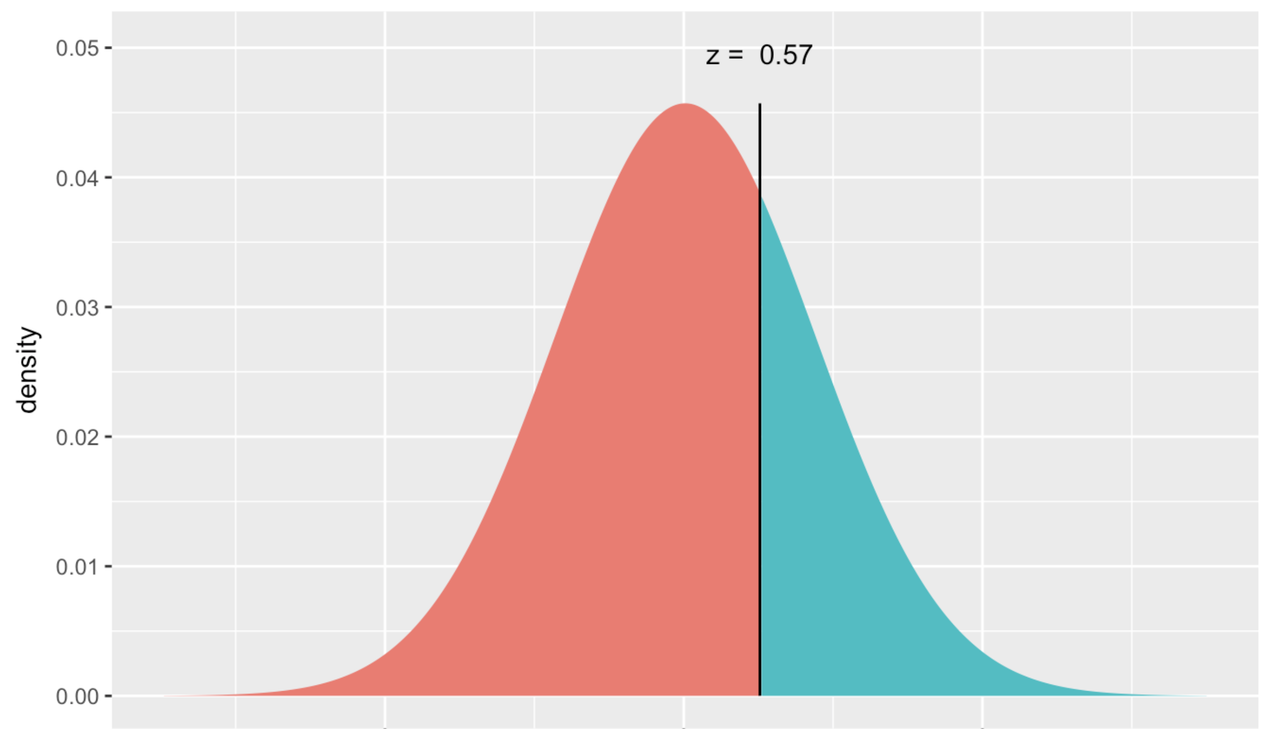
Because the normal distribution has a smooth shape easily defined by two parameters, R can tell us the exact probability by using the mathematical function for a normal distribution. There is a function called xpnorm() that can do this with just three pieces of information: the border you are interested in, and the mean and standard deviation of the normal distribution.
xpnorm(65.1, mean = Thumb_stats$mean, sd = Thumb_stats$sd)Note that you can also leave out the argument labels, mean = and sd =, but then you have to put in these values in the right order (mean then sd) like this: xpnorm(65.1, Thumb_stats$mean, Thumb_stats$sd). If you include the argument labels, you can put the values in a different order like this: xpnorm(65.1, sd = Thumb_stats$sd, mean = Thumb_stats$mean).
This function results in the picture below where you can read off the exact probability that you are looking for.