3.8 Boxplots and the Five-Number Summary
Boxplots are a handy tool for visualizing the five-number summary of a distribution. Making boxplots with the function gf_boxplot() will also clearly show you the IQR and outliers. Very handy.
Unlike histograms, where the values of the variable went on the x-axis, the boxplots made with gf_boxplot() put the values of the variable on the y-axis. Boxplots do not have to be made this way; this is just the way it is done by gf_boxplot().
Here is the code for making a boxplot of Wt from MindsetMatters with gf_boxplot().
gf_boxplot(Wt ~ 1, data = MindsetMatters)The 1 just means that there is only going to be one boxplot here. Later we will replace that as we explore methods of making multiple boxplots that appear next to each other.
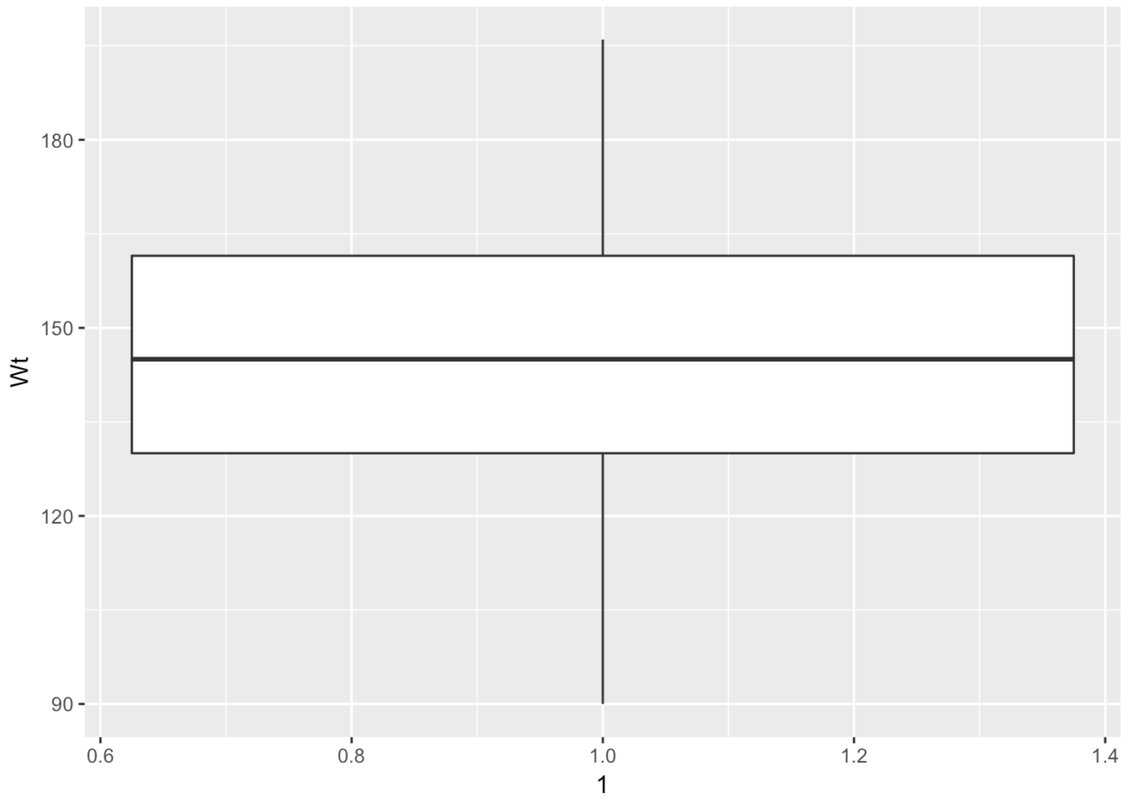
The boxplot is made up of a few parts. There is a big white box with two parts–an upper and lower part. There are lines, called whiskers, above and below the box. Another name for boxplot is box-and-whisker plot.
This is a case where there are no outliers (defined as more than 1.5 IQRs above Q3 or below Q1). So the whiskers will simply end at the max and min values for Wt.
Modify this code to create a boxplot for Population from the HappyPlanetIndex data frame.
require(coursekata)

HappyPlanetIndex$Region <- recode(
    HappyPlanetIndex$Region,
    '1'="Latin America",
    '2'="Western Nations",
    '3'="Middle East and North Africa",
    '4'="Sub-Saharan Africa",
    '5'="South Asia",
    '6'="East Asia",
    '7'="Former Communist Countries"
)
# Modify this code to create a boxplot of Population from HappyPlanetIndex
gf_boxplot(Wt ~ 1, data = MindsetMatters)
# Modify this code to create a boxplot of Population from HappyPlanetIndex
gf_boxplot(Population ~ 1, data = HappyPlanetIndex)
ex() %>% check_function("gf_boxplot") %>% check_result() %>% check_equal()
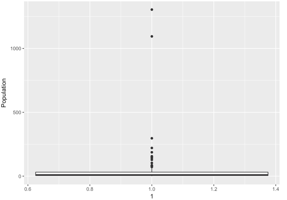
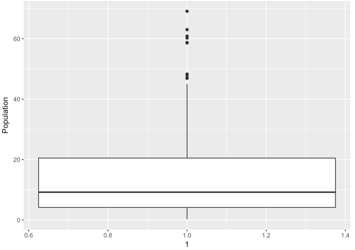
Wow, this is a strange-looking boxplot. You can hardly see the box—it’s squished down on the bottom. And there are all these points here, even though it’s supposed to be depicting a box-and-whisker plot.
The points that appear on a boxplot are the outliers. If they appear above the top whisker, they are outliers because R has checked whether these values are greater than the \(Q3 + 1.5*IQR\). If they appear below the bottom whisker, they are outliers because their values are smaller than the \(Q1 - 1.5*IQR\). When there are outliers, the end of the whisker depicts the max or min value that is not considered an outlier.
There are a lot of large outlier countries. No wonder the histogram we looked at before put so many countries into the same bin! It looks as though most countries are at 0 millions. If only we could “zoom in” on these countries with a smaller population.
In the following code window, use filter() to get just the countries with populations smaller than this upper boundary. Save these countries in a data frame called SmallerCountries. Run the code to see a histogram of those Population data.
require(coursekata)

HappyPlanetIndex$Region <- recode(
    HappyPlanetIndex$Region,
    '1'="Latin America",
    '2'="Western Nations",
    '3'="Middle East and North Africa",
    '4'="Sub-Saharan Africa",
    '5'="South Asia",
    '6'="East Asia",
    '7'="Former Communist Countries"
)
# this calculates the Q3 + 1.5*IQR
upper_boundary <- 31.225 + 1.5*(31.225-4.455)
# modify this code to filter in only countries with population sizes less than the upper_boundary
SmallerCountries <-
# this makes a histogram of the smaller countries' populations
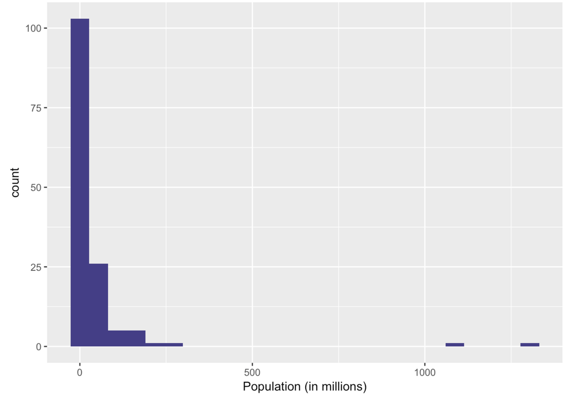
gf_histogram(~ Population, data = SmallerCountries, fill = "slateblue4") %>%
gf_labs(x = "Population (in millions)", title = "Population of Countries (Excludes Outliers)")
upper_boundary <- 31.225 + 1.5*(31.225-4.455)
SmallerCountries <- filter(HappyPlanetIndex, Population < upper_boundary)
gf_histogram(~ Population, data = SmallerCountries, fill = "slateblue4") %>%
gf_labs(x = "Population (in millions)", title = "Population of Countries (Excludes Outliers)")
ex() %>% {
    check_function(., "filter") %>% {
        check_arg(., ".data") %>% check_equal(incorrect_msg="Don't forget to filter in HappyPlanetIndex")
        check_arg(., "...") %>% check_equal(incorrect_msg="Did you use `Population < upper_boundary` as the second argument?")
        check_result(.) %>% check_equal()
    }
    check_object(., "SmallerCountries") %>% check_equal
    check_function(., "gf_histogram") %>% {
        check_arg(., "object") %>% check_equal()
        check_arg(., "data") %>% check_equal()
    }
}
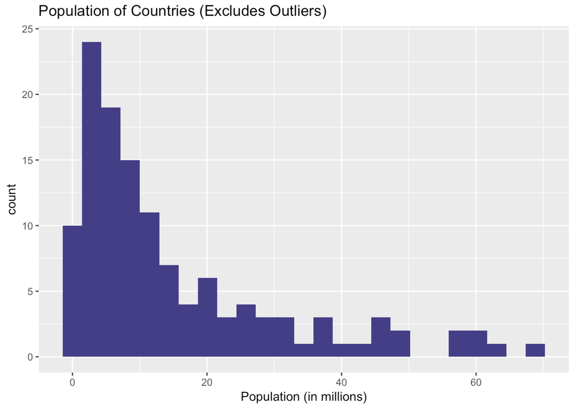
Ah, this is a very different histogram than the one that included outliers. Here we get a sense of how the countries that previously got lumped together in one bin actually vary in their population size.
Let’s re-run the boxplot for just these countries in the data frame SmallerCountries to see what that looks like. Just press the <Run> button.
require(coursekata)

HappyPlanetIndex$Region <- recode(
    HappyPlanetIndex$Region,
    '1'="Latin America",
    '2'="Western Nations",
    '3'="Middle East and North Africa",
    '4'="Sub-Saharan Africa",
    '5'="South Asia",
    '6'="East Asia",
    '7'="Former Communist Countries"
)
pop_stats <- favstats(~ Population, data = HappyPlanetIndex)
SmallerCountries <- filter(HappyPlanetIndex, Population < (pop_stats$Q3 + 1.5*(pop_stats$Q3 - pop_stats$Q1)))
# Make a boxplot of Population from the SmallerCountries
gf_boxplot(Population ~ 1, data = SmallerCountries)
# Make a boxplot of Population from the SmallerCountries
gf_boxplot(Population ~ 1, data = SmallerCountries)
ex() %>% check_function("gf_boxplot") %>% check_result() %>% check_equal()