Chapter 12 - What You Have Learned
You may not think you have learned a lot, but we think you have! Think back to the very beginning of the class when we said that statistics is the study of variation. Look how far you have come since then! You now have a real sense of what it means to study variation. Just like a practicing statistician, you now have skills to help you explore variation, model variation, and evaluate models.
And although what we have done in this class might seem relatively clean and simple compared to the real world problems that thoughtful people such as yourself will need to solve, the basic concepts and skills you have learned provide all the foundation you need for future learning as you deepen your knowledge of statistics and data analysis.
Just in case you don’t think you have learned a lot, let’s take you for a little tour of what you have learned, and give you a chance to show yourself what you can do.
12.1 What You have Learned about Exploring Variation
We will start with a data set called hate_crimes from FiveThirtyEight. The data set contains data on hate crimes reported to both the Southern Poverty Law Center (SPLC) and the FBI in all 50 states and the District of Columbia. Go ahead and run str() to see what’s in the data frame. (See? You didn’t know how to do this before, did you?)
require(coursekata)
# use the str() function to see what is in the hate_crimes data frame
# use the str() function to see what is in the hate_crimes data frame
str(hate_crimes)
ex() %>%
    check_function("str", not_called_msg = "Did you use the str() function?") %>%
    check_arg("object") %>%
check_equal(incorrect_msg = "Did you call str on the hate_crimes data set?")tibble [51 × 13] (S3: tbl_df/tbl/data.frame)
$ state : chr [1:51] "Alabama" "Alaska" "Arizona" "Arkansas" ...
$ state_abbrev : chr [1:51] "AL" "AK" "AZ" "AR" ...
$ median_house_inc : int [1:51] 42278 67629 49254 44922 60487 60940 70161 57522 68277 46140 ...
$ share_unemp_seas : num [1:51] 0.06 0.064 0.063 0.052 0.059 0.04 0.052 0.049 0.067 0.052 ...
$ share_pop_metro : num [1:51] 0.64 0.63 0.9 0.69 0.97 0.8 0.94 0.9 1 0.96 ...
$ share_pop_hs : num [1:51] 0.821 0.914 0.842 0.824 0.806 0.893 0.886 0.874 0.871 0.853 ...
$ share_non_citizen : num [1:51] 0.02 0.04 0.1 0.04 0.13 0.06 0.06 0.05 0.11 0.09 ...
$ share_white_poverty : num [1:51] 0.12 0.06 0.09 0.12 0.09 0.07 0.06 0.08 0.04 0.11 ...
$ gini_index : num [1:51] 0.472 0.422 0.455 0.458 0.471 0.457 0.486 0.44 0.532 0.474 ...
$ share_non_white : num [1:51] 0.35 0.42 0.49 0.26 0.61 0.31 0.3 0.37 0.63 0.46 ...
$ share_vote_trump : num [1:51] 0.63 0.53 0.5 0.6 0.33 0.44 0.41 0.42 0.04 0.49 ...
$ hate_crimes_per_100k_splc : num [1:51] 0.1258 0.1437 0.2253 0.0691 0.2558 ...
$ avg_hatecrimes_per_100k_fbi: num [1:51] 1.806 1.657 3.414 0.869 2.398 ...
Whatever your theories about hate crimes might be, you can explore variation in a number of ways! Let’s use avg_hatecrimes_per_100k_fbi as an outcome variable for now; hate_crimes_per_100k_splc would also be a good one—you are free to explore it too!
Take a look at the variation in the hate crimes reported to the FBI in some kind of plot.
require(coursekata)
# make a plot to help us explore the variation in avg_hatecrimes_per_100k_fbi
# all of these are ways to look at a single continuous variable
# some are more helpful than others

gf_histogram(~avg_hatecrimes_per_100k_fbi, data = hate_crimes)

gf_dhistogram(~avg_hatecrimes_per_100k_fbi, data = hate_crimes)

gf_freqpoly(~avg_hatecrimes_per_100k_fbi, data = hate_crimes)
gf_density(~avg_hatecrimes_per_100k_fbi, data = hate_crimes)
gf_boxplot(avg_hatecrimes_per_100k_fbi ~ 1, data = hate_crimes)

gf_violin(avg_hatecrimes_per_100k_fbi ~ 1, data = hate_crimes)
ex() %>% check_or(
    check_function(., "gf_histogram") %>% check_result() %>% check_equal(),
    check_function(., "gf_dhistogram") %>% check_result() %>% check_equal(),
    check_function(., "gf_freqpoly") %>% check_result() %>% check_equal(),
    check_function(., "gf_density") %>% check_result() %>% check_equal(),
    check_function(., "gf_boxplot") %>% check_result() %>% check_equal(),
    check_function(., "gf_violin") %>% check_result() %>% check_equal()
)

Look at that! You are able to make graphs to help you visualize the variation you see in the rate of hate crimes. We might be interested in knowing which state is such an outlier in terms of hate crimes, an ignoble distinction. How would we find that out where that is? Could we arrange the data frame in some way to see the states sorted in descending order by avg_hatecrimes_per_100k_fbi? Could we just print the six states with highest crime rates?
require(coursekata)
# Can you arrange the data frame to show you the places with the highest hate crime rates? Can you just print the 6 states with the highest crime rates?
# Can you arrange the data frame to show you the places with the highest hate crime rates? Can you just print the 6 states with the highest crime rates?
# there are multiple ways to approach this task. Here are a few possible solutions:

head(arrange(hate_crimes, desc(avg_hatecrimes_per_100k_fbi)))

hate_crimes <- arrange(hate_crimes, desc(avg_hatecrimes_per_100k_fbi))
head(select(hate_crimes, state, avg_hatecrimes_per_100k_fbi))
ex() %>% {
    check_function(., "desc", not_called_msg = "Did you use the desc() function to arrange avg_hatecrimes_per_100k_fbi in descending order?")
    check_function(., "arrange", not_called_msg = "Did you use the arrange() function to arrange avg_hatecrimes_per_100k_fbi in descending order?") %>% check_result() %>% check_equal()
    check_function(., "head", not_called_msg = "Did you remember to print the first 6 rows of the data frame?")
}# A tibble: 6 x 12
state median_house_inc share_unemp_seas share_pop_metro
<chr> <int> <dbl> <dbl>
1 District of Columbia 68277 0.067 1
2 Massachusetts 63151 0.046 0.97
3 North Dakota 60730 0.028 0.5
4 New Jersey 65243 0.056 1
5 Kentucky 42786 0.050 0.56
6 Washington 59068 0.052 0.86
# ... with 8 more variables: share_pop_hs <dbl>, share_non_citizen <dbl>,
# share_white_poverty <dbl>, gini_index <dbl>, share_non_white <dbl>,
# share_vote_trump <dbl>, hate_crimes_per_100k_splc <dbl>,
# avg_hatecrimes_per_100k_fbi <dbl>We could also save the arranged data frame and then print out just the state name and outcome variable of interest.
hate_crimes <- arrange(hate_crimes, desc(avg_hatecrimes_per_100k_fbi))
head(select(hate_crimes, state, avg_hatecrimes_per_100k_fbi))
# A tibble: 6 x 2
state avg_hatecrimes_per_100k_fbi
<chr> <dbl>
1 District of Columbia 10.953480
2 Massachusetts 4.801899
3 North Dakota 4.741070
4 New Jersey 4.413203
5 Kentucky 4.207890
6 Washington 3.817740Let’s go back now and take a closer looks at the distribution of hate crime rates. As statisticians, what we really want to do is explain the variation we see here. Why do some places have higher rates of hate crimes (per 100,000 people) than others?

Well guess what? You not only know how to think about explanatory variables, but you also know how to explore the relationships between outcome and explanatory variables in the data.
Let’s do it. Pick a few explanatory variables and make some plots to explore their relationship with rate of hate crimes (avg_hatecrimes_per_100k_fbi). You might want to see if unemployment (share_unemp_seas) is related to hate crimes. Or if wealth (median_house_inc) might have something to do with hate crimes.
In the code window below, make a visualization that would help you explore the relationship between unemployment and hate crimes. You can also put the best-fitting regression line on it if you want. Also make a visualization looking at whether hate crimes can be explained by income. (Feel free to explore other explanatory variables as well!)
require(coursekata)
# make a visualization of hate crimes explained by unemployment


# make a visualization of hate crimes explained by household income
# make a visualization of hate crimes explained by unemployment
gf_point(avg_hatecrimes_per_100k_fbi ~ share_unemp_seas, data = hate_crimes, color = "navy", size = 3) %>%
    gf_lm(color = "orange")

# make a visualization of hate crimes explained by household income
gf_point(avg_hatecrimes_per_100k_fbi ~ median_house_inc, data = hate_crimes, color = "darkgreen", size = 3) %>%
    gf_lm(color = "orange")
ex() %>% check_error()
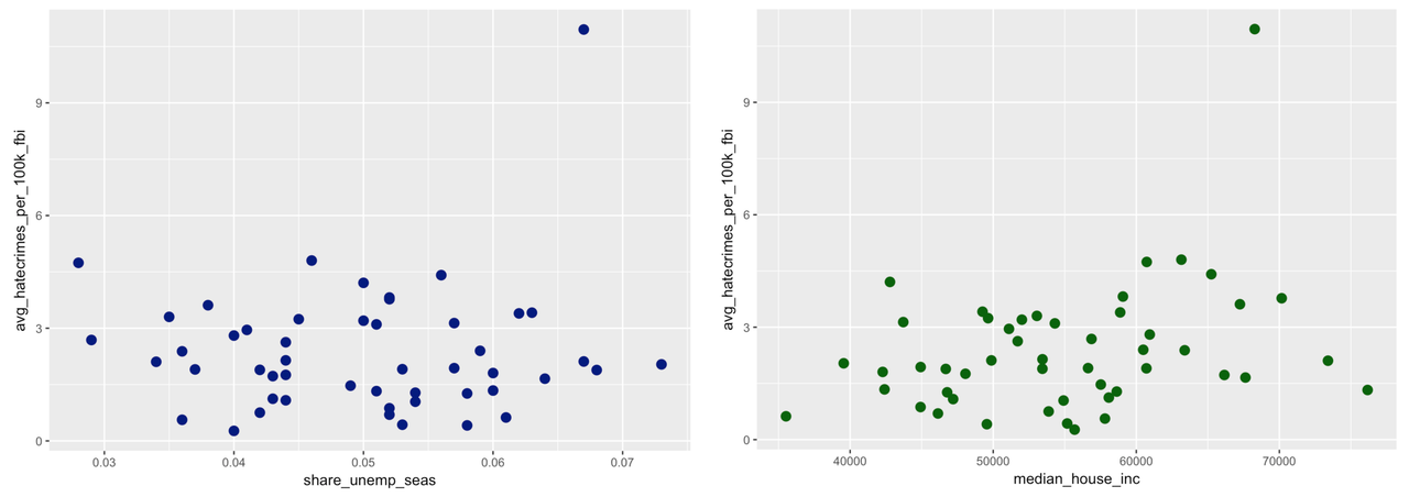
You also know, even with just a scatterplot, how to think about what it means for one variable to “explain” variation in another. You know that to explain means that knowing a score on one variable helps you make a better guess as to that same unit’s score on another. It looks like there may be a relationship in the scatterplot on the right, at least more so than in the plot on the left.