Course Outline
-
segmentGetting Started (Don't Skip This Part)
-
segmentStatistics and Data Science: A Modeling Approach
-
segmentPART I: EXPLORING VARIATION
-
segmentChapter 1 - Welcome to Statistics: A Modeling Approach
-
segmentChapter 2 - Understanding Data
-
segmentChapter 3 - Examining Distributions
-
segmentChapter 4 - Explaining Variation
-
segmentPART II: MODELING VARIATION
-
segmentChapter 5 - A Simple Model
-
segmentChapter 6 - Quantifying Error
-
6.10 Getting Familiar with the Normal Distribution
-
segmentChapter 7 - Adding an Explanatory Variable to the Model
-
segmentChapter 8 - Digging Deeper into Group Models
-
segmentChapter 9 - Models with a Quantitative Explanatory Variable
-
segmentPART III: EVALUATING MODELS
-
segmentChapter 10 - The Logic of Inference
-
segmentChapter 11 - Model Comparison with F
-
segmentChapter 12 - Parameter Estimation and Confidence Intervals
-
segmentFinishing Up (Don't Skip This Part!)
-
segmentResources
list High School / Advanced Statistics and Data Science I (ABC)
6.10 Getting Familiar With the Normal Distribution
By now you see why normal distributions are often good models of error (aggregation of forces!) and also how you might use them to make predictions. But why is it that distributions that look very different from one another are all called “normal”? The shape of the normal distribution is intuitively like “a bell”, but let’s consider what that really means.
To be more concrete, let’s go back to Kargle, our favorite video game.
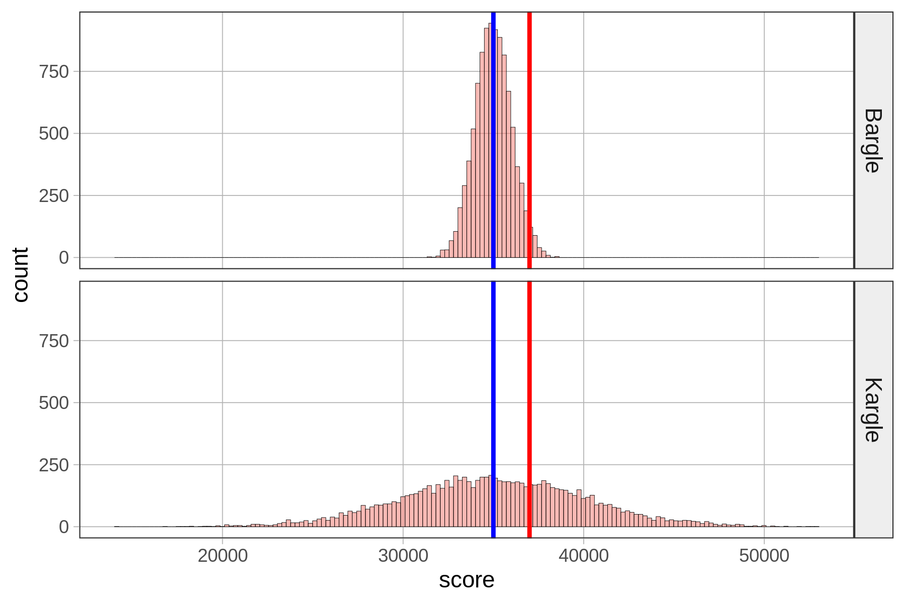
Remember we had that friend who scored 37,000 points in Kargle (shown in red) and we were trying to evaluate how skilled a player she was? When we discovered that the bottom distribution (where the standard deviation is about 5,000) was the actual distribution of Kargle scores, we were less impressed than when we thought it was the top distribution. As it turns out, the top distribution (with a standard deviation of about 1,000) is from a game called Bargle.
Normal distributions are roughly “bell-shaped” in that there are way more scores in the middle than there are out in the tails. They are also symmetrical from left to right. But it turns out that normal distributions are even more regular, and thus quantifiable, than that description.
To illustrate the regularity of this normal shape, let’s just think about the players of both Kargle and Bargle that are within plus or minus (+/-) one standard deviation from the mean. We’ll call this area of the distribution Zone 1 for now. These are the players with the less extreme scores.
Dividing Scores into Zones Based on Standard Deviation
We constructed a new variable called zone that simply indicates whether each person’s score is within Zone 1 (coded “1”) or outside of it (coded “outside”).
To do this we first transformed each person’s raw score into a z-score (which, you may recall, indicates how many standard deviations a score is from the mean). We then coded “1” in the variable zone for every player whose z-score was > -1 and < 1. (Don’t worry about doing this in R; you can learn later if you want.)
In the histograms below, we have shaded Zone 1 in red, and anything outside of Zone 1 in purple.
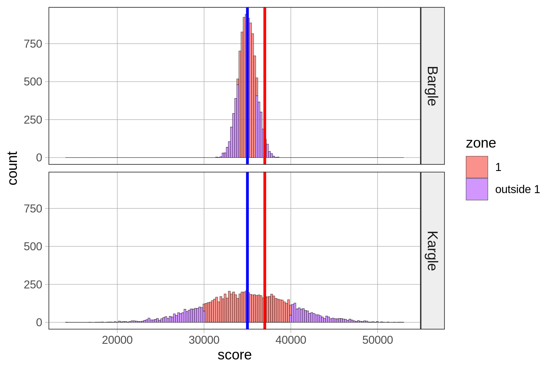
Notice that our friend who scored 37,000 falls into Zone 1 for Kargle, but if that was her score in Bargle, she would be outside Zone 1. Putting aside our friend for a moment, what’s the proportion of players that fall inside Zone 1 in Bargle and Kargle? Let’s run a tally to find out.
tally(zone ~ game, data=VideoGame, format="proportion") game
zone Bargle Kargle
1 0.6844 0.6822
outside 1 0.3156 0.3178Wow, Zone 1—within one standard deviation from the mean—is very similar (about .68) for both Bargle and Kargle! Interestingly, more than half the distribution is within one standard deviation of the mean.
If we are one standard deviation in the positive direction, the z-score would be 1. If we are one standard deviation in the negative direction, the z-score would be -1. So Zone 1, +/- one standard deviation, would contain all the data for which z-scores fall between -1 and 1.
Let’s loosen our idea of “close to” average and consider the players of both Kargle and Bargle who are +/- two standard deviations from the mean. We’ll call this area Zone 2 for now.
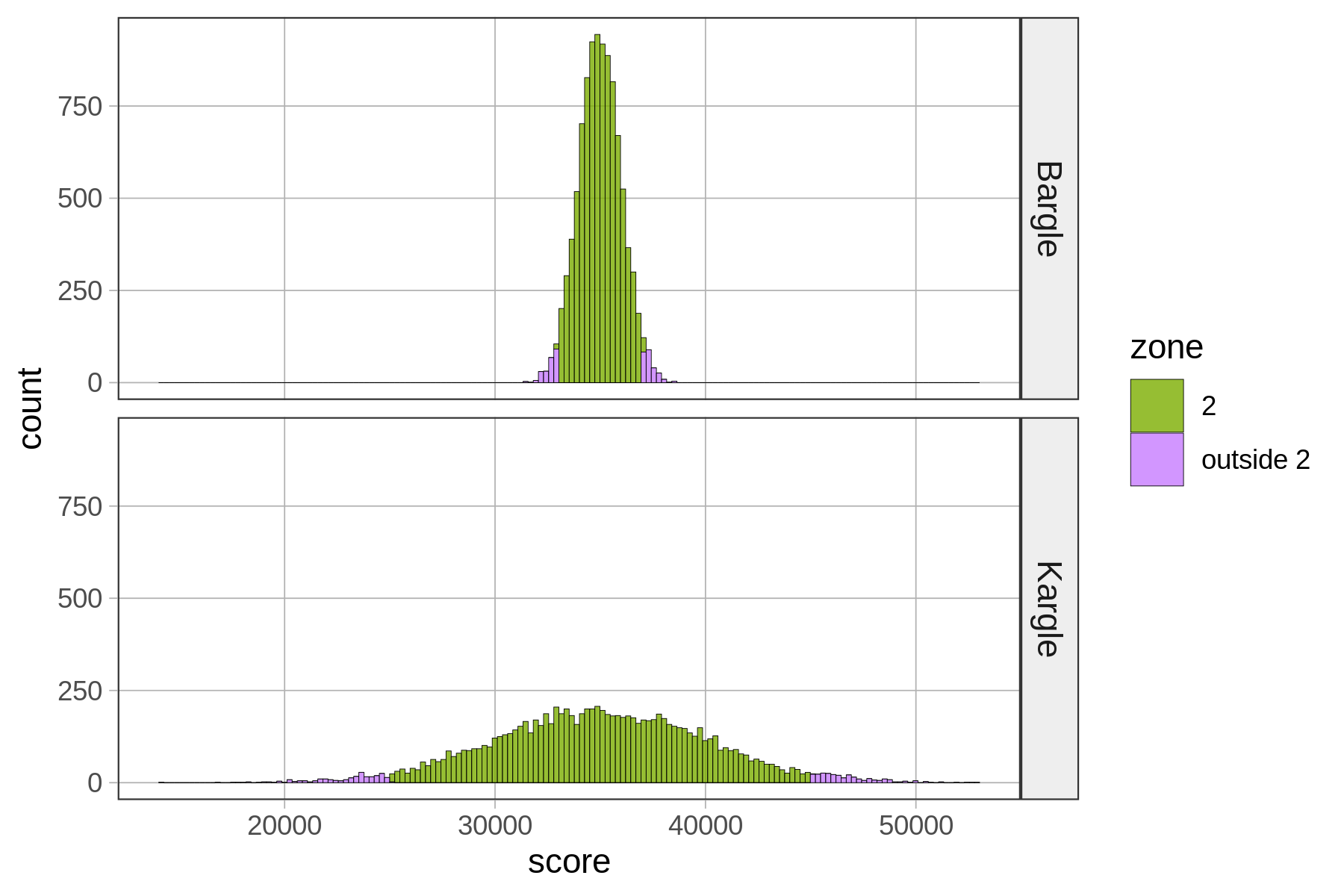
           game
zone        Bargle Kargle
  2         0.9518 0.9487
  outside 2 0.0482 0.0513
Basically, .95 of the scores fall within two standard deviations of the mean. In a normal distribution, scores are so clustered in the center that if you go out just two standard deviations from the center, you have captured a whole lot of your distribution!
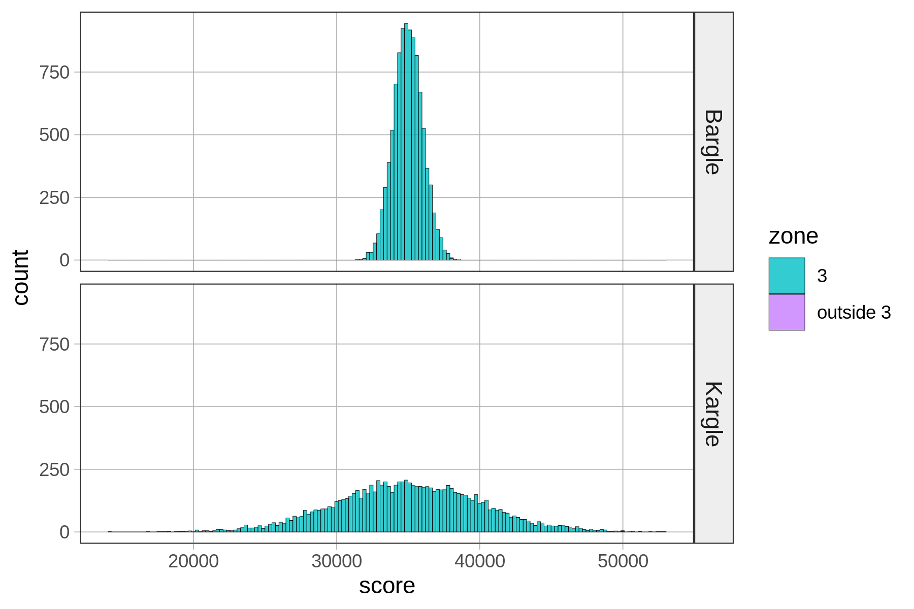
       zone Bargle Kargle
1         1 0.6844 0.6822
2         2 0.9518 0.9487
3         3 0.9982 0.9972
4 outside 3 0.0018 0.0028
Zone 3, which is within three standard deviations from the mean, seems to cover almost all of the distribution. If you look at the tally (or look very, very carefully at the histograms), you can see that there is a tiny proportion of scores outside Zone 3.