8.5 Modeling the DGP
We have learned how to fit a two-group and a three-group model to data and to see how much error we can reduce with a group model compared to the empty model. But let’s pause for a moment to remember that our main interest is not in a particular data set, but in the Data Generating Process – that is, the process that generated the data.
Revisiting the Tipping Study
Back in Chapter 4 we learned about an experiment that investigated whether drawing smiley faces on the back of a check would cause restaurant servers to receive higher tips (Rind & Bordia, 1996).
The study was a randomized experiment. A female server in a particular restaurant was asked to either draw a smiley face on the check or not for each table she served following a predetermined random sequence. The outcome variable was the percentage tipped by each table (Tip).
Distributions of tip percentages in the two groups (n=22 tables for each Condition) are shown below. We’ve also overlaid the best fitting model using gf_model().
Condition_model <- lm(Tip ~ Condition, data = TipExperiment)
gf_jitter(Tip ~ Condition, data = TipExperiment, width = .1) %>%
 gf_model(Condition_model)
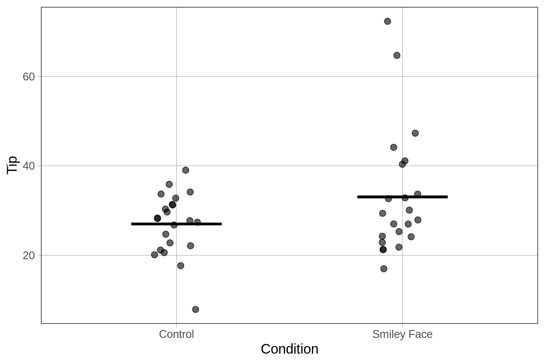
Although we can see in this graph that the tables in the smiley face condition tipped more, on average, than those in the control condition, we also can see a great deal of overlap between the two distributions. It’s possible that drawing the smiley face on the check caused tables to tip a bit more. But it’s also possible that the effect in the data is just the result of random sampling variation.
Back in Chapter 4 we considered this possibility by using the shuffle() function to see what patterns of results might result if the true effect of condition in the DGP is purely random. Our approach back then was to graph various re-shuffles of the data, and look to see if the graph of real data looked different from the graphs we generated randomly. Now that we have learned how to fit a two-group model, we will revisit the shuffle() function.
As we will see, the concepts and procedures of statistical modeling that we have learned since then can help us use the shuffle() function in a more sophisticated way. First, it will put the question being asked into a model comparison framework. Second, it will give us a way to quantify our analysis of the randomly-generated data.
Model the Data
Let’s start by fitting a two-group model to the tipping study data:
\[Tip_i=b_0+b_1Condition+e_i\]
Fit the model in the code window below and print out the best-fitting parameter estimates.
require(coursekata)
# NOTE: The name of the data frame is TipExperiment
# NOTE: The name of the data frame is TipExperiment
lm(Tip ~ Condition, data = TipExperiment)
ex() %>%
  check_function("lm") %>%
  check_arg("formula") %>%
check_equal()Call:
lm(formula = Tip ~ Condition, data = TipExperiment)
Coefficients:
(Intercept) ConditionSmiley Face
27.000 6.045We’ve plotted the tips broken down by condition, overlaid the predictions of the two-group model, and labeled the \(b_1\) estimate in the figure below. The \(b_1\) estimate shows us that in our data, putting a smiley face on the check results in an increase in tips, on average, of 6 percentage points.
Comparing Two Models of the DGP
Having fit the model, we can return to the same question we posed in Chapter 4, but this time we can pose it in a more sophisticated way. In Chapter 4 we asked: is it possible that the slight increase in tips between the control and smiley face groups was due simply to random sampling variation and not to a true effect in the DGP?
Even though the best-fitting model of the data produces a \(b_1\) estimate of 6 percentage points, is it possible that such an effect could have been produced by a DGP in which \(\beta_1\) is equal to 0?
In other words, based on the data, which model will we adopt? The more complex condition model, in which we estimate the value of \(\beta_1\) to be 6? Or the simpler, empty model, in which \(\beta_1\) is 0?
Condition model: \(\text{Tip}_i=\beta_0+\beta_1\text{Condition}_i+\epsilon_i\)
Empty model: \(\text{Tip}_i=\beta_0+\epsilon_i\)
Note that the only difference between these two models is that the term \(\beta_1Condition_i\) has been deleted from the empty model. If \(\beta_1\) is 0, then this term will drop out of the model.