4.13 Shuffling Can Help Us Understand Real Data Better
Randomness Produces Patterns in the Long Run
One important thing to understand about random processes is that they will produce a different result each time. If you only flip a coin one time and get heads, you can’t really tell anything about the random process that produced the result. You can’t even know that it was, actually, random. But if you flip a coin a thousand times, you will see that in the long run the coin comes up heads 50% of the time. It’s the law of large numbers!
The same is true with shuffling data. Just shuffling the tip percentages one time shows us one possible result of a purely random process. (We know the process is purely random because the shuffle() function is designed to be random.) But to see a pattern in the randomness requires that we do many shuffles. This is the only way we can see the range of possible outcomes that can be produced by a purely random process, and see how frequently different outcomes occur.
The R code in the window below creates the jitter plot we’ve been looking at of tips as a function of condition in the tipping study. You can shuffle the tips before graphing them by simply using shuffle(Tip) instead of Tip as the outcome variable. Add shuffle() to the code, then run it a few times to see how the jitter plots change with each shuffling of tips.
require(coursekata)
# shuffle the tips in the jitter plot
gf_jitter(Tip ~ Condition, data = TipExperiment, width = .1) %>%
  gf_labs(title = "Shuffled Data")
# shuffle the tips in the jitter plot
gf_jitter(shuffle(Tip) ~ Condition, data = TipExperiment, width = .1) %>%
  gf_labs(title = "Shuffled Data")
ex() %>% check_or(
  check_function(., "gf_jitter") %>%
    check_arg("object") %>% check_equal(),
  override_solution(., "gf_jitter(shuffle(Tip) ~ shuffle(Condition), data = TipExperiment)") %>%
    check_function("gf_jitter") %>%
    check_arg("object") %>% check_equal(),
  override_solution(., "gf_jitter(Tip ~ shuffle(Condition), data = TipExperiment)") %>%
    check_function("gf_jitter") %>%
    check_arg("object") %>% check_equal()
)Each time you shuffle the data, you’ll get a slightly different pattern of results. Plotting the group means on top of each shuffled distribution can help you see the pattern more clearly as it changes with each shuffle.
Saving the shuffled Tip as ShuffTip will allow us to plot the means of the two groups as lines.
require(coursekata)
# add the shuffle function to this code
TipExperiment$ShuffTip <- TipExperiment$Tip

# this makes a jitter plot of the shuffled data and adds means for both groups
gf_jitter(ShuffTip ~ Condition, data = TipExperiment, width = .1) %>%
  gf_labs(title = "Shuffled Data") %>%
  gf_model(ShuffTip ~ Condition, color = "orchid")
# add the shuffle function to this code
TipExperiment$ShuffTip <- shuffle(TipExperiment$Tip)

# this makes a jitter plot of the shuffled data and adds means for both groups
gf_jitter(ShuffTip ~ Condition, data = TipExperiment, width = .1) %>%
  gf_labs(title = "Shuffled Data") %>%
  gf_model(ShuffTip ~ Condition, color = "orchid")
ex() %>% {
  check_function(., "shuffle") %>%
    check_arg(1) %>%
    check_equal()
  check_function(., "gf_jitter") %>%
    check_arg(1) %>%
    check_equal()
}Below are three examples of shuffled tips plotted by condition.
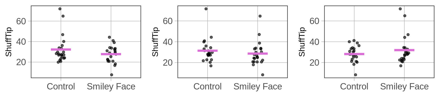
As we can see, some shuffles produce distributions where the tips look similar across conditions (as in the center plot). Other shuffles result in higher tips from the control group (as in the left plot), while in others the smiley face tables appear to be tipping more (as in the right plot).
None of these results could possibly be due to the effect of smiley faces on checks. We know this because the assignment of tables to groups was done using a 100% random process. What we are seeing in these graphs is what possible outcomes can look like if the process is purely random. The more times we run the code, the more sense we will get of what the range of outcomes can look like.
How Shuffling Can Help Us Understand Real Data Better
Let’s go back to the question we were asking before we started shuffling tips. Are the slight differences in tips related to adding smiley faces to checks due to the smiley faces, or could they be just due to randomness? Shuffling tips provides us with a way to begin answering this question.
By graphing multiple sets of randomly-generated results, we can look to see whether the pattern observed in the real data looks like it could be randomly generated, or if it looks markedly different from the randomly-generated patterns. If it looks markedly different, we might be more likely to believe that smiley faces had an effect. If it looks similar to the random results, we might be more inclined to believe that the effect, even if apparent in the data, could simply be the result of randomness.
Below we show nine different plots. Eight of them are the result of random shuffles of tips; the other one, in the upper left with red lines for averages, is the plot of the actual data. Take a look at all these plots, and compare the plot of real data to the other plots.
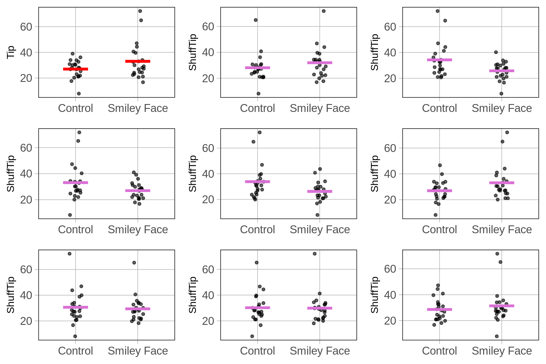
Using shuffle() slows us from concluding that every relationship we observe in data (e.g., the relationship between smiley face and tipping) is real in the DGP. We always need to consider whether the relationship in the data might just be the result of random sampling variation. Concluding that a relationship in data is real when in fact it results from randomness is what statisticians call Type I Error.
Maybe It’s Not Just Randomness
Based on our analysis of the nine jitter plots above, we’ve concluded that maybe – just maybe – the difference we observed between smiley face and control groups could just be due to random sampling variation. But would this always be the result of random shuffling? Absolutely not.
Let’s take the case of the sex and students’ height. Below we’ve put a jitter plot that shows the relationship, and, like before, added on the average height for females and for males as a red line.
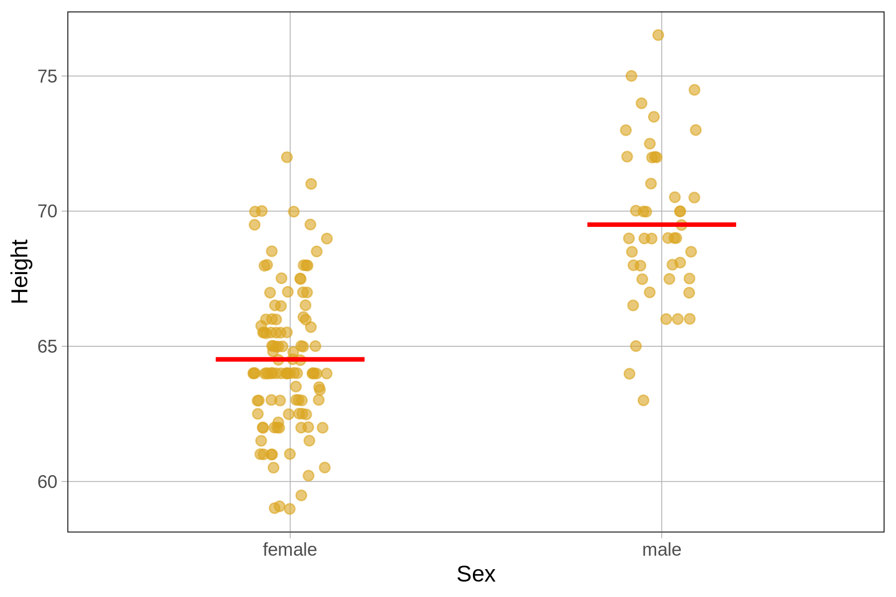
This looks like a fairly large difference between females and males. But still, there is a lot of overlap between the two distributions; even though males are taller in general, some females are taller than some males. The question is: Could the difference between females and males be due only to random sampling variation, or is there really a difference in the DGP?
In the nine jitter plots below we’ve shown the actual data (with the means in a different color), and eight graphs showing eight different shuffles of height across females and males.
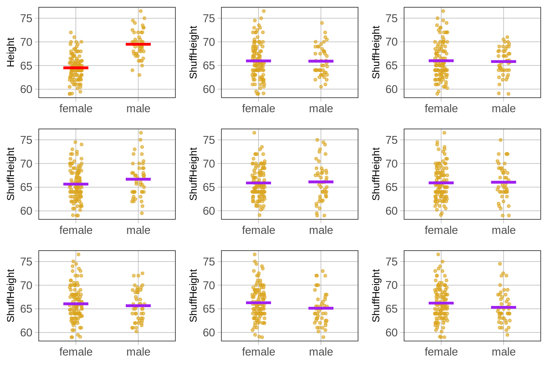
For the smiley face data, it was hard to distinguish the real data from the randomized data. But in this case, the graph of real data looks very different from the randomly generated data. For this reason, we might conclude that the relationship between sex and thumb length is not just due to randomness but is a real relationship in the DGP.
Even though it’s still possible that a random process generated this height data (after all, it’s possible to flip 1000 heads in a row), it’s not very likely. Later we will learn more systematic ways of making this decision, but for now, just shuffling and looking at the results can be a powerful tool for helping us interpret patterns of results in data.